

Contemporary Artists and their use of Viewpoints
Each room in a house offers a completely different story. A lot of people will generally have different colour schemes for each room; blue or yellow in a living room for a cooler atmosphere or red in a bedroom to promote sensuality and romance perhaps. Furniture also pays a large role in expressing a person’s personality, for instance a student earning a small income may prefer very space-saving furniture, made from lightweight flat-packed material which is easy to manoeuvre, whereas a wealthy middle-aged couple may have rather expensive, heavy and good quality wooden furniture and a leather suite for lounging.
Comparison of Artists
For this part of the course and having a starting point with Anthony Green and Phillip Pearlstein, I decided to do a general online search for other artists whose work has included that of a domestic interior.
I tried to find artists from several different times in history with different ideas as to how one’s living room should look and below are my findings:

Fig. 1. van Gogh, V The Bedroom (1888) 
Fig. 2. Green, A Study for Mrs Madeleine Jocelyne with her Son (1987) 
Fig. 3. Lichtenstein, R Modern Room (1990) 
Fig. 4. Weischer, M Living Room (2003)
| Fig. van Gogh, V The Bedroom (1888) | Fig. Green, A Study for Mrs Madeleine Jocelyne with her Son (1987) | Fig. Lichtenstein, R Modern Room (1990) | Fig. Weischer, M Living Room (2003) |
| Van Gogh was a Dutch painter during the Post-Impressionism era. Before van Gogh began suffering the effects of his mental health problems, he spent a year in Arles in the south of France. Van Gogh created this piece during his time in Arles in the Yellow House. | This piece was created by Anthony Green who is a British painter. Green specialises in creating work focussing on the wealthier middle-class domestic interiors, choosing canvases of peculiar shapes to assist him with his irregular angles and perspectives. | Roy Litchtenstein was an American painter during the Pop Art movement. His work was rather precise in its composition and structure of the piece; however, he would often allow the piece to hold some humour, easing the formality somewhat. | Matthias Weischer is a German painter whose work is very architectural and precise in nature, however, similar to Lichtenstein, Weischer inserts touches of the abstract into his pieces to blur the lines between real and imaginary. |
| This piece shows a bedroom in a relatively modest looking building. Van Gogh removed the majority of the furniture from the room, repositioning that which he thought suitable for his composition, including pieces of his own work on the walls above the bed. The view of this room appears to be at the eye level of a child – perhaps van Gogh had settled himself on the floor in the corner of the room to be able to create this piece and allowing the biggest view possible. The light from the window and the shades of blue on the walls lead me to think the piece was created either in the early morning or early evening. | This piece is an aerial view of Mrs Jocelyne’s living room and surrounding rooms. The piece appears to have a fish eye view of the room, however, is very angular as opposed to round. The perspective of this piece appears to be from that a fly on the ceiling. I can only imagine Green used a pair of ladders to be able to achieve this angle. Looking at the shades of the colours used and the whiteness of the windows, I believe the piece was created during the day time. | The layout of the living room in this piece consists of a sofa, a couple of tables, a chair, a mat and a bookshelf. Lichtenstein has used solid blocks of colours, line and dots to show different planes, directions and depth of the objects within the piece. The perspective of this piece appears to be from that of an adult entering the room – perhaps after finishing work for the day? It would appear to be daylight as the colours are very light and airy. | This piece shows a darker, cooler mood than the rest and allows a glimpse at the outside world as well. The image consists of what appear to be a piano and a couple of tables just making it into the viewpoint of the piece, a stool and what would appear to be a bed, but considering the title of the piece, I can only assume it is a bench. There appears to be a bit of a flowerbed inside the building, in front of the window and several plant pots. In the background, there appears to be something resembling half of a pyramid and two palm trees. There also appears to be a wave or tip of an iceberg. This could also be an indication of rain or clouds. Finally, there are some filled and also some empty bookshelves. It is rather strange that the room shows a very cold interior and a hot exterior, yet the sun is inside. I think this plays on the fact that the image appears to have been created in the late evening, when the sun would be on its path to setting. The windows appear to continue around the end of the piece, so perhaps the sun on the cupboard door is actually the reflection of the sun in a mirror? |
| This piece also creates a sense of comfort and relaxation. However, I also feel slightly unsteady and unbalanced due to the inward leaning of the objects. It feels as though the room is slowly folding inwards on itself. | The atmosphere of this piece invites a feeling of warmth in the sofa, yet it is also slightly uncomfortable with the sharp edges to the piece. | Due to the sparsity of details in this piece beyond lines and dots, as well as the straight lines throughout, this piece is very uncomfortable and clinical, almost as though the room was a waiting room in a dentist practice. | This room, due to the use of blue, feels very cold indeed. It almost appears to represent ice, especially with the jagged downward slope to the floor. Even the flowers look familiar to snow. I find it surprising that there appears to be what looks like a sun on one of the cupboard doors. |
| The colours in this piece are very mixed. The furniture uses warm yellows and reds whereas the actual walls of the room are very cold. Again, there is only a small touch of green in this piece and it is not the main point of emphasis. Whilst at first glance this image appears rather accurate, when you look closer you can see there are flaws to the structure of the room and the objects, showing a rather well masked contortion of the angles in the piece. There are only a few objects in this room and the detailing to the objects in the piece is greatly reduced. | This piece uses many strange angles but is very obvious about this, where as the other pieces seem to mask them somewhat. The colours in this piece are very warm, using red and yellows with only a hint of green or blue in places. This piece has a lot of visual information both in the amount of objects, their details and the amounts of rooms. | The colours used in the piece vary between muted on the walls and floor and bold in the stripes, spots, chair and side table. The colours are also mostly primary, except for the plant in the bottom right of the image. Again, the incorrect angles in this piece are well masked as the piece appears rather accurate upon first glance. Whilst this piece has a lot of objects in it, the details in are very limited. | Similar to Green’s piece, this has quite a lot of visual information, however, the details to the objects are rather limited. The angles in this piece all appear to be accurate, however, the objects and angles all appear to be placed cleverly to create the appearance of jagged angles. The bulk of the piece appears to have been created in cold colours, with only hints of warmer colours in places, such as the sun, the stool and bench. |
| In this piece, the eye is initially drawn to the bold coloured bedding on the bed. It then becomes apparent that the angles of the room all appear to be leaning inwards, as though the room were collapsing inwards. It almost feels that this piece is a delusion; perhaps van Gogh created this piece to represent a mental prison he had created for himself which was slowly imploding or caving in on him or which he felt he was in prior to his mental breakdown. It is this leaning which leads me to believe it is van Gogh’s way of being expressive in this piece. | Initially, your eye is drawn to the person in red in this piece, who appears to be Mrs Jocelyne. The person behind Mrs Jocelyne is less distinct initially due to the colours blending with the background. From there, the eye is pulled downwards towards the curtains on both sides. All of the angles and sections jutting out in every direction pulls your eye in every direction, but there is visual information to be found in each one. This piece is the only one to contain any actual people who appear very close. The lady is sat in the forefront, very prim and proper and bold in colouring. The male is slouching across the back of the sofa almost as a child would and is very muted in colouring, showing he is not the main focus of the piece but merely a supporting role. This piece is rather chaotic but is very expressive with the amount of detail it contains and the almost magical qualities of the hidden rooms attached. | The first thing I noticed about this piece was the face in the picture which appears to be looking towards the left-hand wall which has diagonal lines leading downwards to the spots of the sofa, which both contrast each other greatly and help show the difference in depth to the objects. This piece shows a photograph on the wall of an Asian male and reminds me of a dictator of some sort, which I feel is totally at odds with the character of the piece itself. This piece appears very computer-generated and very cartoon-like, however, there is still some expression to the piece in the humour it seems to contain within the inclusion of the photograph and contrast between the lines and dots. | This piece is very linear and angular throughout, so your eye is pulled in several directions purely from the objects themselves. Even the curtains appear to have a zigzagging motion working through them. The triangles in the semi-pyramid are placed cleverly to give the appearance of steps. The crosshatching in the stool and bench are very clever in that they create depth to the objects and show which way they are moving. This piece also has a few little additions which add a bit of expression to it; the sun and the almost real-looking statue on the table, again, adding a slight touch of humour to the piece. |
| The success of this piece is the scaling of the flooring and the realism to the floor boards. I think the green to the floorboards is slightly off, but it does offer a good contrast. | Overall, I really like the use of the jagged angles within this piece and the quantity of visual information it holds. I feel I can look at it again and again and still find things I didn’t see before, which keeps it really interesting. However, I feel the amount of visual information is also a slight failure to the piece as it tires me to look at it for too long due to my eyes being pulled in every direction and causing confusion and frustration. It also makes me feel somewhat erratic and stressed. | Overall, I really like the spots and stripes to the piece and how the table looks very plastic, however, I do think the angles of the chair, sofa and table are all somewhat skewed. | I really like how the artist has made the glass visible in some of the windows but there is a bit of a lack of this detail in the remaining panes. I also think the lack of detail to the white flowers is slightly disappointing since there is detail, even if only simply, to everything else in the piece. |
| For this piece, I would use oil pastels due to their bold colours and expressive qualities. | If I were to recreate this piece, I would use pencil crayons as I feel this would be the best to recreate the fine details. | I think markers would be best to use to recreate this piece due to their solid and bold colouring. I also think they would be the best medium to create a cartoon-like finish to the piece. | For this piece I think either markers or ink would be best. The markers would have the bold colours and control to the movements, but the ink would be able to flow better. |
Own Interpretation of Artists’ Works
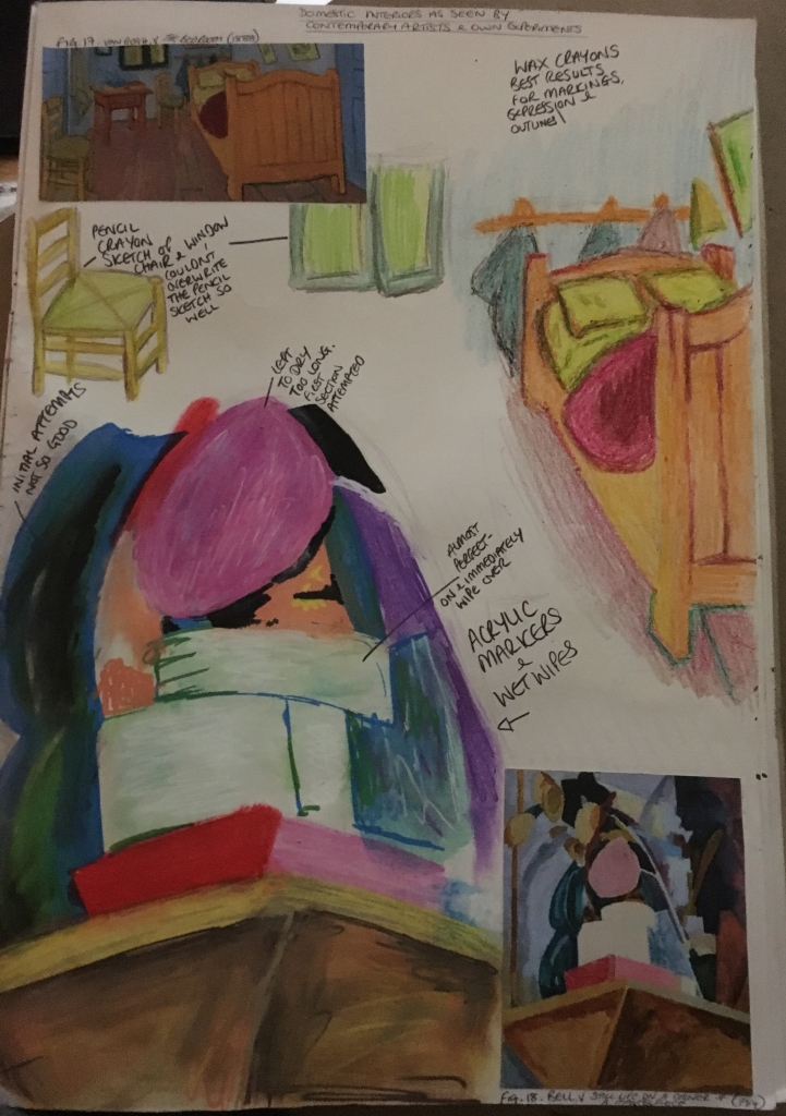
First page of own interpretation of artists’ works 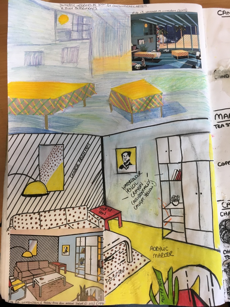
Second
page of own interpretation of artists’ works
Firstly, I decided to take certain elements of van Gogh’s The Bedroom (1888) piece, using wax crayons and pencil crayons to assist me. I was rather surprised at the use of very contrasting colours used for outlines (around the base of the bed / wooden floor and the bed frame itself. More-so, I was somewhat excited to see the results and colours I could use to try and replicate the objects. It is funny as I have always just quickly glanced at the piece and seen an orange bed, a red duvet, a green and yellow chair etc, but can actually see now that van Gogh includes multiple colours in just the smallest of sections which build up to appear as a whole of one solid colour.
I then moved on to Bell’s Still Life on Corner of a Mantlepiece (1914) and tried to replicate this somewhat. I couldn’t make out what the objects were meant to be, but presumed they were separate objects all stacked on top of each other. I decided to experiment with the acrylic pens for this part and to thin the colours by using a wash over them. I started over to the left-hand side and was rather disappointed with the results, but altered my method and by the time I came to the objects I can only describe as two white cakes, I had mastered the technique as well as possible. I really like the simplicity of the objects in this piece as they remind me somewhat of Morandi’s work.
Next, I turned to Weischer’s Living Room (2003). To look at, I rather liked this piece with its jagged angles and cool colouring, but to try and recreate I was rather disappointed. I chose pencil crayons to create the walls and flooring, felt tip pens for the sun and table tops and, finally, a bit of brown packaging with some acrylic pens for the sides of the tables.
Finally, I chose to recreate Litchenstein’s Modern Room from Interior Series (1991). Whilst I initially didn’t like the piece all that much due to its cartoon-like appearance, I found this the most exciting to recreate, I worked in acrylic pens, felt tip pens, chinese brush pens and watercolour pencils. I was pleased with the result of this the most.
Reflection
Having looked at the several different artists’s styles and methods used to create their pieces, I think I have a much better understanding of what helps make a good piece as well as the abilities mixing several contrasting colours together can have when trying to create just the appearance of one solid colour.
NB: Citation for images used in my sketchbook can be found by clicking here.
List of Illustrations
Fig. 1. van Gogh, V (1888) The Bedroom [oil on canvas] At: https://www.vangoghmuseum.nl/en/collection/s0047V1962?v=1 (Accessed on 18 March 2019)
Fig. 2. Green, A (1987) Study for Mrs Madeleine Joscelyne with her son [watercolour, oil, pastel and pencil on paper] At: https://www.bridgemaneducation.com/en/asset/308025/summary?context=%7B%22route%22%3A%22assets_search%22%2C%22routeParameters%22%3A%7B%22_format%22%3A%22html%22%2C%22_locale%22%3A%22en%22%2C%22filter_text%22%3A%22anthony+green%22%7D%7D (Accessed on 18 March 2019)
Fig. 3. Lichtenstein, R (1990) Modern Room from Interior Series (C. 252) [Lithograph, woodcut and screenprint on museum board] At: https://www.artsy.net/artwork/roy-lichtenstein-modern-room-1 (Accessed on 18 March 2019)
Fig. 4. Weischer, M (2003) Living Room [Oil on canvas] At: https://www.saatchigallery.com/artists/artpages/weischer_living_room.htm (Accessed on 18 March 2019)
Bibliography
ArtUK (unknown) ‘Anthony Green’ in ArtUK.org [online] At:
https://artuk.org/discover/artists/green-anthony-b-1939 (Accessed on 11 April 2019)
Artic (unknown) ‘Van Gogh’s Bedrooms: About the Paintings’ In: Artic.edu [online] At: http://archive.artic.edu/van-gogh-bedrooms/about-paintings (Accessed on 18 March 2019)
Artsy.net (unknown) ‘Roy Lichtenstein’ In: Artsy.net [online] At: https://www.artsy.net/artwork/roy-lichtenstein-modern-room-1 (Accessed on 18 March 2019)
Artsy.net (2013) ‘Modern Room, from Interior Series (C. 252)’ In: Artsy.net [online] At: https://www.artsy.net/artwork/roy-lichtenstein-modern-room-1 (Accessed on 18 March 2019)
Royal Academy (unknown) ‘Anthony Green RA’ In RoyalAcademy.org.uk [online] At:https://www.royalacademy.org.uk/art-artists/name/anthony-green-ra (Accessed on 10 April 2019)
Saatchi Gallery (unknown) ‘Matthias Weischer: Living Room’ In: Saatchi Gallery.com [online] At: https://www.saatchigallery.com/artists/artpages/weischer_living_room.htm (Accessed on 18 March 2019)
Van Gogh Museum (unknown) ‘The Bedroom’ In: van Gogh Museum [online] At: https://www.vangoghmuseum.nl/en/collection/s0047V1962?v=1 (Accessed on 18 March 2019)
Wikipedia (2019) ‘Matthias Weischer’ In Wikipedia.org [Online] At: https://en.wikipedia.org/wiki/Matthias_Weischer (Accessed on 10 April 2019)
Wikipedia (2019) ‘Roy Lichtenstein’ In Wikipedia.org [Online] At: https://en.wikipedia.org/wiki/Roy_Lichtenstein (Accessed on 10 April 2019)

3 thoughts on “Part Two: Project Four: Research Point: Domestic Interiors”