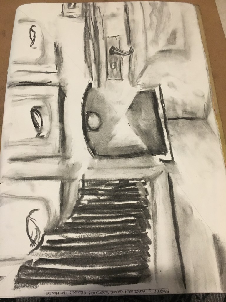
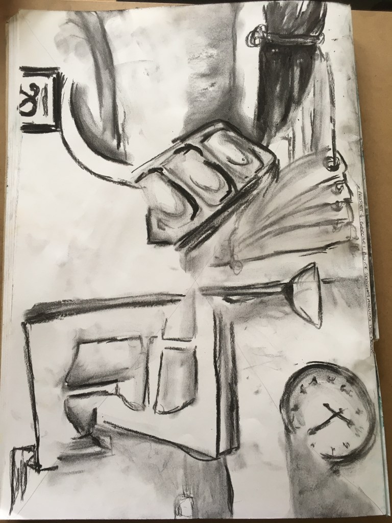
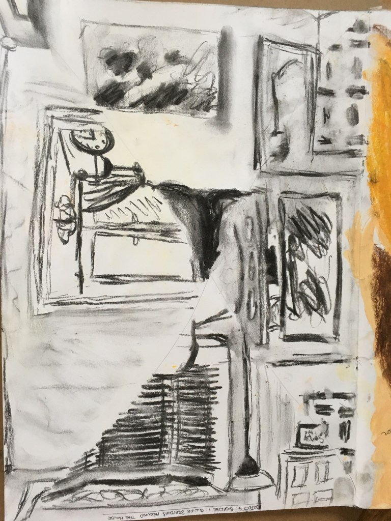
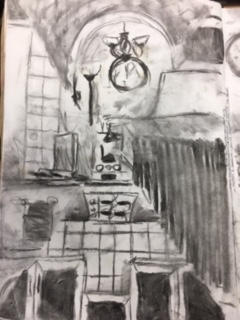
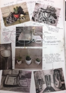
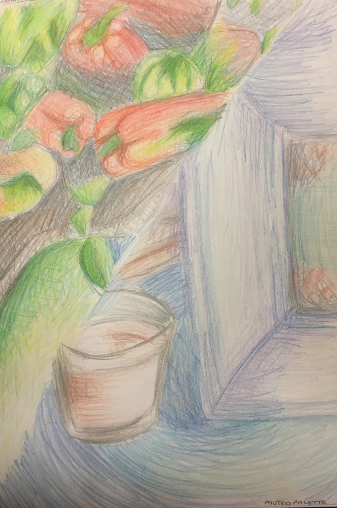
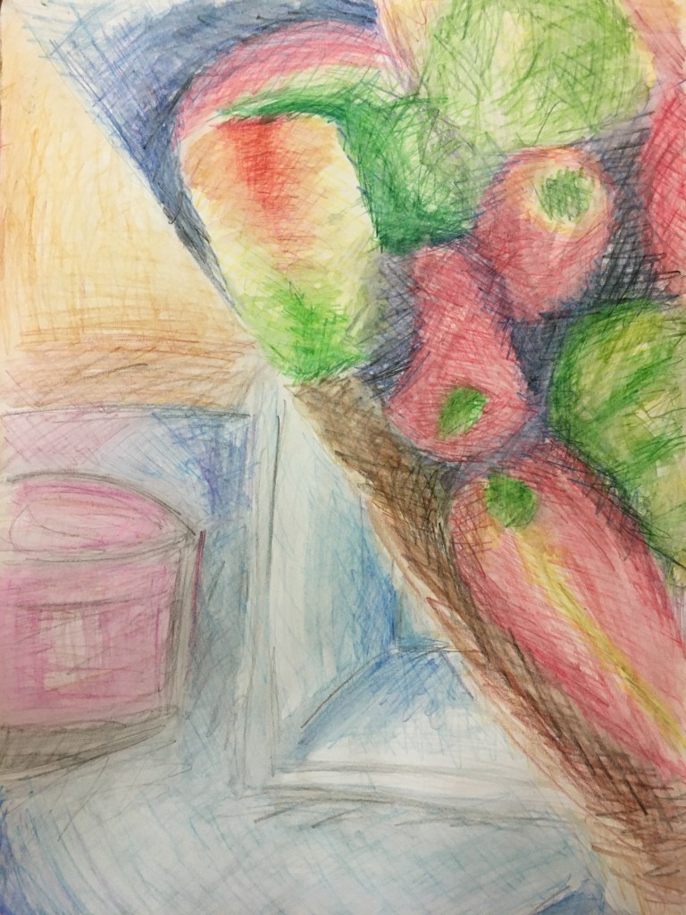
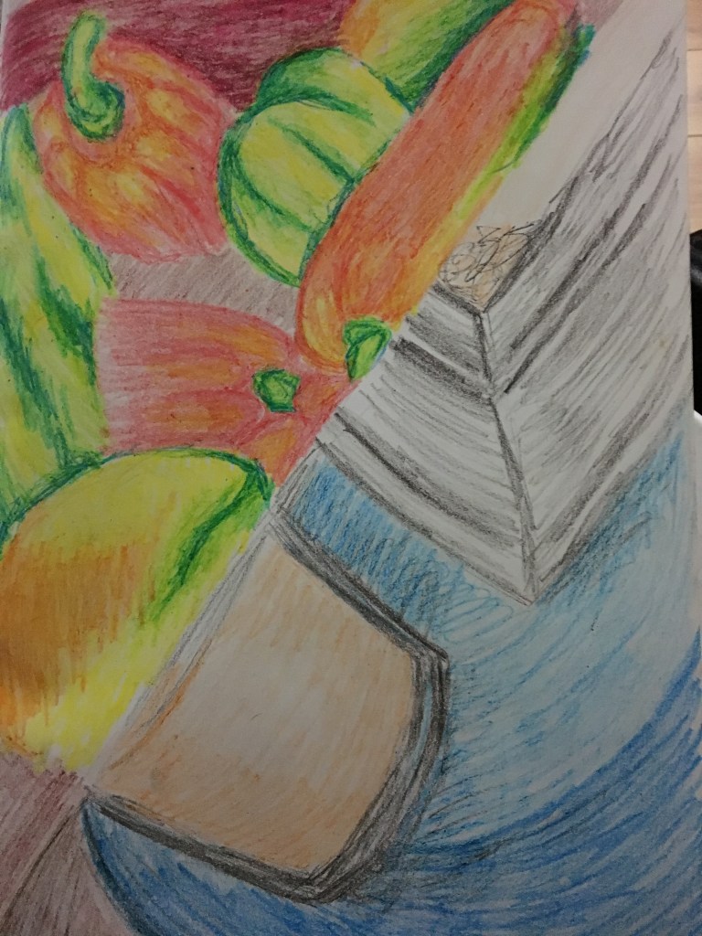
For this exercise, I looked at different areas of my home in several rooms; the living room, dining room, kitchen and my bedroom. My home is very minimalistic and so I do not have anything in the way of ornaments etc. As a result, I presumed my work would be rather boring and with little content.
To begin with, I sat myself in the middle of my living room floor and looked up into the corners of my rooms, however, there was not much interesting detail in several of these, so I simply chose to pick out parts which interested me and work on a close-up scale, sometimes closer than others, depending on the subject matter chosen. I also tried to alternate between landscape and portrait. I had divided my sketchbook pages into four triangles for each room and filled each with the subject matter I found most appealing.
Because this was an exercise to work quickly and not to be too concerned with fine lines and details, I decided to use willow charcoal, which I was also able to blend somewhat to create depth and shadows briefly.
Quick Sketch of My Bedroom
Quick Sketch of the Dining Room
Quick Sketch of the Living Room
Quick Sketch of the Kitchen
Reflection
I was rather pleased with the end results of this exercise and was surprised as to how much I actually enjoyed myself whilst doing it. However, I was rather disheartened by how easily the charcoal would smudge as I used it. Looking back, I think I may have done better having used a Chinese brush pen and ink to create these sketches, however, the blending did come in handy sometimes when I needed to quickly smudge out any errors. I think my favourite room sketchings has to be the kitchen as there is plenty to see and draw, yet without too much fine detail, which is something I tried to avoid when creating these quick sketches. I will definitely try to use this exercise going forward as it really did help me to see things I did not even imagine were visible and taught me some lessons about the home I thought I knew so well and now feel I have never really taken the time to look at fully.
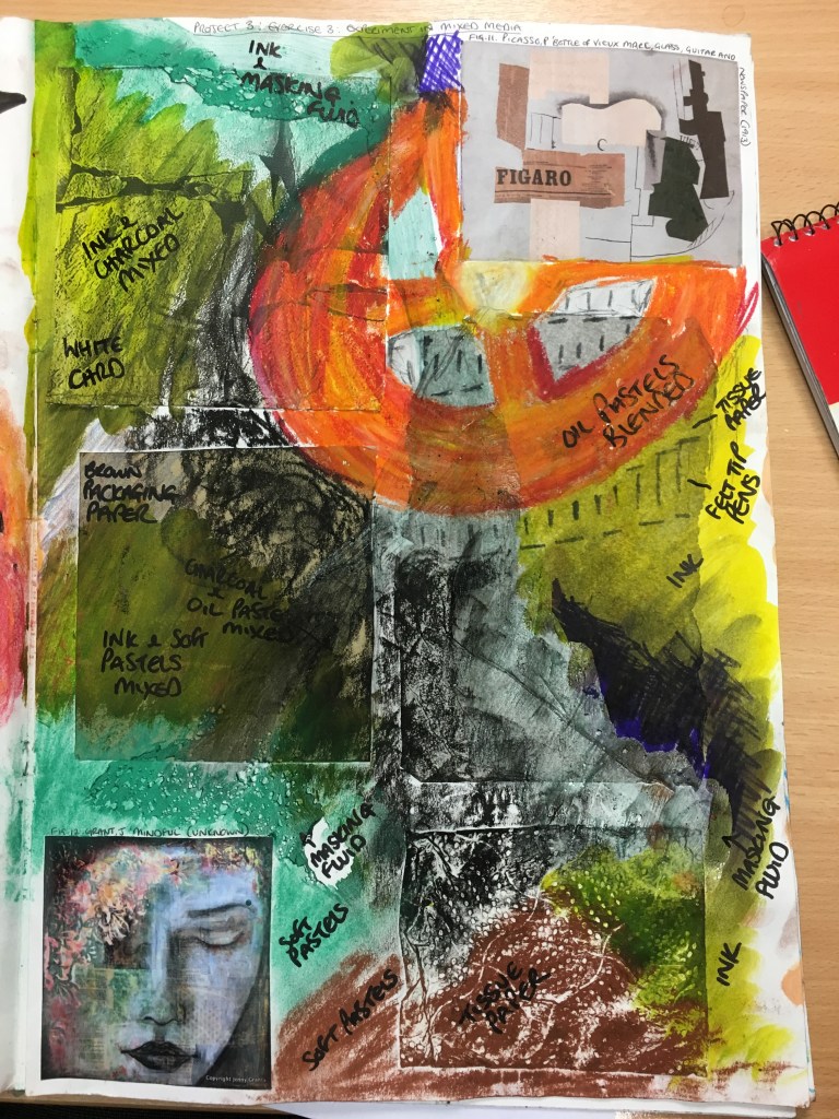
For this section, I was asked to use both traditional media
(such as ink, pencil crayons and charcoal) together with non-traditional media
(such as highlighters and wax crayons) to create a mixed media piece.
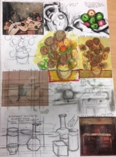
Experimentation
Firstly, I decided to get stuck right in and be messy and experimental with several different media and support. I used two pieces of work by two very different artists (the citation for which can be found by clicking here) as a guide. I decided to use different aspects from each piece to experiment with; the collaged supports from the top image, the wash over the support from the bottom image, but also from a ceiling I came across in a local cafe.
Mixed Media Experiment in Sketchbook Page One
I was really pleased with some of the results in this experiment;
I really liked the way the colours intensified or weakened depending on the
support. I really liked the effect on
the kitchen roll, especially the charcoal. I was rather surprised to see how well the
charcoal mixed with other media. I also
liked the way the masking fluid rubbed away somewhat on the white card when the
ink was applied.
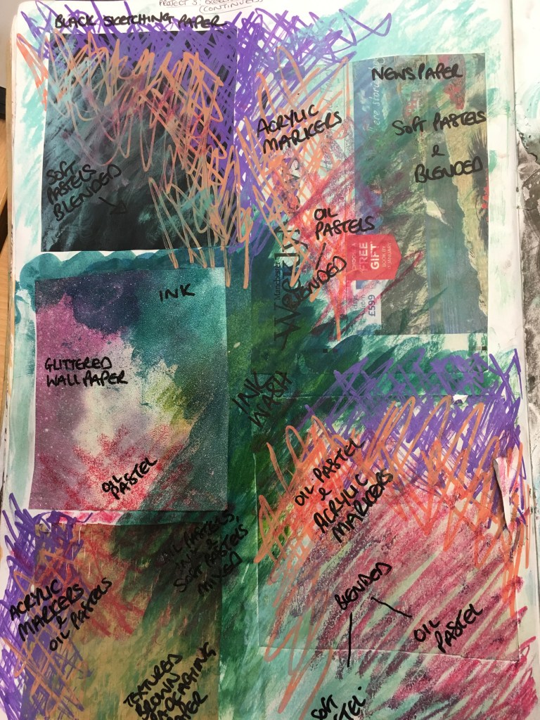
Mixed Media Experiment in Sketchbook Page Two
On the next page, I rather liked the result of the ink and
soft pastels merging together and may use this going forward. Also, the soft pastel and oil pastel merged
rather nicely too.
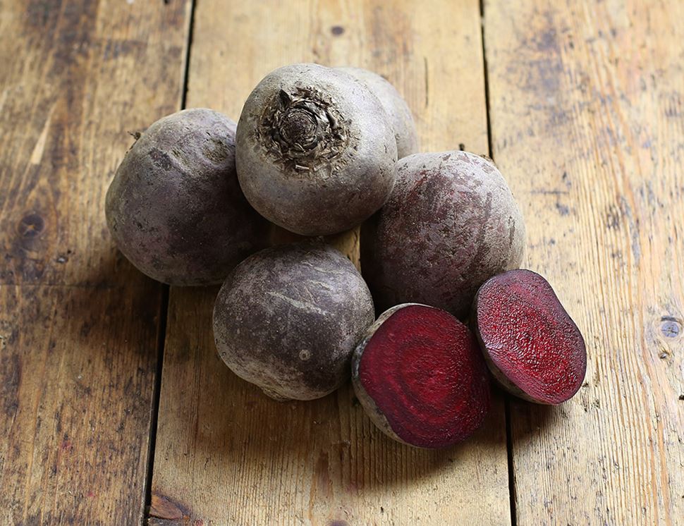
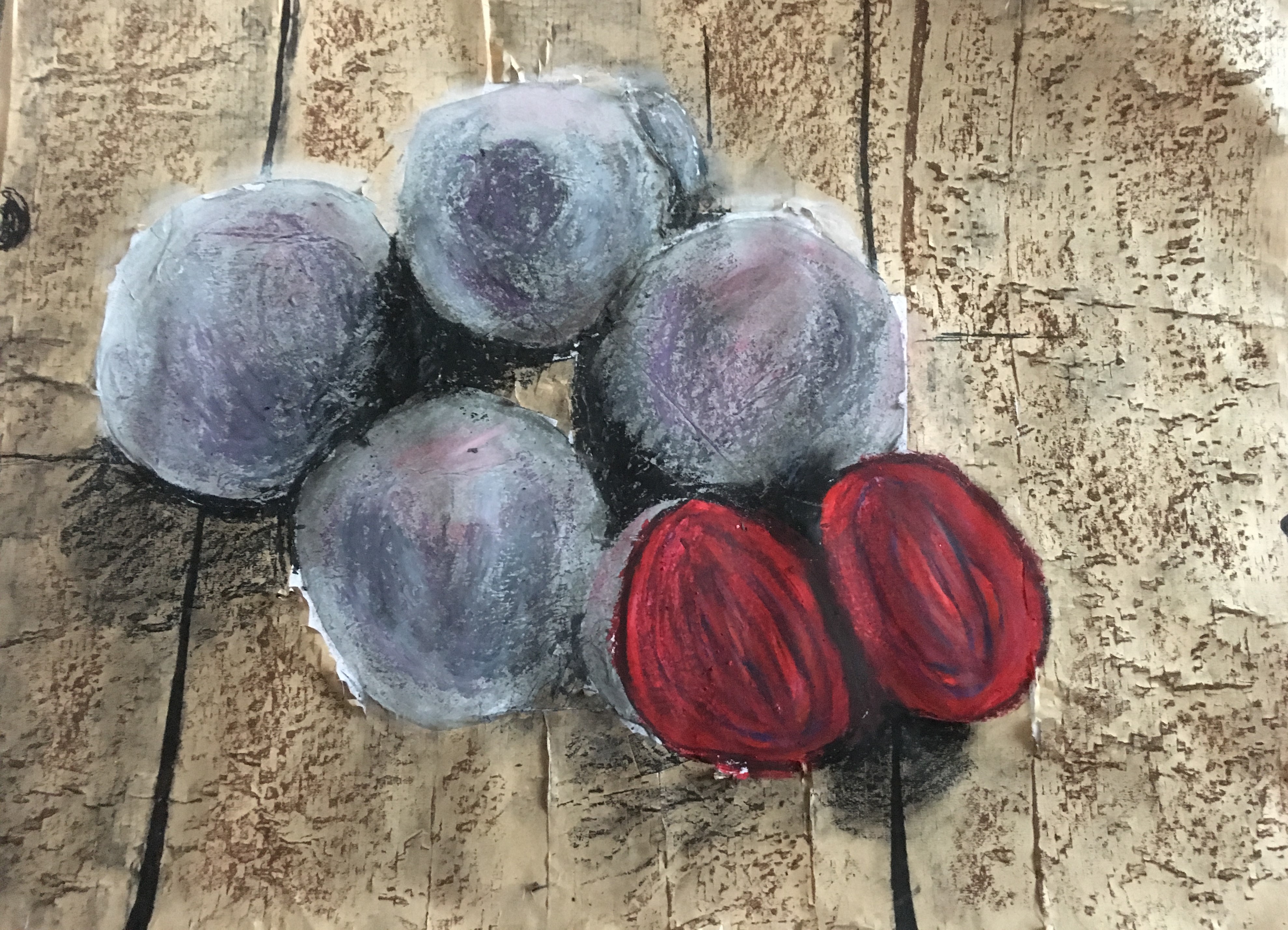
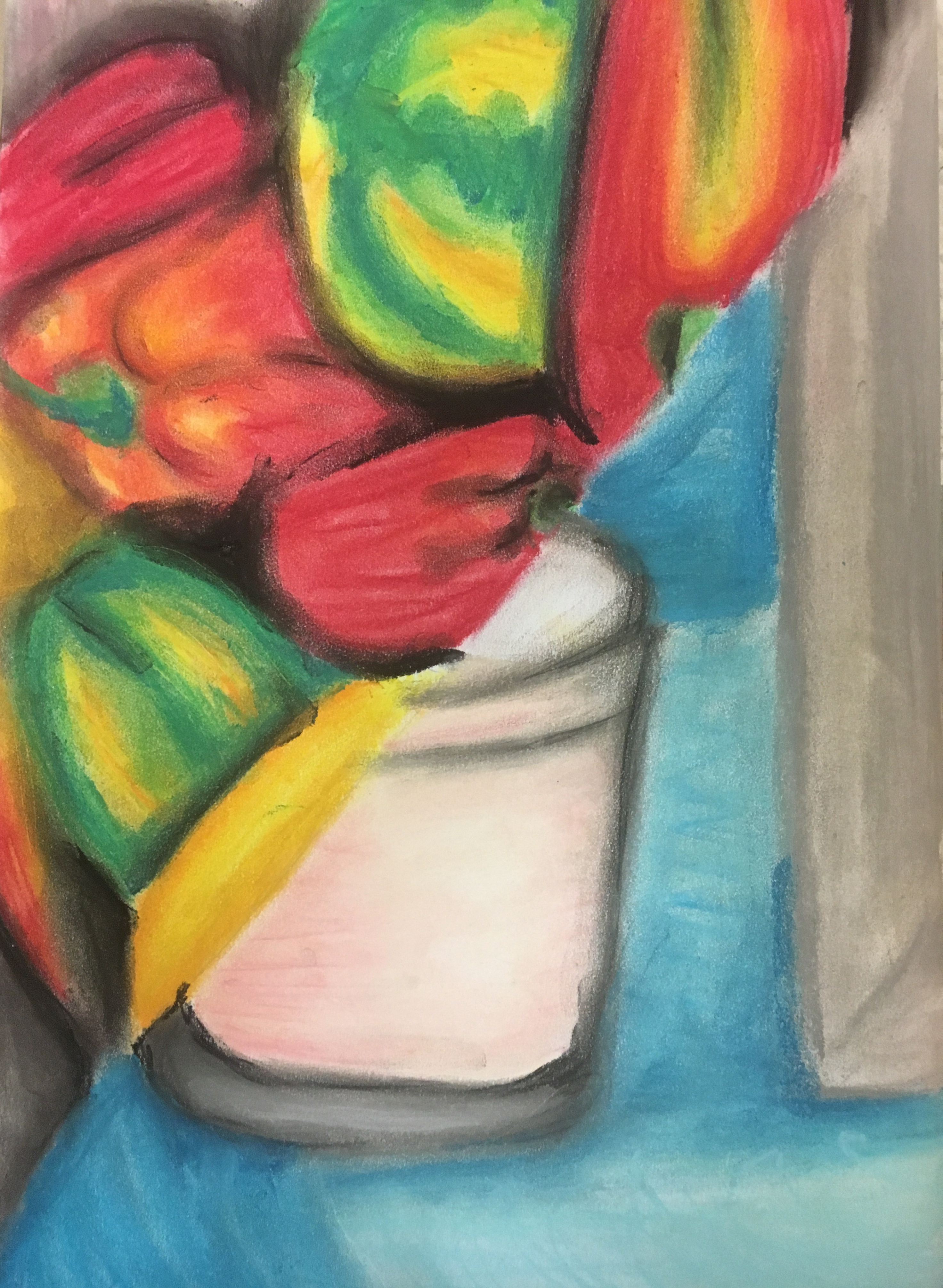
Final Piece
I struggled finding a muse for this part of the course, so
decided to search the internet for the best fitting image. I decided upon a bunch of beetroot on a
wooden surface due to the multitude of colours, vibrancies, textures and
surfaces. I chose to work with a sheet
of A2 sketchpad paper as a base for my piece.
I then used some textured brown packaging paper to represent the wooden
parts of the image. Next, I chose some
grey tissue paper for the skin of the beetroot.
I left the base of the insides of the beetroot as the plain white
surface of the paper, but applied a layer of PVA glue.
Once everything had dried, I began working in some of the
detail of the objects; I tried to work in the darkest shadows in charcoal. I then added some of the colours I could see
in the beetroot skin with soft pastel, trying to recreate the purples, pinks
and blues I could see as well as the grey.
I also tried to bring out the lightest parts of the skins by adding a
very light grey and white soft pastel. I
used ink for the flesh of the beetroot, with a layer of wax crayons and oil
pastels on top to add in the veins of the layers. I finished the piece by using oil pastels to
add in the deepest shadows again as these became somewhat lost with the layers
of soft pastel etc. I used black marker for
the gaps in the wood and a brown conté stick on its side to add texture as if
grains in the wood.
Final piece – Beetroot
Reflection
Overall, I am very pleased with this piece and think I have captured the different types of surfaces well. I think the shadow on the bottom middle beetroot could be slightly more prominent as it looks somewhat unreal compared to the others, or maybe I have simply overworked the others? I am not so sure. I also noticed a bit to the left-hand side of the bottom beetroot which is still white which works to spoil the illusion I am trying to recreate. I really enjoyed creating this piece and the methods used are definitely something I would like to consider incorporating for my final piece for this Part, but also in future parts too.
NB: Citation for images used in my sketchbook can be found by clicking here.
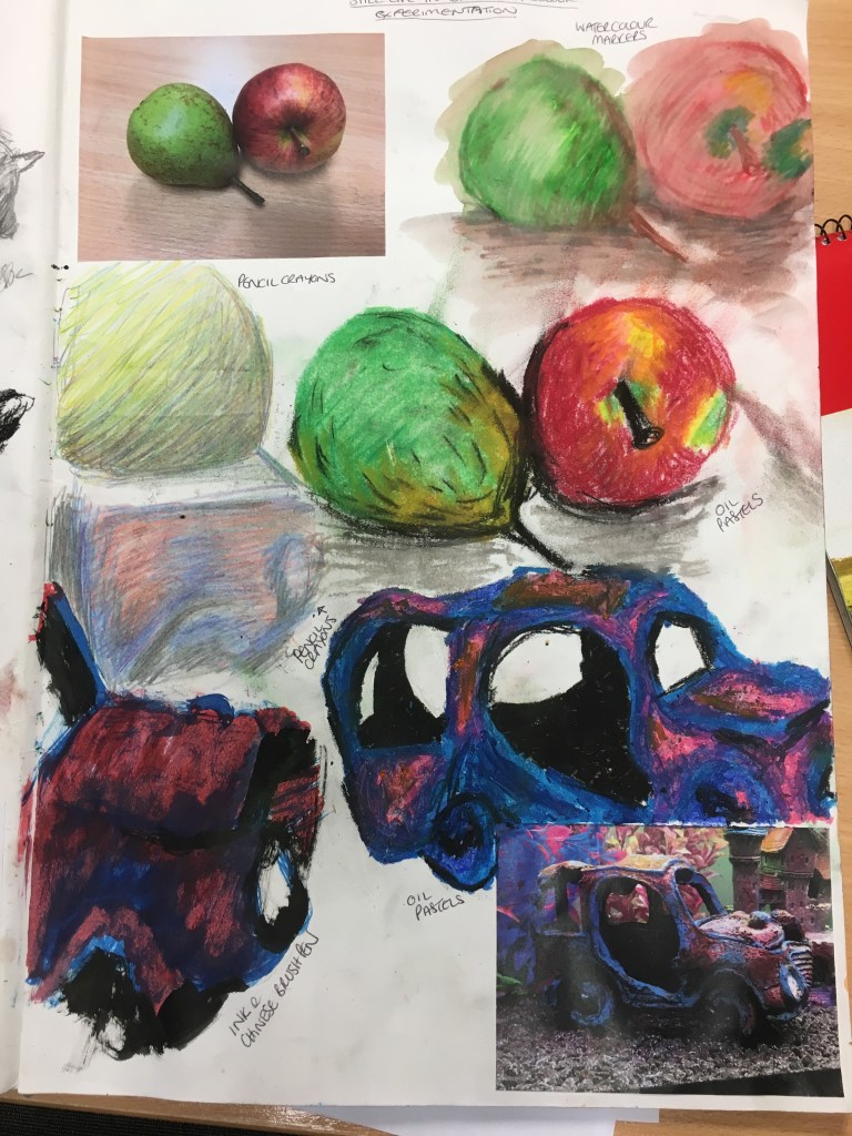
To begin this exercise, I decided to have a play in my
sketchbook with two different objects (one natural and one man-made) using
several different media before deciding on the ones I would use for my final
piece for the exercise.
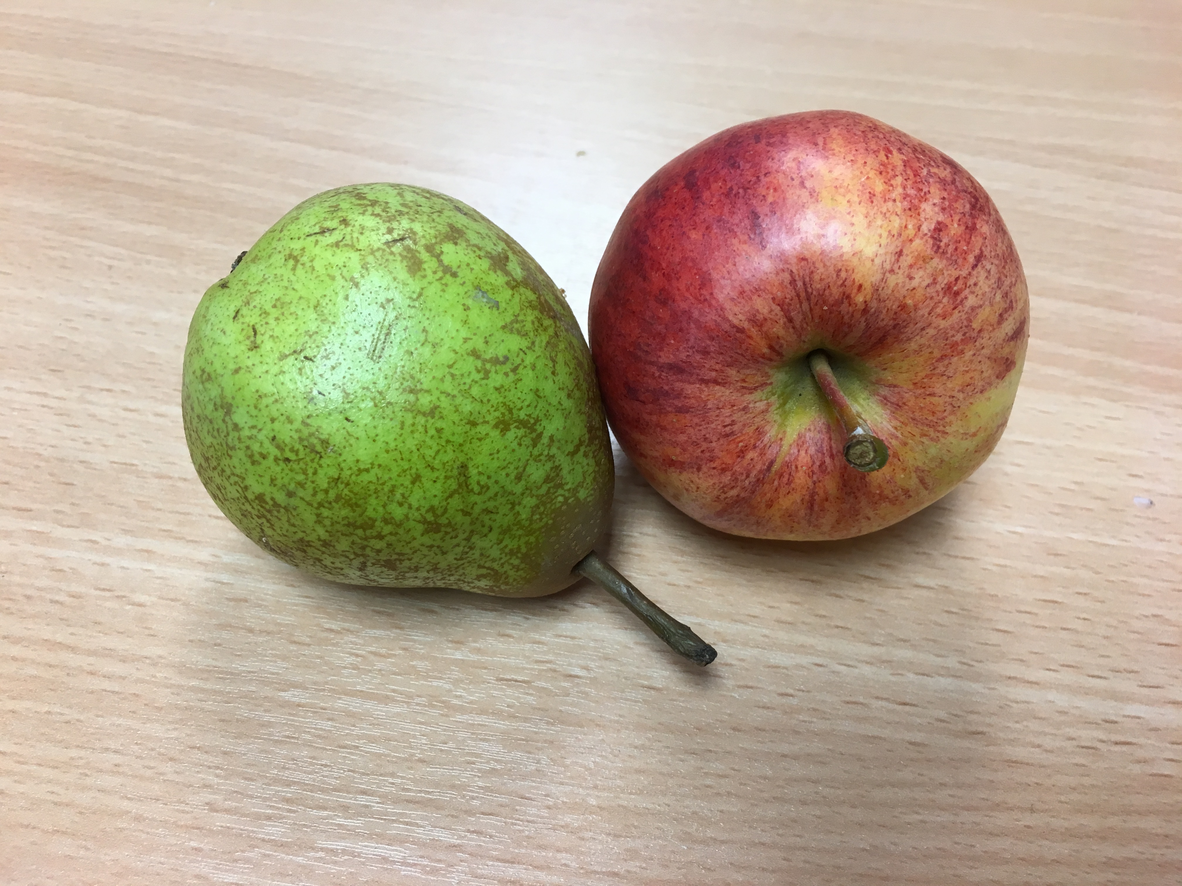
Pear and apple on office desk
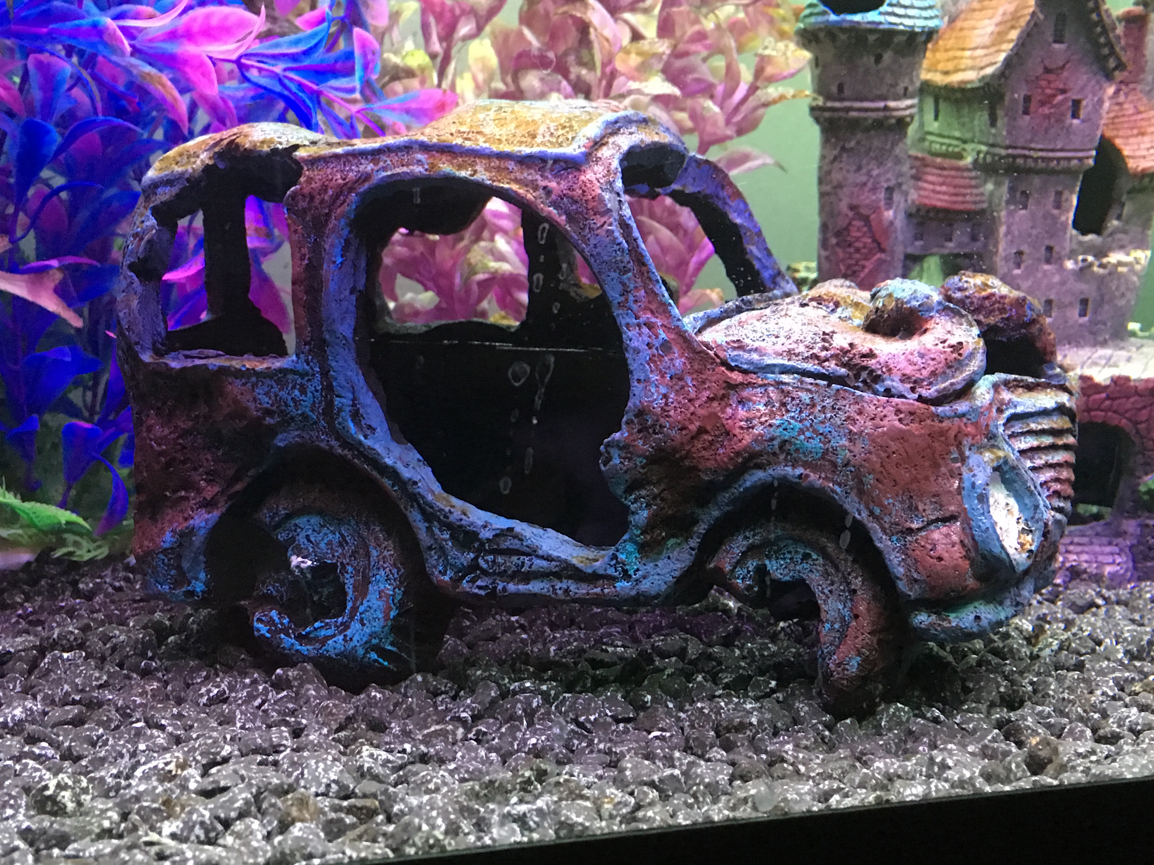
Sunken car in fish tank
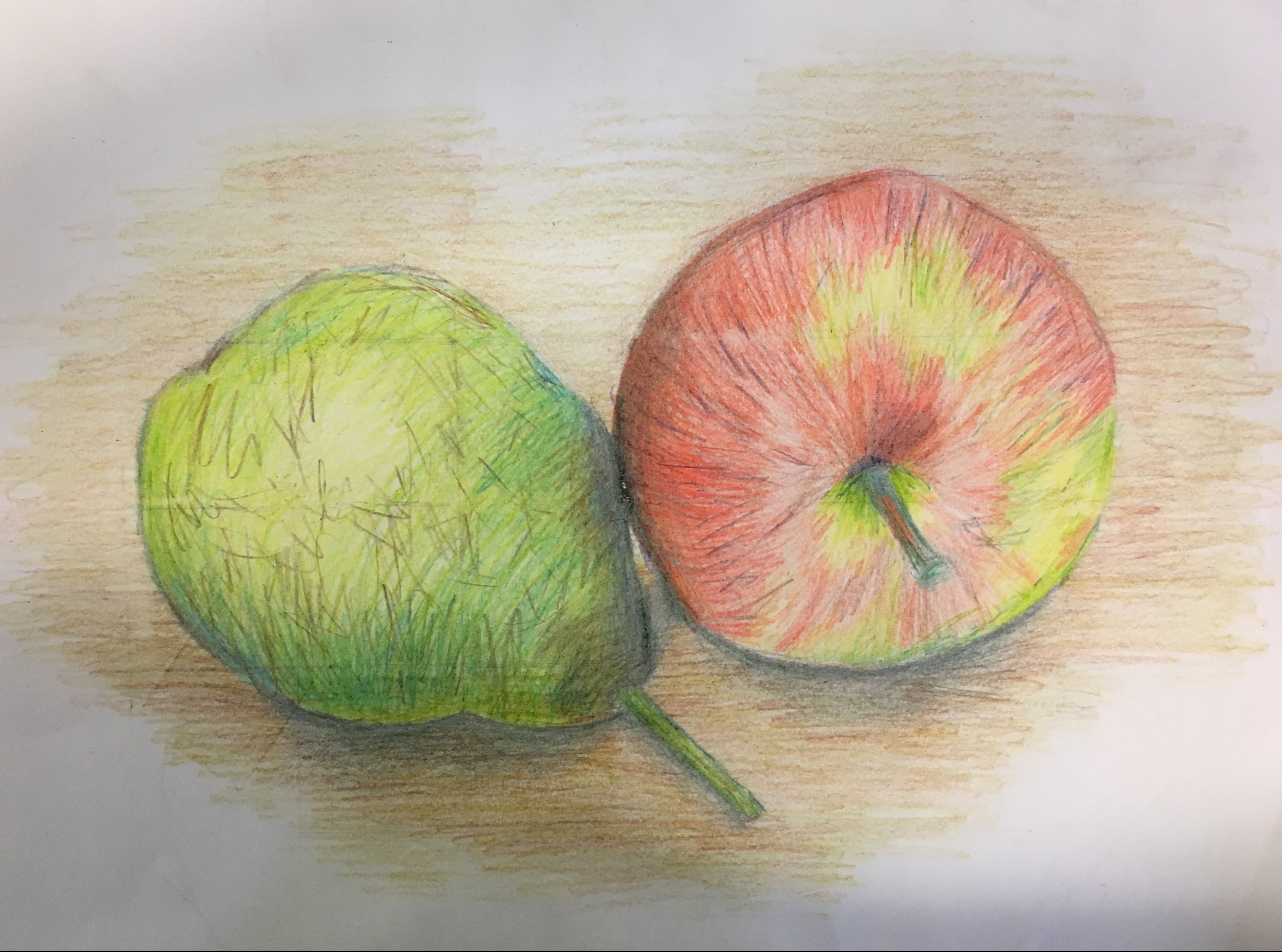
I settled on a picture of an apple and a pear together and
also a sunken, ruined car which is in the bottom of our fish tank. I chose these three objects because the
colours were very bold and contrasting, but also allowed for a lot of mixing
with my colours. The colours in the fruit
are both very natural (green, yellow, red, pink and a touch of white), whereas
the colours to the car are completely different (blue, pink and purple).
Firstly, I quickly drew the pear and apple using watercolour
markers and then used a wash of water over the top of them. I actually really liked the outcome of this
and the background created by the bleeding colours.
After this, I used pencil crayons to recreate the pear. Whilst I liked the colours, I was able to
create with this medium, I was a bit disappointed with how round it actually
made it, instead of creating the natural misshapen bumps to the object.
I then used soft pastels to create the pear and apple. I loved the boldness of the colours in this
and the ability to blend them but still retain the smooth but rough-looking texture
to the objects. I ran a little water
over the shadow on the table and really liked the effect.
After working in several ways with the apple and pear, I moved
on to the sunken car and recreated it quickly using pencil crayons, ink and oil
pastels. The pencils just did not pull
through the vibrancy of this object, just as I had found when I used them in my
preliminary
work for this section. The ink was
fantastic in bringing through the colours, but the oil pastel was, once again,
by far my favourite medium to use due to its ability for blending, messiness
and vibrancy of colours.
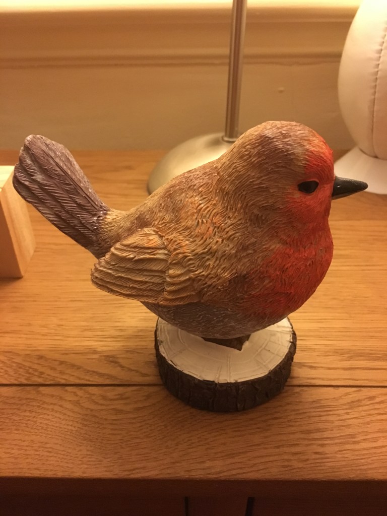
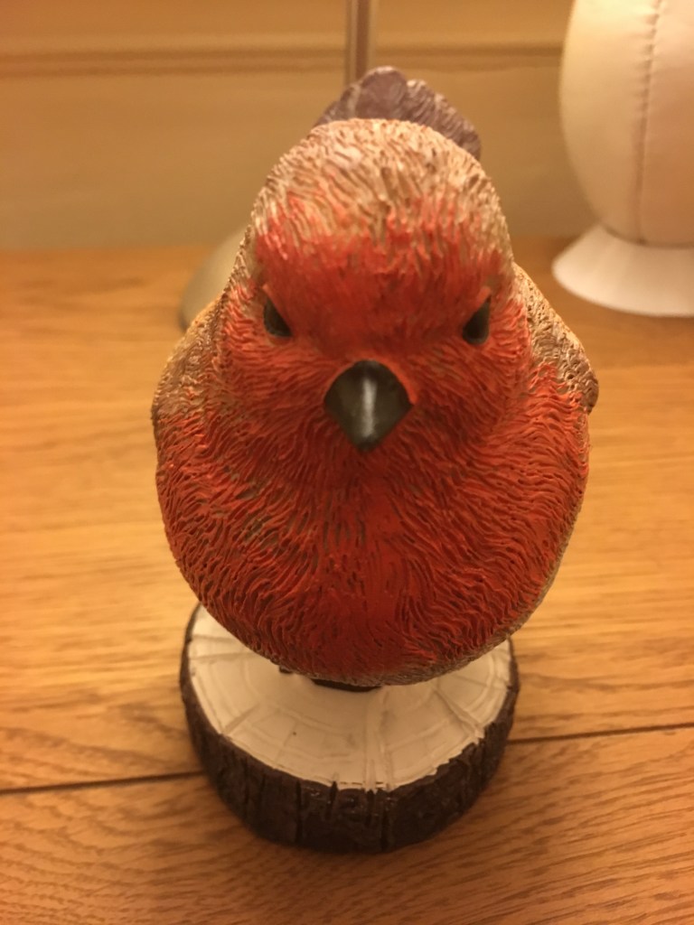
I then carried out one final experiment in my sketchbook,
using a statue of a robin on a log, the same object I used as my final piece for
Part
2: Project 2: Exercise 1: Still Life using Line. I used marker, soft pastels and oil
pastels. The markers were great for their
intense colours and the detail of the bird’s feathers. The soft pastels were by far the easiest to
blend, but the oil pastels did blend and did still show through some of the
markings of the bird’s feathers.
Final Piece
For my final piece I decided to recreate the apple and pear
again, but using pencil crayons. I chose
this medium because I liked how they had worked in my preliminary work and,
whilst the pear and apple are vibrant in their colours, I think they are also
very natural objects, so my work should reflect the naturalness instead of
using artificial intense colours.
Final Piece – Pear and Apple
Taking note of my tutor’s feedback on my scaling issues, I decided to try using a grid to help me measure the items out better. I found this unbelievably helpful and feel the likeness and scale are really good compared to my earlier works. However, I made a rookie error and did not remember to rub out the grid before I began colouring! I tried to remove the grid afterwards and then recolour the patches. I decided not to colour the full background of the table the fruit was resting on which, again, is something new for me as I am trying not to create ‘pretty pictures’ so to speak.
Reflection
Whilst I really do like the end result and see it as somewhat of an achievement for myself as it is nowhere as bold as my usual pieces, I think I still managed to overwork the medium because there are sections of the page where I have pressed too hard trying to urge the boldness of the shadows through (where the apple and pear meet). Also, I am somewhat disappointed in myself for not noticing something so simple as the grid still being in place before colouring. I will put this down to trial and error and will try to learn from it going forward! I also really like the shadow on the table because I put the black down first and then went over it with brown and a very dark red which gives the shadow depth and warmth and adds weight to the objects. I was also rather surprised by the fact that yellows and blues on the green for the pear really worked, as did yellow, orange, pink and purple for the red of the apple.
Questions
Below are the questions in my course textbook, which I have decided to answer at the bottom of both exercises, as opposed to both together:
What aspects of each drawing were successful, and what did you have problems with? The parts of this exercise I thought successful were the mixture of colours to create a solid three dimensional finished object. The problems I encountered in this piece was definitely my error in not removing the grid prior to colouring in the piece. This is something I will have to consider going forward – perhaps I can use water-soluble colours to draw the grid to make it easier to cover over and reduce the need to erase the lines.
Did you manage to get a sense of depth in your drawings? What elements of the drawings and still life groupings helped to create that sense?
The depth in this piece was achieved by the mixing of the colours. I was able to include shadow in the correct places and use the contrast between the lighter and darker colours to show the natural ‘line’ found in real life as opposed to the cartoon-like outline of my previous piece. The movement of the colouring and the placement of the shadows helps to shape the objects into understandable information for the viewer to process.
What difficulties were created by being restricted to line or tone?
On reflection, I think I have not stuck to using block tone and have, again, focussed on it looking like a picture. I think if the image was purely blocks of different tone, there would be no real depth, direction of the object’s movement or clarity as to the object’s identity to be found in the piece due to the lack of line. I think I have inadvertently realised that the two generally must go hand in hand!
How did using colour affect your working method?
Using colour in this piece as opposed to just line, I found I was a lot freer with my movements and had the ability to lift or darken the colours in the piece to suit, assisting to create the sense of depth and direction of the shape’s movements to suit my will. I found it much easier to portray shadows with colour than with just line, however, I think I could use cross-hatched lines or – if considering the methods used on a map or in an illusion for instance – distance between the lines to assist in shadow and depth formation, for example I could put the lines closer together, they would appear darker than those which were spaced further apart, thus tricking the viewer’s mind into seeing something I wish them to see.
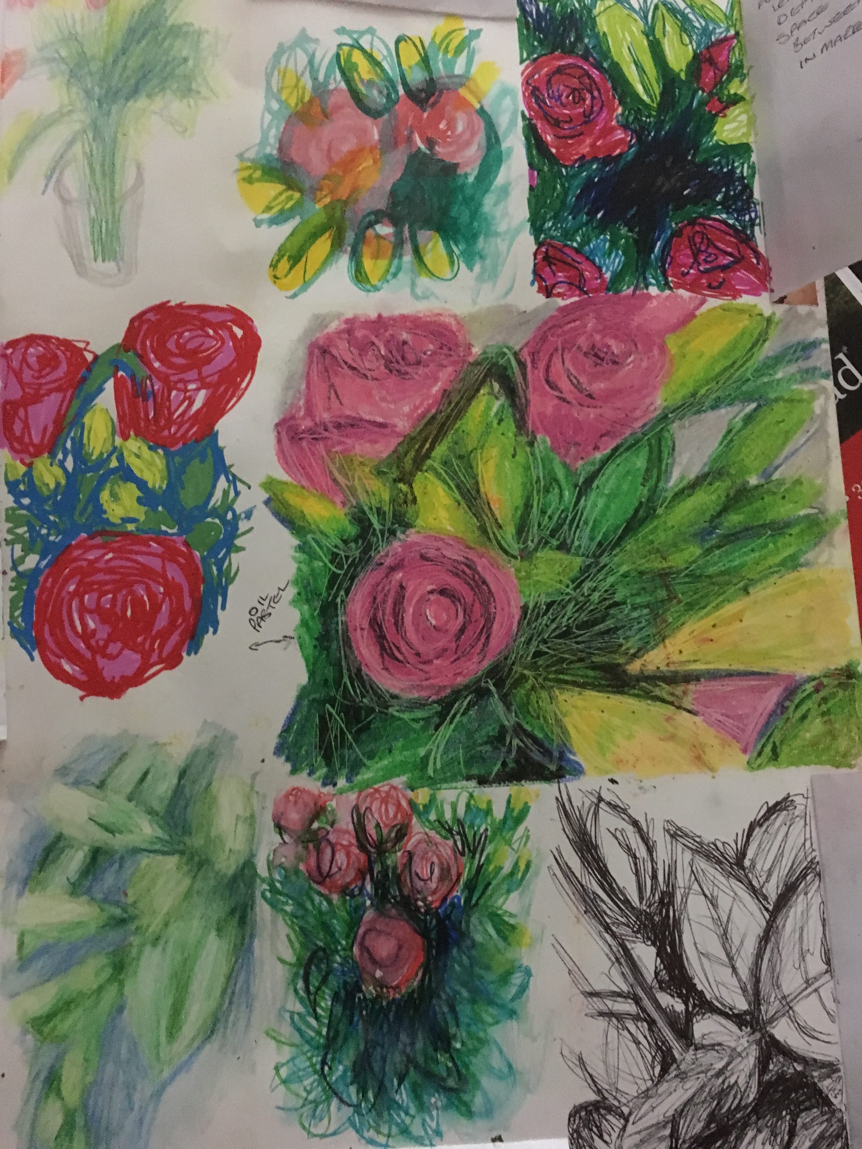
To begin this exercise, I decided to look closely at a bunch of flowers and use several different media to interpret the differing tonal ranges within them in my sketchbook. I decided not to be too precious about the marks I made, but to just try and recreate the flowers roughly as I wanted to investigate them more than draw them.
Observation of bunch of flowers in different mediums
Whilst I was aware I was meant to be focusing on natural objects, I was drawn to the different areas of tone and differing areas of shadows overlapping each other due to several different lighting angles and also the marbling detail to the object.
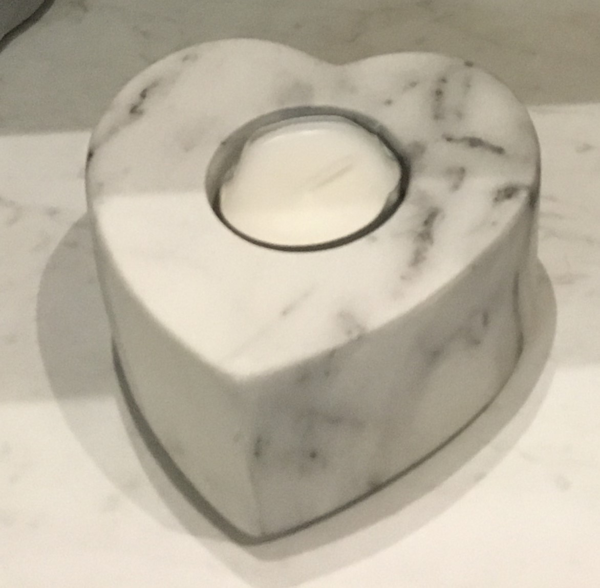
Original marble candle holder
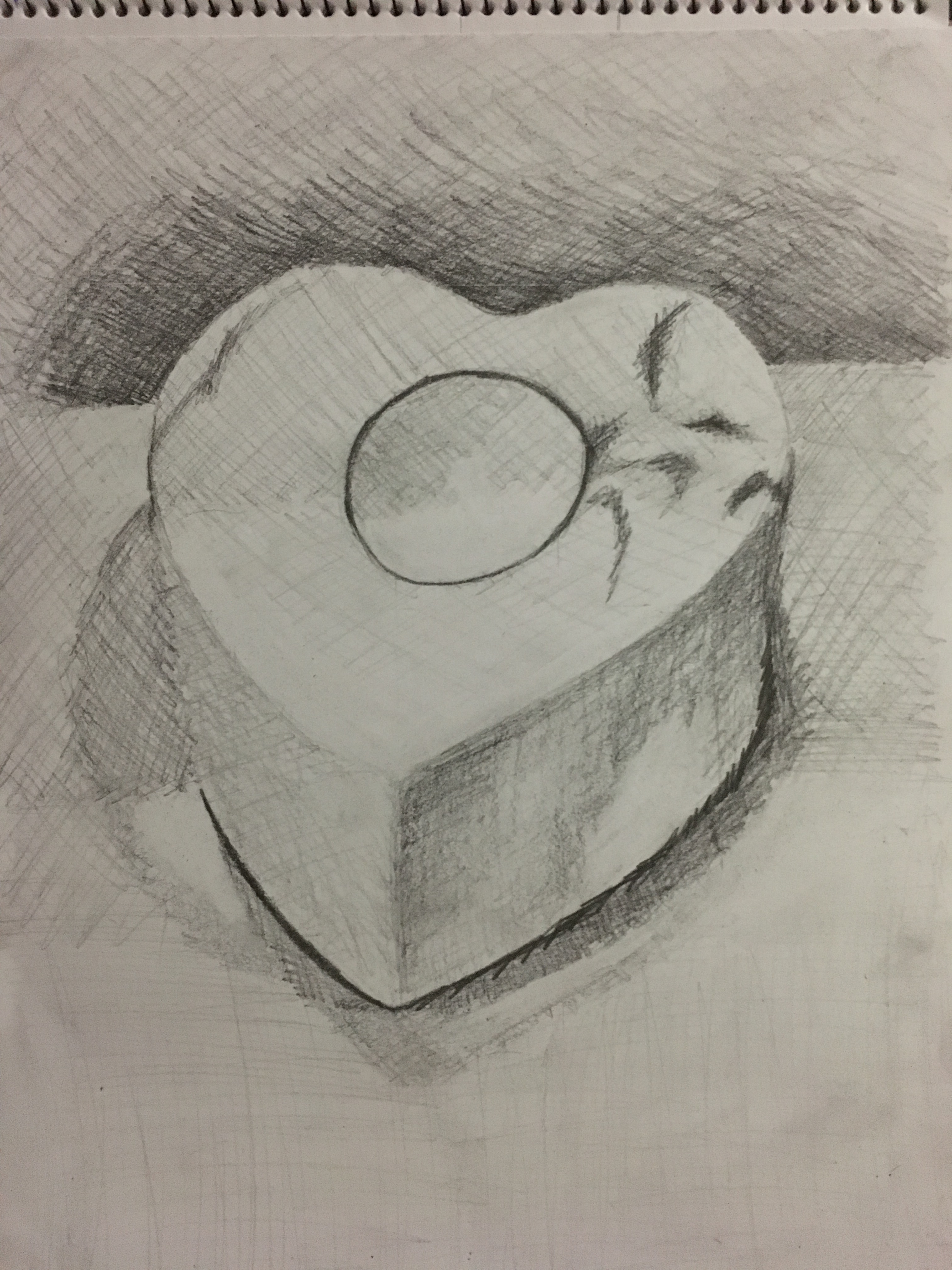
Marble candle holder drawing
I created the piece very gradually and stayed rather delicate throughout, allowing patience and delicacy where I wouldn’t normally. After my tutor’s comments regarding my issues with perspective, I realised I needed to work on it somewhat. Whilst I do not think I have recreated the perspective completely accurately here, I am rather pleased with the overall shape as I do think there is a good depth to the shape. I began by putting in the darkest areas of tone with a 4B pencil (behind the object in the divide between the wall and shelf and also at the base of the object) and then gradually got lighter and lighter, moving my way gradually through the grades of pencils until I finally filled in the lightest areas of tone (the front top left of the holder and the shelf it is sitting on. I then used the putty rubber to work in some finer, lightest details to the object and the surface it sat on.
Reflection
I am glad I began the exercise by being experimental in my sketchbook. I think doing so allowed me to get the initial burst of energy out of my system, leaving me somewhat contented and able to relax into a more delicate piece.
I really enjoyed working from darkest to lightest and found it really did help to screw my eyes up to see the darkest areas. I found it quite foreign to begin with the darkest areas at first, but then began to rather enjoy it. As I said above, I think my perspective may have been off slightly, but overall I think I have improved slightly in this area. I also feel this will increase as the course progresses, but hopefully it is a step in the right direction. Having taken a step back since finishing the piece, I think I have overused the rubber somewhat too. I considered going back and adding the detail back in, but decided to leave it be and put it down to being a learning curve for future reference.
All pieces of art consist of positive and negative space. ‘Positive’ space is the area of a piece which contains understandable visual information; a person’s features, a flower’s petals, leaves and stem, and so on. ‘Negative’ space is the area of a piece which contains no understandable visual information, such as a background and is a very important tool in the construction of all pieces of art. The balance between positive and negative space is meant to be rather equal and complementary to one another.
Whilst artists may work in different ways (such as expressionism, cubism or surrealism), positive and negative space is always there. When you first think about creating a piece, you are presented with a blank page with no visual information at all. This is completely negative space and creates no visual stimuli whatsoever. If you were to draw the outline of a circle, the outline would become the positive space, with negative space both around and inside it. By adding tone by drawing or painting to the inside of the circle, you would be creating more positive space in the piece and changing the ball into a sphere or a hole, if coloured in completely and depending on the styles used. If detail was added to the outside of the circle, this would then become the positive space, leaving a hole inside the circle in the remaining negative space.
Artists, whether in drawing, painting or sculpting, have used positive and negative space throughout the history of time, a few examples of which are shown below.
Comparison of Works
I came across a few artists whose work really caught my eye, (as shown below) and compared their styles. The results of my findings are as shown below:
Fig. 1. Caulfield, P Pitcher (1981-1982)
Fig. 2. Hume, G Waterpainting (1999)
Fig. 3. Durrant, J Watercolour (2013)
Fig. 4. Bar, N Pointed Sense (unknown)
Fig. 1. Caulfield, P Pitcher (1981-1982)
Fig. 2. Hume, G Waterpainting (1999)
Fig. 3. Durrant, J Watercolour (2013)
Fig. 4. Bar, N Pointed Sense (unknown)
Patrick Caulfield was a
British artist who was renowned for his bold colours and simplified images. His work has often been linked with the Pop
Art movement, but he was not happy about this as he viewed his work as more
formal in nature.
Gary Hume is a British
artist who is associated with the Young British Artists (‘YBA’) generation. He works with only a small selection of colours
and simplifies the visual information within his pieces. Hume has made comment about how his pieces
are all religious.
Jessica Durrant is an
American artist who specialises in the fashion, beauty and lifestyle genres
and illustration. She also uses
positive and negative space regularly within her work. Whilst I cannot find any religious
connotations in her work, Durrant uses a very strong focus on the female form
and in empowering women.
Noma Bar is an Israeli
graphic designer and illustrator who works with simplified images without
excess visual information to avoid distraction and the strong use of positive
and negative space. Whilst I cannot
see any references to religion in the pieces per se, I know Bar follows the
Jewish religion, so I believe his upbringing in this religion will have some
form of impact in his work, even if indirectly.
This piece appears somewhat
differently to the rest. Instead of
using the negative space to imply an alternative image, this artist appears
to use the negative space as part of the positive image by carefully placing
certain shapes in precise locations so as to help the viewer’s brain create
an imagined outline and thus the complete object. This piece is fascinating in a completely
different way to the others, but I think it very clever in its own unique
way. This piece was created using
screen print on paper.
This piece appears to be
the silhouette of a woman (or several women, perhaps) who are moving either
towards the ‘lens’ or away from it.
The piece is monochrome in colours and simply consists of what appears
to be a background of green and a white continual line drawing of the woman /
women layered on top of each other in white.
The piece was created using household paint on an aluminium panel, as
is the artist’s preferred method.
This piece appears to be
the side view of a woman’s face in the negative space. It appears as though the positive space in
the piece is the watercoloured part as it is the only section with visual
information, but yet is the background of the image. I think it rather fascinating as I find
myself constantly questioning which part of the piece is the positive and
which the negative! The piece was
created with watercolours, but I also wonder whether the artist used masking
fluid to ensure there was no bleeding of the colour.
This piece appears to be
computer-generated, having a green negative background and the positive
foreground silhouette of a moving dog who is exiting through the right-hand
side of the piece. When looking again,
what originally appeared to me as a negative background can actually be
interpreted as a positive foreground of the silhouette of the front end of a
moving dog entering the piece from the left-hand side. This piece is fascinating to me as I am
constantly pulled between the two silhouettes as to which is the ‘real’
animal. Perhaps it is actually a pack
of dogs / wolves etc caught mid-prowl?
The colour in this piece
makes me consider that the contents of the pitcher must be hot or at least
warm – perhaps coffee? The overall colouring of the piece is warm in nature,
so perhaps it is actually misleading and the pitcher is actually filled with
cold juice?
In this piece, I can see
the woman / women moving around the piece.
The movement appears chaotic and frantic to me due to the many
overlapping lines.
This piece reminds me of
cold, running water and wonder if perhaps she is in the shower washing away
her tribulations of the day?
In this piece, I can hear a
dog barking, imagine being able to stroke its fur and tail. I imagine a very strong, confident
dog. The simplicity works rather well
in the sense that a dog’s life is rather simple; he eats, drinks, sleeps…
There are no worries for the average dog about working, paying bills etc.
This piece differs from the
rest in the way it uses the negative space, allowing the mind to complete the
outline of the pitcher, whereas the rest show the outline completely and do not
require the viewer’s mind to fill the blanks.
Similar to Bar’s piece, the colours and shapes are made of solid
blocks of colour.
This piece is similar to
Durrant’s piece as it seems to focus on women, showing an appreciation for
their form, as well as only using two colours. This piece is similar to Bar’s piece in the
sense it has several perspectives instead of one single one.
Again, this piece is
similar to Hume’s piece as it focuses on women and also the contrast between
the white of the page and the blue paint.
Similar to Hume’s piece, this
has more than one perspective; showing the front end and then the back end of
a dog. This piece differs from Durrant’s
piece as it has only flat, solid colours, similar to that of Hume’s and Caulfield’s
pieces.
I find the white space in
this piece to be the main point of emphasis, but also rather confusing and
frustrating as I cannot see the need for it to be there. The background is a completely different
colour, so this cut out space appears to be solid. If trying to imagine holding the pitcher
up, I can only imagine hitting something such as a solid piece of plastic or
ceramic etc, which I find really frustrating.
I really just want to colour the section in to match the rest of the
background. Perhaps this was done by
the artist on purpose to create such frustration?
The points of emphasis in
this piece are the lines used and the eyes, lips breasts of the woman / women.
For me, the strongest point
of emphasis to this piece is the divide between the positive and negative space;
between the white space and the coloured space. There are strong, dark features to the face
in the eyes / brow and lips.
The black in this piece is
much bolder than the green, which is rather mellow, so is the main point of
emphasis to this piece.
Due to the bold, solid
shapes used in this piece, I cannot see any expressive marks here at all.
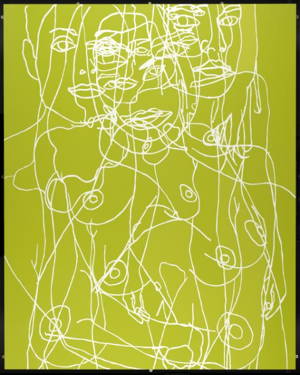
This piece is full of
expressive qualities in respect of the constant flow of lines and the mass of
faces.
The running colour and the
hair in this piece provide quite a nice amount of expressive quality.
Due to the solid shapes in
this piece, there is not much in the way of expression, which appears only available
in the quiffs of the fur.
Whilst I find the colours
in this piece somewhat soothing to my eye, I am also increasingly frustrated
due to the handle.
I find this piece rather
chaotic and frustrating and too much visual information for my liking.
This piece makes me feel
inspired and empowered as a woman.
However, I also feel somewhat sad; perhaps this is because I question
what the character in the piece may have endured and what the ‘tears’ may
represent.
This piece also makes me feel
emboldened as I cant help but feel as a member of the pack would; needed, on
a mission, determined to continue their current mission, perhaps to find prey.
This piece is very
successful in the fact it is able to request the viewer’s brain to fill the
blanks due to the perfect placement of the shapes used. As stated above, however, I do not like the
space inside the handle and find it rather disappointing and frustrating.
I think the successes of
this piece are the contrast between the green and the white and the
movement. As stated above, I do not
enjoy this piece as much as some of the others as the eye is pulled in too
many directions all at once and I find it rather confusing and chaotic.
I really like the outline
and separation of the two sections in this piece, as well as the contrast between
the two. However, I think the several
spots of paint on the face of the woman let the piece down somewhat. I think it would be better if it had been
created without this inclusion.
This piece offers a strong
double-meaning within it and also the movement. However, I think the face is too large for
the rest of the body.
For this piece, I would use
markers and collage on coloured paper.
If I were to recreate this
piece, I would use masking fluid with watercolours acrylic or ink creating an
overlay before removing the masking fluid.
For this piece, I would use
ink over masking fluid. Whilst I know
this piece was created with watercolours, I would be interested to see what results
could be achieved using the same method but with inks.
For this, I would use a
black marker on a muted coloured page.
Experimentation
I decided to experiment in my sketchbook in different media with the concept of positive and negative space.
Experimentation with Positive and Negative Space
I first tried to use PVA glue and the wax of a candle to
create the ‘negative’ space when layering over the different media. I was rather disappointed with the PVA glue
as it did not provide as much resistance as I thought it would. If anything, it reminded me of the trail a
snail would leave; rather shimmery in appearance. It was interesting, however, as it seemed
like a hidden message within the piece which only became visible when looked at
in a certain way – this started to remind me of my research into Redon’s
Two Trees and the fact that the average viewer would generally glance at
the piece quickly and then move on without giving enough time to actually see the hidden message. I think I may potentially use this again
moving forward; perhaps to show a hidden message, or maybe to add a sort of
pearlized shimmer to certain objects.
The candle wax, however, provided a fantastic amount of colour
separation and a clear negative space, however, the grease in it seemed to ruin
the page on the other side of my sketchbook in places and due to the fact it
reset rather quickly with cooling, I think I could only really use this method
on rather thick material or material I do not wish to use the other side of and
only for places I wish there to be expressive marks made as the lack of control
is to temperamental to try and use for a specific shape or object.
I then came across something called masking fluid, which I had never heard of before. I decided to experiment with it by drawing around my hand on the page over the different mediums and then adding a wash of diluted ink over the top before removing the masking fluid to reveal the surface underneath.
Reflection
I think I have found a real appreciation for the positive and negative space within artwork and how important a role both play in all pieces. I’ve realised there is a delicate balance between the two and getting them both right can lead to phenomenal results.
I was actually really pleased with how easily the masking fluid was removed and how crisp the lines were underneath in my experiment. This is definitely something I really want to use again in my future pieces and perhaps also my final piece for this part of the course.
NB: Citation for images used in my sketchbook can be found by clicking here.
Still life, or nature
morte in French, refers to where artists have created a piece of work where
the subject matter is inanimate, whether it be man-made objects or organic
objects and things which used to be alive.
Common items used for still life pieces include flowers, fruit and other
household objects such as chairs, however, other items such as skulls and dead
animals are also used to add a sinister touch to the work.
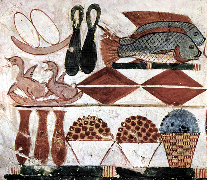
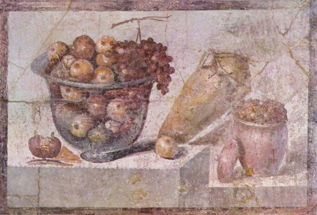
Still life has been used throughout history and notably by the Ancient Egyptians in the 15th Century BCE, who would paint food and meat at burial sites as an offering to the gods. The Greeks and Romans created still life pieces in mosaics and frescoes (a painting done in watercolours onto wet plaster so the colours become embedded during the drying process).
Fig. 1. Maler der Grabkammer des Menna (circa 1422-1411 BCE)
Fig. 2. Glass bowl of fruit and vases (around 70AD)
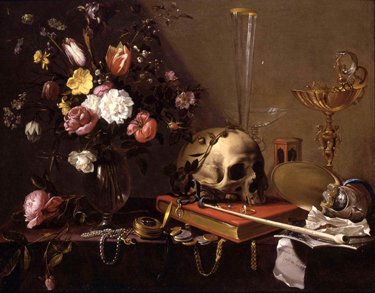
During the Renaissance (14th to 17th Century), flowers became a well-used item for still life pieces as artists were becoming more and more interested in recreating realistic imagery in their work as well as the use of colours. In the Middle Ages (around 1500AD to 1600AD), still life was used by artists for religious purposes as both symbols and as decoration around the border of manuscripts. The 17th Century also saw rise of the Dutch Golden Age and the interest in flowers develop with the creation of ‘vanitas’ works, which would focus on reminding the viewer of their own mortality and the fleetingness of time.
Fig. 3. Van Ultrecht, A Vanitas Still Life with a Bouquet and a Skull (1642)
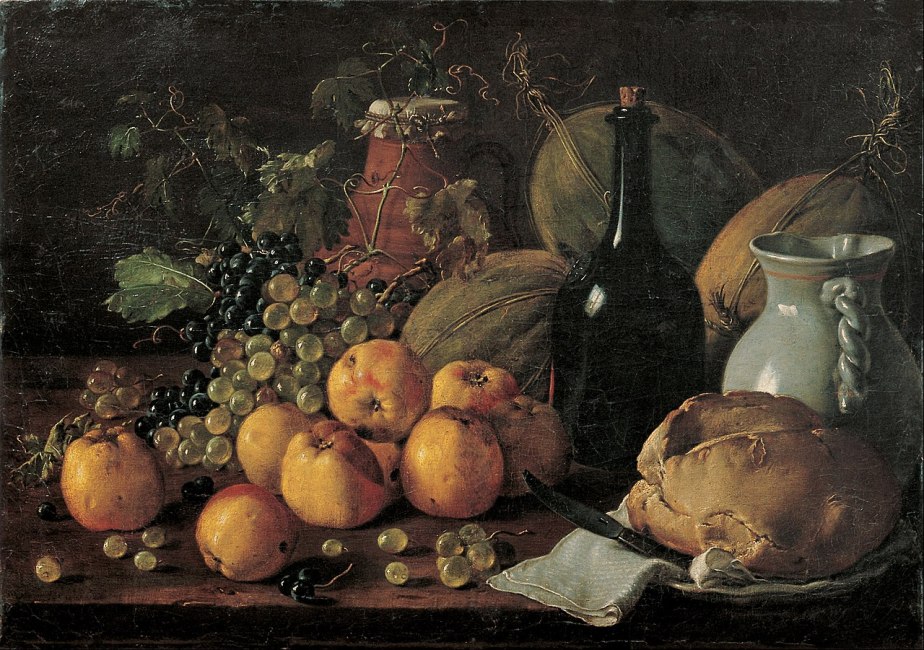
The 18th Century saw a rise in notable French artists whose focus in regard to still life was similar to that of vanitas works, but which would focus on the wealth and bounty of the aristocracy and would leave out the moral messages found within the vanitas pieces. Still life was seen as a lesser importance than religious and mythical depictions.
Fig. 4. Meléndez, L Still Life with Apples, Grapes, Melon, Bread, Jug and Bottle (circa 1771)
The 19th century brought about the Impressionists
and Post-Impressionists who were more interested in experimenting with the
vibrancy and exaggeration of colours and methods of applying paint as the
invention of cameras had reduced the call for realistic painted pieces.
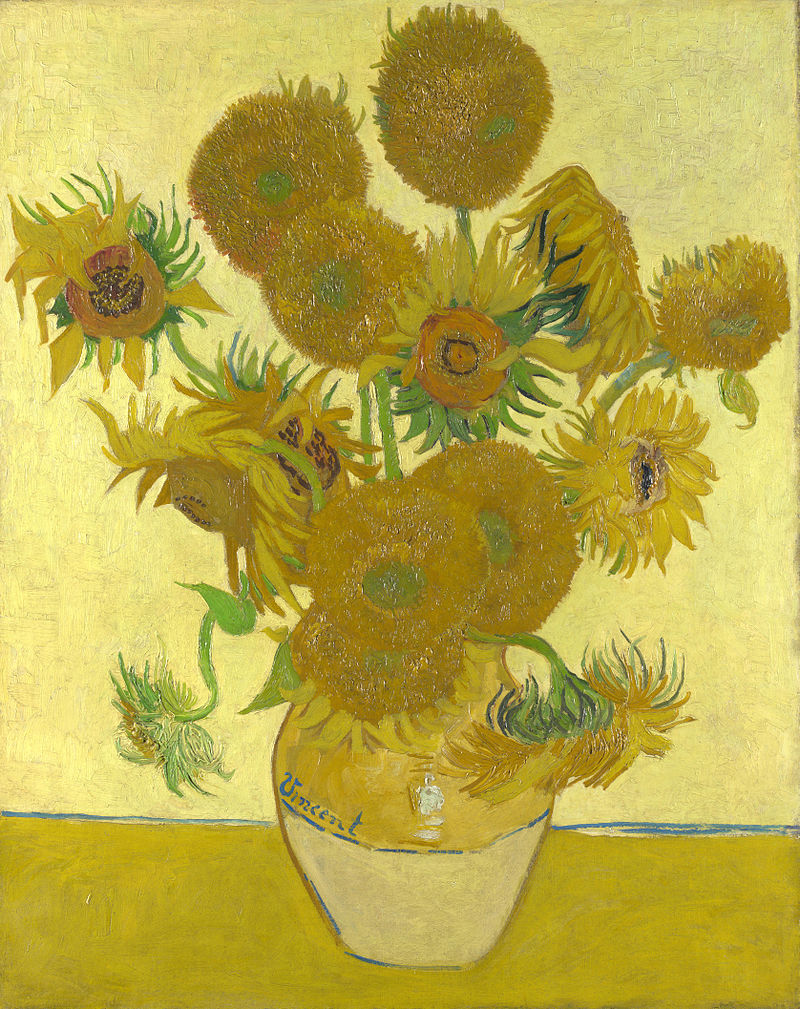
Fig. 5. Van Gogh, V Sunflowers or Vase with 15 Sunflowers (1888)
Fauvism (the emphasis of bold colours over realistic values)
and Cubism (the deconstruction of objects into geometric and abstract shapes)
was developed in the 20th Century.
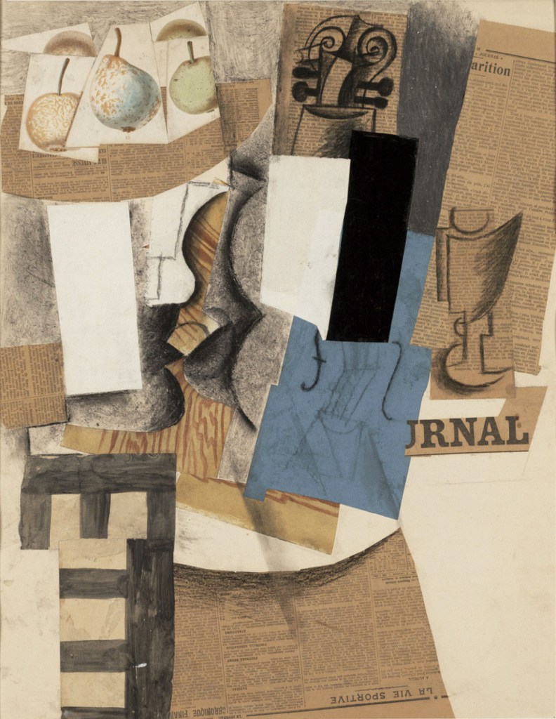
Fig. 6. Picasso, P Compotier avec Fruits, Violon et Verre (Bowl with Fruit, Violin and Wineglass) (1913)
The 21st Century has seen the rise of many
interpretations of still life pieces, with artists using such things as
computer rendering and sculpture to show their personalities within their work.
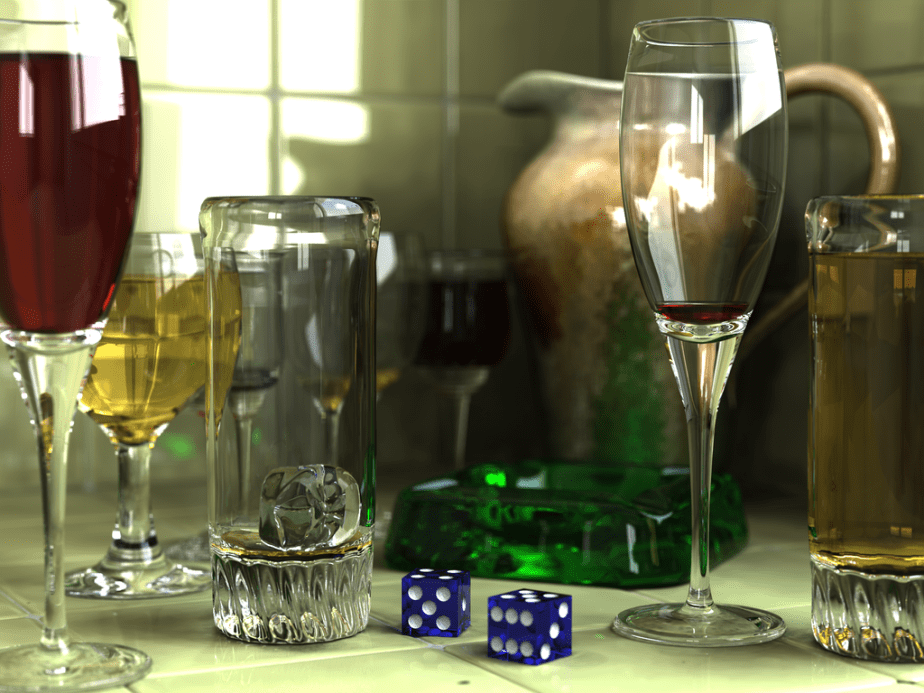
Fig. 7. Tran, G A Completely Synthetic, Computer-Generated Still Life (2006)
Experimentation
with Works Throughout History
I decided to compare a few of the pieces I found above from different times in history to their predecessors and successors, as well as two of the artists my tutor suggested in my feedback for Part One. My findings are as shown below:
Pre-Twentieth Century
Fig. 3. Van Ulrecht, Vanitas Still Life with a Bouquet and a Skull (1642)
Fig. 5. Van Gogh, V Sunflowers (1888)
Fig. 8. Cezanne, P Curtain, Jug and Fruit Bowl (1893)
Flemish artist
(from Antwerp). Work created in
Belgium. Piece created when a new type
of still life was emerging.
Dutch artist during
the Post-Impressionism stage.
French artist. Piece created in France during the
Post-Impressionism era. Cezanne’s work
was later seen as the bridge between Impressionism and Cubism.
Piece consists of a
vase of flowers, a human skull, gold and silver coins, several vases, a book
and a pocket-watch.
Piece consists of
numerous sunflowers during various stages of their lives in a vase.
Piece consists of a
jug, curtain, a piece of material, fruit and a bowl.
The term ‘vanitas’
translates to ‘empty’. These pieces
were used by Christians to show how earthly goods are pointless and meaningless
as we all will face our mortality regardless of our wealth or stature.
There does not
appear to be any religious significance to this piece that I can find,
however, it is well known that van Gogh was raised in a very religious
household.
This piece does not
appear to have any religious connotations; however, it does show fruit and a
jug, which could be found within pieces depicting religious offerings to gods
or even in pieces such as those depicting The Last Supper.
This piece causes
me to smell the sweetness of the flowers, whilst also the stench of
death. I hear the clock ticking and
the coins jangling, reminding us of our greed, indulgence and gluttony, as
well as our eventual fates, whether as a direct or indirect result of our
greed.
Whilst initially I
sense the freshness and happiness of the bright and colourful flowers, I am
then filled with a sort of confusion
I imagine the sweet
taste of the apples, feel the weight and coldness of the jug and bowl, as
well as the softness of the cloth.
Created with oil
paints on canvas. To replicate this
piece in drawing, I would use markers for their bold but controlled colours
and lines or pencil crayons for their delicacy.
Created with oil
paints on canvas. To replicate this
piece in drawing, I would use oil pastels for their bold colours and
expressive mark-making qualities.
Created with oil
paints on canvas. To replicate this
piece in drawing, I would use oil pastels for their bold but expressive
colours or pencil crayons for their delicacy.
The successes in
this piece are that it is realistic, has a strong message to portray and has
strong contrast in tonal values.
There is actually
nothing in this piece I would change or improve as I think it is almost too
realistic.
I really like the
stages of life depicted in the sunflowers, however, I am not a huge fan of
the colour yellow, so this piece does not appeal to me as much as
others. I think the perspective of the
vase is slightly off, sliding slightly too far down to the right of the piece
and the blue is rather contrasting in comparison to the rest of the colours
used in the piece. Perhaps this was
intentional, but it does take away some of the realism of the piece.
The depth of the
fruit and jug in this piece are fantastic and something I will try to
replicate and consider going forward.
I think the perspective of the drawer and the table are slightly
off. However, this could be
intentional – the table does appear old, so maybe parts of it do not stand as
they would have when first created due to the wear and tear of time.
The perspective of
this piece appears to be at eye level, looking forward at the banquet in
front of me.
This piece seems to
use the Rule of Thirds, most notably in the divide between the table and the
wall being the bottom horizontal line and the vase and tallest flowers being
placed centrally within the composition.
The perspective of
this piece appears to be at eye level.
If looking at the piece with the Rule of Thirds in mind, the front of
the table is along the lower horizontal line, the body of the objects in the
centre of the piece and the tops of the jugs along the upper horizontal
line. The blue fabric is located in
the left-most column.
Twentieth Century Onwards
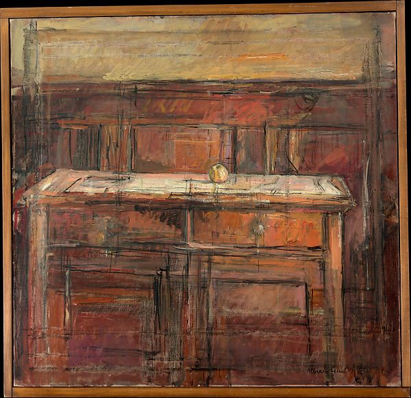
Fig. 9. Giocometti, A Still Life with an Apple (1937)
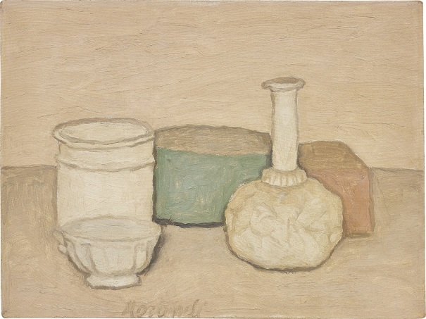
Fig. 10. Morandi, G Natura Morta (1952)
Fig. 7. Tran, G Glasses (2006)
Alberto Giocometti
was a Swiss artist who was heavily influenced by Cubism and Realism. He enjoyed debating philosophical questions
relating to the human condition and phenomenon.
Morandi, who was of
Italian descent, was heavily influenced by the works of Paul Cezanne.
Gilles Tran is a
contemporary French artist who specialises in rendered art.
This piece consists
of a single, almost insignificant apple sitting on a desk in what appears to
be a study or an educational setting perhaps and was created with oil paint
on a canvas.
This piece consists
of simple blocks of colour and objects.
This piece was created with oil paint on a canvas.
This piece consists
of several different types of glass objects, such as drinking glasses and two
dice. This piece has been generated
completely via a computer, using POV-Ray.
From this piece, I
see a lot of darkness, moodiness and expressive marks. I find the piece surprising as the focus
appears to be on the apple, but it is also rather insubstantial within the
piece. I think the apple may represent
the humbleness and delicate beauty of nature which is not always bold and
intense enough to be deemed ‘beautiful’ instantly, whereas the desk (which
could potentially have been made using the wood from the same tree which grew
the apple) is bold, majestic and grand, indicating the greed and manmade
‘beauty’ which can usually be appreciated much sooner than that of simple,
humble fruit.
I find this piece
to be calm and peaceful, having been created with a muted palette. I like the simplicity of the objects and
their gentle colouring. I have
struggled to find anything within this piece which represents any
symbolisation, but feel the muted colours could perhaps represent a calm
within the painter himself. Perhaps he
has tried to view the world as a child would; purely basic shapes and
colours, leaving the intricacies and finer details of the objects / life for
others to be concerned with.
This piece firstly
fills me with thirst due to all of the drinks! Secondly, I am filled with amazement that
this is actually a computer-generated image.
It is so realistic and well created, however, I do not think there is
much expression in the piece except, perhaps, for the brightly coloured dice
which stand out in the piece. Again, I cannot find any hidden symbology
within this piece, but can only conclude the artist was very interested in
recreating real life, almost as though considering himself a supreme being in
his own right.
The perspective of
this piece appears somewhat different to that of the other pieces, which seem
to rest at the same level as the object, whereas this piece seems to focus on
the objects from a distance. However,
it is somewhat similar as it does contain fruit.
The piece also appears to contain something natural and something which is
manmade.
Again, this piece
appears to be created from a little distance from the objects, but still at
the same sort of level as the objects.
These objects are all manmade and the artist has opted for a very
muted palette as opposed to previously seen bold and intense colours and
detail.
Again, this piece
appears to contain only manmade objects and focuses on bold, intense colours,
but does have a few muted colours as well.
The perspective of the piece is once again rather close up and at the
same level as the objects.
On first viewing
this piece, my eye was drawn to the middle to the apple, then the desk as a
whole and then to the drawer to the right as these all appear to have the
most visual information and lighting.
In this piece, my
eye was naturally drawn to the middle of the piece and then up the neck of
the bottle as this seemed to be where the information is mainly held and none
of the colours really battle for the viewer’s attention.
For this piece, my
eye was instantly drawn to the bold, bright colouring of the dice, then to
the green of the glass stem and then just around the rest of the piece
generally. Whilst there is what
appears to be a glass of red wine in the piece, the red is not an intense
shade and does not really battle for your attention in comparison to the blue
and the green.
For this piece, I
think the apple appears very fresh and ripe, whereas the wood of the desk
appears to be old and almost an antique, which does counter the thought that
maybe it could be from the same tree as the apple.
The body of the
bottle within this piece seems to remind me of crinkled paper and not so much
of a bottle, even though it is clear as to what it is meant to be.
The objects in this
piece were almost too realistic. I
imagine a party taking place and, similar to a vanitas painting, the dice may
represent the gamble with our lives we take when drinking in abundance and
enjoying the intoxication of life’s frivolities.
The successes to
this piece as the age of the wood and the depth created with the paint. The placement of the apple, whilst almost
insignificant, is done very well and intensifies the depth to the desk. However, I feel the cupboard door has been
overworked and is rather close to spoiling the piece.
I think the
successes of this piece are the muted colours and the depth created even with
the lack of other details. I do think
the outline to the objects does let the piece down slightly as they are
somewhat less realistic as a result and there is an apparent lack of shadow
to the objects, which is somewhat strange I feel.
I think the realism
of this piece is fantastic, as are the shadows and reflected colours and
light, however, due to it being so realistic, I do not think there is much
personality to the piece or a fingerprint of the artists so to speak.
If I were to
recreate this piece, I think I would use oil pastels due to the expressive
nature of the marks made, as well as the boldness of the colours used.
For this piece, I
would use soft pastels or pencil crayons to recreate it due to their soft and
calm nature, not to mention the ability to create a muted palette best of all
the mediums I have experimented with so far, but also for their ability to
create the finer lines for the outlines of the objects.
Again, I would be
tempted to use pencil crayons for this piece due to their ability for fine
detail, but would also be tempted to use markers as they are also able to
produce finer lines, but also would add the boldness of colour that the
pencil crayons would lack.
Other Works Compared
Fig. 8. Cezanne, P Curtain, Jug and Fruit Bowl(1893)
Fig. 9. Giocometti, A Still Life with an Apple (1937)
Fig. 7. Tran, G (2006) A completely synthetic, computer generated still life [computer-generated] At: https://en.wikipedia.org/wiki/Still_life (Accessed on 12 March 2019)
Composition is mentioned within this part of the course, so I decided to do a little research of my own to enrich the actual Research Point for this project, which requires me to look at and compare approaches of traditional and contemporary artists in their still life pieces so I would have a better understanding of what I should be questioning.
Findings
Composition is the arrangement of objects and their
placement on the canvas in such a manner as to be both aesthetically pleasing
to the artist, but also the viewer.
Composition has been a key part of all artwork throughout history,
whether to increase the sense of balance in the piece or to work against it and,
although our course manual advises there are no specific rules to follow, I found
that some artists do, indeed, follow some
basic instruction or attempt to challenge the ‘rules’ others may generally
follow, the ideas of which I will explain below:
Rules of Composition
There are several rules artists have followed throughout
history to improve their responsiveness to the viewer. Some of these rules (notably ones I wish to
look into further in the future) are:
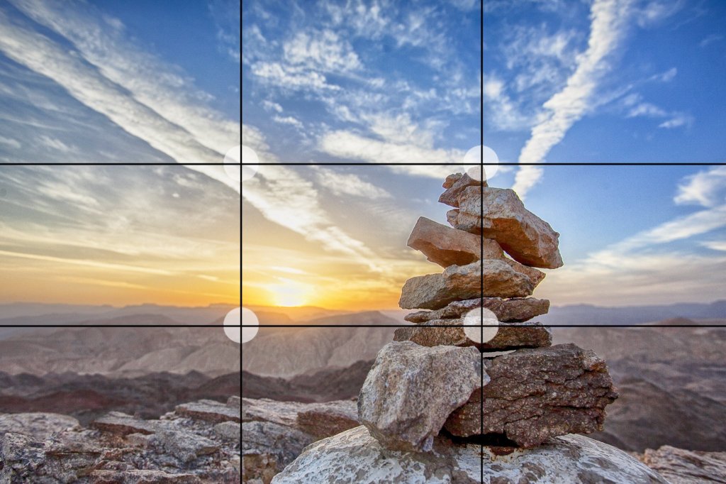
Rule of Thirds
Fig. 1. Rule of Thirds (unknown)
This rule means dividing the page into nine equal squares /
rectangles. Images are then placed on or
close to vertical and horizontal lines as these are meant to be the most
aesthetically pleasing to the viewer.
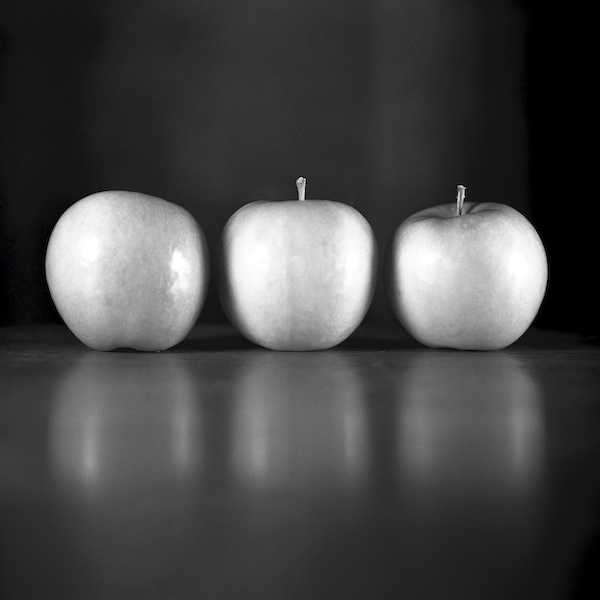
Rule of Odds
Fig. 2. Rule of Odds (unknown)
It is thought that uneven numbers of objects are more
pleasing to the eye than even numbers.
Triangles have also been used in many pieces throughout history
due to their uneven number of sides.
Triangles may be included in art as such things as apex roofs or even a
group of three people sitting together in a hypothetical triangle shape.
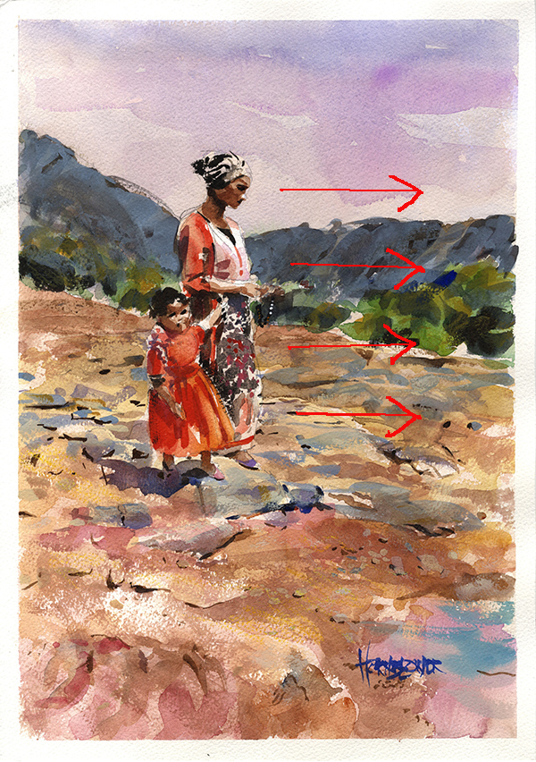
Rule of Space
Fig. 3. Hornblower, K Rule of Space (2016)
This rule is used when the artist wishes the viewer’s focus
to be drawn in a specific way or to create the idea of movement such as the
subject of the painting looking towards a certain direction with a lot of open
space toward the same direction or the subject’s eyes following the viewer as
they move around the room.
Simplification
Fig. 4. Hornblower, K Simplification (unknown)
I quite like this rule and believe I have used it quite
regularly myself already without knowing the significance. Being someone who does not really enjoy fine
detail within their work, I tend to simplify backgrounds and other details of
my work (such as simplifying writing and other finer details) anyway.
Geometry and Symmetry
Fig. 5. Niaz Composition with Cloud (2008)
This is another rule I think I use somewhat without
realising within my work. I rather enjoy
symmetry within my pieces, but also enjoy challenging this (sometimes without
meaning to if I haven’t measured my objects out correctly before beginning
working into them and they then run off the page in places).
Experiments
I decided to carry out some quick experiments with some of the rules and composition in general within my sketchbook, as shown below:
Reflection
I find the whole concept of ‘rules’ rather daunting and understand why the course implies there aren’t any formal rules, but I have found that some of them do actually help me when considering how I want to display my pieces. This is definitely something I will try and consider moving forward, specifically the Rule of Thirds and the Rule of Odds. I think concentrating on too many of these ‘rules’ at once may become overwhelming and lead to a bit of a messy and overly complex composition.
NB: Citation for images used in my sketchbook can be found by clicking here.
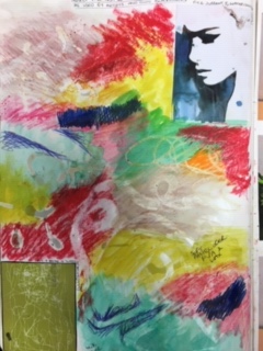
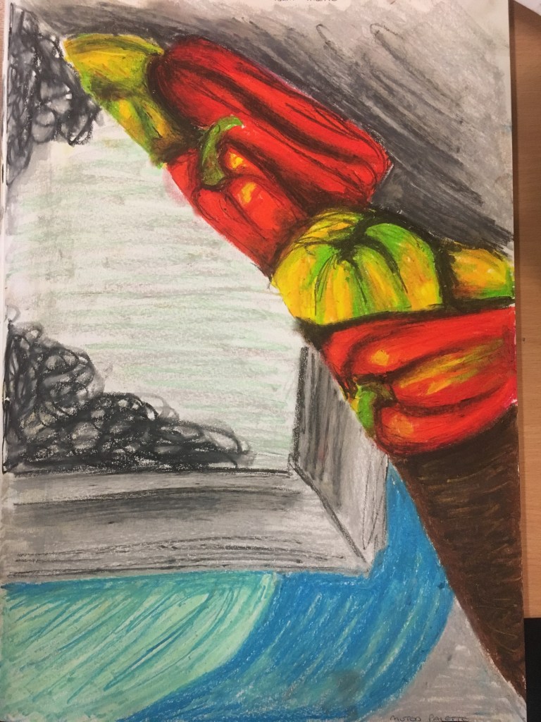
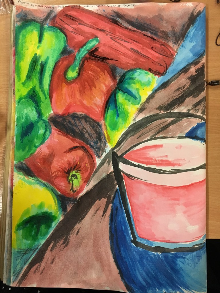
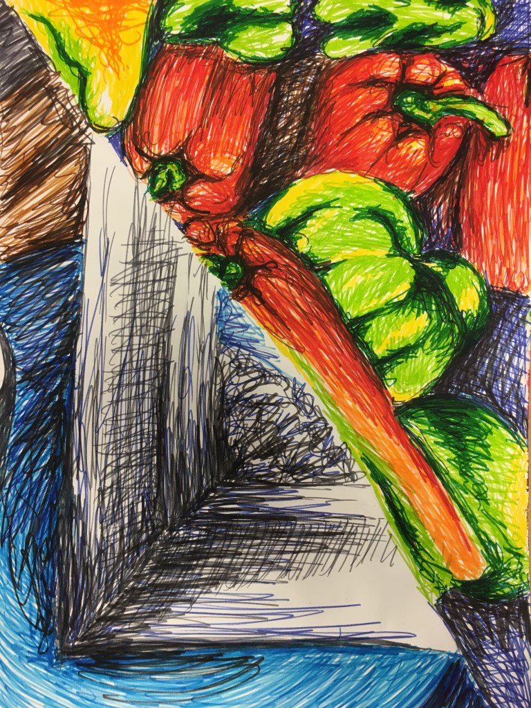
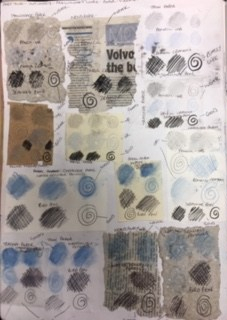
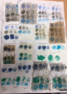
Before I began this part of the course (and before I received my tutor’s feedback), I decided to play with all of the media discussed in the course textbook by creating the same pieces in each media; one half of the page using a vibrant palette, the other using a muted palette, to see how the differing media worked and which ones suited which palette best.
Materials and Tools
Coloured Pencil
Vibrant and Muted Palettes in Pencil Crayon
Watercolour Pencils
Vibrant and Muted Palettes in Watercolour Pencils
Wax Crayons
Vibrant and Muted Palettes in Wax Crayons
Soft Pastels
Oil Pastels
Vibrant and Muted Palettes in Oil Pastel
Coloured Inks
Markers
Paper
Reflection
I think several media have worked better than others for both palettes. For the vibrant palette, I think the wax crayons, soft pastels, oil pastels and markers were all the best successful. The coloured inks were also successful, but were slightly less intense in their colours, which I was rather surprised at. For the muted palette, the coloured pencils, watercolour pencils and wax crayons worked best by far. Their colours were calm and gentle as opposed to bright and intense. Some other media worked rather well for this palette too, but were still rather bold in colour; the soft pastels and oil pastels. I believe this is due to their ability for blending and softening of the lines they were formed with. The markers and coloured inks were far too intense and bold to be viewed as muted. I will consider this as I move forward through this part of my course and try and use the best colours and media to suit the mood of the palette before me.
NB: Citation for the images used in my sketchbook can be found by clicking here.


