I began my final piece by choosing two subjects which I could not decide between and started with two pieces of A1 paper (knowing larger scales work best for my method of working). It was my hope that as I moved through the creative process with both pieces, it would become more apparent to me as to which piece should become my final piece and which was more successful than the other before finally settling on the one final option.
Surfaces
1 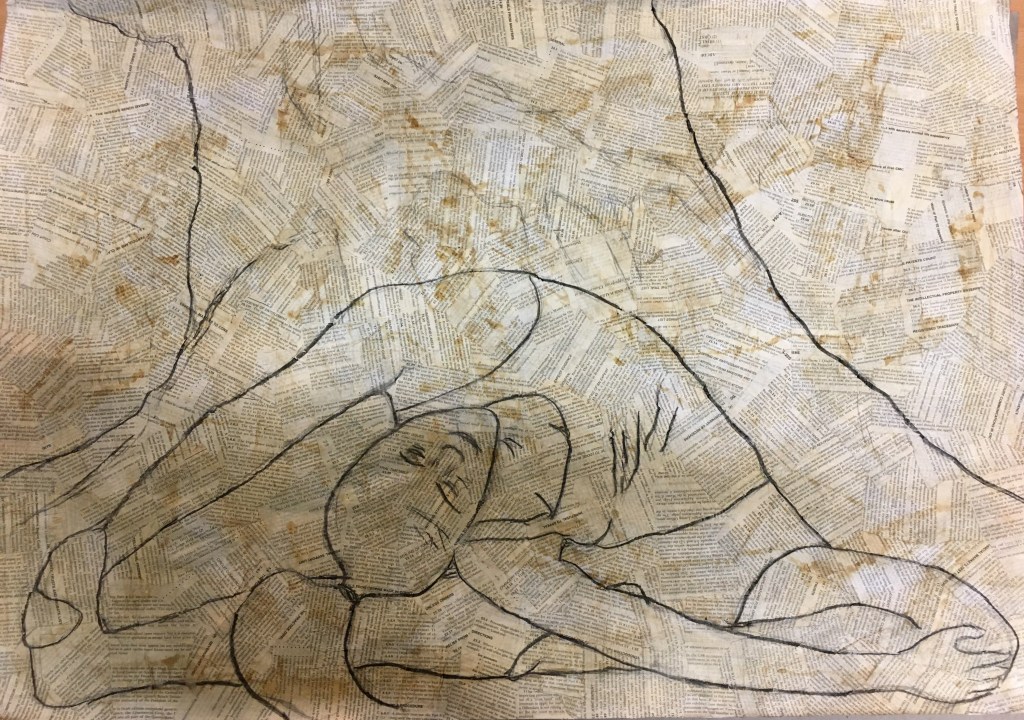
2
I decided from my experimentation that the strongest result was from that of a surface of newspaper and also the ink as I found these the most appealing, however, I later changed my mind and decided from looking at earlier experiments that I actually preferred found papers due to their cleaner black and white appearance as opposed to the grey of the newspaper. I also then decided that using tea staining would create even more texture than the ink due to the way in which ink appeared to dry smoothly, whereas tea staining would dry where it lay, creating a marbled effect on the found papers.
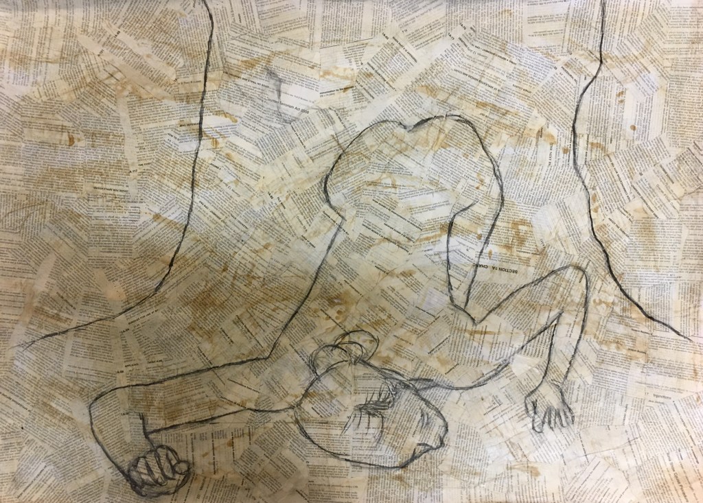
Once this surface was ready to work on, I decided to draw a grid on both pieces to assist me with laying my chosen subjects down roughly but accurately. I then removed the grids and outlined the subjects in charcoal to assist in being able to see it easier whilst working into the pieces.
It was at this stage that I realised that the second of my pieces was not really working. I found that the human subject only reached halfway up the page with the tree subject covering the remaining half of the page. I felt that if I were to continue, the tree would become more excess space than interesting detail, as well as creating a bit of a battle with the human subject to claim the foreground of the piece, when I would actually prefer the human subject to be the main focal point and the tree important but secondary in the background.
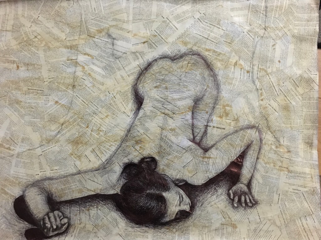
Initial Detail of the Human Subject in Biro
Face, Hair and Hands
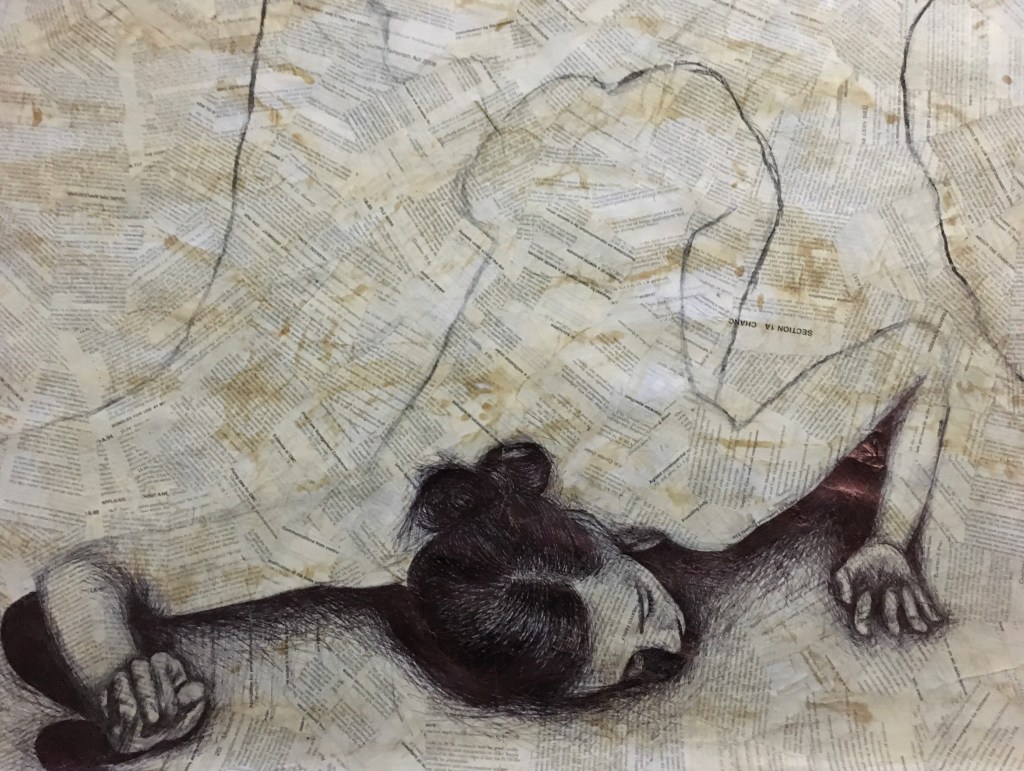
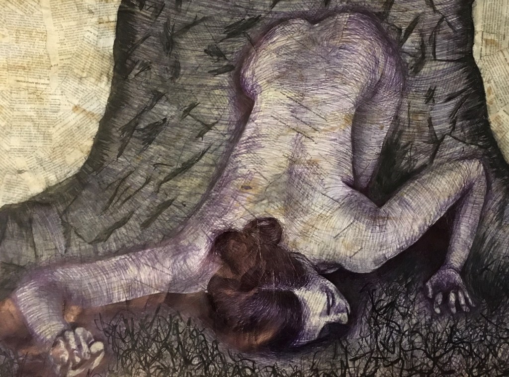
I decided to begin filling in the detail of the human subject by using black biro, as I knew there were a few very fine details which needed to be considered very delicately (the face, hair and hands) and my earlier experiments have led me to understand that biro is my strongest tool in this area.
When working on these areas, I decided not to draw the actual shapes I could see, but the shadows, patches of tone and the contrasts within them all as I wanted them to be as deep and as strong as possible to create depth and the sense that the human was quite three-dimensional. With regard to the hair, I decided that the biro was the strongest tool for the base shape and flow of the strands as I could manipulate the direction and shape of my lines to create a realistic representation, but also to help assist the viewer in distinguishing the hair from the deep shadows and the rolls which make up the bun at the back.
Arms, Torso, Buttocks and Leg
Once I had completed the finer detailed areas, I moved on to the remaining areas of the human subject’s body and created subtle marks and cross-hatching to show the movement of the skin over the underlying bones and muscles to create depth and shape within the flat surface and to subliminally inform the viewer the direction the lines are moving in and the roundness this adds.
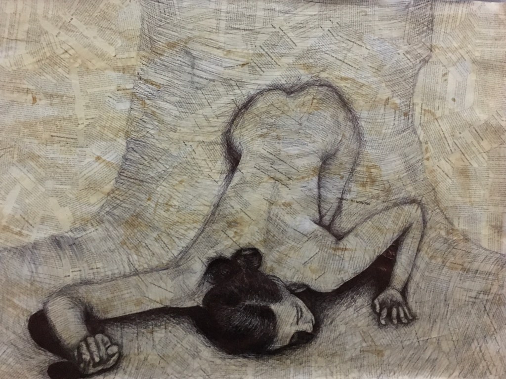
Initial Detail of the Tree Subject in Biro
I then began using the same method with the biro for the tree as I had the human form, to stay light and delicate, but to simply give the tree its rounded form by subliminally showing the direction the lines are moving in.
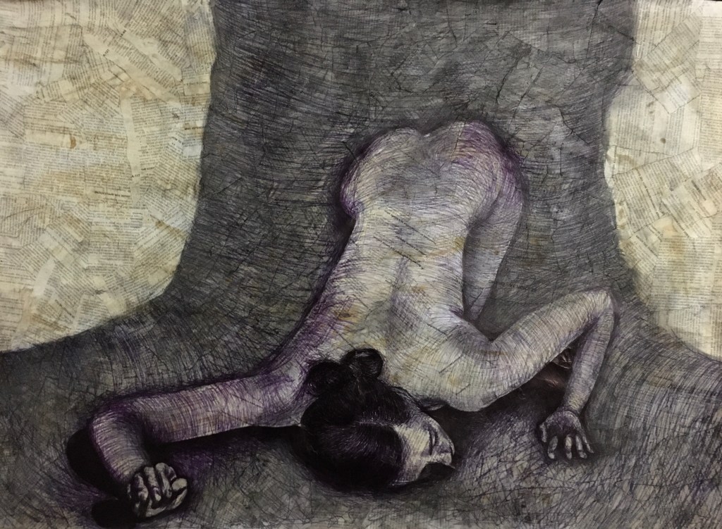
From here, I added a layer of charcoal to the tree and sealed it with pastel fixative.
I was quite surprised by the changes which developed in the marks created with the pen from the application of the fixative as it seemed to make the lines bleed somewhat and bring out the different under-layers of colour used to build the ink to its black hue. I actually rather enjoyed the surprise result and decided to try and work with it.
I later returned to my piece, having worked in stages throughout the development, deciding that the single layer of charcoal on the tree was effective, but needed more work to show a differentiation between the ground, the roots and the trunk of the tree, but also to stop the human subject from appearing to float in the air.
Additional Media Usage
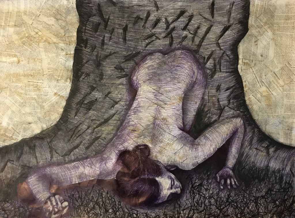
I then moved on to adding several additions to the piece.
Firstly, I used a putty rubber to redact some of the charcoal to increase the definition around the edges of the collaged paper with the intention of this to subtly stand out as though real bark would itself. This did not really appear to work so well as the layer of charcoal was actually rather thin in the first place, so not much was lifted. There was also the matter that I had used the pastel fixative a little too prematurely, in hindsight, so I decided to rethink my methods and come back to the piece at another time with fresh eyes.
When I returned to the piece, I used the black biro to work back through the piece to create differentiated lines to break up the single directional lines previously created and to deepen some areas I had already created, but felt I had overlooked slightly.
Next, I added some black marker marks to the piece and finally a layer of black acrylic paint pens as I liked how the layers of black lines seemed to deepen and created that layered effect my tutor had tried to get me to develop earlier in the course. I also worked on creating a definition in my grounds by bringing a sense of grass to the area beneath the model and at the base of the tree’s roots.
I used the acrylic marker to also make apparent the different edges of the paper I had used to create a collage, within the tree to emphasise the bark. I felt doing this would be a much more natural way of creating the bark as opposed to trying to create my own example of the same. I felt it rather fitting to emphasise the use of paper in a piece expressing a love and appreciation of trees and the extent to which we humans rely upon the same.
Reflection
Once I had finished my piece, I took a while away from it to be able to see it with fresh eyes before returning to be able to reflect without continuing and potentially overworking the piece.
I think I could potentially added a little more shadow to the human subject’s flank on her right-hand side to assist in grounding her further and showing the form of the root on that side also. I think I could have worked further with the bark markings to create shadow to one side and add more texture as the result shown above appears a little cartoon-like.
Finally, I think there could perhaps be some excess space within the piece which could be removed and the piece cropped to have more of an impact (as shown below), however, I do think the space in the result above does add to the grandness of the tree.