Overall Comments
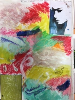
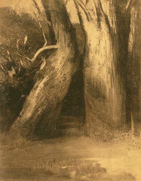
Thank you for your submission Rachael. You have a variety of work going on which is good because this is a diagnostic first part and you need to see where your strengths and weaknesses lie. Don’t assume you have a style otherwise you will be too narrow minded with alternative ways to work. Your learning log is in depth and I can see that you are studying hard and understanding the fundamentals of what drawing can be and how it can be depicted. You work better with looser applications, charcoal and expressive media and the 3 vases has been the most successful to show this. There are technical aspects to work with, especially with perspective, measurements of objects next to each other and tonal qualities to give depth to your still-lifes.
I agree with the
comments regarding ‘having a style’ and being ‘too narrow minded’ as I think I
have thought myself too set in my ways so far, so I will definitely work on being
open to trying new methods and exploring ways I would generally not use.
Feedback on assignment
Demonstration of technical and Visual Skills, Quality of
Outcome, Demonstration of
Creativity
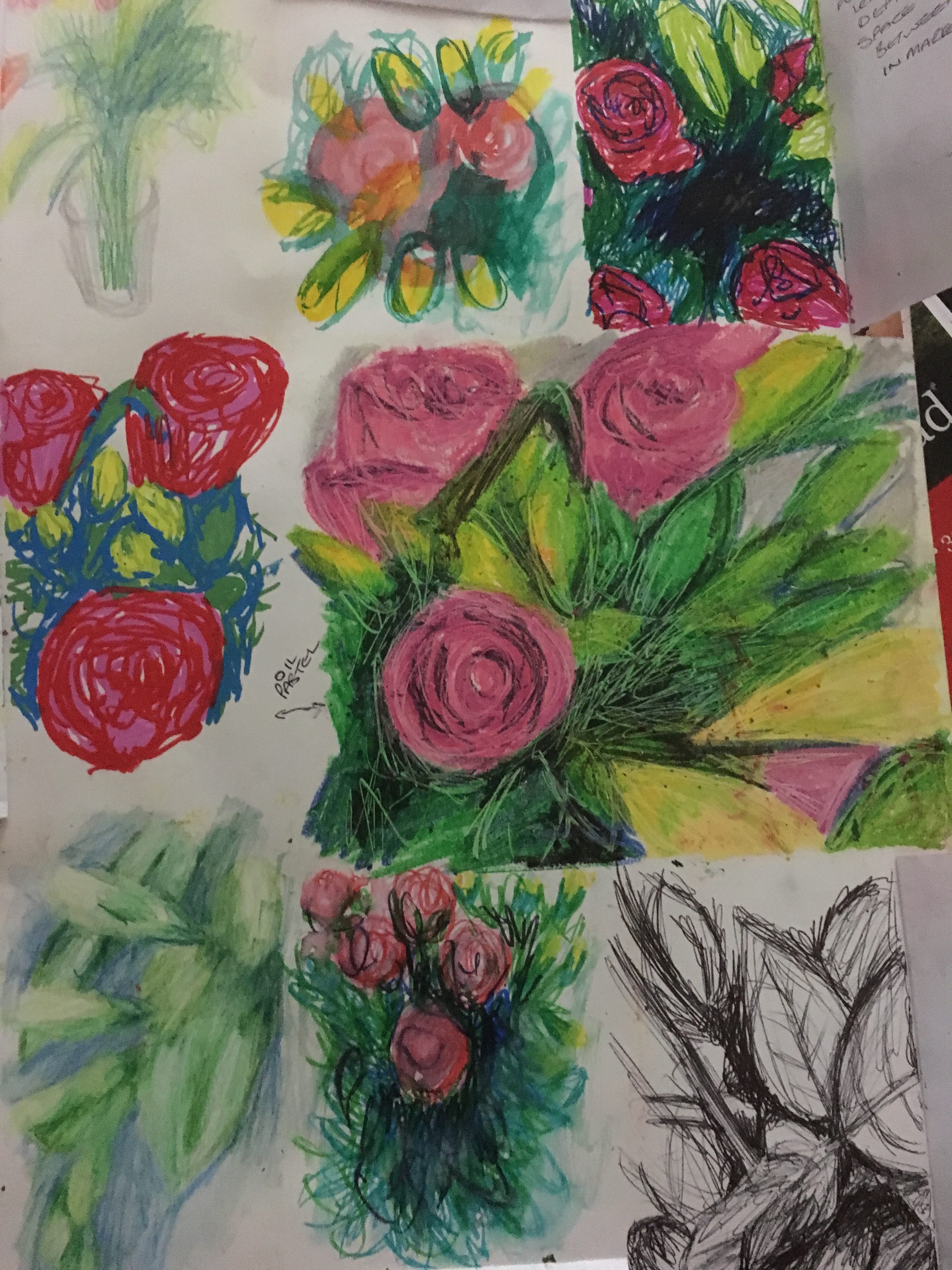
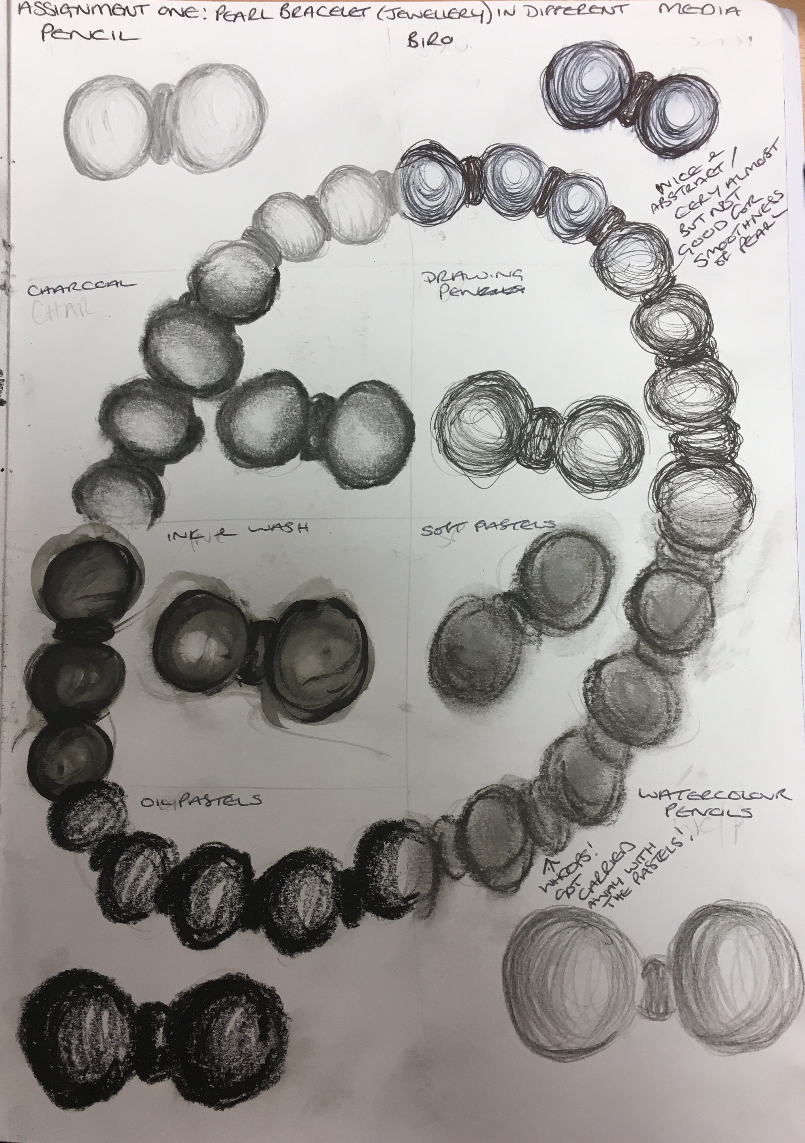
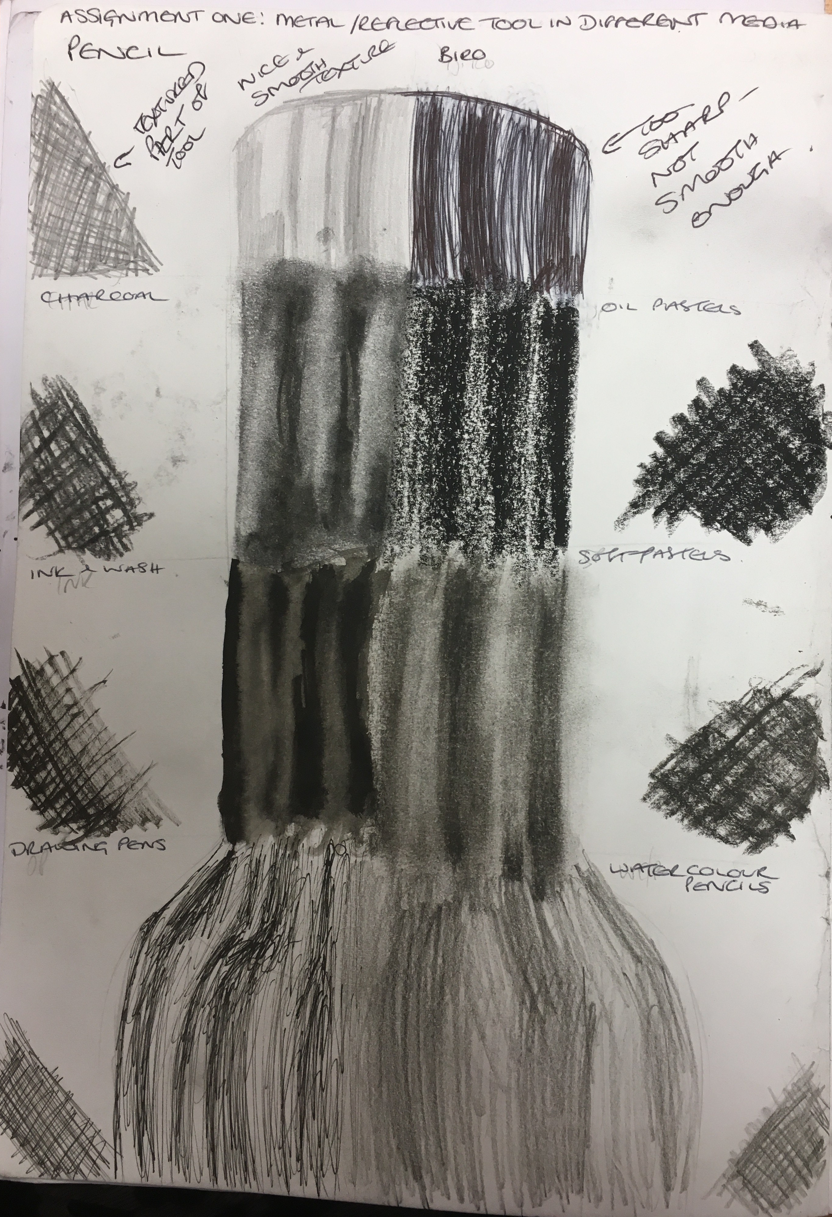
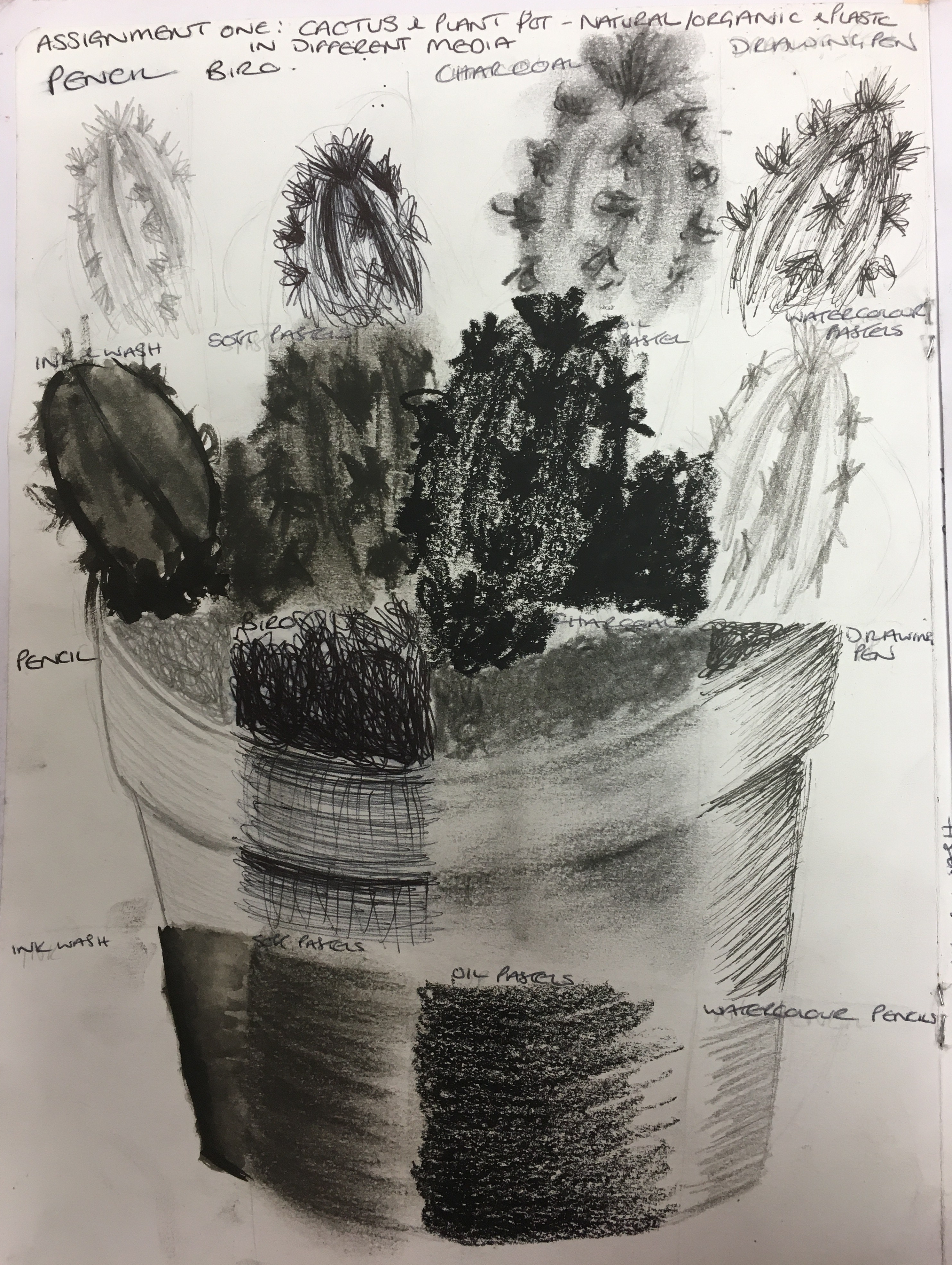
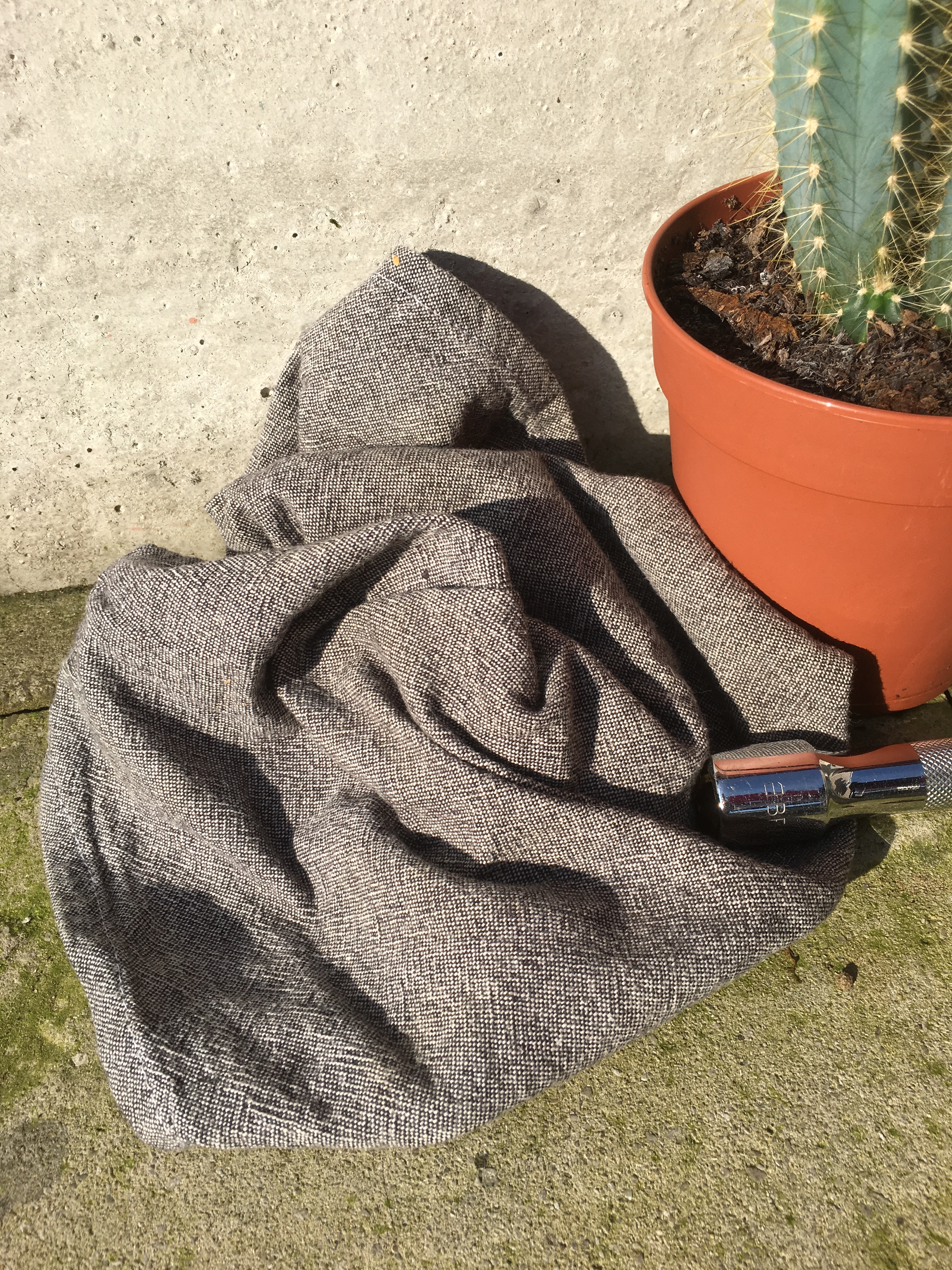
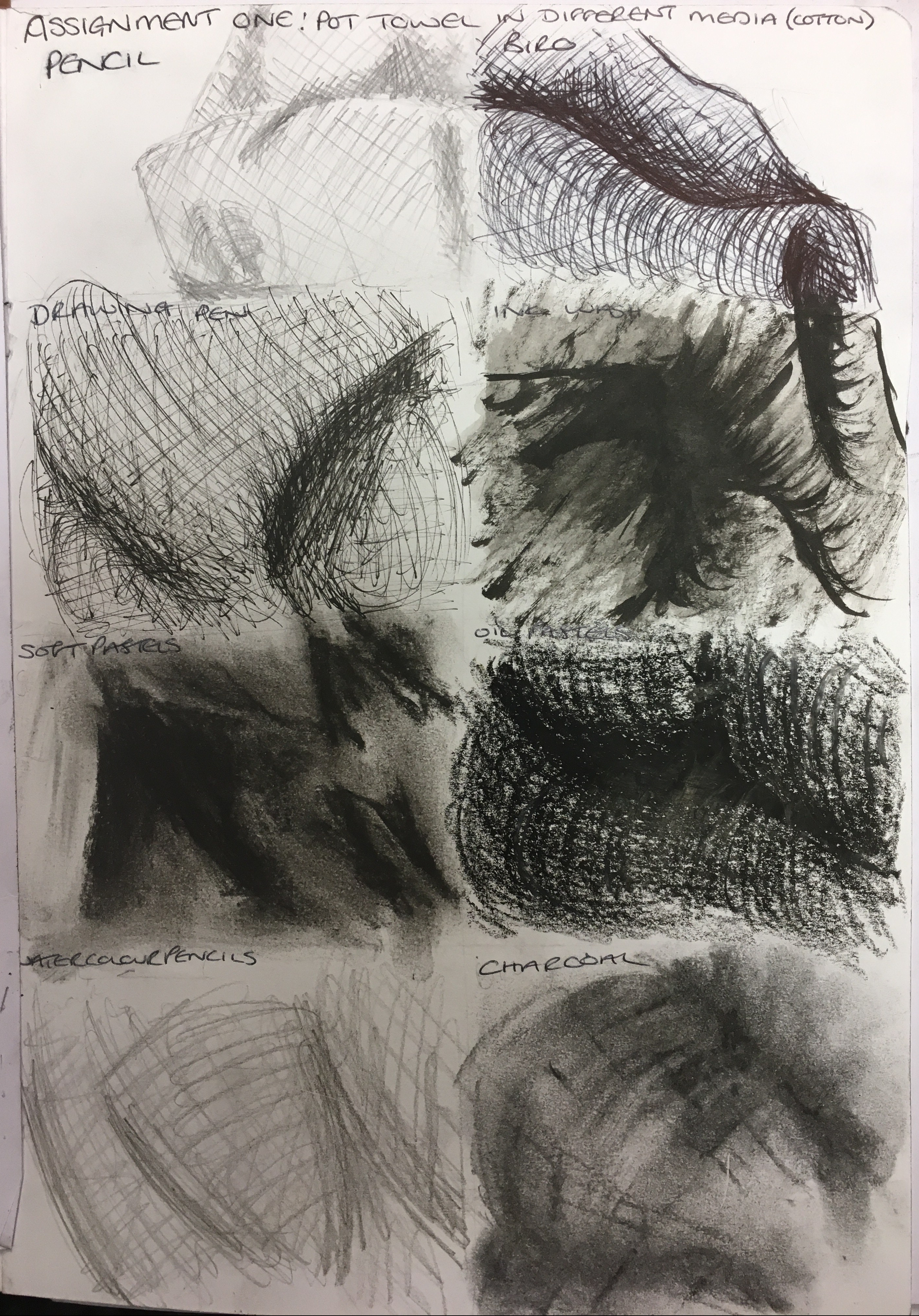
Project 1– it’s good to see you delving into the expressive mark making but they are a little tamed. With these initial exercises, it’s about getting to know the characteristics of each media so be cathartic and see what they do. In terms of the temporary drawing- this means drawing, which is not created but exists already in the world, such as cracks, marks left, traces, residue. The fact you have found this through cleaning is good. However, do not make them stylised and finished otherwise everything becomes a picture.
I think I will
take from this the need to experiment with my media more before I use them for
my actual piece. I will use my
sketchbook to carry out these experiments and apply more effort to this than I have
so far. As for the temporary drawings, I
will try to ‘see’ this type of ‘drawing’ more and make reference to it to
potentially use it further down the line.
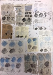
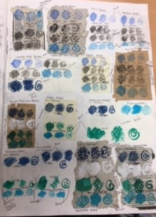
Project 2 experimenting with texture- I’m glad you are looking around your house to observe and depict textures. It is not always about making a picture but rather emulating surfaces through different media. I hope you remember these marks to apply to more of the still-lifes and other subjects.
I do very much struggle with the idea of leaving
something ‘unfinished’. I think I need
to work harder on stepping back from my work and being ok with it not looking
too pretty or obvious. I will definitely
be carrying this knowledge further and will experiment further as I go along.
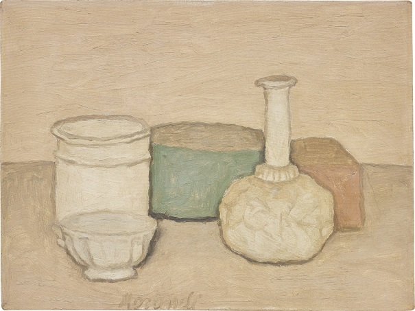
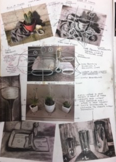
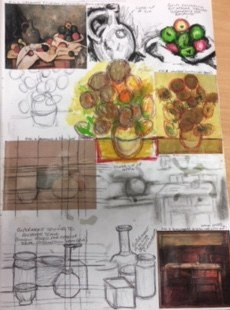
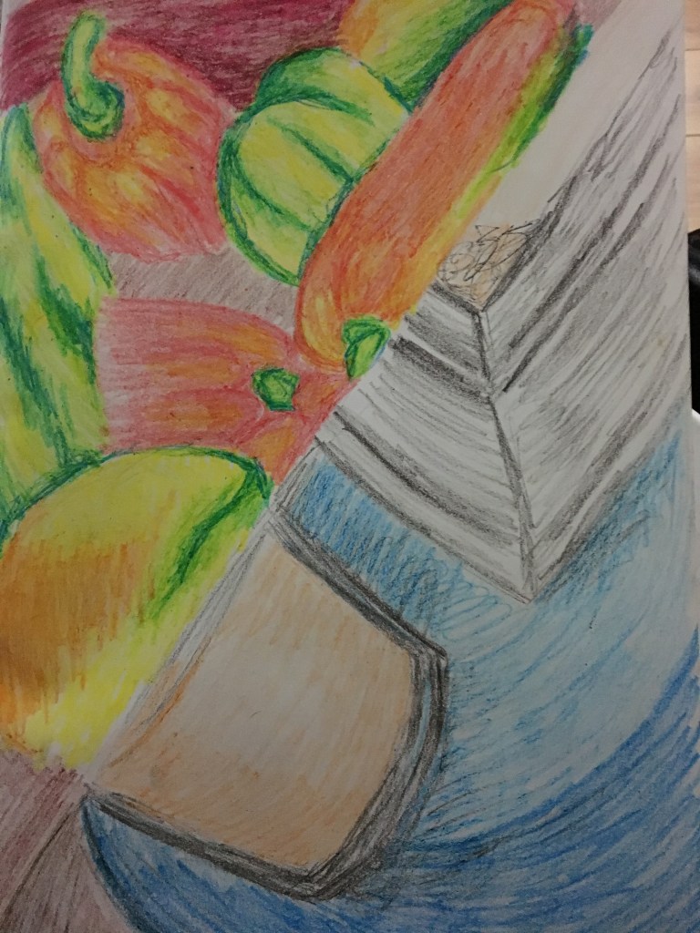
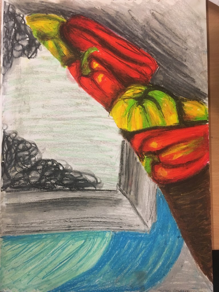
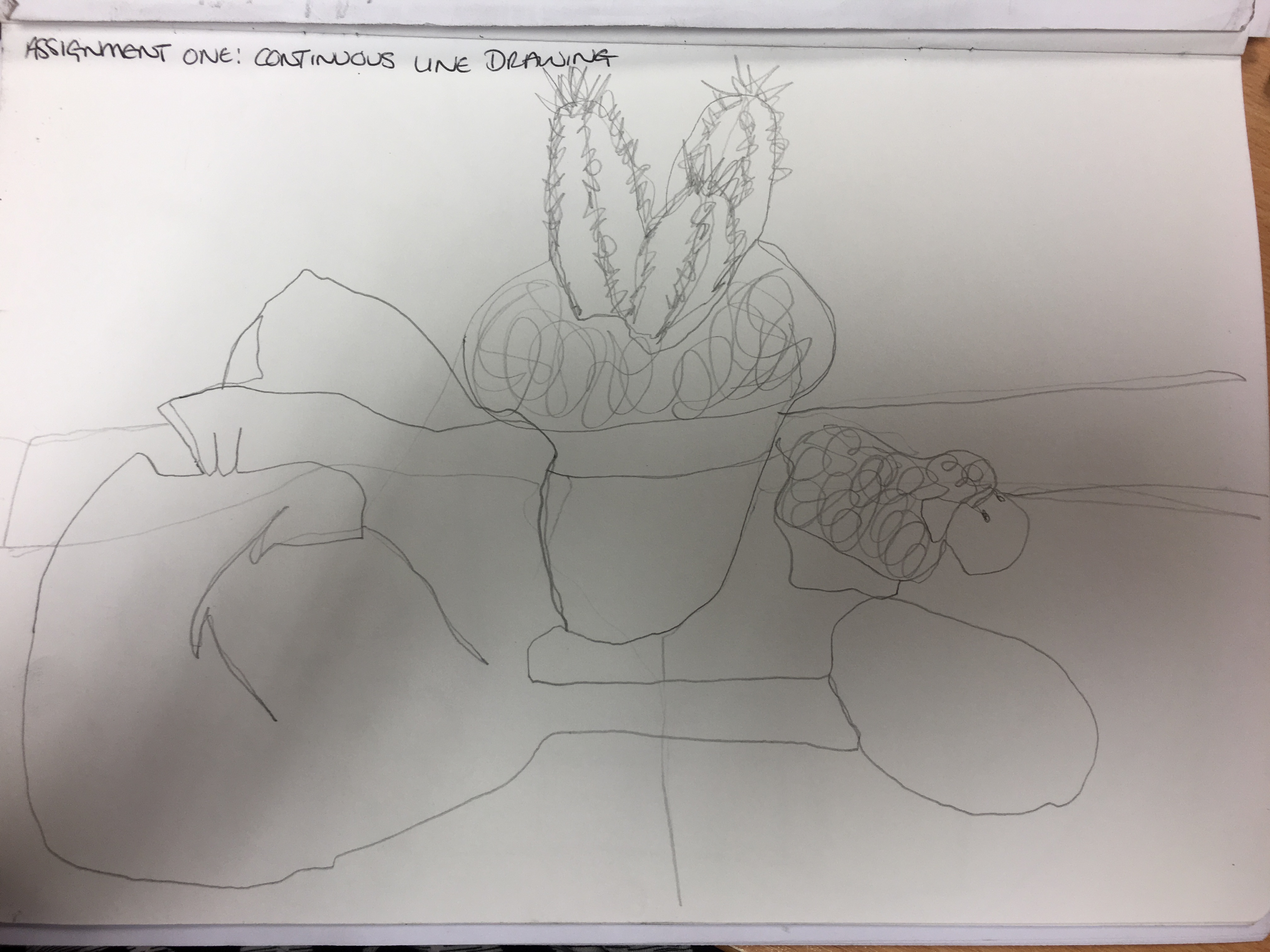
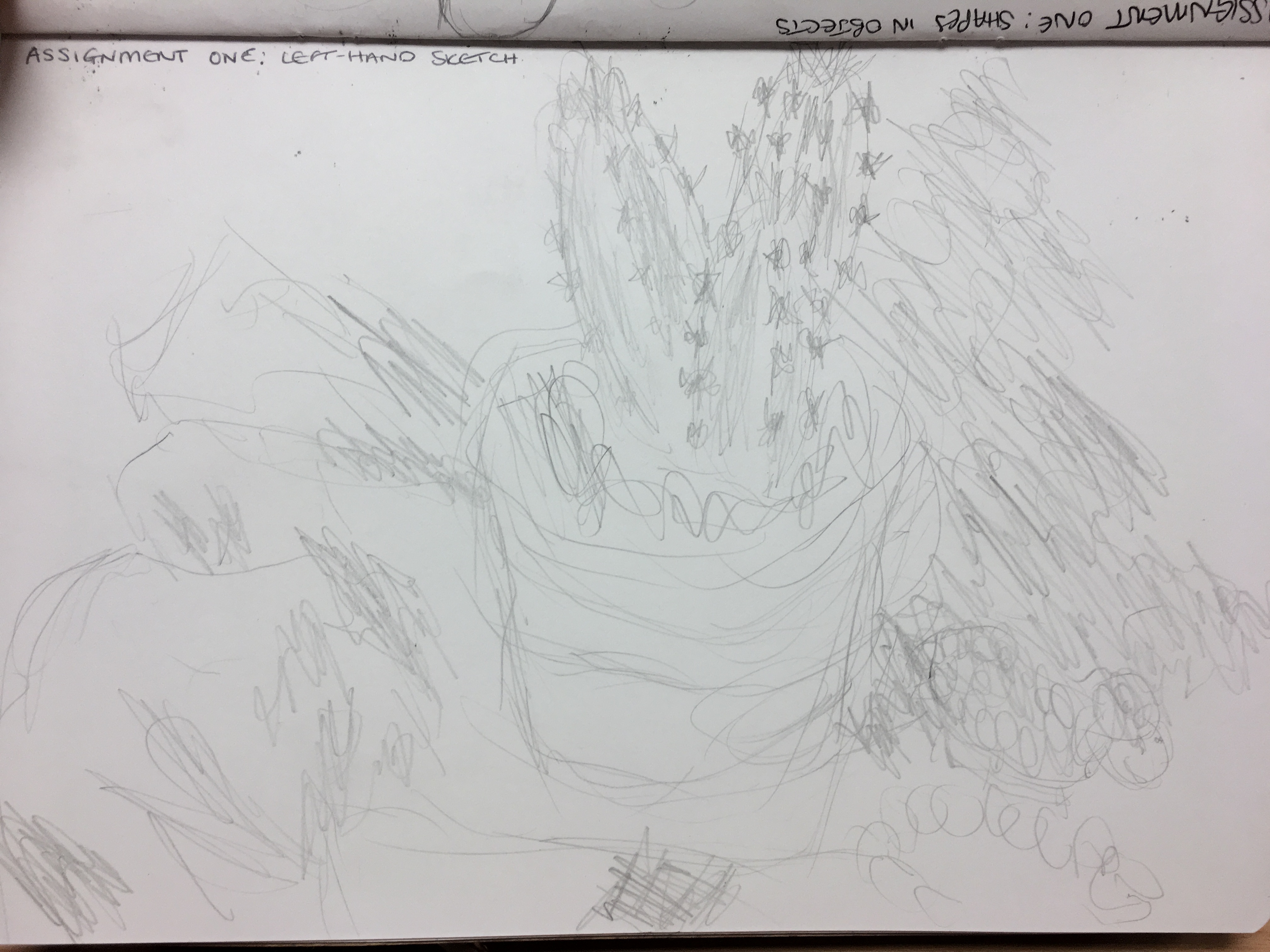
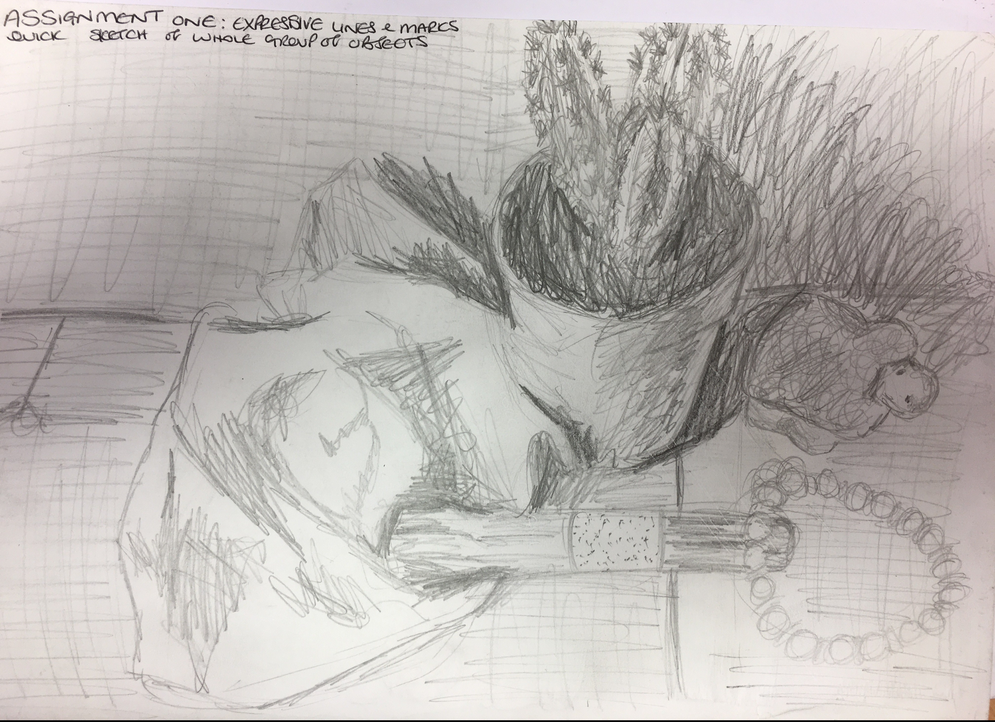
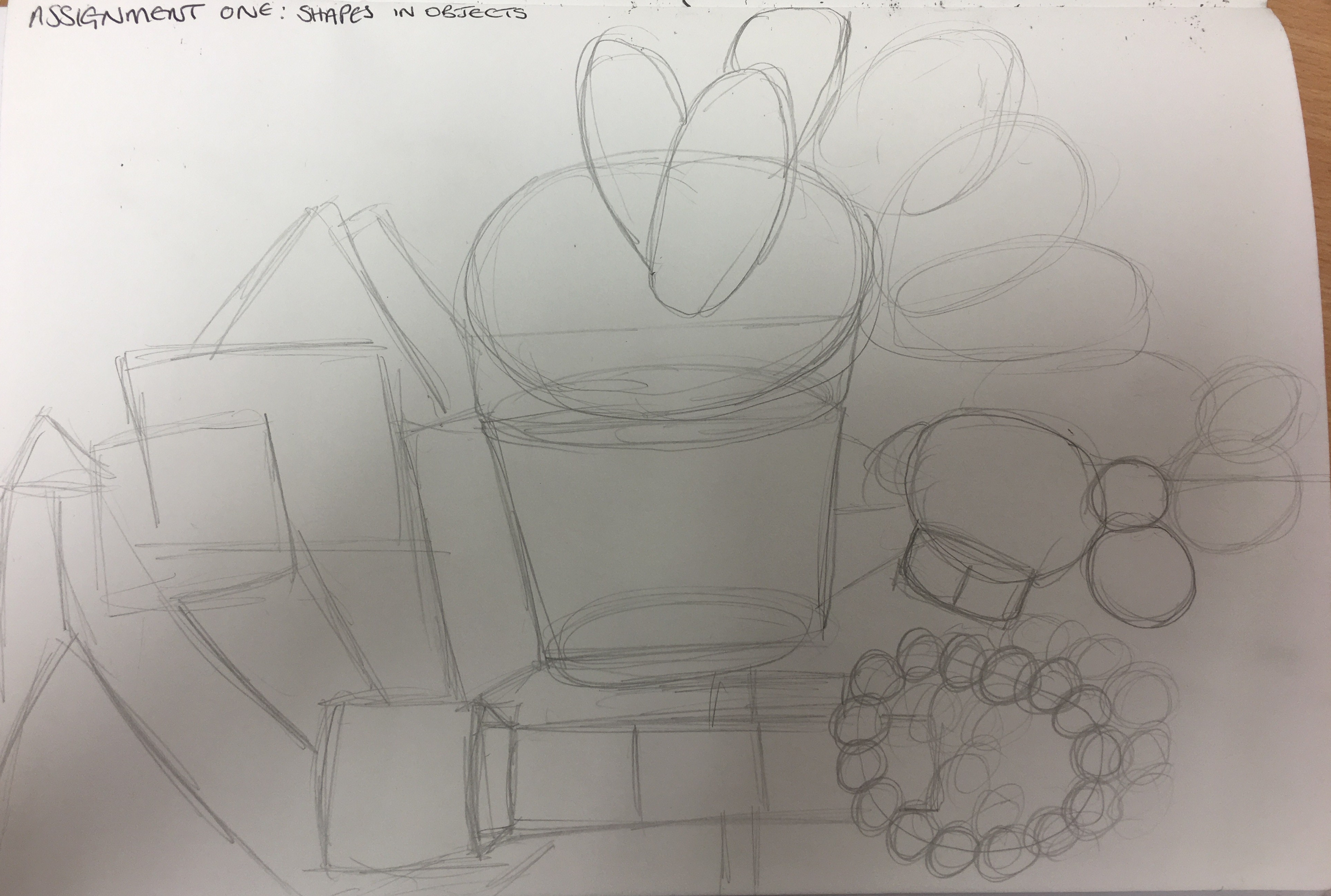
Project 2 ex 1 group of objects– yes, it is about reading in between the lines. You have to go through the exercises to learn the fundamentals of drawing. This exercise is about measuring accurately and this should help you break down objects in front of you and observe better. You start by being simple, which is good because you need to train your eye to see shapes and scale of objects next to each other. Then you can be more expressive with your lines and mark making. The milk bottle in particular shows good understanding of shape and ellipse. Try not to lose this accuracy.
I definitely have trouble with measuring things accurately,
as well as the breaking down of objects.
I have bought a small sketchbook to keep with me always to do brief
drawings to practise these skills.
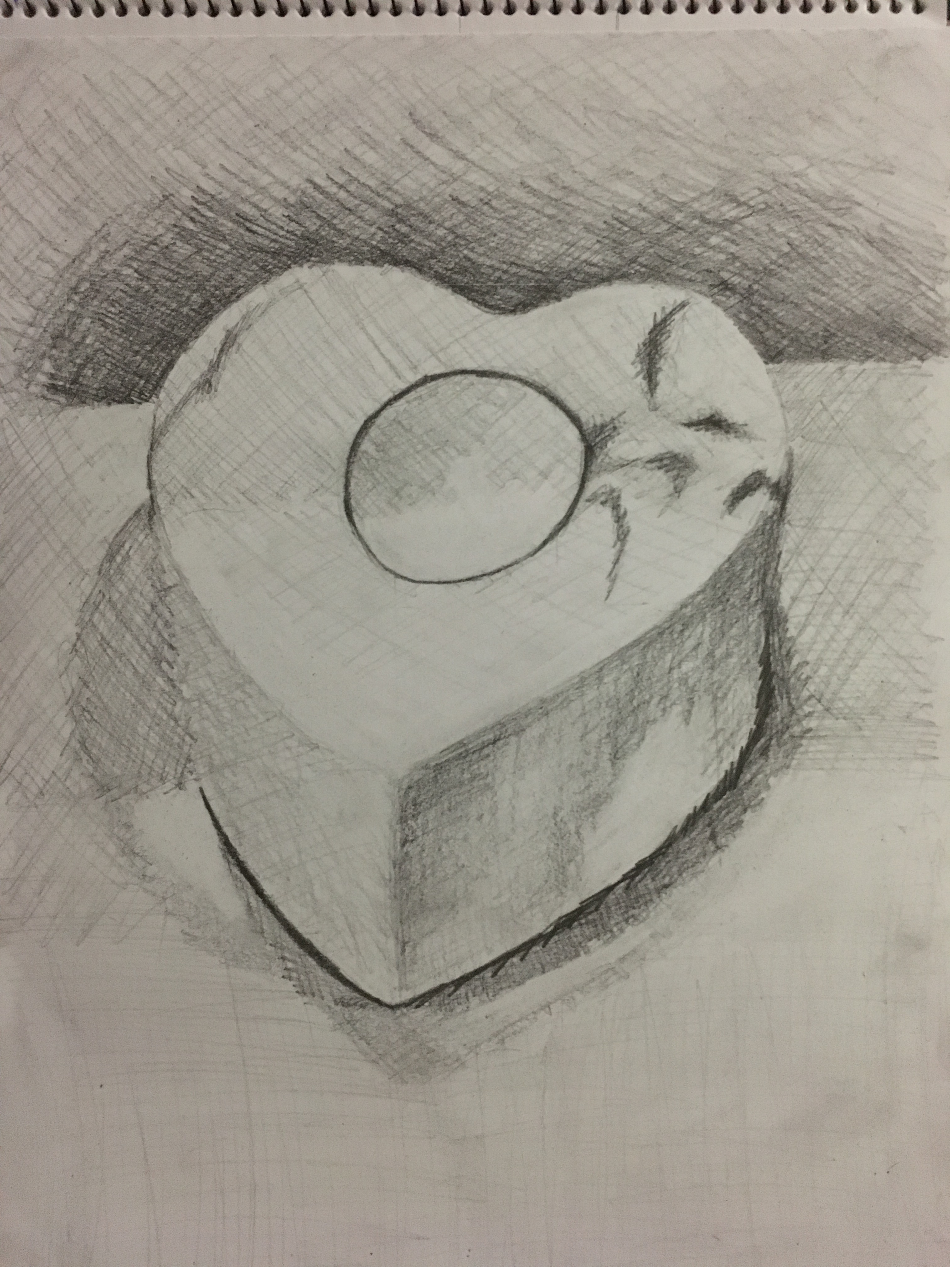
Project 2 ex 2 observing shadow using block of tone– you are being too concerned with what the subject looks like rather than looking at the simplicity of the blocks of tone. Work with different pressures, highlights, reductive drawing and variations of tone to depict the correct depth of shadows. Your planes are quite similar so be careful to observe.
Again, I think
this leads back to me thinking I have to create a pretty, finished
picture. I think some of this comes from
perhaps feeling embarrassed that some may see the work and think my skills weak,
but I know I have to work through this and ‘get over myself’, so to speak!
I was slightly unsure
what was meant by my ‘planes’ being quite similar, so I will look into this and
how I can improve this area.
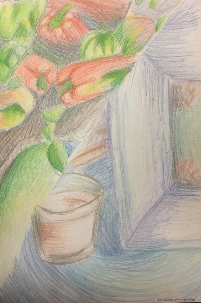
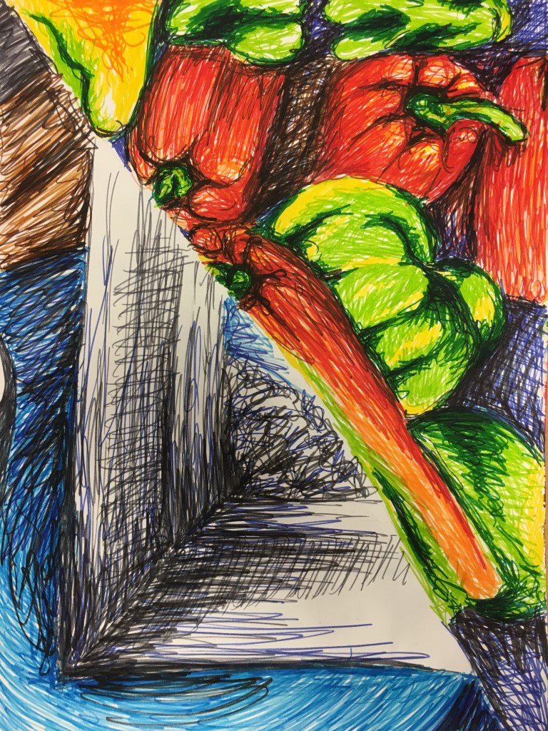
Project 2 ex 3- creating shadow through line and marks- it’s good to see you exploring marks and line with different media but try not to create the same qualities each time. The group of plants could be magnified so you are concentrating on the textures and tones rather than making realistic representations. This first part is about exploring. Treat each leaf and part of the plant differently.
I agree I have created the same qualities each
time. Perhaps this is because it is my
comfort zone? I will work to break out
of this and work in ways which may not come so naturally to me so that, in
time, they will. I will definitely create
more pieces which are of close observations.
I think this may also help me to break out of my ‘pretty picture’
comfort zone, so I am rather eager to do this.
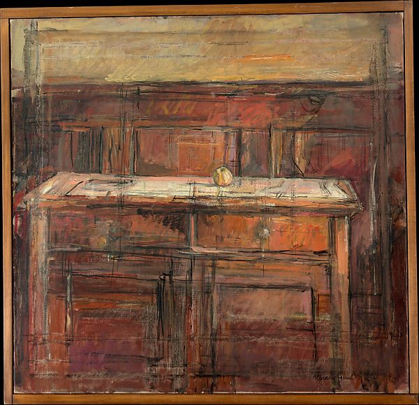
Project 2- ex 4 shadows and reflected light- the piece of the three vases done in charcoal has very explorative mark making; it is raw, expressive and holds substantial gestural qualities. This is best left alone otherwise it becomes too polished and what you see what you get. The pencil piece is not as in-depth, as it has been done with timid marks. The charcoal piece does need work in terms of balance and measurements of shadows but the main factor is you are being expressive with the marks and the shapes of reflection is coming through.
Again, it is leaving pieces as they are which I struggle
most with – I feel as though my tutor would give me a negative mark for not
finishing work or not being able to see what I am trying to portray, so I need
to work on this and not overthink things so much, but trust my intuition more. I am surprised
to see the comment regarding my pencil lines being ‘timid’ and the piece not
being as ‘in-depth’ as I felt I put more effort into this piece and recreating
the shadows than I did the three vases, so I will consider this more as I move
forward.
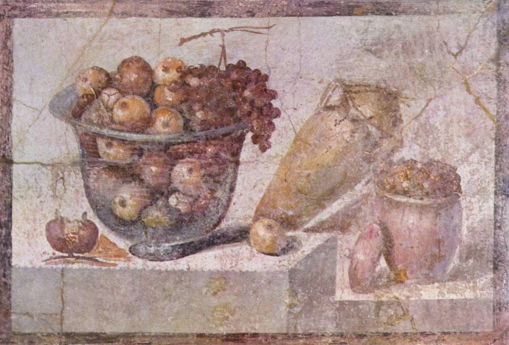
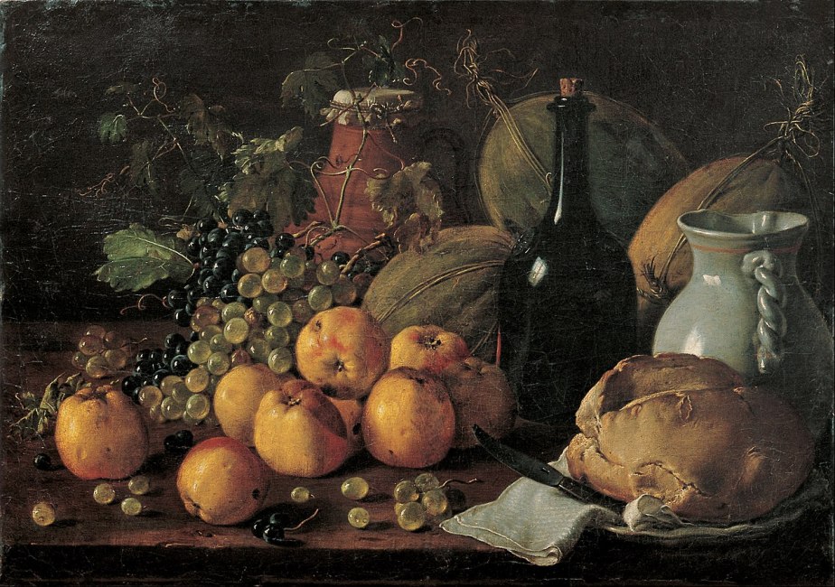
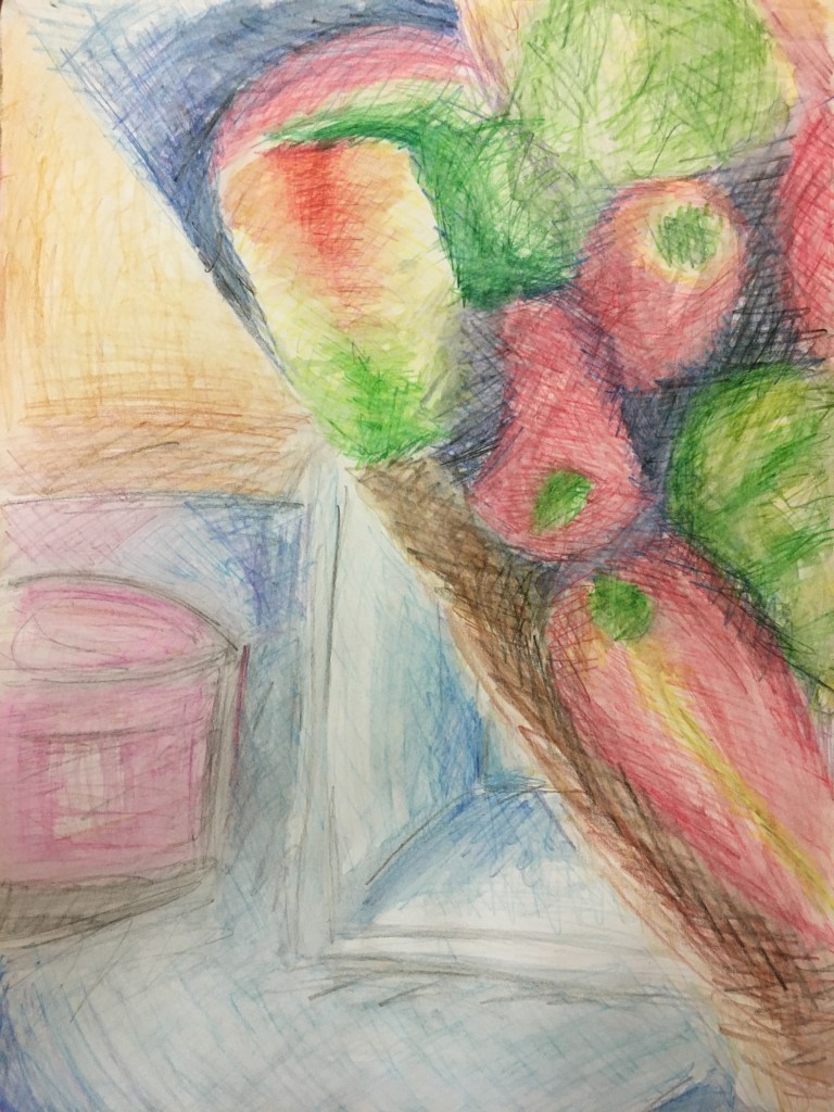
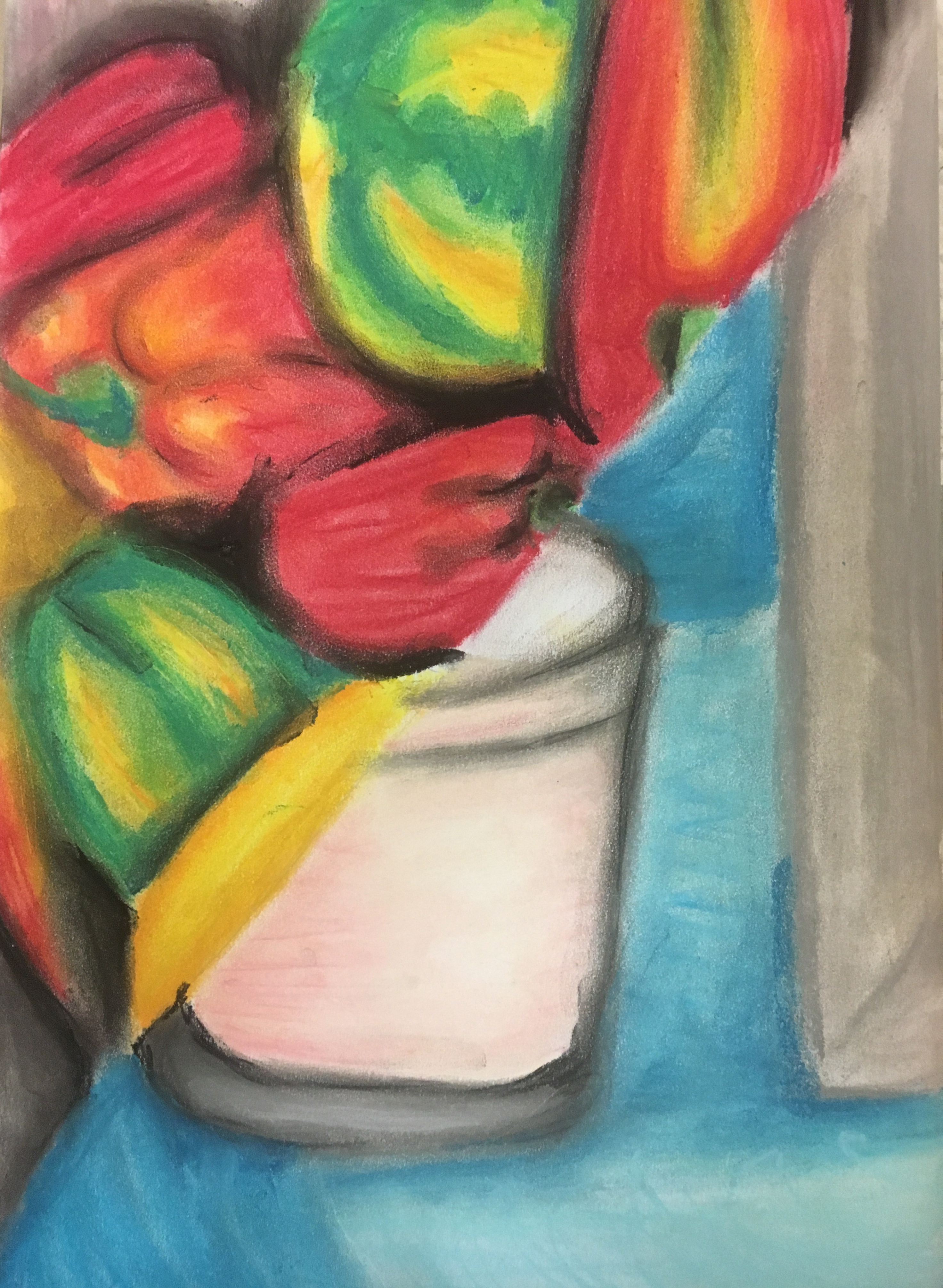
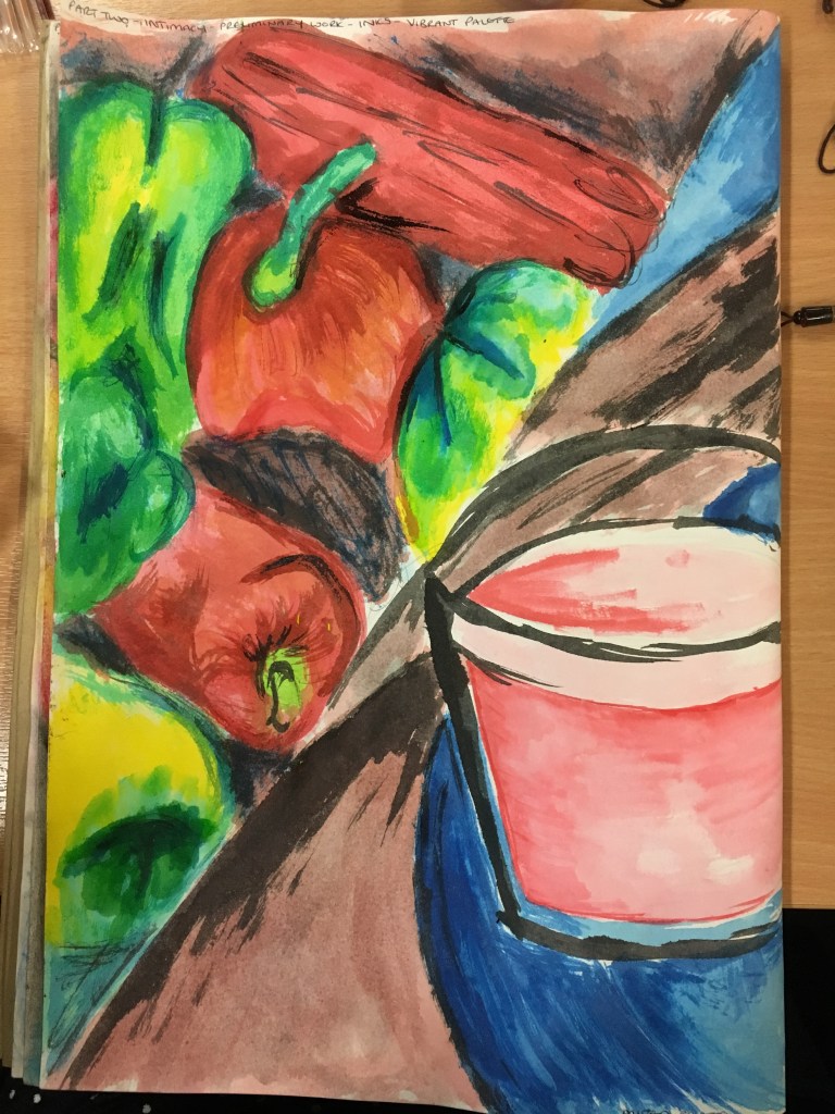
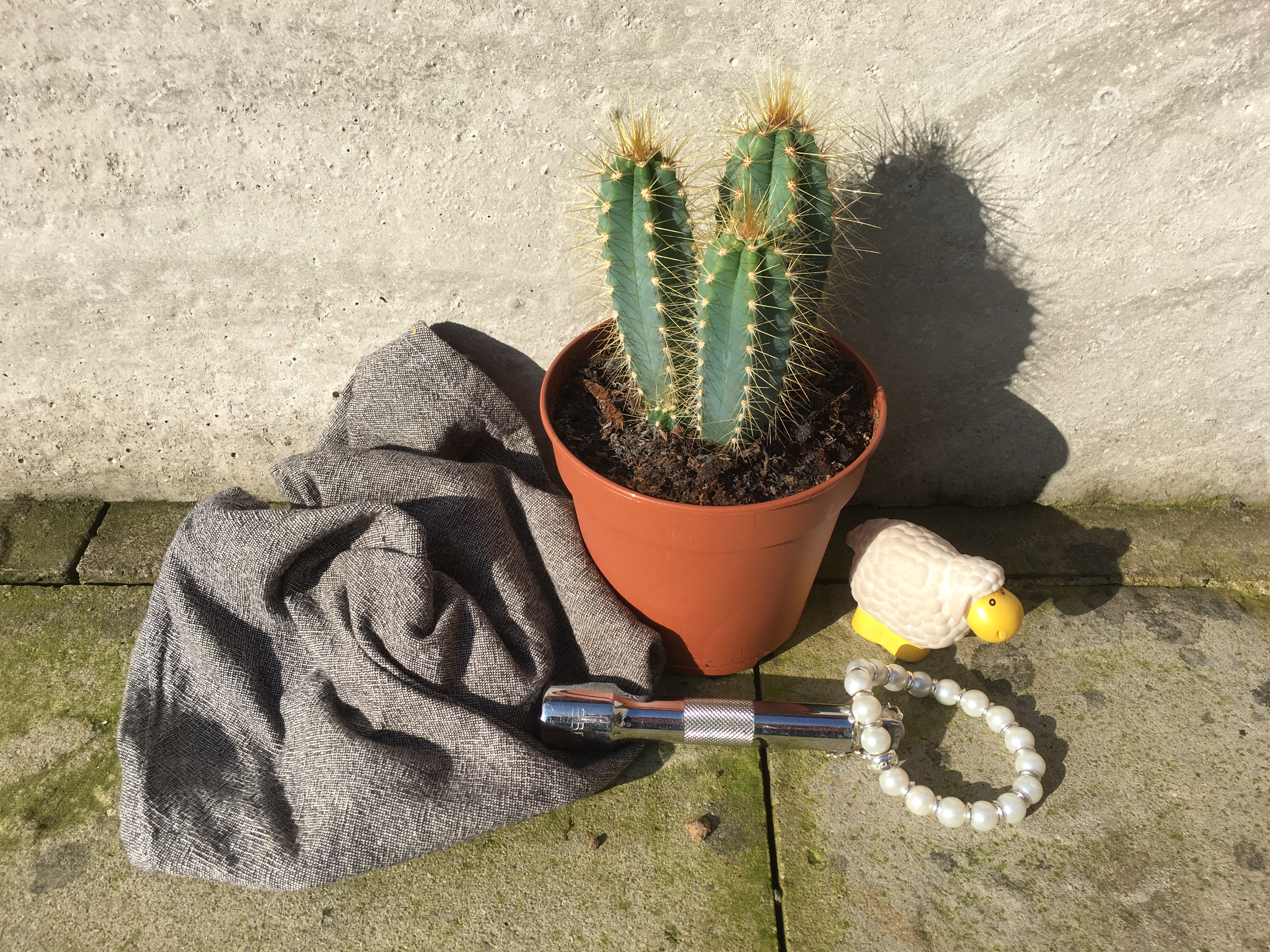
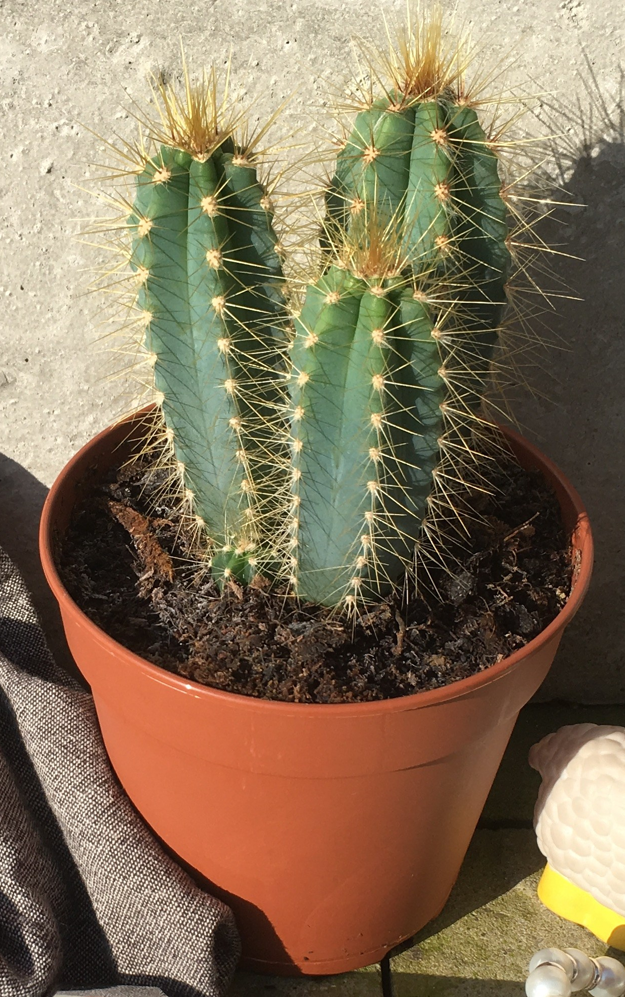
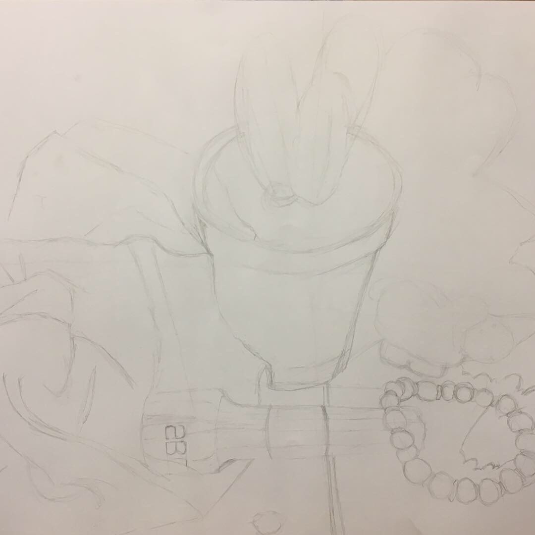
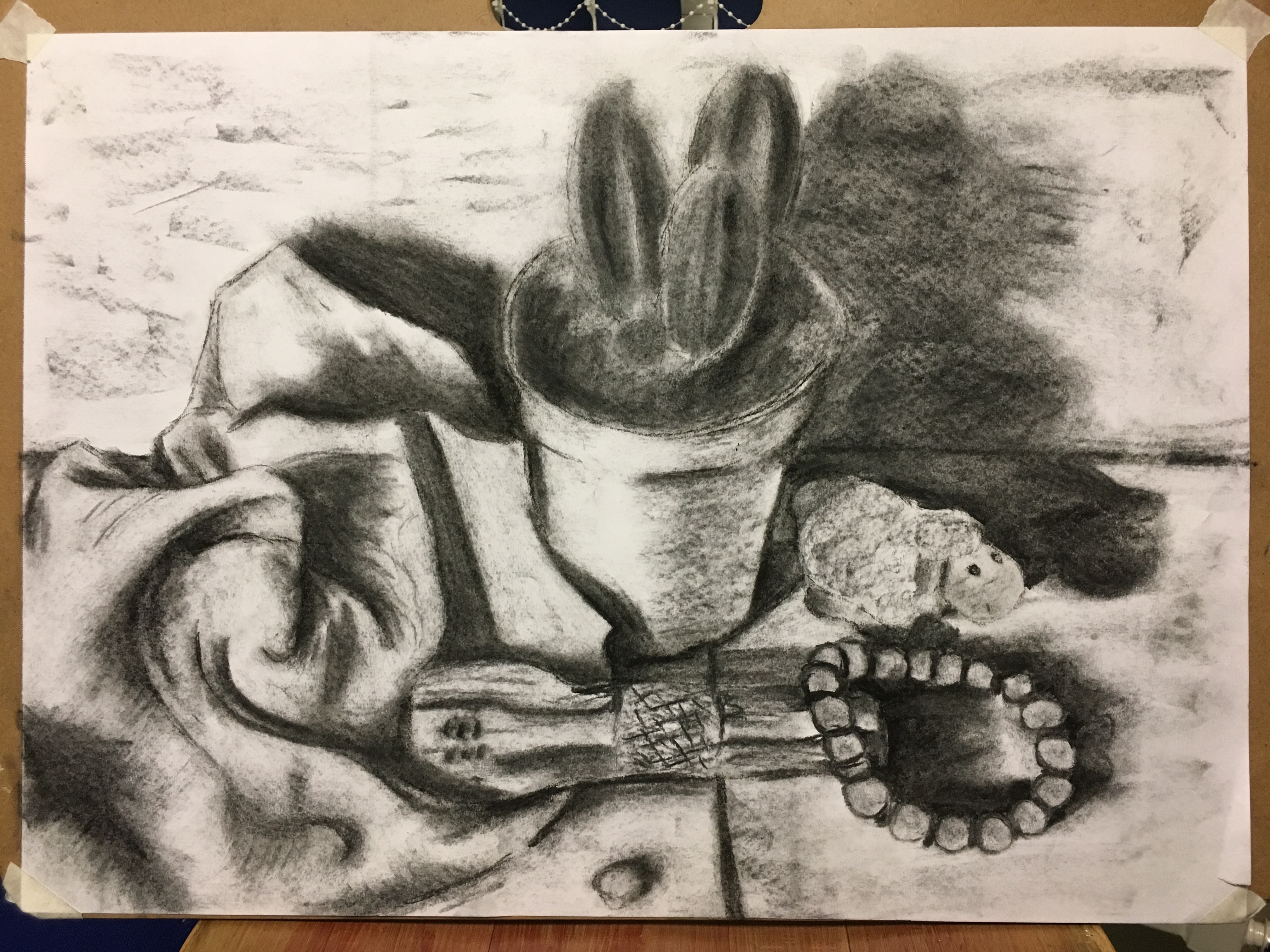
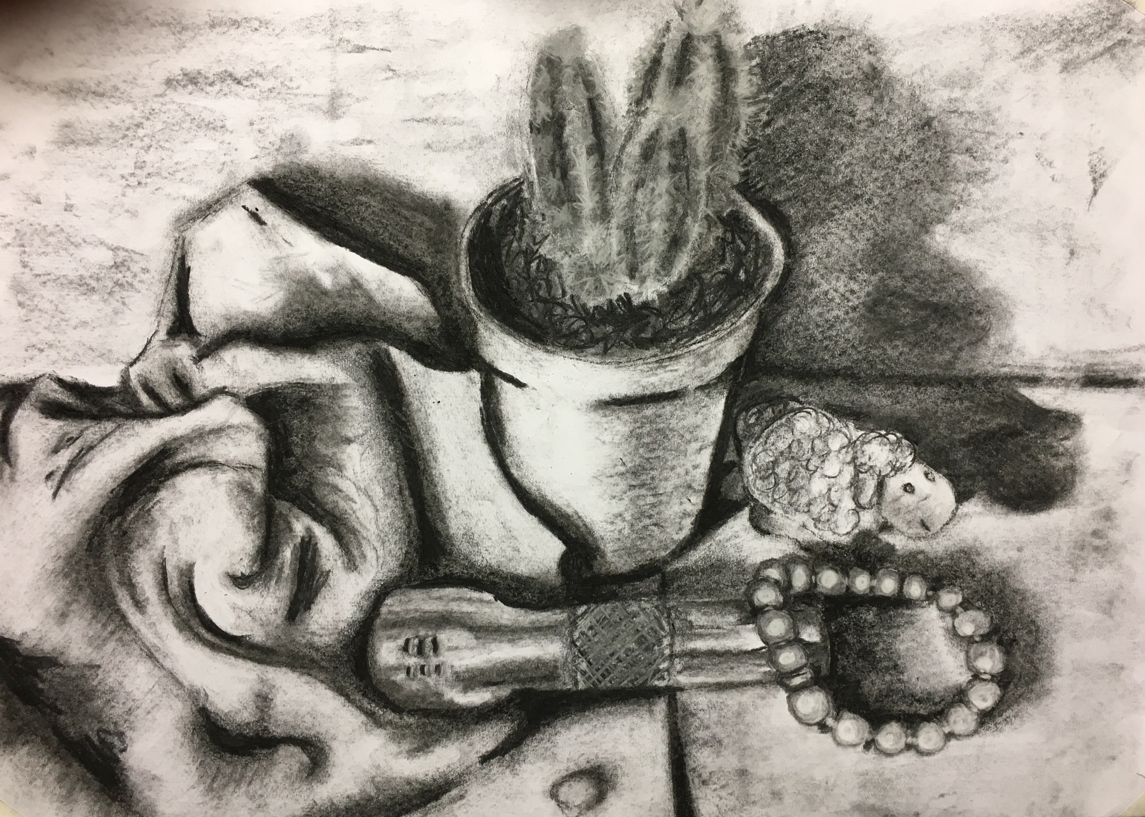
Assignment- you have tried to use your skills of shadow; light and dark tone representation and composition into a piece, which shows progression. Overall, the whole piece is cumbersome with the amount of objects that are included because you have treated them all in the same way. Break down what is in front of you. Do this by building up your layers from the lightest to the darkest (close-up, foreground, mid, background and distance). This will allow you to differentiate the different tonal variations from light to dark. The perspective and viewpoint is awkward because the ellipse of the plant pot is different to the frontal view of the fabric. So really observe the measurements of your objects next to each other and break down the relationship between the lines. Overall, a very complex image that needs work technically.
I am a little surprised at the comment here regarding the group of objects being cumbersome as I thought I had chosen rather well, but I see it is because I have treated them all the same way – this is something I don’t quite understand either as I thought I was to work in the same media for the whole piece and I tried to change my methods to suit, but clearly I need to work harder on this; perhaps choosing mixed media to represent different objects, as well something such as collage perhaps?
I agree with the comment regarding my perspective
and viewpoint, so I will take this into account and look into ways of
increasing my skills in this area.
Sketchbooks
Demonstration of technical and Visual Skills, Demonstration of
Creativity
I assume that some of your images on the blog are from your sketchbook? If so, it’s good to see you trying exercises a few times because you will only improve. However, use your sketchbook as a space to play, investigate what media can do but for you and more importantly practice the fundamentals of the technicalities. Keep these practices simple, by doing outlines, observing the simple shapes and forms and working out perspectives from different angles.
Some of the
images are from my sketchbook, yes, but as I stated in my blog, I do not think I
have used this well enough during this part of the course. As I said earlier, I have now invested in a
hardback sketchbook of A5 size and shall carry it with me everywhere, drawing
anything and everything which catches my eye – whether relevant to the current
part of my course or not – and work on improving my measuring and
perspectives. I am also going to go back
and have a play with the various mediums, but with no apparent piece in mind –
this way I cannot be tempted to ‘prettify’ and finalise the experiments beyond
being just that – an experiment.
Research
Context, reflective thinking, critical thinking, analysis
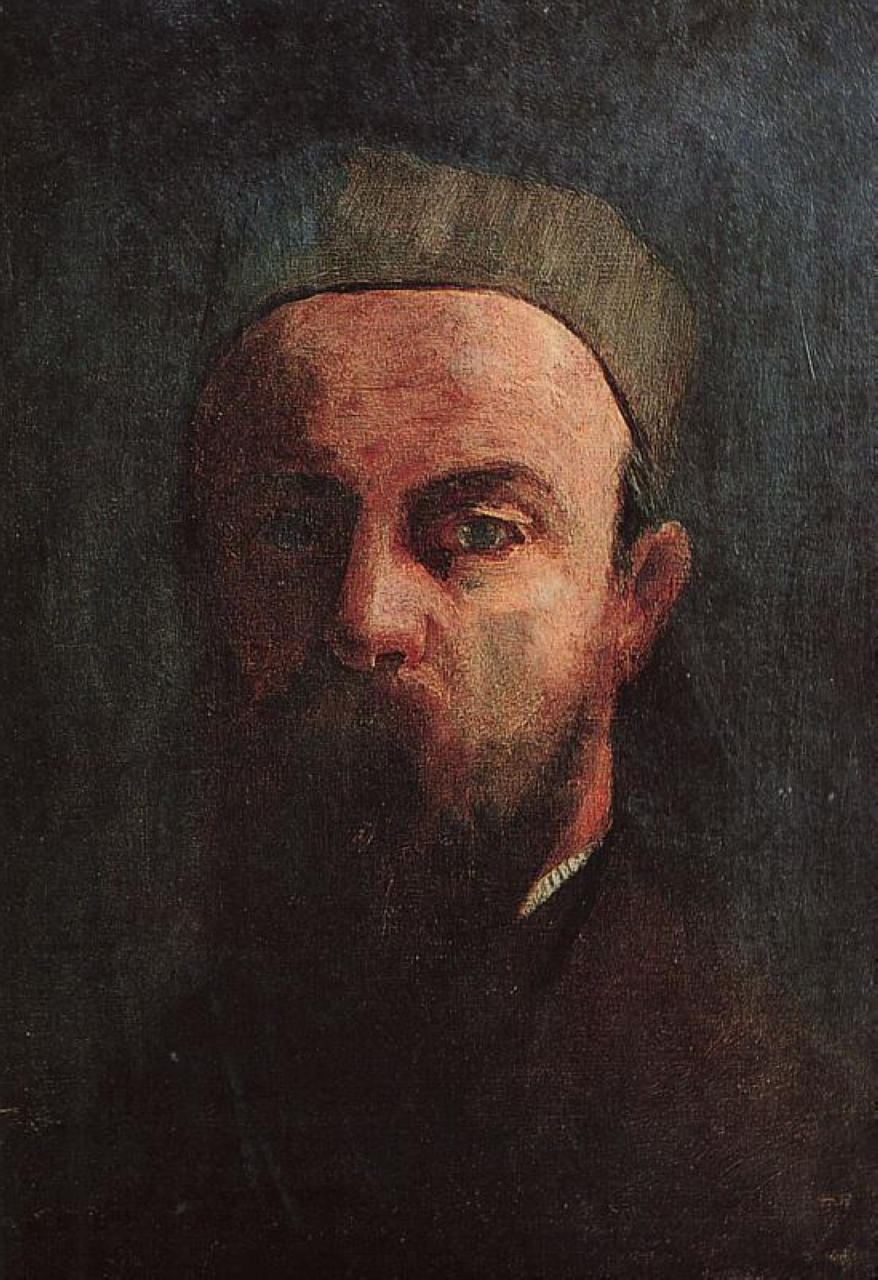
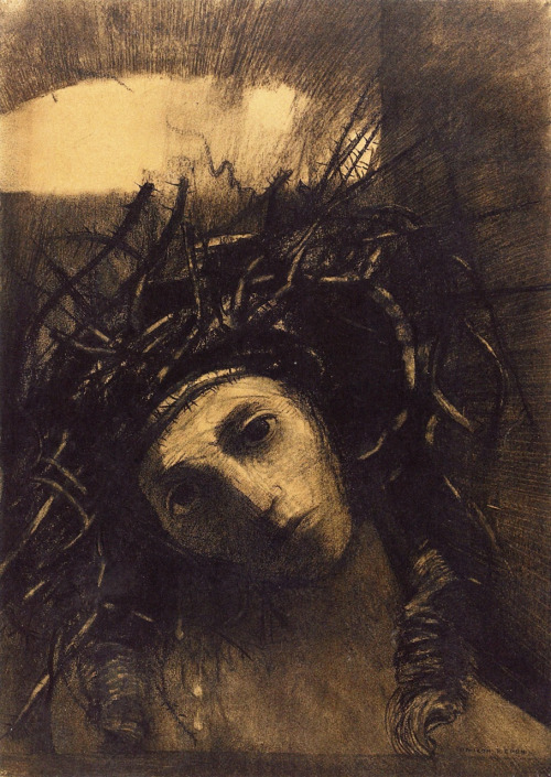
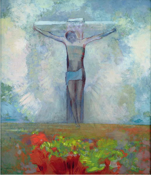
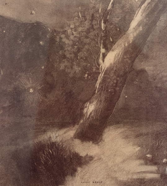
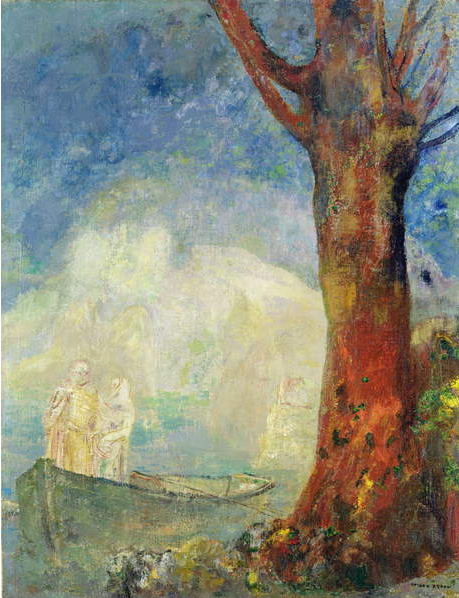
You clearly enjoy reading about artists and your analysis of Redon’s work and the comparative study is analysed well. Do look at the artists I have suggested to help your current work to improve. Also, go to exhibitions, watch documentaries, read behind other artists work independently. The more you look and read, the more you can allow yourself to move on and build up your contextual understanding. Keep referring to the assessment criteria to self-assess. This is good practice.
I really have enjoyed reading about the artists and
am actually wondering now whether I would prefer to change my path to History
of Art! I find it hard to find time to
go to museums, but will try to work this in to my schedule. Most notably, I would really like to go to
the Leonardo da Vinci exhibition and will take my sketchbook and scribble away!
Learning Logs or Blogs/Critical essays
Context, reflective thinking, critical thinking, analysis
Your learning log is self-reflective and in-depth. You have given insight into your intentions; understanding of the fundamentals of drawing and seen where you need to improve. Make sure you listen to your own improvements and apply them to your work. Your commentary is substantial for this level and you have documented your progress well.
I’m really
pleased with this feedback, though the word ‘substantial’ rather threw me as to
whether it was a positive or a negative, but decided to settle on a positive
and not spend too much time overthinking!
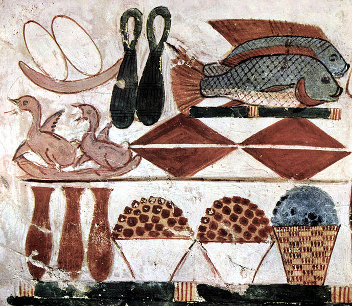
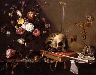
Suggested Reading / Viewing
Context
- Giorgio Morandi drawings of
still-lifes- keeping it simple and looking at measurements of objects.
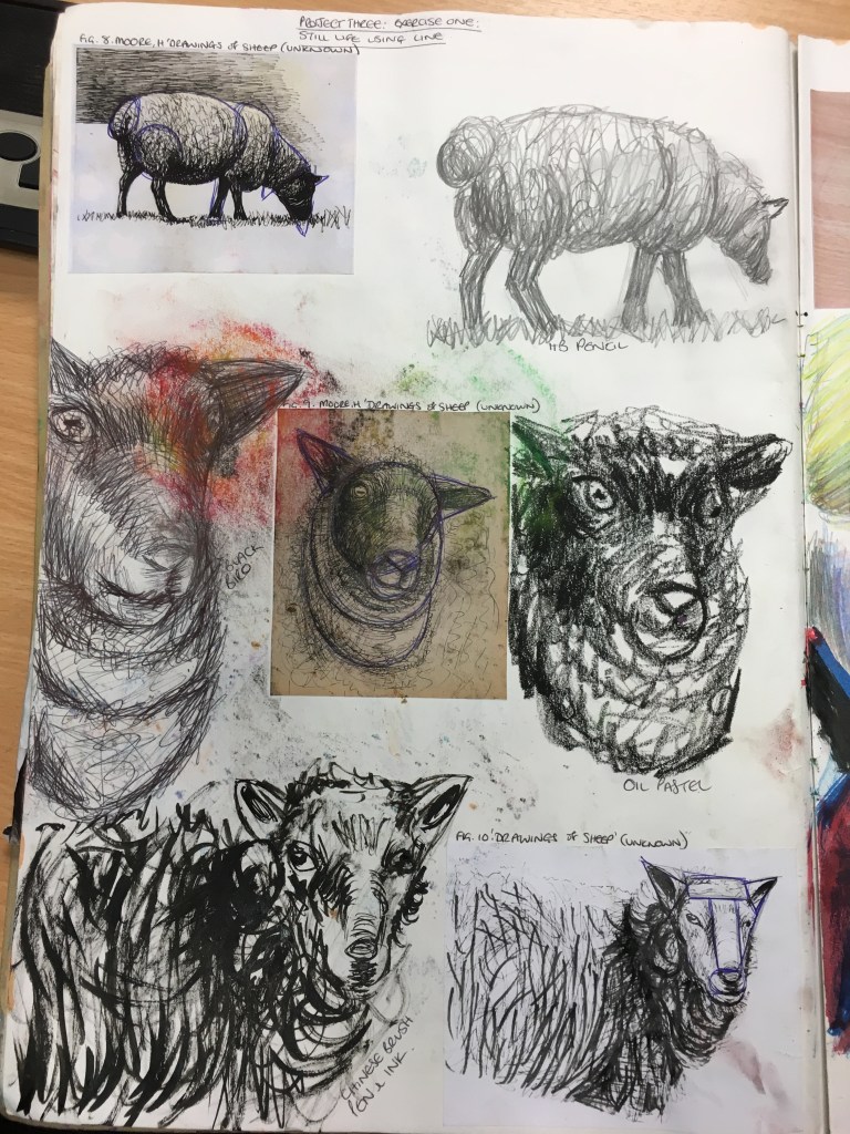
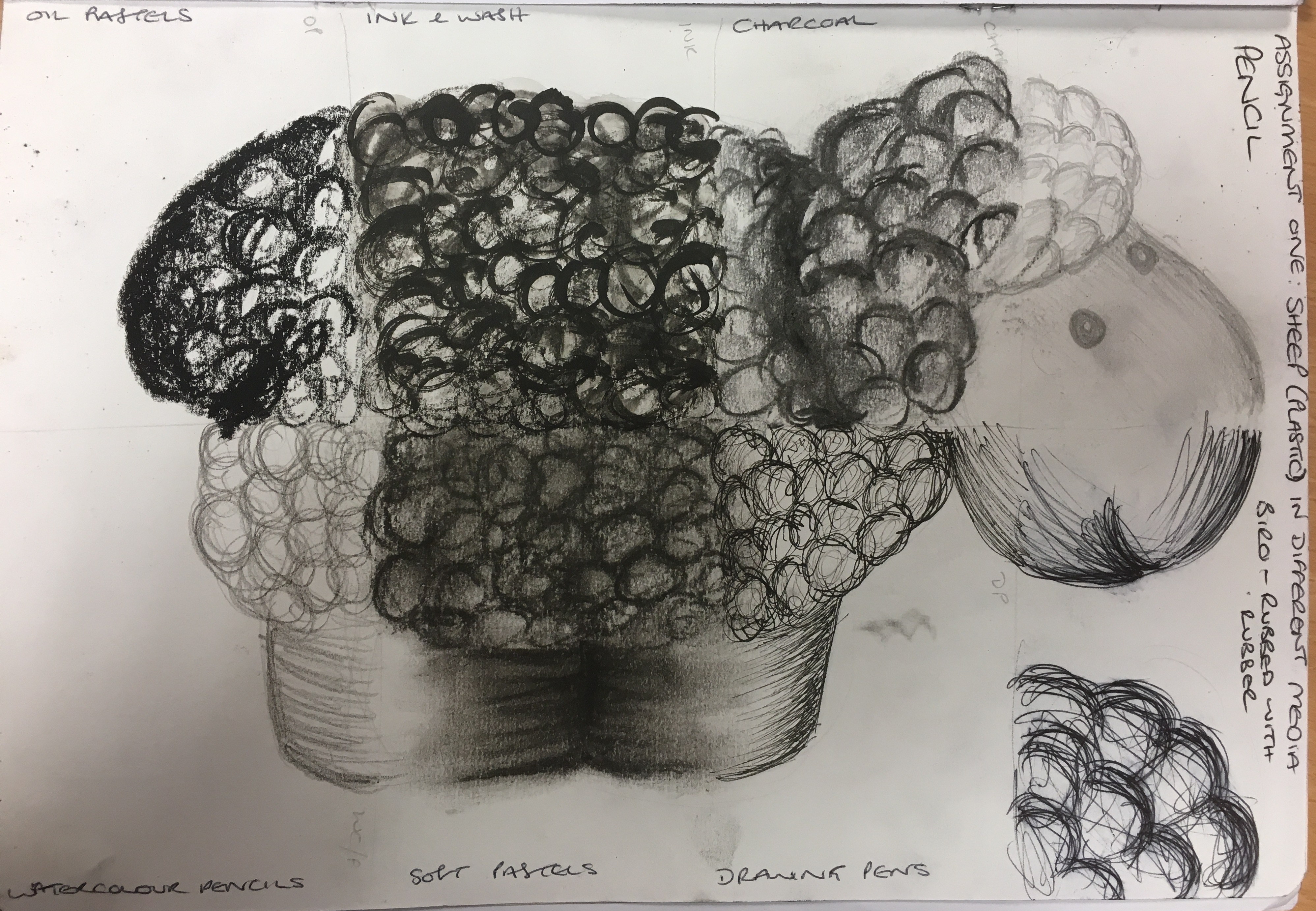
- Henry Moore- sheep drawings- look at
the lighter cross-hatching technique to depict tone and form.
- Giacometti- look at how he observes
accurately but also depicting a more expressive style.
- Paul Cezanne (still-lifes)- look at
his work for depth and composition.
The artists recommended are so exciting and
interesting and seem to suit me completely!
I will do some in-depth research into them all.
Strengths / Areas for Development
You work well with expressive media and with blocks of
tone (3 vases). Don’t feel like you have to finish work and make them over
polished. Keep this way of working but use reductive drawing to show lighter
tones so you are not so heavy handed.
You have exciting and meaningful objects when it comes to
your compositions. Break these down so you are concentrating on the
fundamentals of drawing, especially tone, measurements and scale. You have
different approaches to creating
shadow to depict tone so keep investigating this. Angles, viewpoints and perspective need work
so the work has more accuracy. Your learning log is in depth and you have been
self-reflective. Research the artists I have suggested so you can see what I
refer to with depth in your still-lifes.
From this, I have
taken on board all of the comments, but most notably the ones relating to being
less heavy-handed, concentrating on improving my skills in tone, measurement,
scale, angles, viewpoints and perspective.


