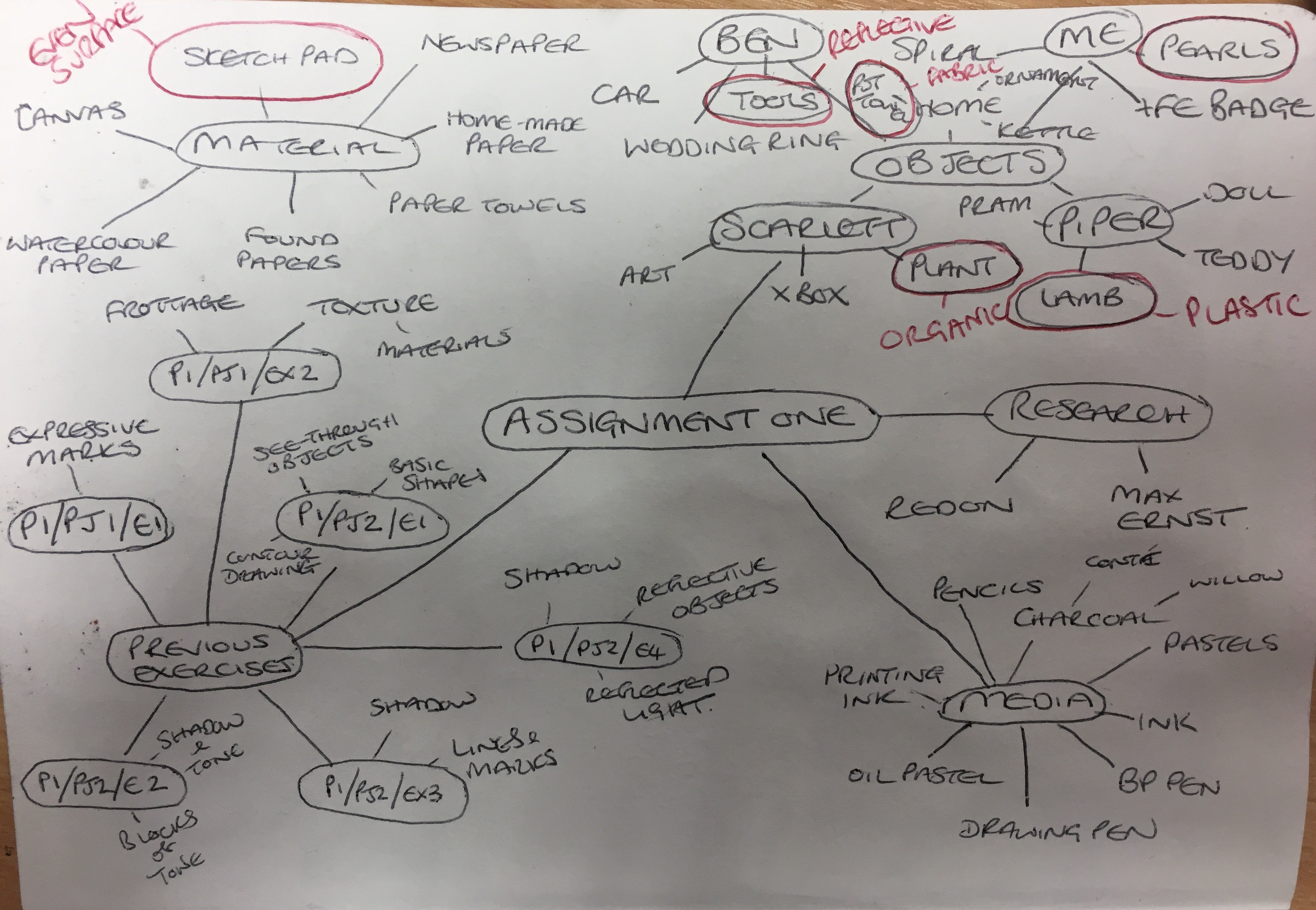
To begin this assignment, I decided to work through my
previous exercises in coming up with my main piece. I began by working out what I wanted to draw
and why by creating a mind map:
Assignment One Mind Map
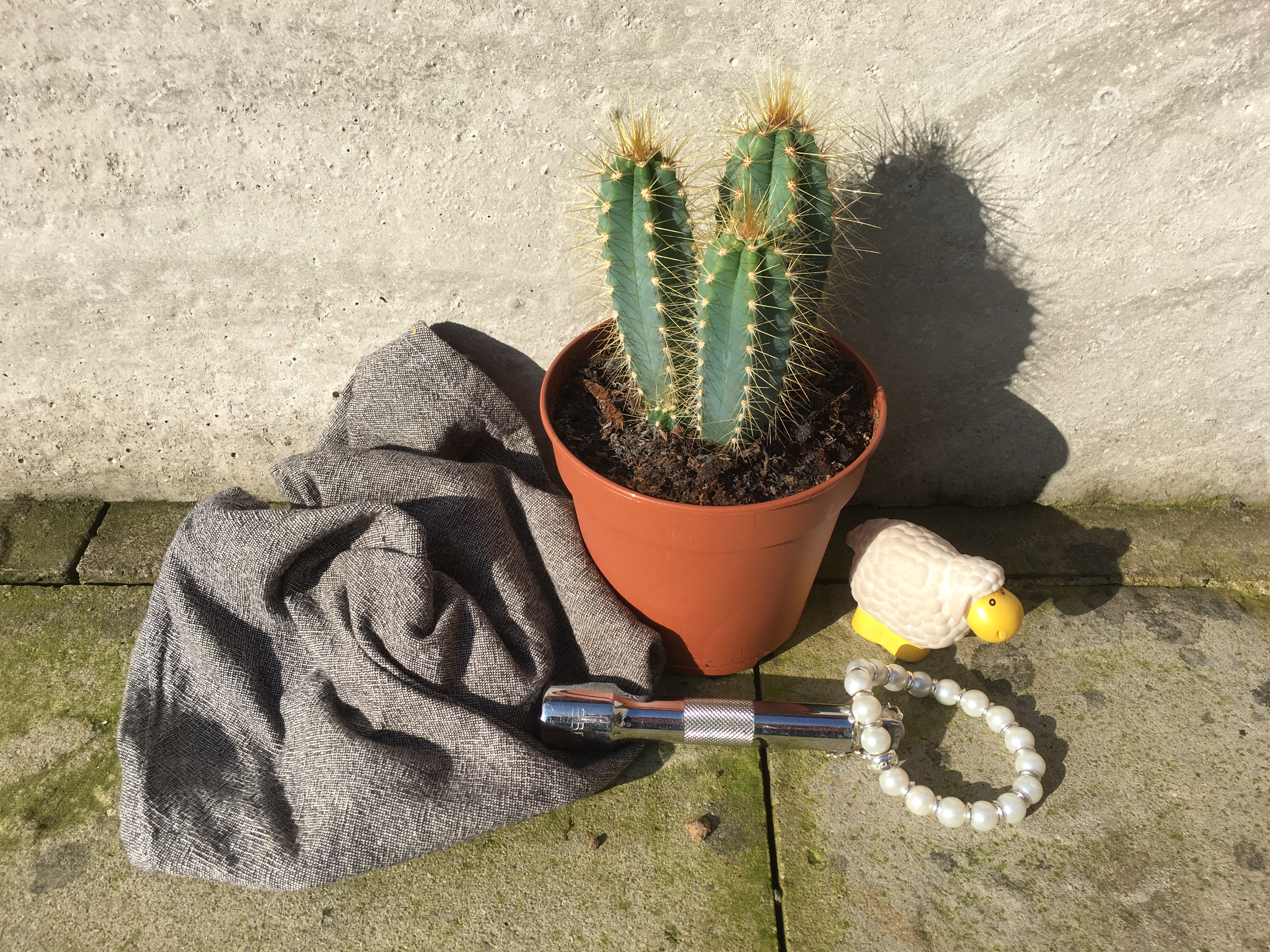
Preliminary Work for Final Piece
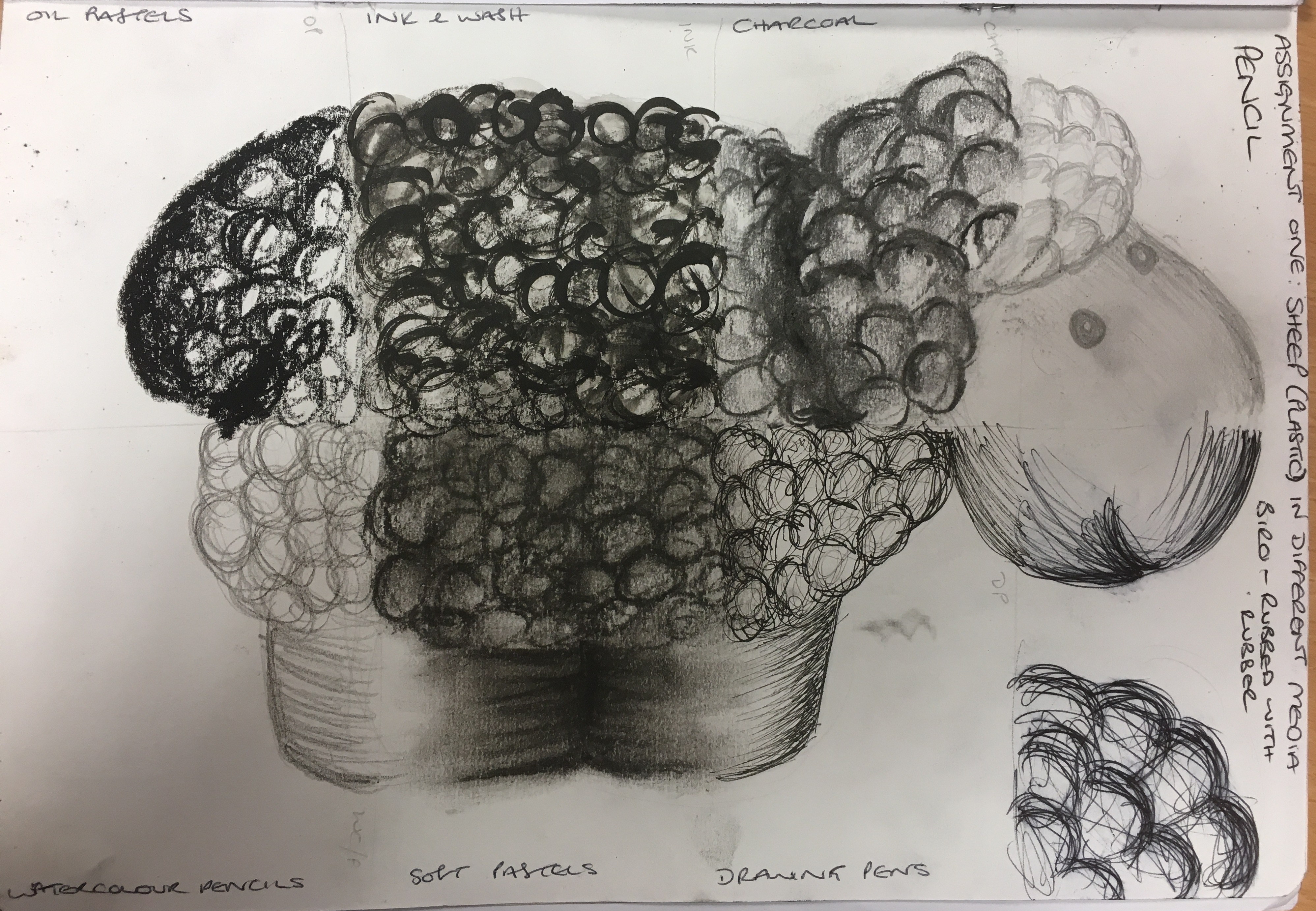
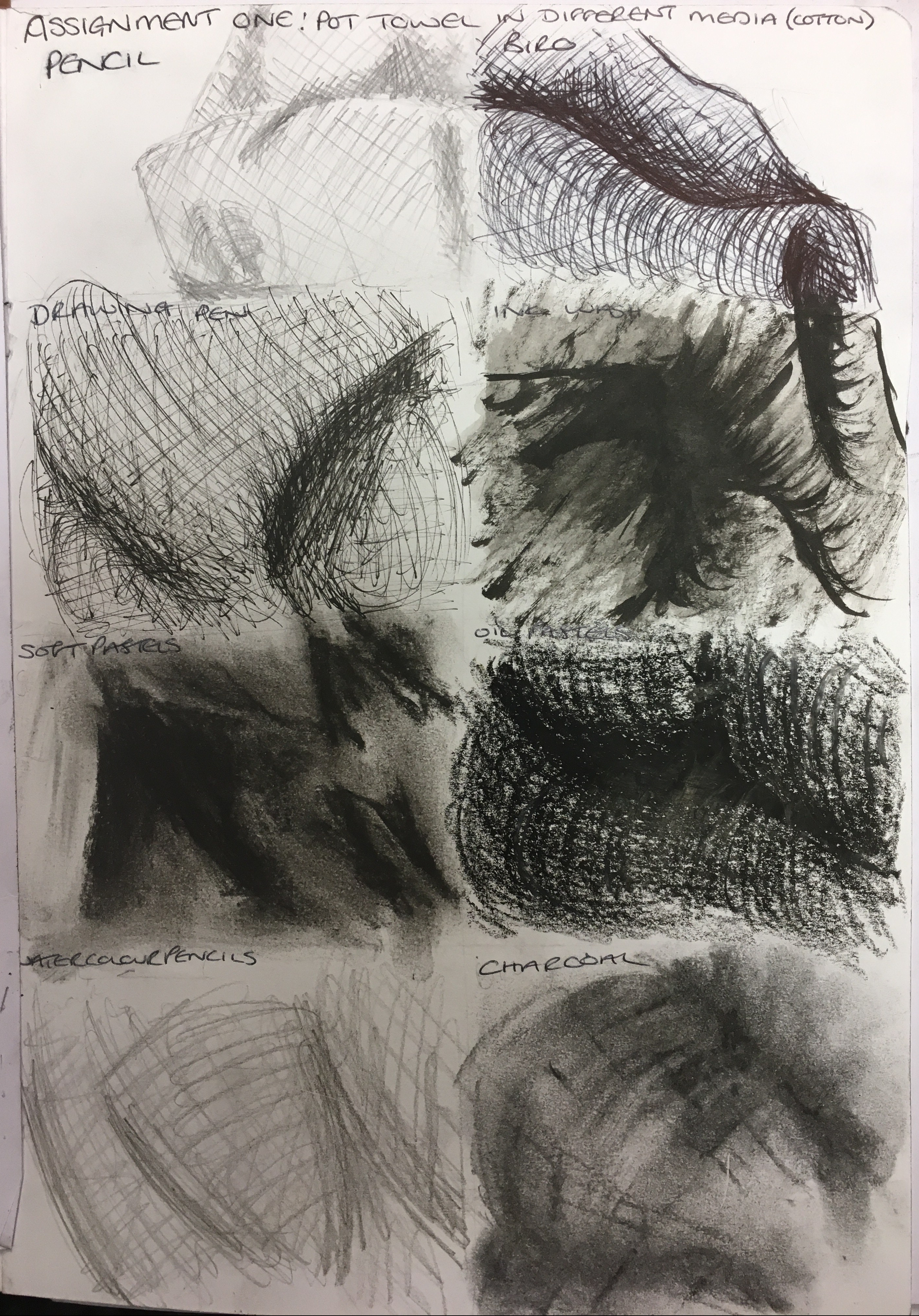
I had settled on several objects which were of significant
importance to me, draw each one with eight different media (pencil, biro pen,
drawing pen, ink and wash, soft pastels, oil pastels, watercolour pencils and
charcoal). I decided on the most
suitable as follows:
Assignment One Group of Objects
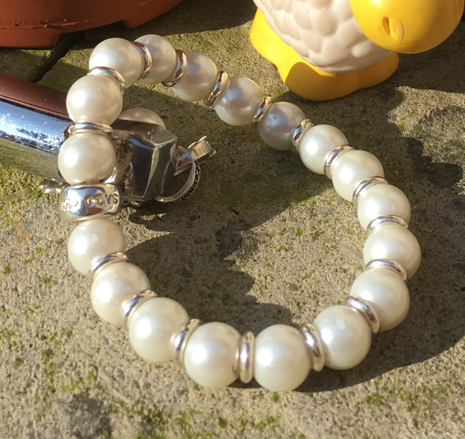
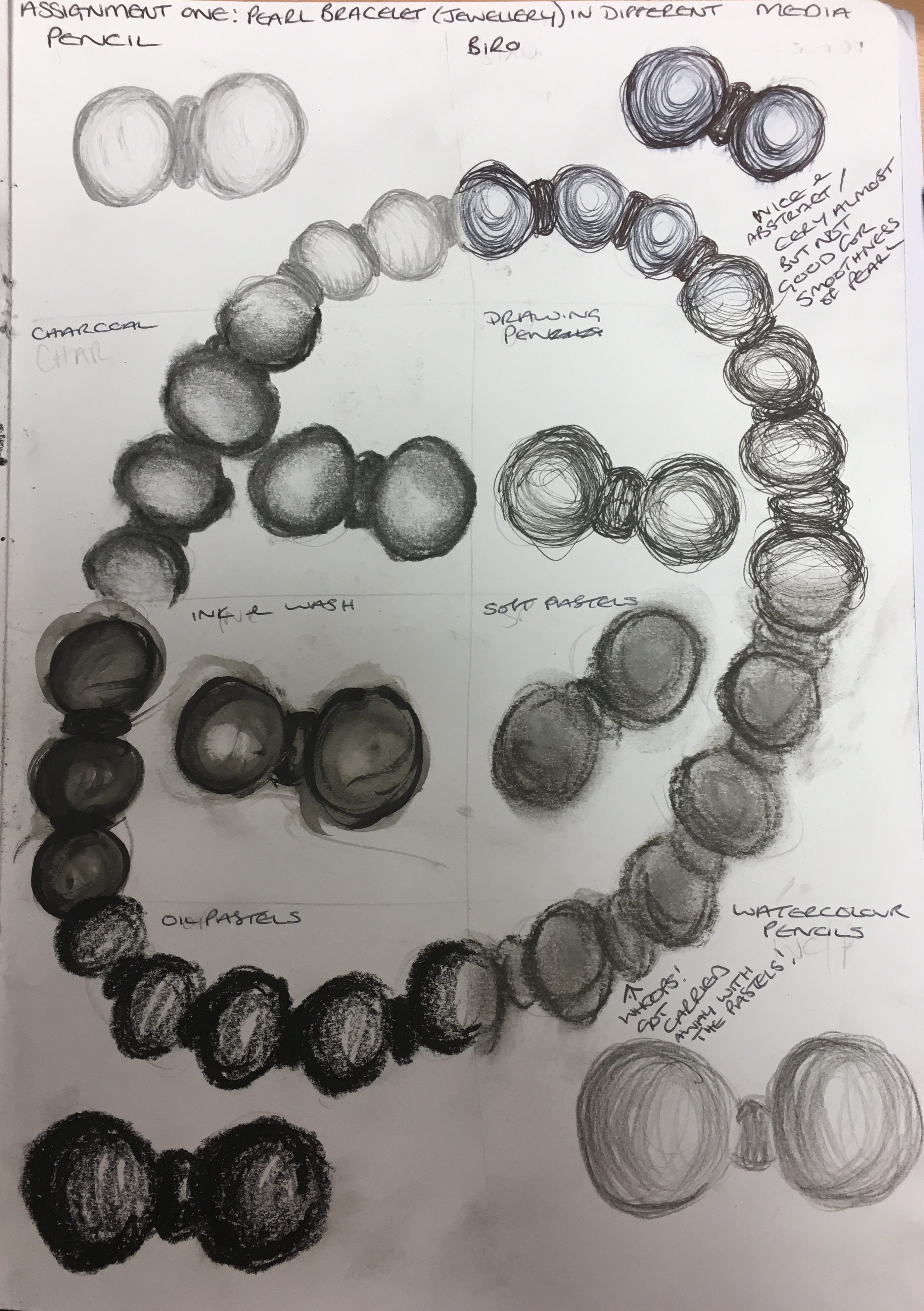
Pearl bracelet: This item represents
myself. I was given this as a gift from
my best friend for my wedding, so my emotional attachment to this object is
very strong. I also like how this object
allows me to attempt to recreate spheres and a pearlized surface. I decided after the mixed-media experiment
that I really liked both the ink and wash and the charcoal to best represent
this object. The charcoal is much more
flexible in recreating the pearlized surface and can also be lifted with a putty
rubber if needed for the lighter areas.
Close-up of pearl bracelet
Pearl bracelet experiment with media
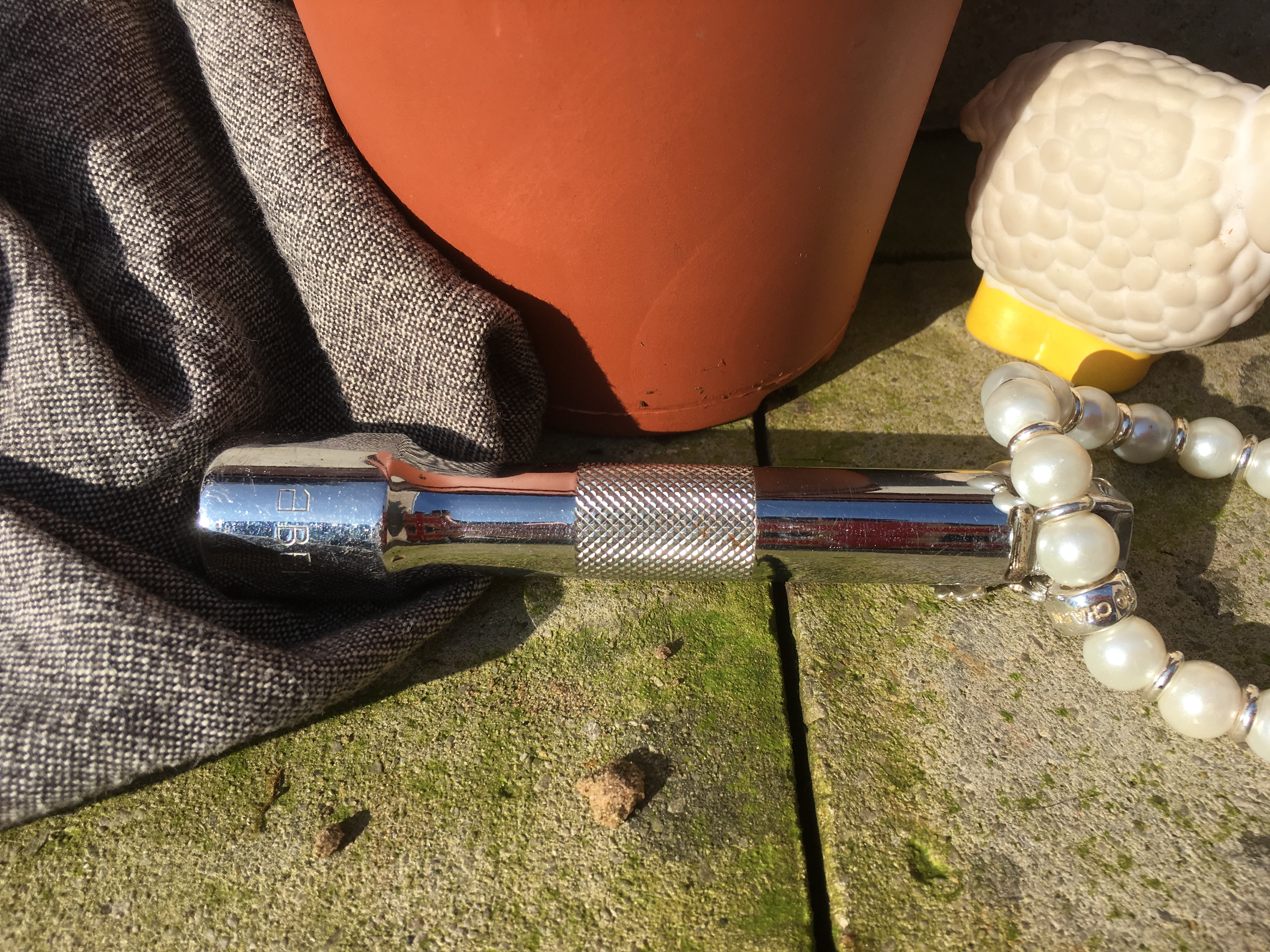
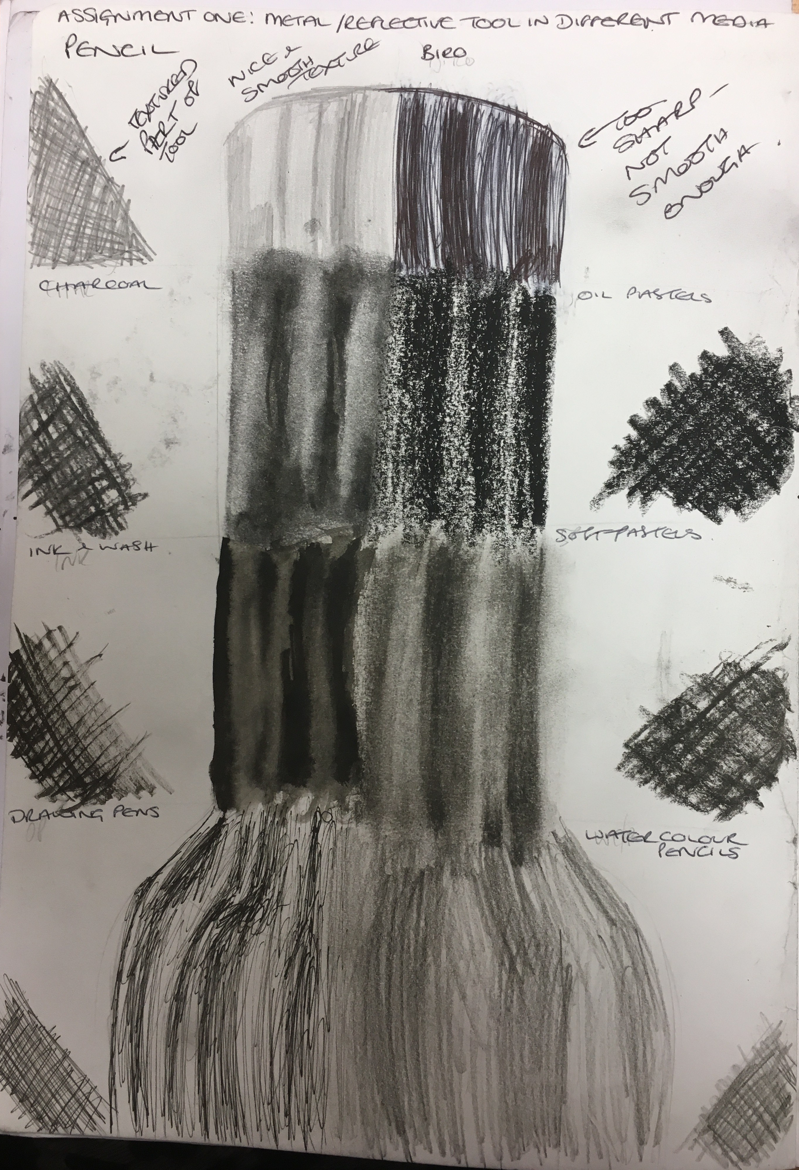
Metal tool: This item belongs to my husband, who
is a mechanic and whose (almost!) whole life revolves around his phenomenal
capabilities with objects such as this.
This object also allows me to recreate a reflective surface, but also
offers a textured surface in the middle section, where I intend to use or
recreate a piece of frottage. My
favourite resulting media for this object was the charcoal and soft pastels due
to their ability to blend and be lifted with a putty rubber as and when needed.
Close-up of metal tool
Metal tool experiment with media
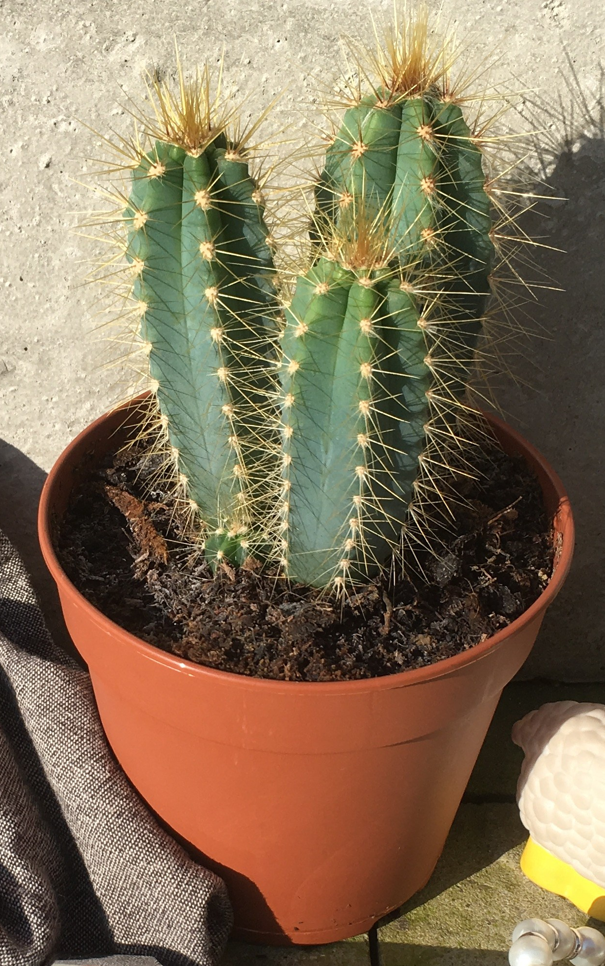
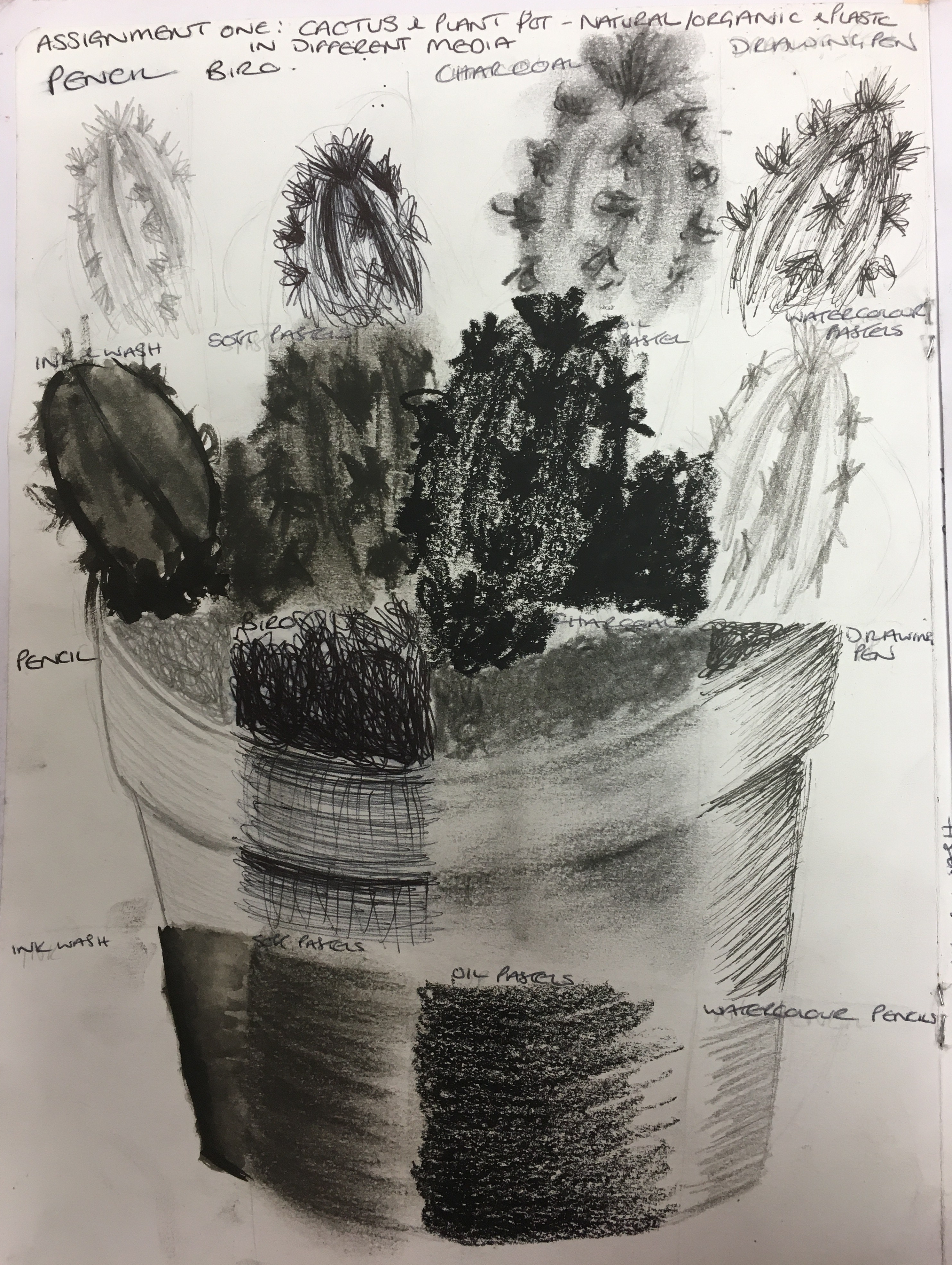
Cactus plant and pot: This object belongs to my
eldest daughter, who has a love of cactuses (possibly because it doesn’t matter
so much if she forgets to water them every now and again! Haha!). For the cactus, I preferred the charcoal and
soft pastel as I felt they gave the object the rough and furry appearance it
holds in real life. I also really like
the drawing pen as this really recreates the spikiness of the plant’s spines
well. For the plant pot, I really liked
the charcoal as it was the best result in creating a smooth, flat (but curved)
surface, but also the messy texture of the soil.
Close-up of cactus and plant pot
Plant pot experiment with media
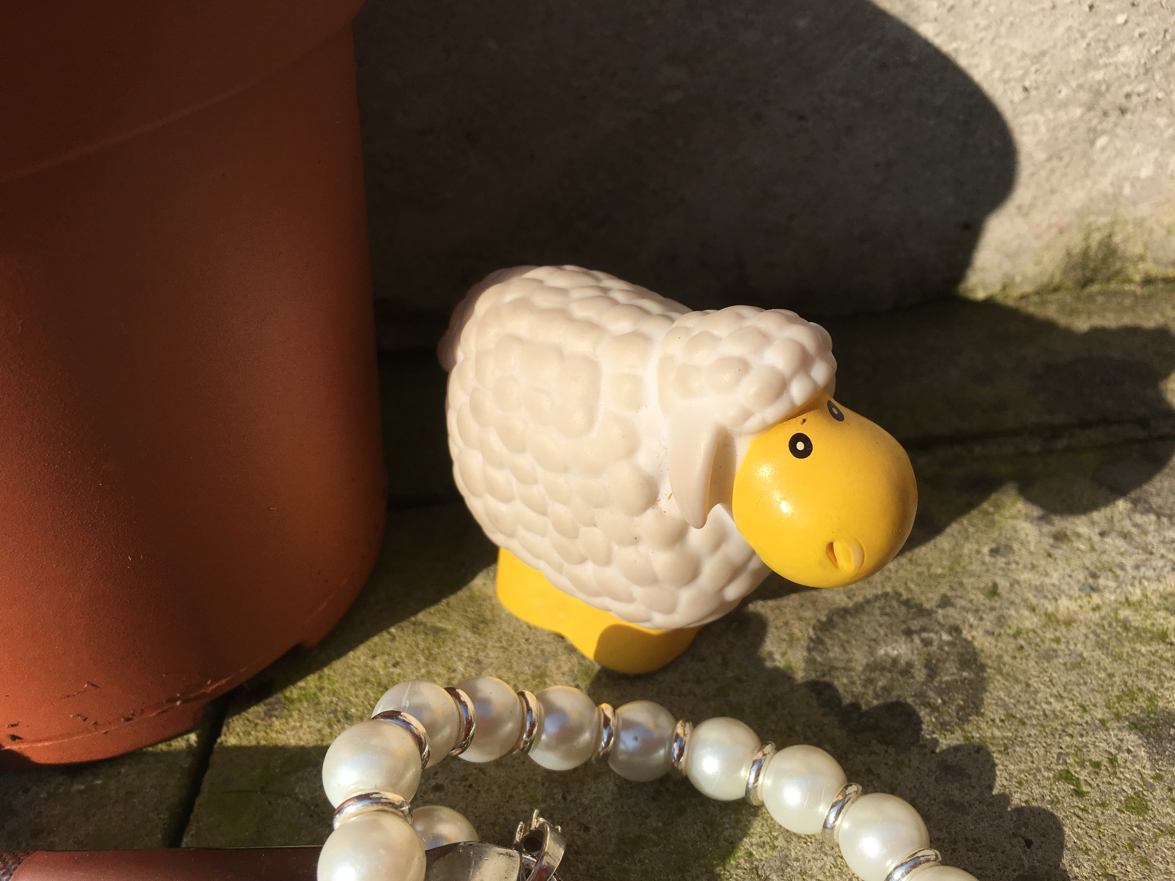
Toy sheep: This object belongs to my youngest
daughter and was her bedtime buddy for a rather long time. I found this object rather difficult to
master with the majority of the media as they all seemed to add texture that
would be present in actual wool, but not in a plastic toy. I decided my favourite media for this was the
pencil and watercolour pencils due to their smoothness. I think, with more time and patience, the
charcoal and soft pastel would also work better as they could be lifted with a
putty rubber to show a reflection of light.
Close-up of plastic sheep toy
Plastic sheep toy media experiment
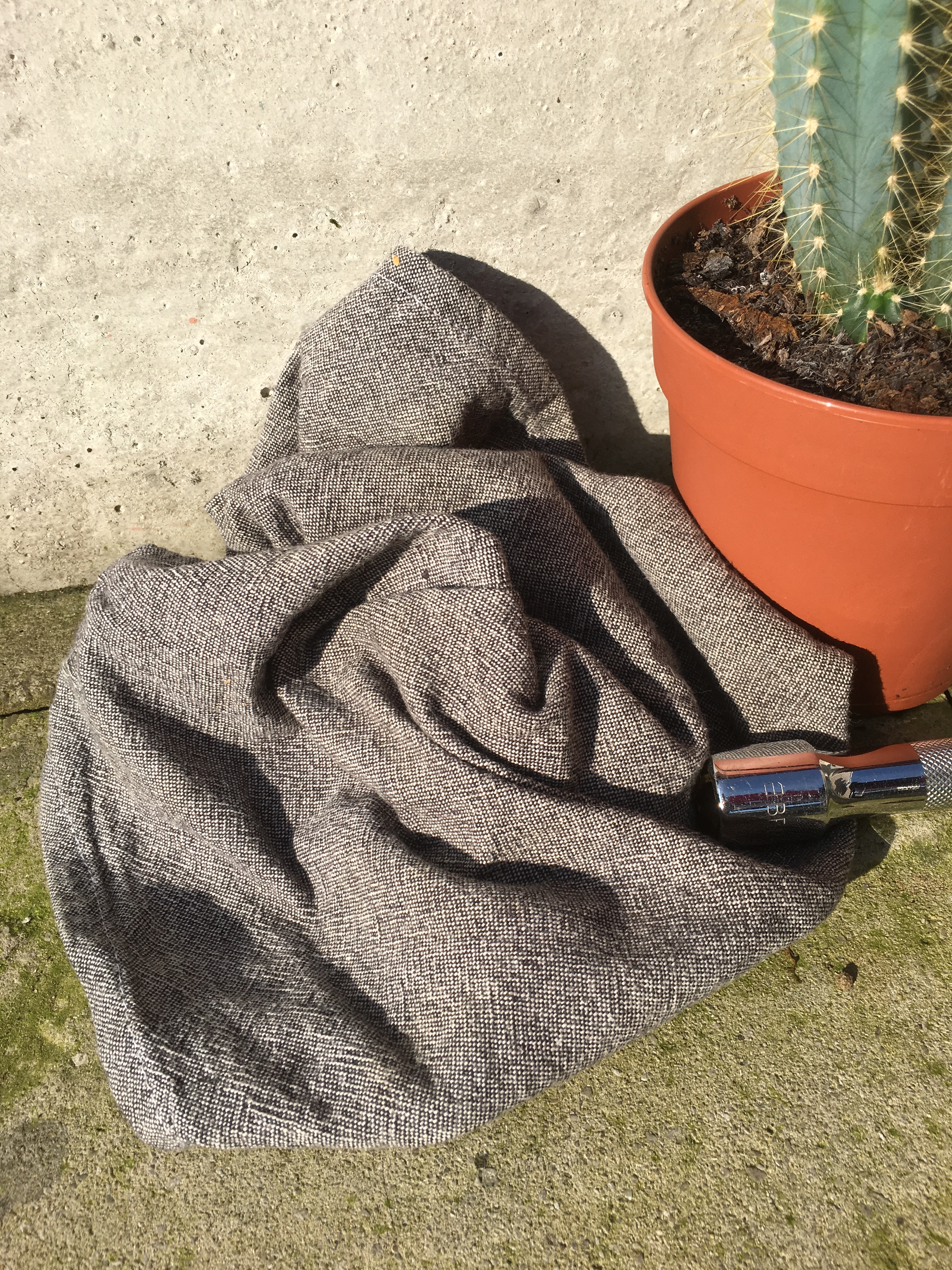
Pot towel: This represents our family home and
life together. Whilst a pot towel holds
no actual significance, I liked that it is a good representation of fabric for
texture and it was just the right size to put alongside my other items. I found that my favourite media for this
object was charcoal as it was the most accurate result. My second favourite media was the oil pastel
due to the white of the background showing through, similar to the actual
object.
Close-up of pot towel
Pot towel media experiment
As a few quick exercises to familiarise myself with the
group of objects before I got to work on my actual final piece, I decided to
attempt some basic exercises I remembered from my school days:
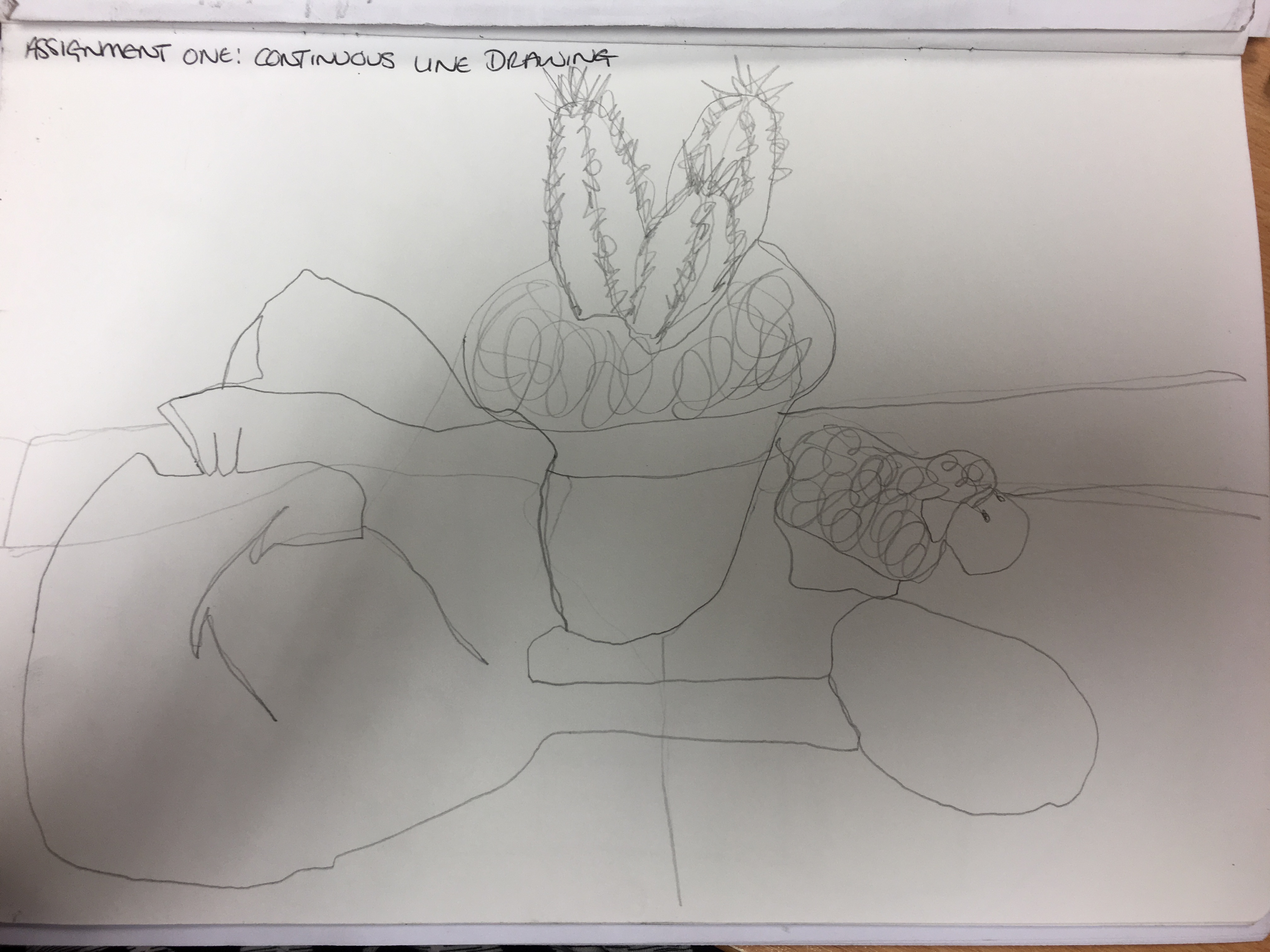
A continuous line drawing: I wanted to practice
my skill of looking without removing my pencil from the page or looking down
and relying solely on my hand / eye co-ordination to reach a final piece. Whilst I think the piece looks like something
my three-year-old could do, I can see my skill of looking is actually improving
somewhat and it is something I will work on more going forward, especially if I
am going to create quick, rough sketches of things which may move position
quickly (such as people in a café etc).
Assignment One continuous line drawing
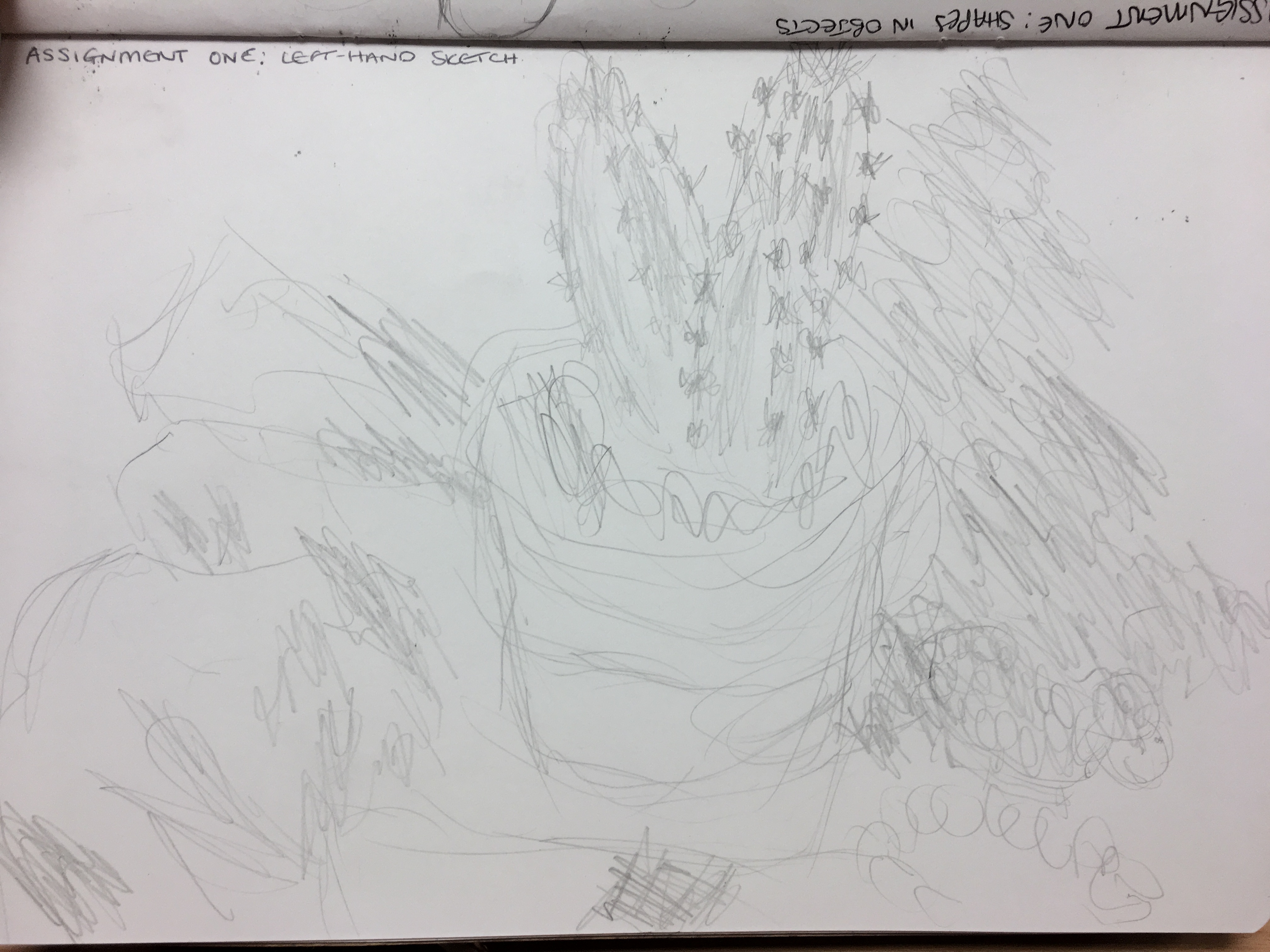
A drawing with my left (non-dominant) hand: I am rather ambidextrous anyway, but I
thought by attempting to use my non-dominant hand, I may be able to remove my
inhibitions and potentially see something with the other side of my brain which
I hadn’t previously seen. What resulted
was actually that I could not really apply any pressure to the piece with the
pencil. I also found that my scaling
ability was rather
Assignment One left-hand drawing
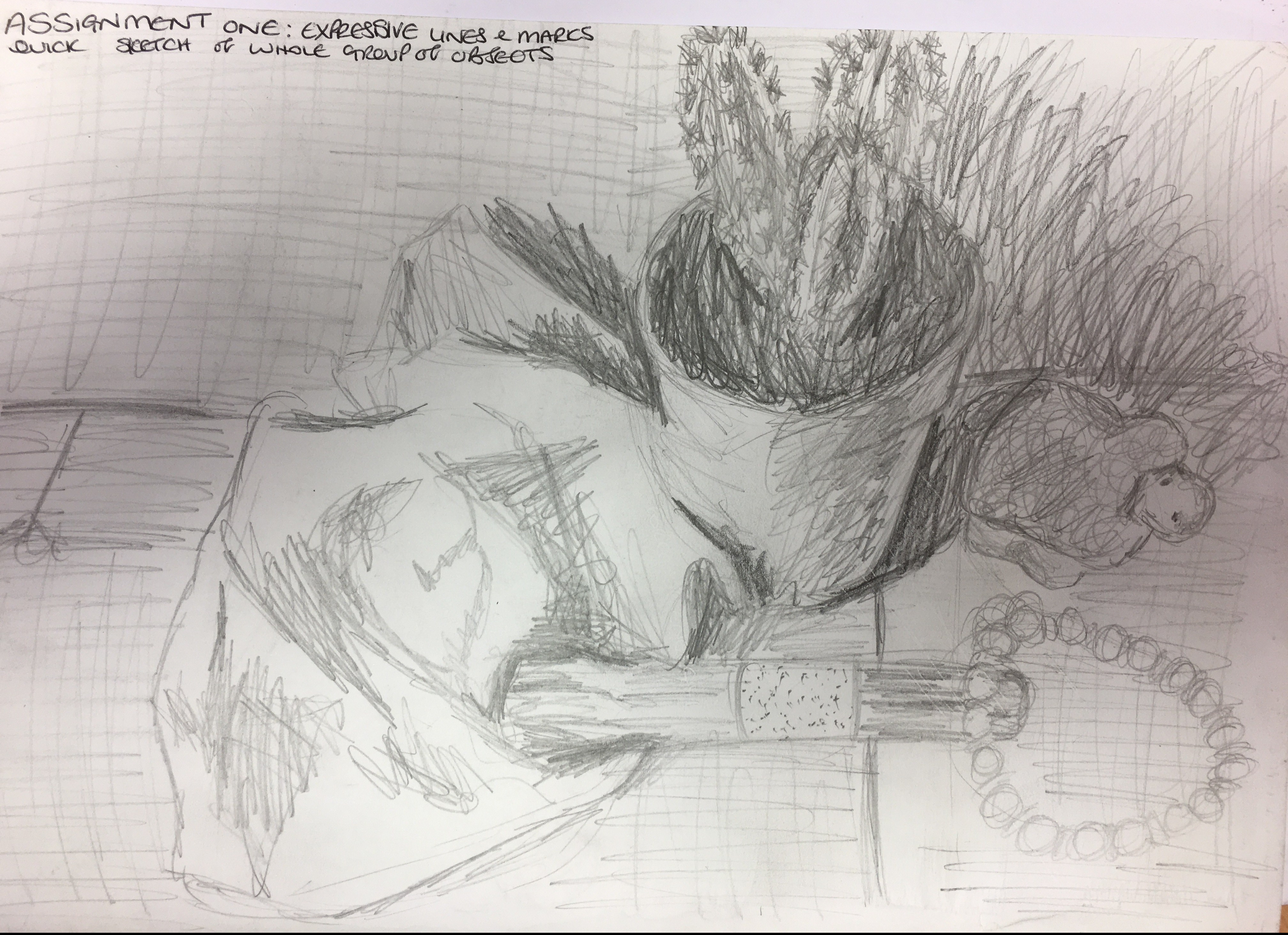
I also drew a ‘normal’ quick sketch of the group of objects,
using very quick, rough marks to highlight points of note in the objects – the
spines on the cactus, the folds in the material and so on.
Assignment One expressive lines and marks quick sketch
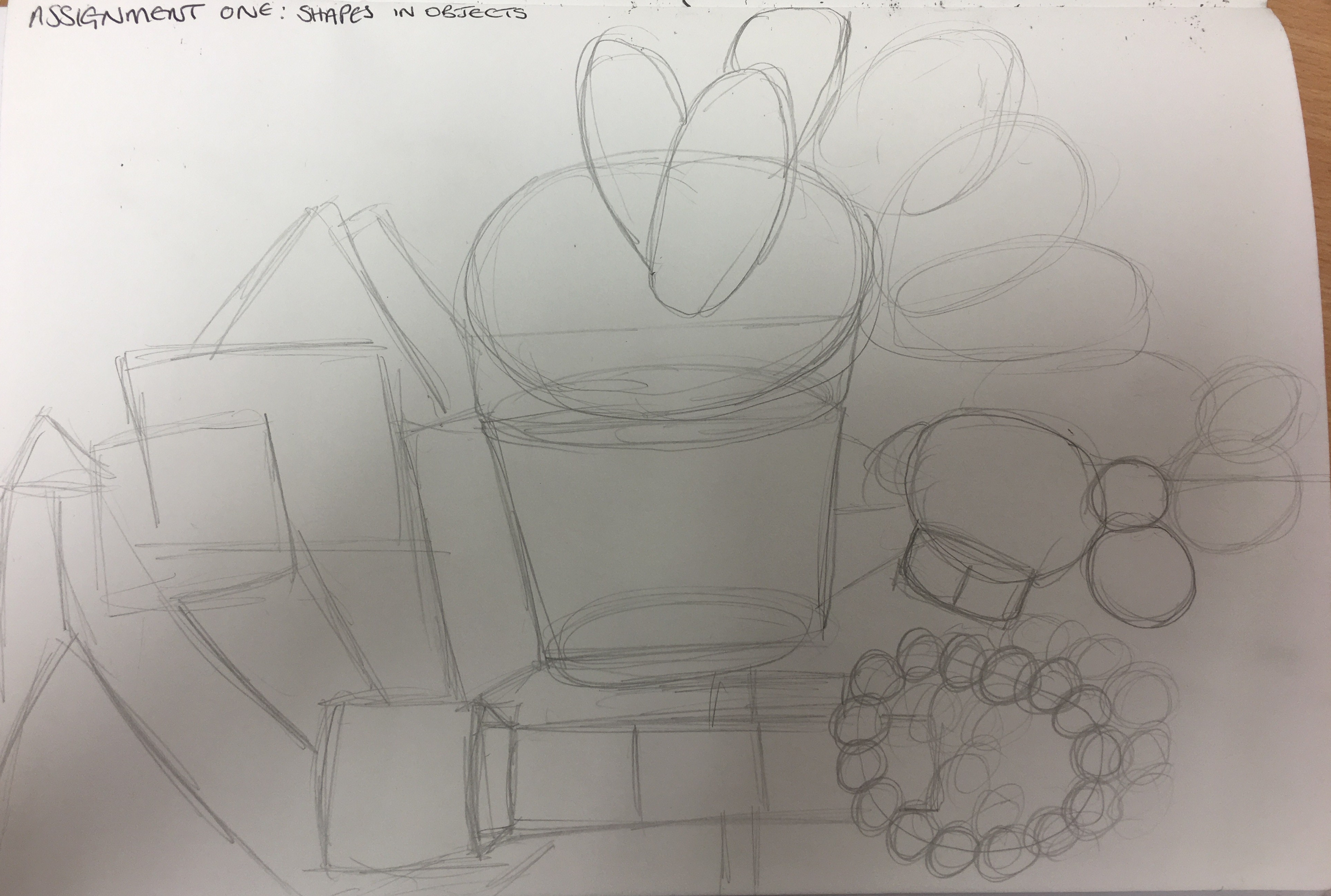
I then created another quick sketch of the basic shapes I could see in the group of objects as a point of reference when completing my final piece.
Assignment One basic shapes seen in group of objects
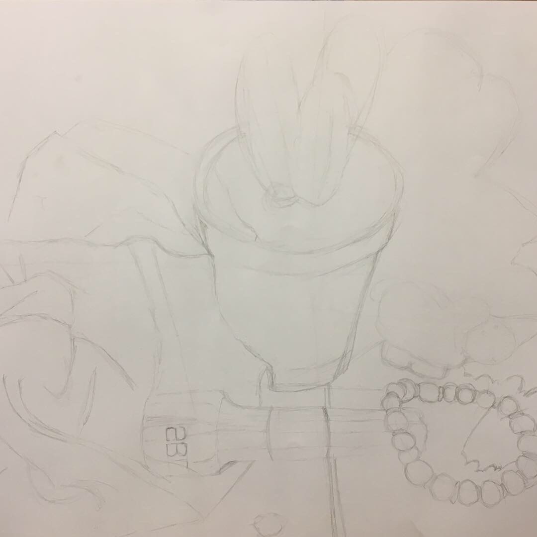
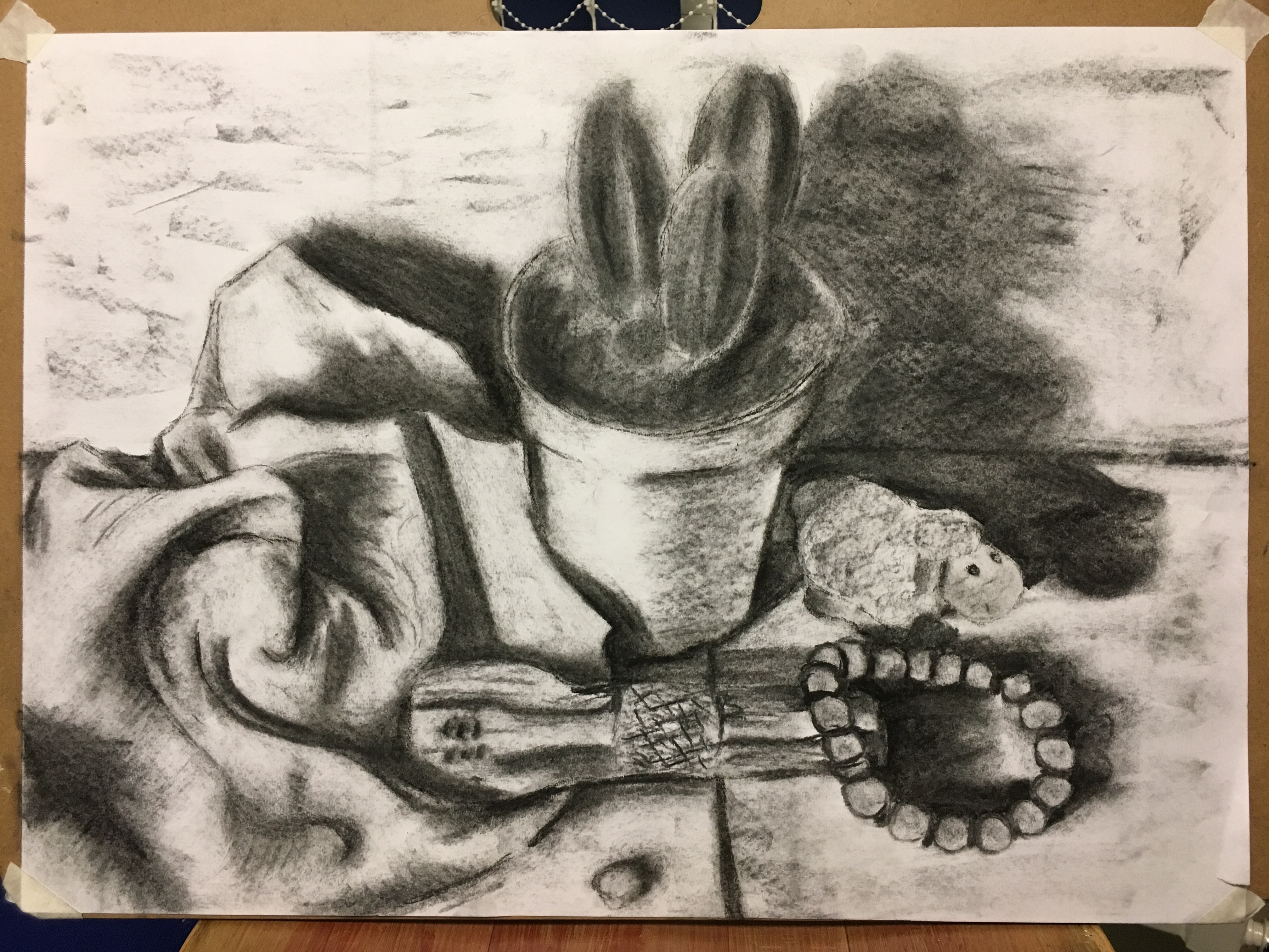
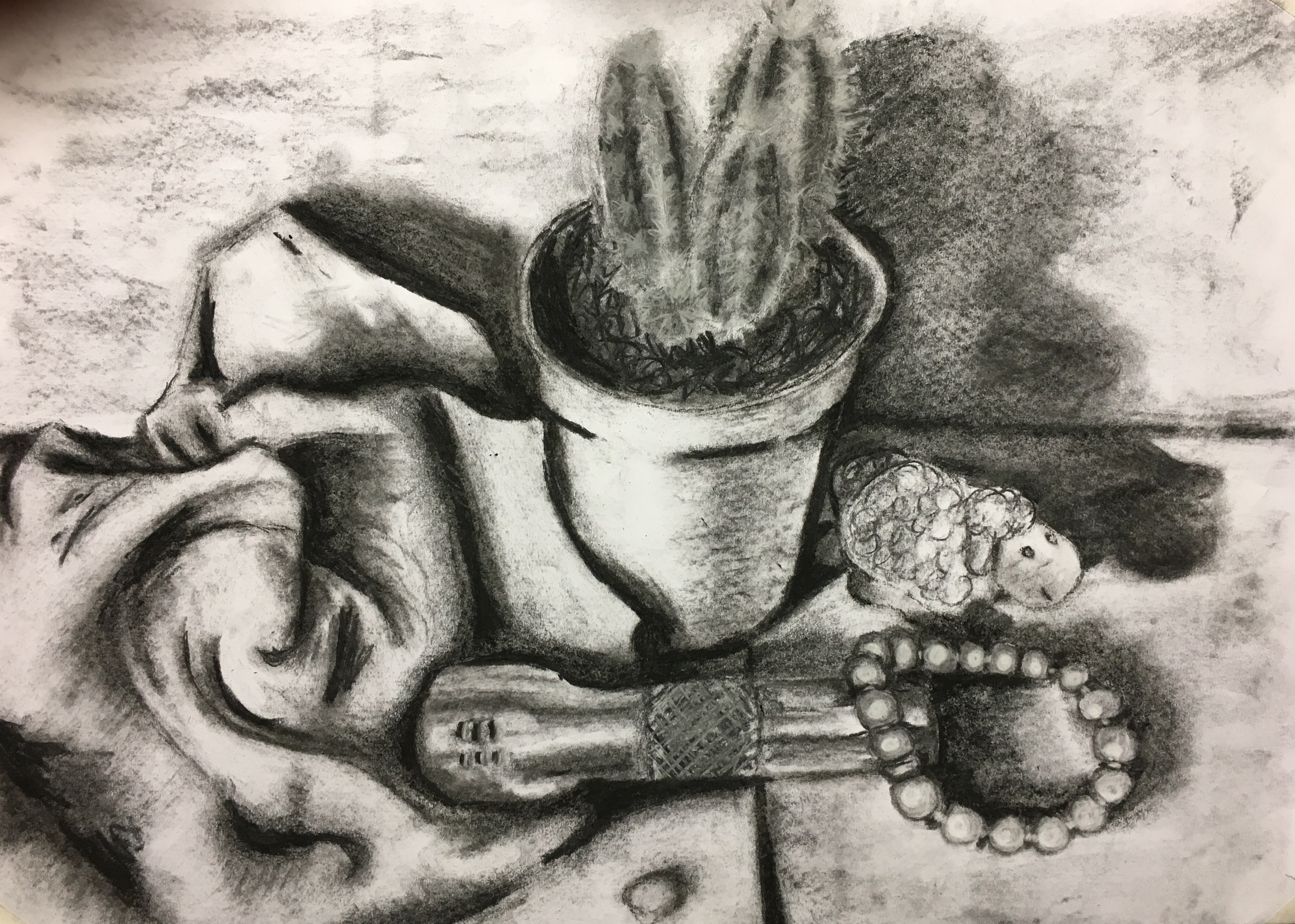
The End Result
I decided to begin my final piece in charcoal as that had
had the best results in my experiments.
I created a sketch of the basic shapes and outline of the piece, then
moved on to creating a base layer of shadows and tone with willow charcoal. Once I had finished that, I worked into the
tone to deepen certain areas with a charcoal conté stick, lift areas with the
lightest tonal value with a putty rubber and also used a white soft pastel conté
stick for such areas as the cactus’s spines due to the ease of control
provided.
Preliminary sketch in charcoal pencil
Base layer of tonal values with willow charcoal
Overall, I think this piece has been quite successful,
however, I think I have misjudged the proportions and scale of the plant pot. I really like how my pot towel worked out and
have found a real passion for fabrics. I
found the metal tool rather hard to recreate due to still not having the best
grasp on working with reflected light, but I think my pearl bracelet and plastic
toy sheep has turned out rather well. I
really enjoyed creating the cactus, but think changing the spines to white
instead of using the charcoal, as I did in my experimental sketch, has lost
some of its structure and realism, although it does create a ‘fuzziness’ which is
apparent in cacti, so maybe it is actually somewhat better than I think?
Assignment One: Finished Piece
Looking at the piece from afar, I think I may have
overworked the darkest tones and, in doing so, have created a cartoon-like
response, which I was determined to try to avoid. Maybe I should accept that that is just my
style of working, but I am determined to improve in this area. I have definitely learned some skills to take
with me into the next part of my course.
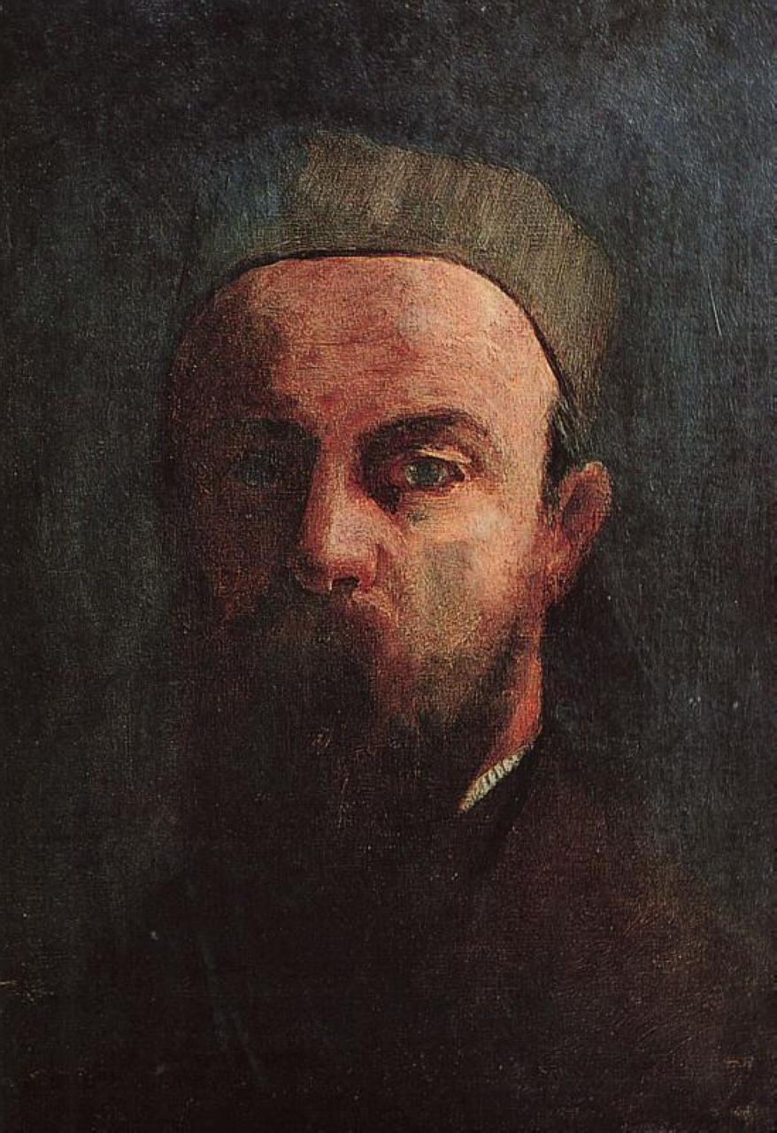
Bertrand ‘Odilon’ Redon was born in 1840 in Bordeaux, France
and died in 1916 in Paris. ‘Odilon’ was
given as a nickname to Bertrand by his mother, whose name was ‘Odile’.
Fig. 1. Self-Portrait (1880)
Redon won several prizes throughout his lifetime, including a
drawing prize at school and the Legion of Honour, awarded in 1903, but was a
relatively unknown artist until 1879, gaining further exposure in 1884 when he
was noted in a cult novel.
Redon was instructed by and studied under Jean-Leon Gerome
(painting) and Rodolphe Bresdin (lithography and etching). Redon enjoyed poetry and was a great fan of
the works of Edgar Allan Poe, with their darkness and sinisterism.
In his earlier years – after being drafted into the army and
the war ending in 1871- Redon focussed solely on working in charcoal and
lithography, and focussing on the contrast and constant battle between light
and dark. He called these works his
‘noirs’ and continued to create this type of work until he was around 50 years
old, creating no more noirs at all after 1900, when he had entered his 60s.
In the 19th century, the Symbolist movement came
into full flow and this shows clearly in Redon’s work with his subtle emphasis
on the spiritual image behind the physical image. Whilst Redon was not a Christian, he was born
during the time of the French Revolution when the Catholic Church was no longer
seen as a legal obligation, allowing other religions such as the Protestant
Church and Judaism to begin to thrive and allowed people with minds such as Redon’s,
to explore more mythical and supernatural philosophies. Redon created a great number of works
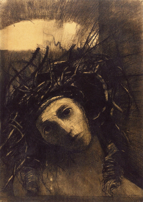
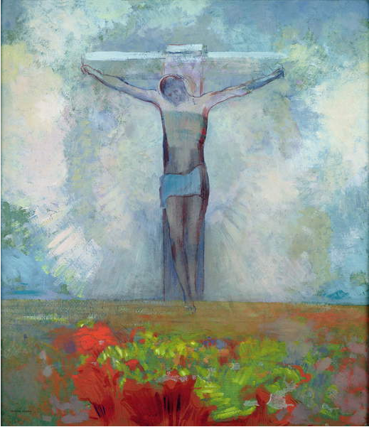
focussing on Jesus Christ, both as a noir and in colour.
Fig. 2. Christ (also known as Head of Christ wearing the Crown of Thorns) (1895)
Fig. 3. The Cruxifiction (c.1910)
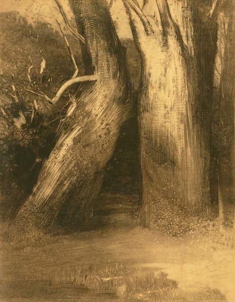
Two Trees, 1875
In 1875, when Redon was in his mid-30s, he created the piece Two Trees. I believe the name for the piece is very fitting as it is literally what you see when first looking at the piece.
Fig. 4. Two Trees(c.1875)
Upon first briefly seeing Two Trees, I was not very moved by the piece at all; I found it rather bland and would have simply carried on walking if I were on the apparent path in the picture, ignoring what appear to be ‘just another couple of trees’.
The piece itself is rather timeless; it could have been
drawn in a woodland somewhere 400 years ago, in Redon’s time or even
yesterday. A woodland’s age moves much
slower than that of other areas of life (i.e. fashion or architecture) which
would be more definitive clues as to the era depicted.
The more I looked at the piece, however, the more I seemed
to become enlightened as to the mystery and sinister invitation behind the
initial ‘normal’ façade. I began to
imagine where the ‘entrance’ between the two trees would take me if I were to
be lured into it; would there be goblins and elves waiting for me? Perhaps a monster or even a parallel
universe? It seemed to whisk me back to
my childhood and fairy-tales of such creatures, I became suddenly enthralled by
the piece and the magic which was hidden beneath the surface. I imagined it as a world in which mere
mortals (as I had been initially) would simply continue past the gap and not
give it a second glance, but those with ‘the sight’ (as I now find myself to
have) would be able to find the hidden entrance between the inconspicuous trees. This excited me and made me feel almost
magically powerful myself! My
inner-child was in her element!
Moving on to the piece’s creation, I think Redon created the
piece outside and that he actually was in front of these specific trees
physically, however, I do think he played with the contrast between light and
dark to emphasise the sense of supernatural and create a more sinister
response. I believe the piece was somewhat
planned to have included the layer of paranormal to it and the result is
perfect.
The piece was created with charcoal and paper. Redon’s skill with the charcoal is fantastic to behold. I really like how he has included what appears to be a little frottage in the piece (in the bark of the trees and the clear dots at the base of the straight tree). Whether these were intentional or not, I am unsure, but I think they add another layer of texture to the piece. Other techniques I can see in the piece are lines and marks going in several directions to show the way the form is moving, blending to create the smooth pathway and stippling (mostly within the leaning tree).
Comparison to Redon’s Other Works
I decided to look into other pieces of Redon’s work and tried to choose pieces from different times in his life, but of a similar composition. I decided on two pieces: Tree and Stars (date unknown, but obviously pre-1900), created in charcoal, and The Barque (1900), created in oil on a canvas.
Fig. 5. Tree and Stars (unknown)
Tree and Stars, at
first glance, appears to be a piece showing a lone tree in an open space slightly
more overgrown than that of Two Trees (perhaps
a marshland?) with several bushes and floating orbs surrounding it during a
late-evening or night-time.
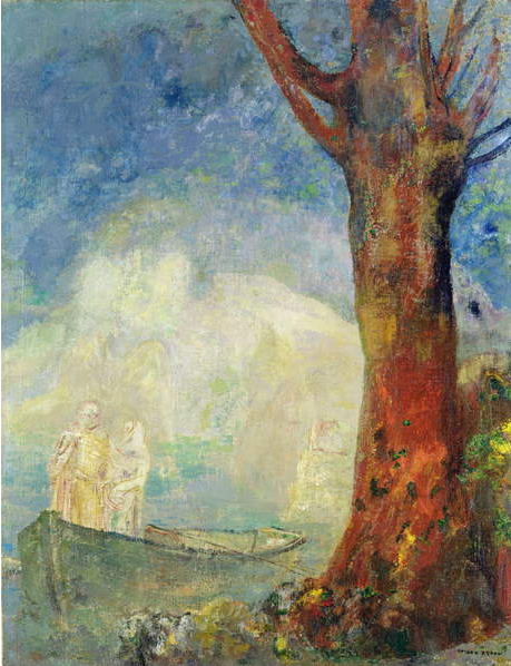
Fig. 6. The Barque (c.1900)
The Barque, at
first glance, appears to show a tree on the edge of the land, surrounded by a
flowerbed, overlooking a body of water (perhaps a lake?) which then fades off
into the skyline. There is a boat in the
foreground with two pale, barely visible passengers aboard during the daytime.
My initial observations of the three pieces and the reason I chose them were how they all contain at least one tree – either leaning to the right or stood tall and straight. I noticed how the straight trees were both located to the right-hand side of the pieces and the lone leaning tree in Tree and Stars was also placed over to the right-hand side. I tried to fathom some reasoning as to this – perhaps it was a hidden message from Redon? Personally, I think it may be an indication of his hand dominance belonging to his left side potentially. I say this as, if you were to actually be the two trees in the image, the tall, straight tree would be the left-hand side and the weaker, leaning tree would be the right-hand side. I also noticed in Redon’s self-portrait that his left-hand side is proudly displayed in the light, whereas his right-hand side is hidden in the darkness – perhaps another indication as to his dominant side? This got me thinking as to what messages I would like to put across to my viewers – whether directly or indirectly – and what I would like people to know about me and my private life that I would not necessarily always say aloud.
All three images seem to have a clear three-way divide also; Two Trees and Tree and Stars both have a sparse background and foreground as well as a cluttered middle-ground, but The Barque seems to create this divide in its colouring – the background is mainly blue, the middle-ground rather white and the foreground very bright and colourful. I wondered whether this was an attempt by Redon to include his love of Japanese art and their technique of splitting images three ways perhaps.
Similar to Two Trees, these two pieces seem rather unremarkable upon first viewing them, but hold more intrigue and mystery the more you observe them. I noticed how Redon has used darkness and light within these pieces in slightly different ways; where Two Trees uses shadow to create the sinister image of an entrance between the trees, Tree and Stars and The Barque appear to focus more on the light to emphasise the magical qualities of the pieces – the ethereal people on the boat and the floating orbs.
I decided to make a list of all similarities and
dissimilarities I noticed between the three pieces and have shown these in the
grids below:
Similarities and Dissimilarities
Two Trees
Tree and Stars
The Barque
Pre-1900
Pre-1900
1900
Two trees: leaning tree (left) and tall, straight tree
(right)
One tree: leaning tree (right), no straight tree
One tree: no leaning tree, tall, straight tree (right)
Focus drawn centrally to the trees and the dark space
between them
Focus drawn centrally / right-hand side to the leaning
tree
Focus drawn to the right-hand side to the bright and
colourful tree
Open expanse to the foreground and background, busy
middle-ground
Open expanse to the foreground and background, busy
middle-ground
Open expanse to the background and slightly to the
middle-ground
Daytime – to create a false sense of security and peace in
the mystical setting?
Night-time – to create a false sense of eeriness when the
stars actually appear so gentle and peaceful?
Sunset? Representing the approaching end of the ethereal
couple’s time on this plane?
Texture created by lines
Texture created by lines
Texture created by colours
Bushes but no flowers
Bushes but no flowers
Flowers and slight greenery
Two apparent directions: from the bottom left and top
right, but no obvious source seen in the piece
One apparent direction, but no apparent source
One apparent light source from a setting sun in the
background
No supernatural beings or objects visible in the piece,
only what is conjured in the mind’s eye
Ethereal floating ‘heads’ which must represent the
stars? One of which appears to be
glowing, as informed by the lines moving outward from it in a circle around
it. I think this confirms the
suspicion of it being a star.
Ethereal beings on the boat which are not immediately
clearly visible when first viewing the piece but become clearer upon closer
inspection. The beings appear to be in
conversation with each other and rather closely located given the apparent
space in the boat. One appears to be a
male and the other a female, so I believe this represents a married couple
perhaps making their way to the next life / plane?
Monotone and subdued colouring focussing on the contrast
between light and dark as opposed to colours.
The darkness between the two trees is, I feel, in competition with the
two trees as to the main focal point of the piece.
Monotone and subdued colouring throughout, offering little
assistance in finding the viewpoint of the tree besides from its
physical-being. The stars, even though
in contrast to the darkness, appear somewhat subdued and do not immediately
jump out as a main focal point. This
also adds to their intrigue as, as with the Two Trees, humans would not immediately see the mystery of the
stars.
Vibrant colours within the forefront with slightly
mellower colours in the background.
The figures are very subdued and are clearly not meant to be the first
focal point before the vibrant tree. This adds to their intrigue as, as with
the Two Trees, humans would not
immediately see the magic within the piece.
Overall, I really like the three pieces. I am more drawn to Redon’s earlier work, with
its darkness and moodiness as opposed to his later almost happier and eerily
peaceful works, almost as though Redon had moved along a sort of spectrum
throughout his life’s journey. Whilst I
do not know for sure when the Tree and
Stars was created, I believe it must have been either around the time of
the Two Trees or maybe not too long
after it, as it still has the same eeriness, however, it seems less sinister in
its outcome, leading me to believe, perhaps, that he created it toward the more
peaceful part of his life, if continuing along the train of thought regarding a
spectrum. I think Redon’s work may
indicate a potentially troubled childhood and fear of the world – he did, after
all, endure a war – moving more towards a calmer sense of being towards the end
of his life. Whilst I do not think his
appreciation for all things dark and mysterious ever left him, I think he may
have found some inner peace towards the end and that perhaps the two people on
the boat were meant to represent him and his wife and how they had come to
terms with the mysteries of the world and would welcome the next adventure with
open arms.
Moving Forward…
I definitely want to create some pieces with Redon’s work in
mind – adding a touch of the sinister and darkness to my own work – and it is
definitely something I want to experiment with further down the line in my
journey.
List of Illustrations
Figure 1. Redon, O (1880) Self-Portrait [Oil on canvas] At: Wiki-Art (Accessed on 19 February 2019)
Figure 2. Redon, O (1894-1895) Christ (also known as Head of Christ Wearing a Crown of Thorns) [Drawing – Charcoal] At: The Athenaeum(Accessed on 19 February 2019)
Figure 3. Redon, O (c.1910) The Crucifixion [Oil on card] At: Bridgeman Education (Accessed on 19 February 2019)
Figure 4. Redon, O (c.1875) Two Trees [Charcoal on paper] At: Bridgeman Education (Accessed on 19 February 2019)
Figure 5. Redon, O (unknown) Tree and Stars [Charcoal] At: Bridgeman Education (Accessed on 19 February 2019)
Figure 6. Redon, O (c.1900) The Barque [Oil on canvas] At: Bridgeman Education (Accessed on 19 February 2019)