
Ancient Depictions
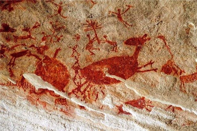
Fig. 1. Serra da Capivara (unknown) 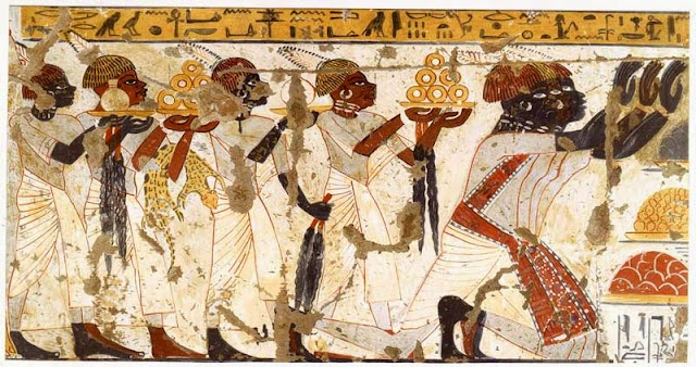
Fig. 2. Ancient Egyptian Art (unknown)
The human form has always been of great interest to artists. In very early times, cavemen would draw images depicting humans with tools mid-hunt, the Ancient Egyptians would depict humans to record stories of real-life events and of their religious beliefs. The Ancient Greeks would create statues of their gods, but also of athletes and other notable beings. They would also depict people on vases to tell stories. Even before this time, the ancient Chinese people would create collections of terracotta soldiers to protect their deceased emperors in the afterlife.
Religious Depictions
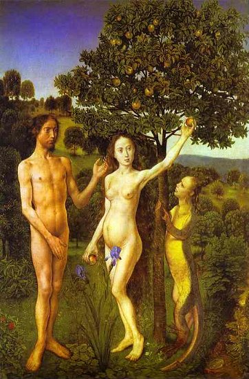
As time passed, opinions regarding the use of the human form in art changed with the differing beliefs and priorities of the times. A very common choice as a subject was Jesus Christ, who has been depicted in many ways throughout history and has often been the leading piece of several infamous artists’ bodies of works. Adam and Eve were also the subject of many famous pieces, mostly in their moments of weakness and their expulsion from the Garden. A lot of these works were commissioned by religious bodies to help people who were not able to read the Bible themselves, so these works would tell the stories for them.
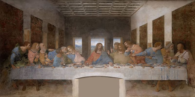
Fig. 4. Da Vinci, L The Last Supper (c.1495 – 1498)
Depictions of Beauty
The idea of what makes a person ‘beautiful’ is shown within pieces from different eras in many diverse ways; for instance the larger, more voluptuous figure was once seen as a symbol of wealth due to the availability of food, thus increasing the beauty of the sitter. One’s skin tone has largely been a symbol of beauty, with a history of people trying to whiten their complexion with powders and even drawing in blue veins to increase the illusion of the skin’s translucency. Both of these things would not be generally classed as typically ‘beautiful’ in today’s day and age, with people seeking a more sun-kissed and slender look as their ‘ideal’.
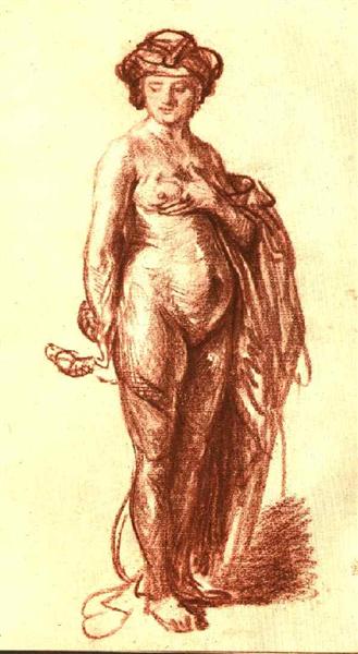
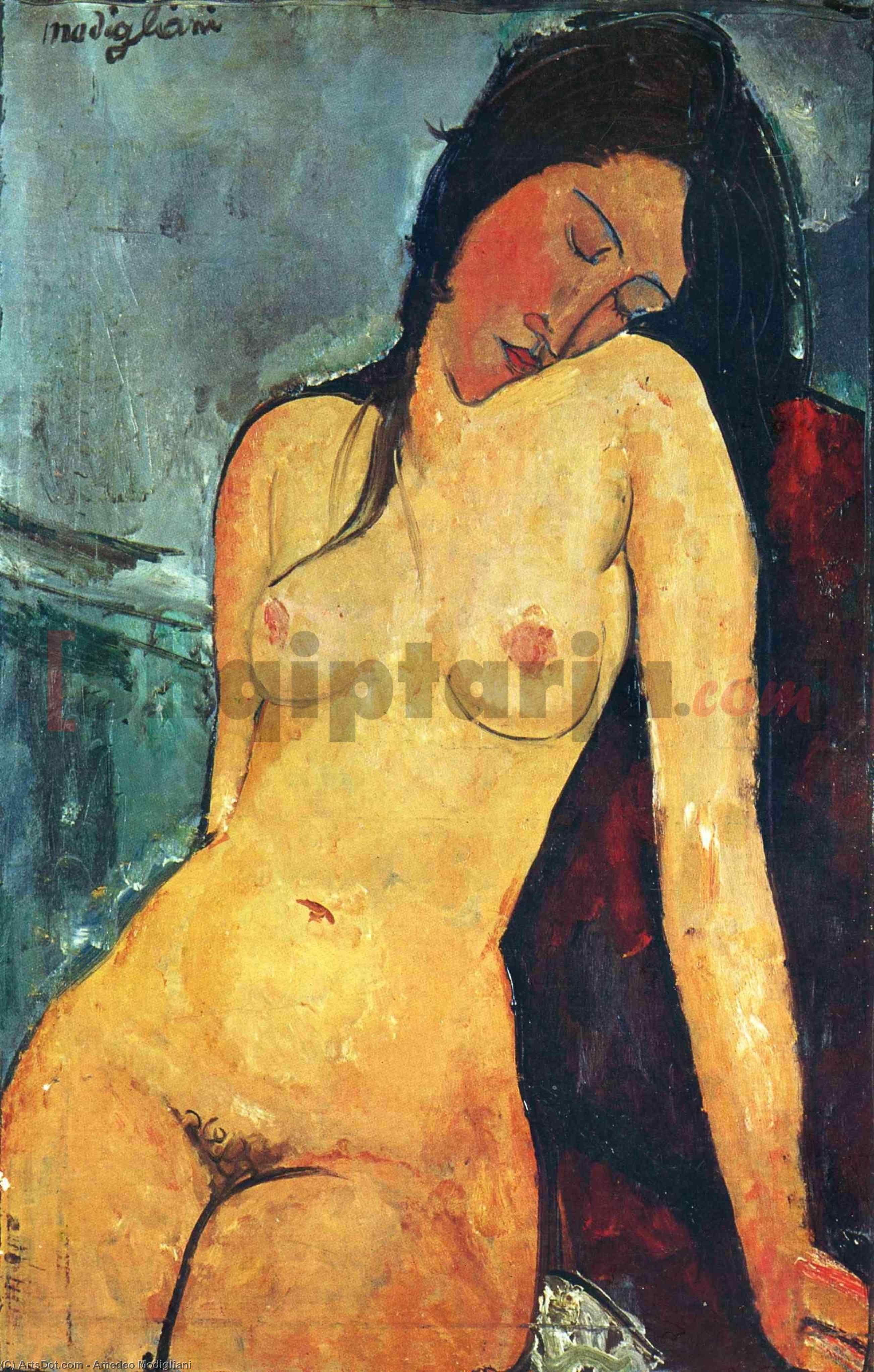
Fig. 6. Modigliani, A Seated Female Nude (1916)
It is interesting to me to see what is deemed beautiful in one country is often completely different in another, as can be seen in this article which I read several years ago, but which has been of interest to me ever since.
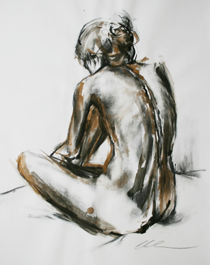
I really do like this piece compared to the rest due to the differentiation between the pressures of the charcoal for different areas, such as the dark and heaviness around the back of the neck (the place of most shadow) and then the delicate whisps of shadow to show the underlying ribcage. Whilst very neutral in its place in time, I think the gold really sets the piece in the here and now due to there being a real demand for the marble effect and the gold touches in respect of today’s fashion and interior design preferences, which I think is actually rather clever of the artist. Whilst my tutor has advised me against using colour, I wonder whether this would work should I try it since the artist has only used the one hue? It is also interesting that Grossman chose to combine the softness of the charcoal with the solid colouring of the gold.
I also came across a video showing the gradual change in perception of the perfect form:
I am really intrigued by the fact that the female form has been much more scrutinised throughout history than the male form; the female, I feel, has had to adapt to suit the times and the desires of the male throughout history, whereas the male has almost always been seen to be ‘beautiful’ when muscled and chiseled.
Looking at the pieces I have chosen to include in this research, I admit I found it rather difficult to find hardly any works from earlier times which matched my style of working; the figures were generally in colour and almost precise in detail. Besides the piece I found by Rembrandt, there does not appear to be much in a similar approach to this from these times. AS we move forward in time to the 20th Century, however, it becomes more apparent that artists were now not so focussed on the realistic aspect of their pieces, as opposed to a more expressive approach, as shown in Modigliani’s piece above. This piece is still rather reserved with having a main outline of the general shape of the body and, again, using rather traditional colourings, however, when we look at the piece created by Grossman, the lines are much more expressive and better suited to my style of working.
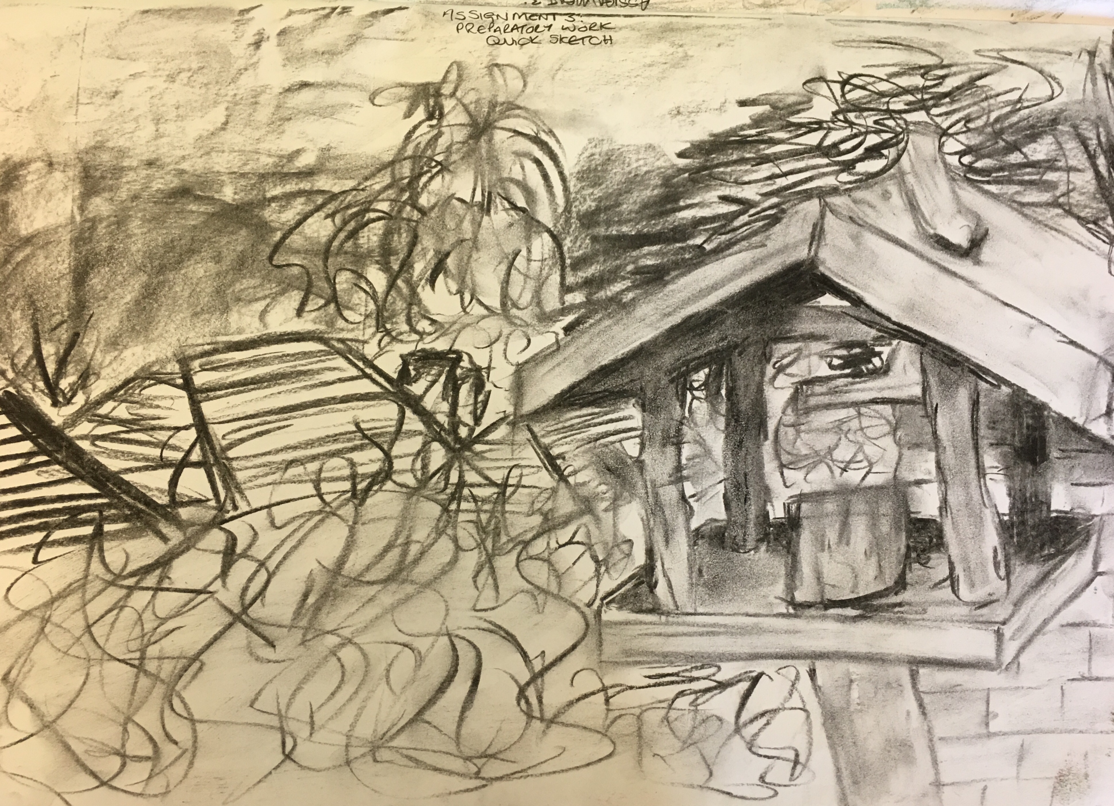
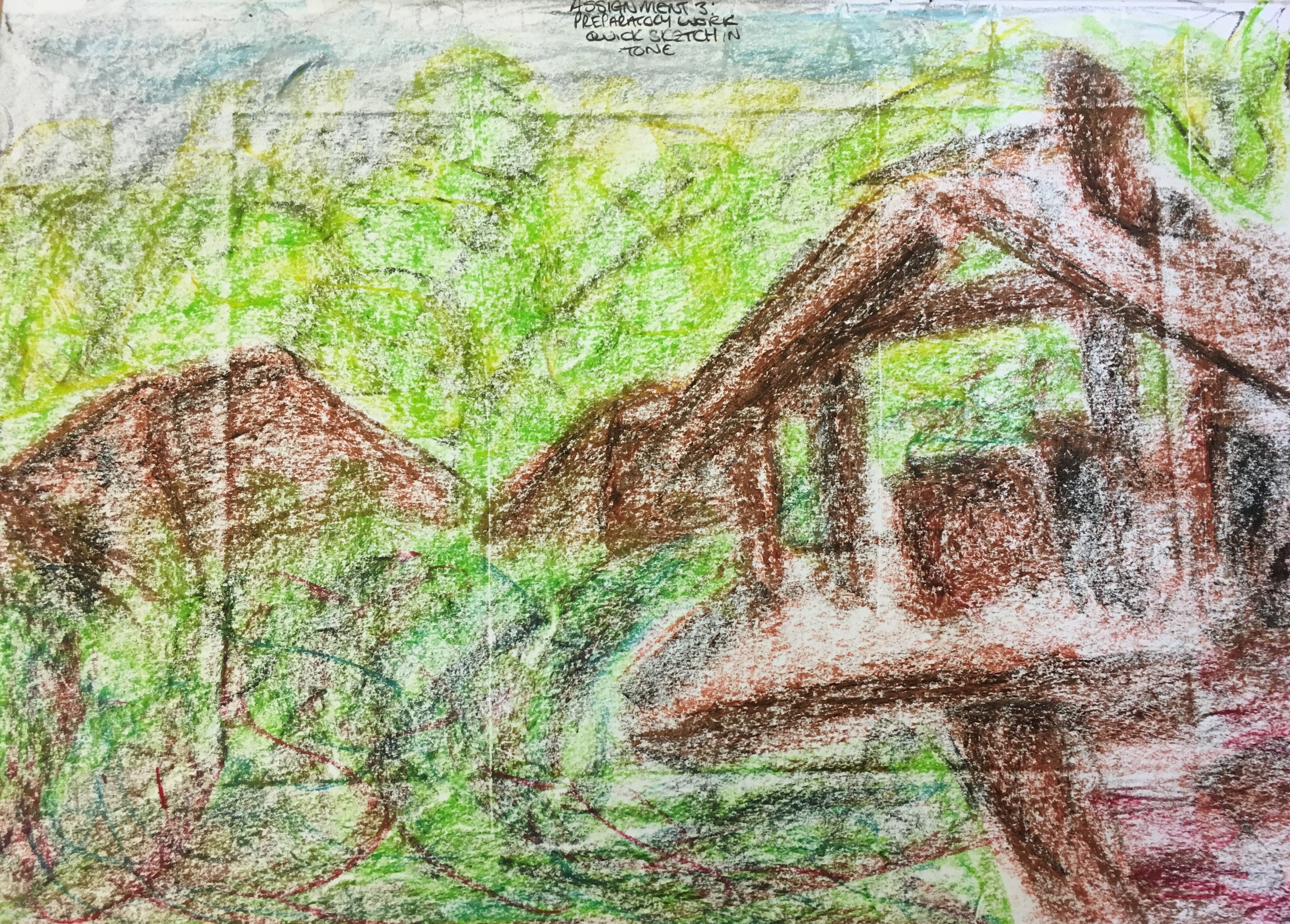
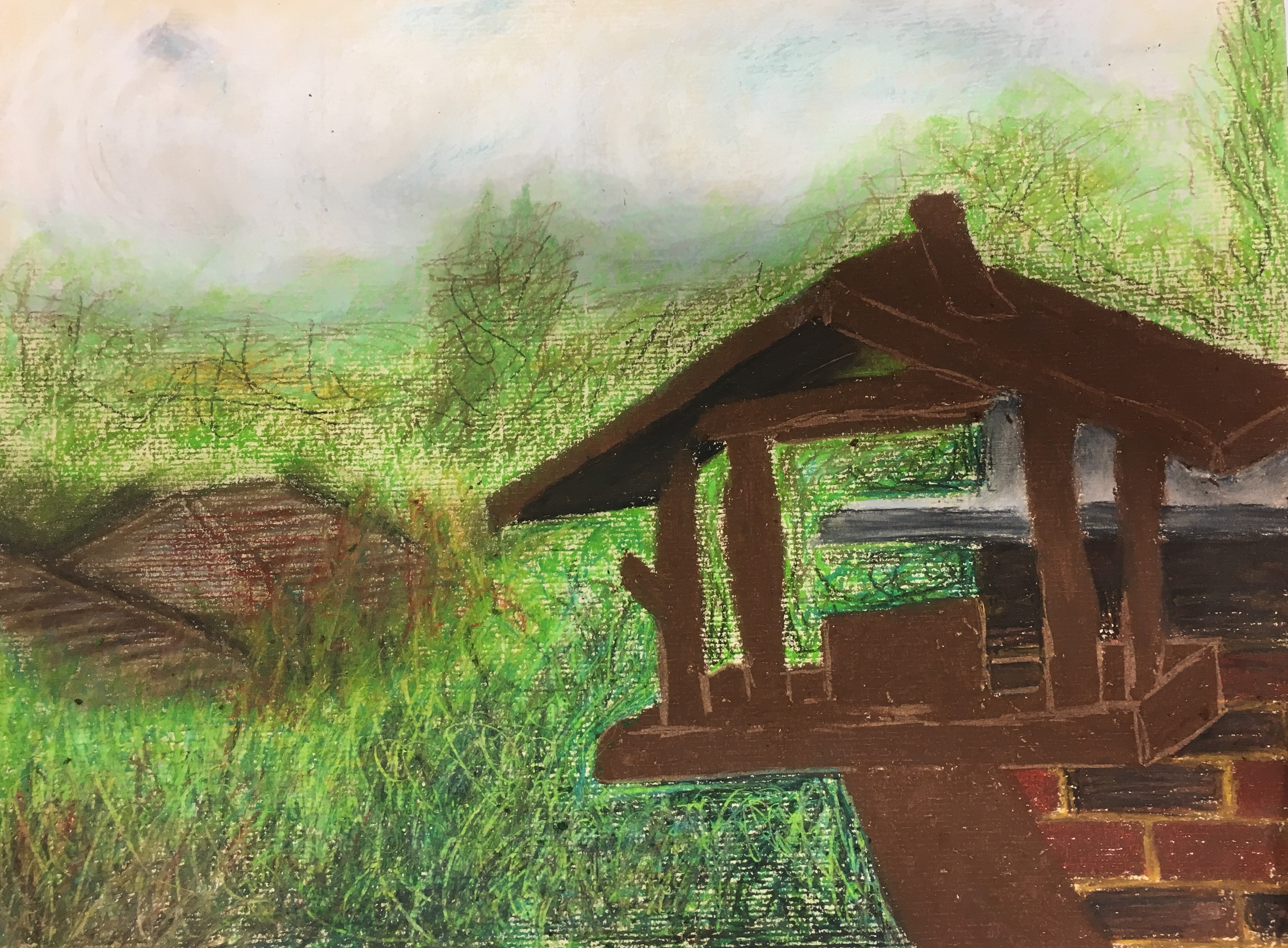
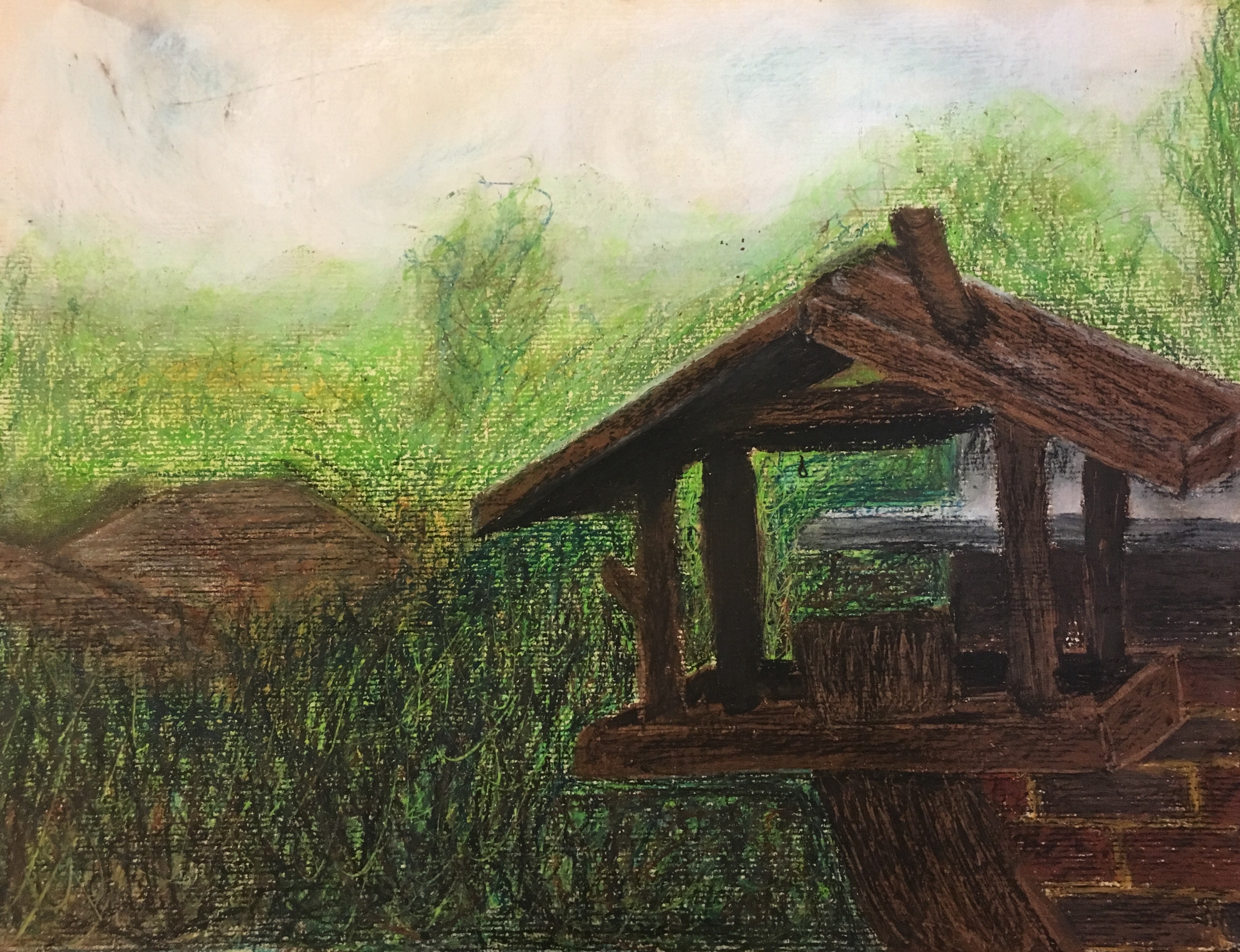
Own Interpretations
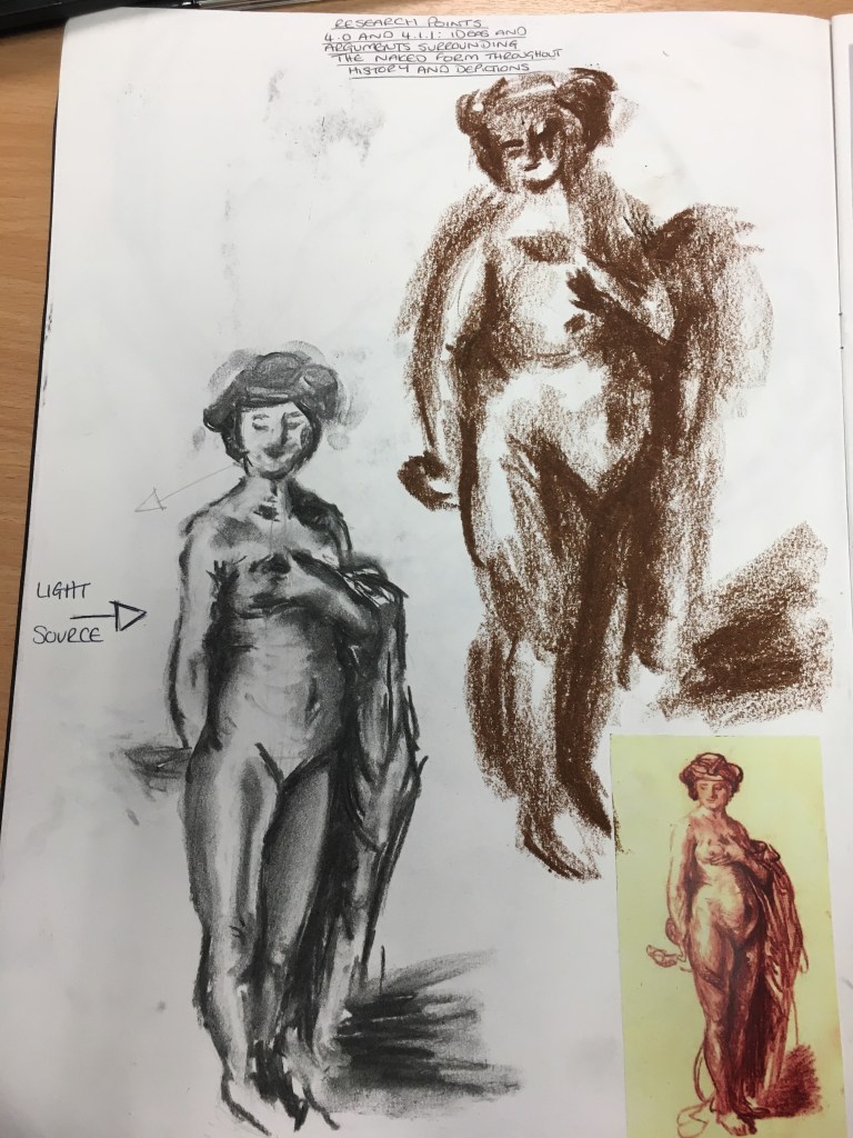
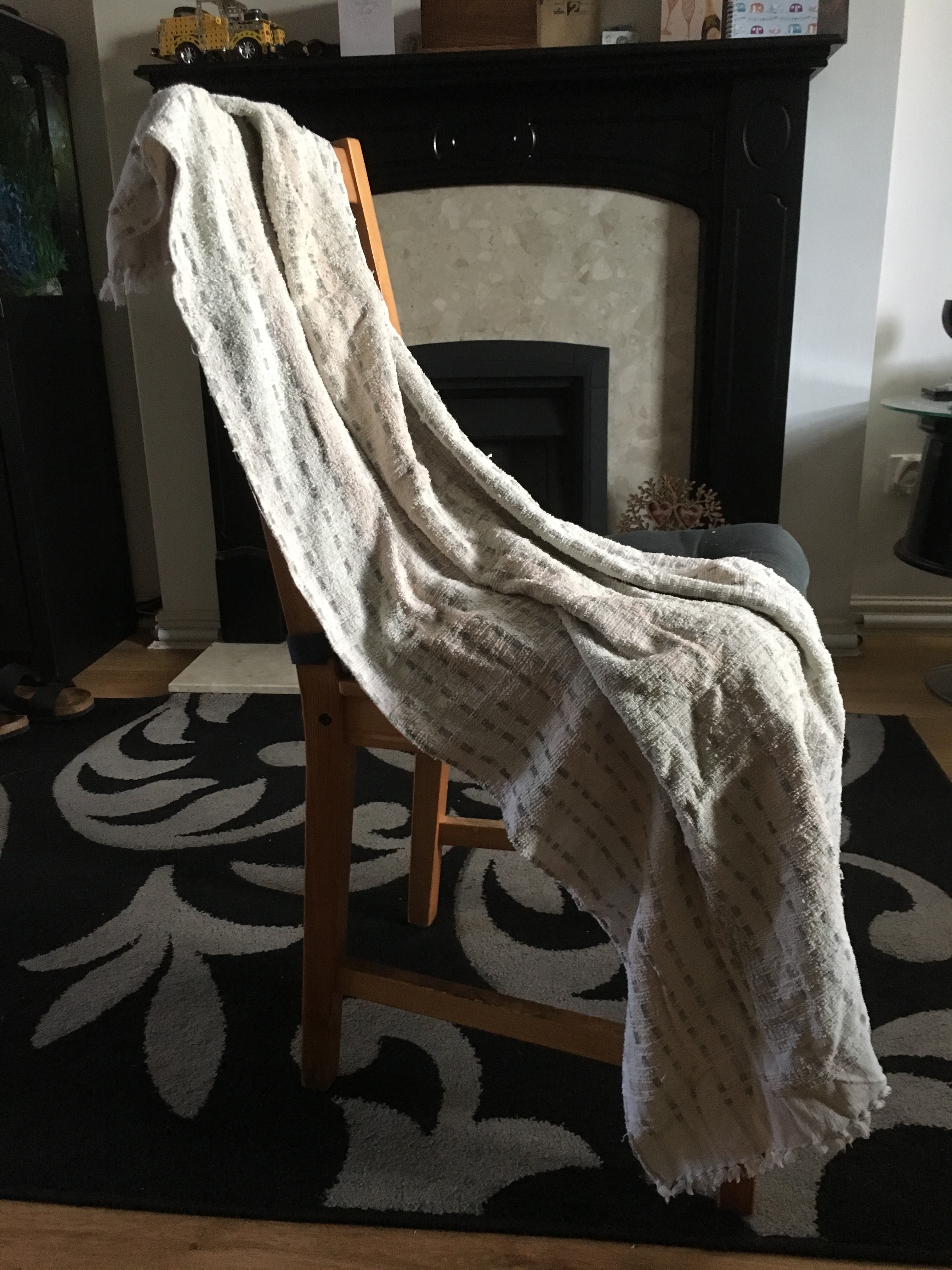
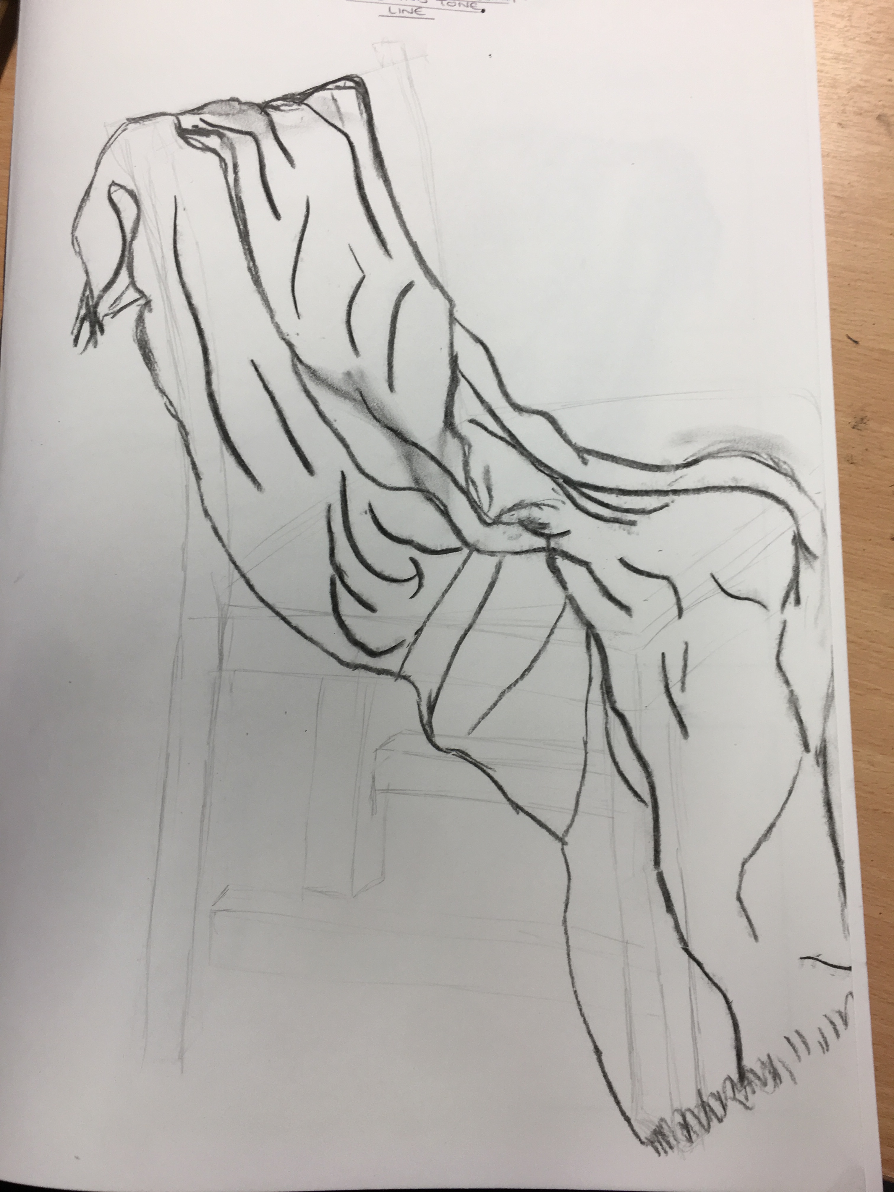
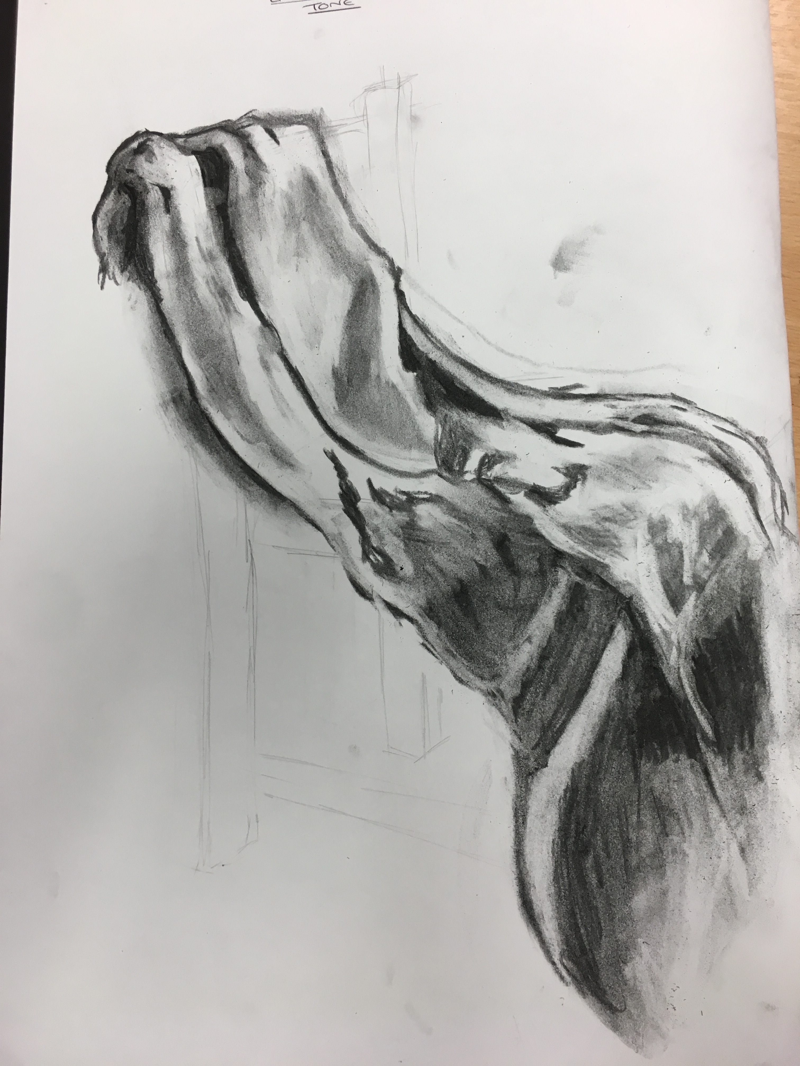
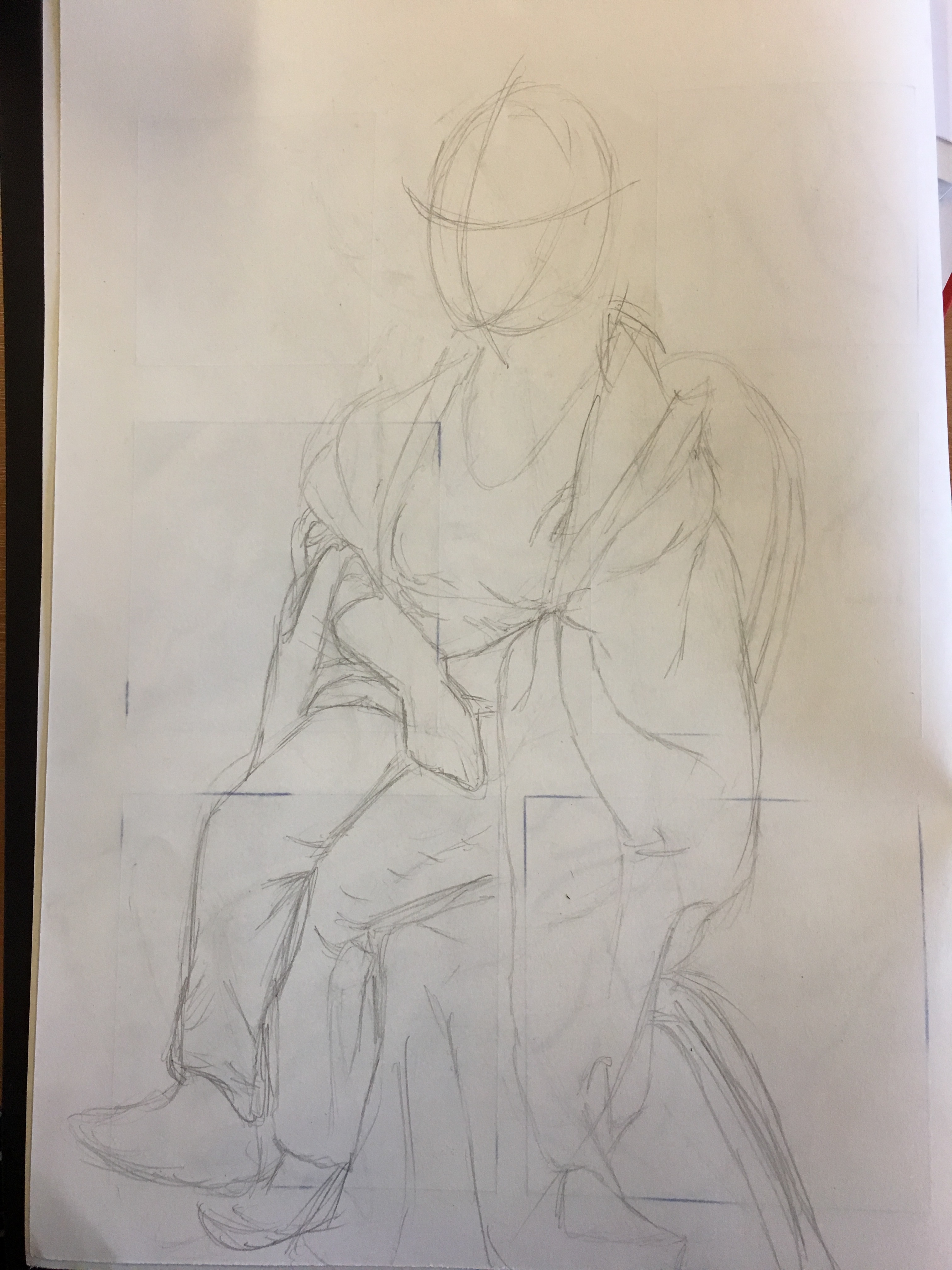
Sketchbook page of own interpretation of Rembrant’s piece 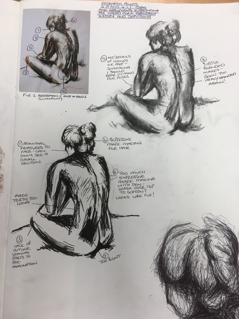
Sketchbook page of own interpretation of Grossman’s piece
I enjoyed recreating the two pieces shown above in my sketchbook. I tried to stay as honest to the original pieces as possible, but with my own little bit of a stamp on them. I really do find trying to recreate the pieces helps me understand the process the artist went through in creating the piece originally and to be able to fully appreciate the information held within it. I see it almost like reading a book; you can look at the front cover, but to fully understand the story, you have to read the words inside it.
Looking at Rembrandt’s piece, I found that using the media to block in the tonal patches instead of focusing on the details of the features really worked in bringing some form of realness to the subject matter.
Recreating Grossman’s piece really felt like ‘coming home’ to me; the lack of detail and hidden hands, feet and facial features I thought was very clever and definitely a technique I will use in the future. I think creating facial features, hands and feet as part of a larger whole just does not work for me; unless depicted as basic shapes, I feel they often look too cartoon-like or simply unbelievable, however, I think I am stronger at recreating them with tone than I am line, which is also something to bear in mind going forward.
I am extremely fascinated by this area of art and will definitely be taking it further in the future. As I move through this part of the course, I will consider the questions asked of me in this Research Point and how they may assist me in my future studies.
List of Illustrations
Fig. 1. (unknown) Serra da Capivara [Cave painting] At: https://www.touropia.com/prehistoric-cave-paintings/ (Accessed on 15 July 2019)
Fig. 2. (unknown) [Painting] At: http://www.fineartandyou.com/2014/01/ancient-egyptian-art-sculptures-and.html (Accessed on 15 July 2019)
Fig. 3. Van Der Goes, H (c. 1482) Adam and Eve [oil on canvas] At: https://www.artbible.info/art/large/291.html (Accessed on 13 August 2019)
Fig. 4. Da Vinci, L (c.1495 to 1498) The Last Supper [Tempera on gesso, pitch and mastic] At: https://en.wikipedia.org/wiki/The_Last_Supper_(Leonardo)#/media/File:The_Last_Supper_Leonardo_Da_Vinci_High_Resolution_size_32x16.jpg (Accessed on 21 August 2019)
Fig. 5. Rembrandt (1637) Study of a Nude Woman as Cleopatra [chalk drawing] At: https://www.wikiart.org/en/rembrandt/female-nude-with-snake-cleopatra-1637 (Accessed on 13 August 2019)
Fig. 6. Modigliani, A (1916) Seated Female Nude [Oil on canvas] At: https://en.artsdot.com/@@/8XXN6E-Amedeo-Modigliani-Seated-female-nude (Accessed on 15 July 2019)
Fig. 7. Grossman, C (unknown) Nude in Gold 2 [charcoal and gold ink on paper] At: http://www.claregrossman.co.uk/from-the-model/4551445591 (Accessed on 21 August 2019)
Bibliography
Artbible. (Unknown) ‘The Fall of Adam’ [online] At: https://www.artbible.info/art/large/291.html (Accessed on 13 August 2019)
How Women’s Perfect Body Types Changed Throughout History (2017) [user-generated content online] Creat. The List 27 March 2017 At: https://www.youtube.com/watch?v=y4ipUdS8Td4 (Accessed on 22 August 2019)
Jessica Brown of Indy100. (2016) ‘What being beautiful means in 25 countries around the world’ [Online] At: https://www.indy100.com/article/what-beautiful-looks-like-around-the-world-7364346 (Accessed on 15 July 2019)
Robson, D (1995) The Art of the Nude. Bristol: Parragon Book Service Limited
Visit Uffizi. (Unknown) ‘Venus of Urbino by Titan’ [Online] At: https://www.visituffizi.org/artworks/venus-of-urbino-by-titian/ (Accessed on 13 August 2019)
Wikipedia. (2019) ‘Nude (art)’ [online] At: https://en.wikipedia.org/wiki/Nude_(art) (Accessed on 15 July 2019)
Wikipedia. (2019) ‘The Turkish Bath’ [online] At: https://en.wikipedia.org/wiki/The_Turkish_Bath (Accessed on 13 August 2019)


#/media/File:The_Last_Supper_Leonardo_Da_Vinci_High_Resolution_size_32x16.jpg)