For this assignment, I decided I wanted to recap on some of the key points I took from the first Part of the course, as well as those from this Part of the course, so as to try and keep a steady flow throughout my progress and to keep my memory of these things rather fresh.
Key Points to Remember
Part One: Form & Gesture
- Work on a larger scale – A2 or A1;
- Practice the shapes of the objects;
- Create a space with interesting shapes and angles;
- Look at the spaces between the objects as well as the actual objects themselves;
- Use a range of drawing tools, mediums and surfaces;
- Consider such things as the height, depth, textures, tones and how these will translate into a visual form;
- Practice skills in creating perspective and scaling of pieces;
- Consider methods used by Redon, Morandi and Moore in their works;
- Reflect on and review the work using the Assessment Criteria.
Part Two: Intimacy
- Look closely and be selective;
- Create atmospheric, expressive, interesting images;
- Choose a medium which fits the subject, mixing mediums together to create interesting results;
- Layer with darker marks or begin with the darkest and move to the lightest in layering;
- Consider the positive and negative space of the piece;
- Consider the choice of objects used, the composition of the piece, the background to the piece, the point of view, whether portrait or landscape and the lighting used;
- Consider how to create the image in just line or how to create tone by using colour or by simply being monochrome;
- Create several quick sketches to find the most interesting;
- Reflect on and review the work using the Assessment Criteria.
Preliminary Experiments
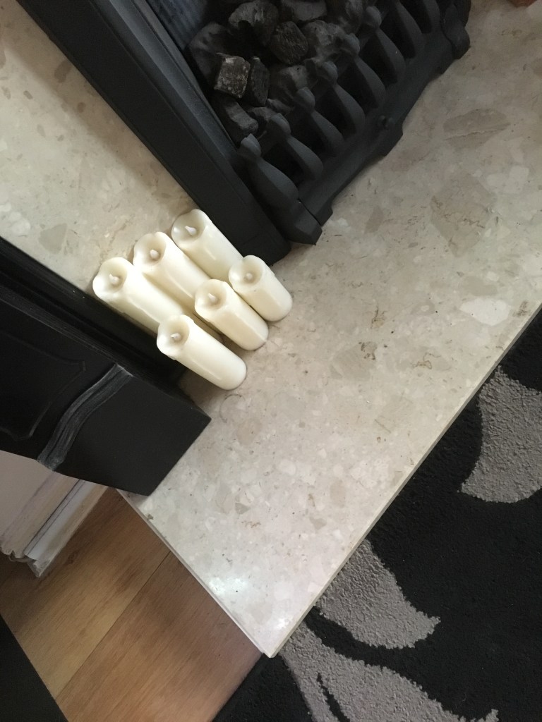
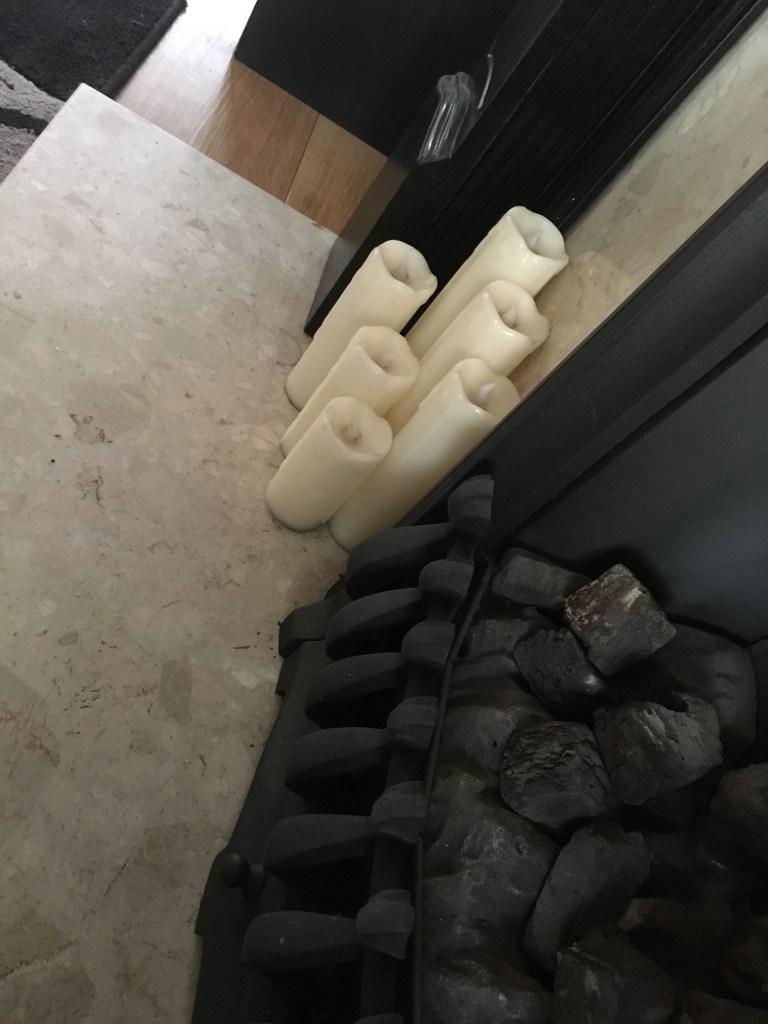
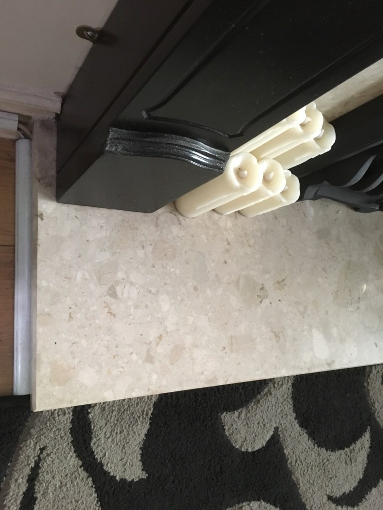
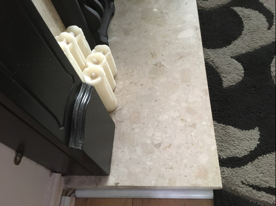
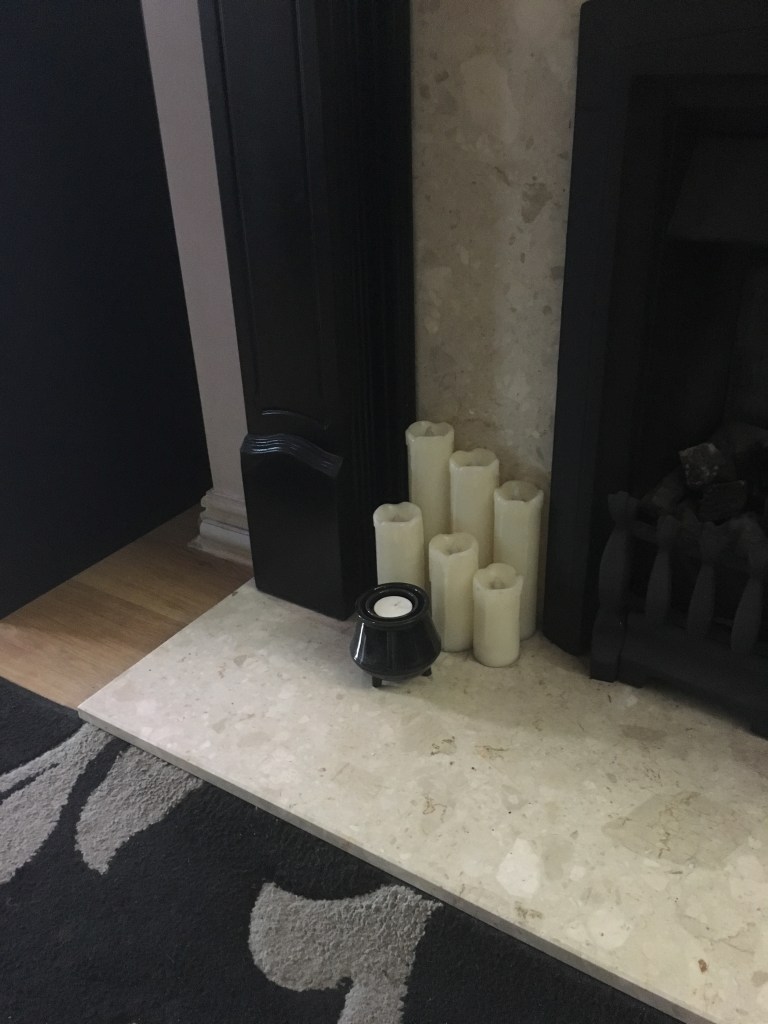
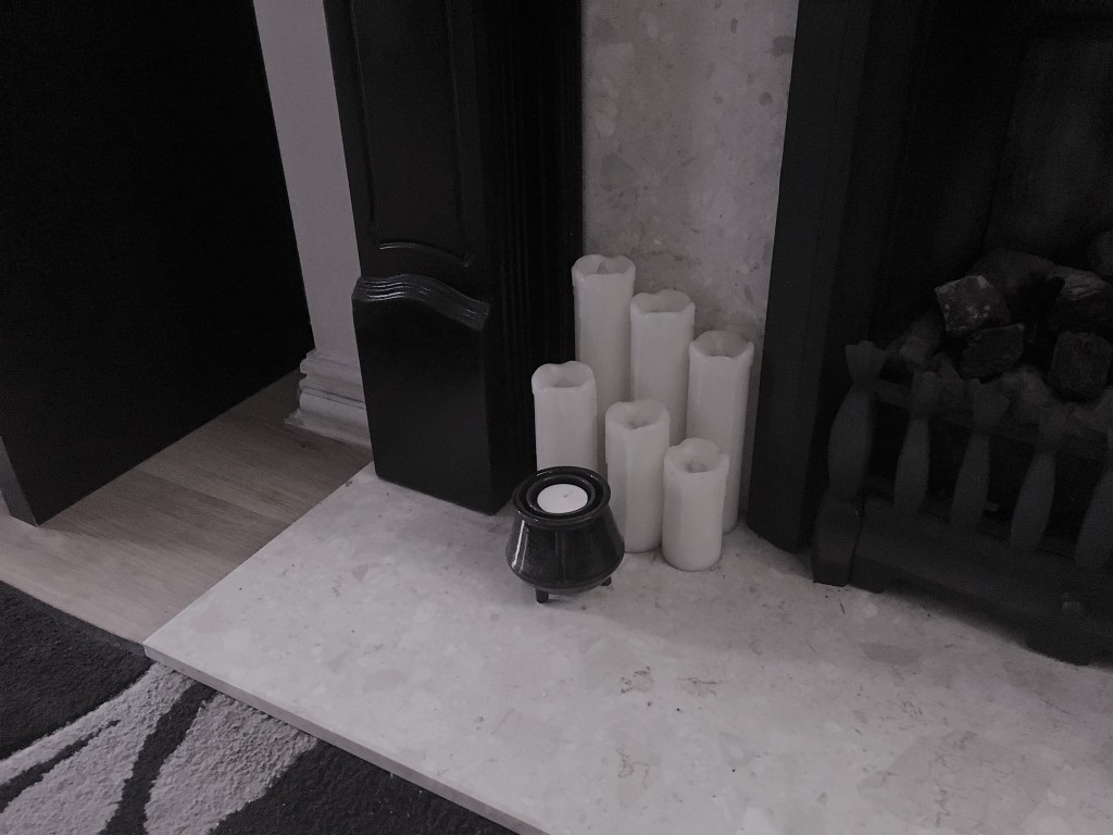
I had decided earlier on that I would work with my fireplace to create my assignment piece and used my later exercises to create some of the preliminary work for the assessment.
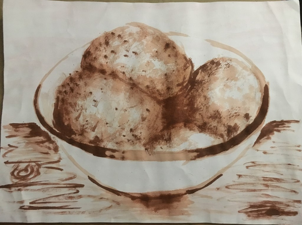
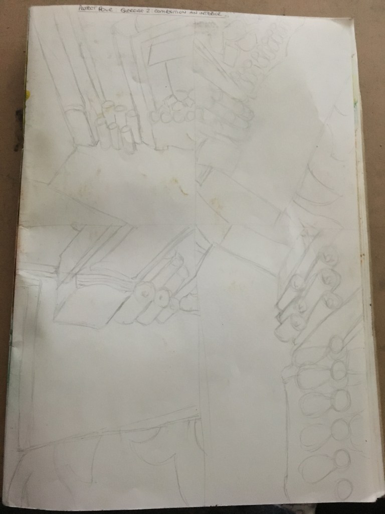
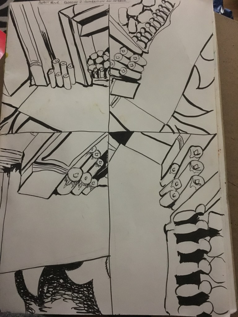
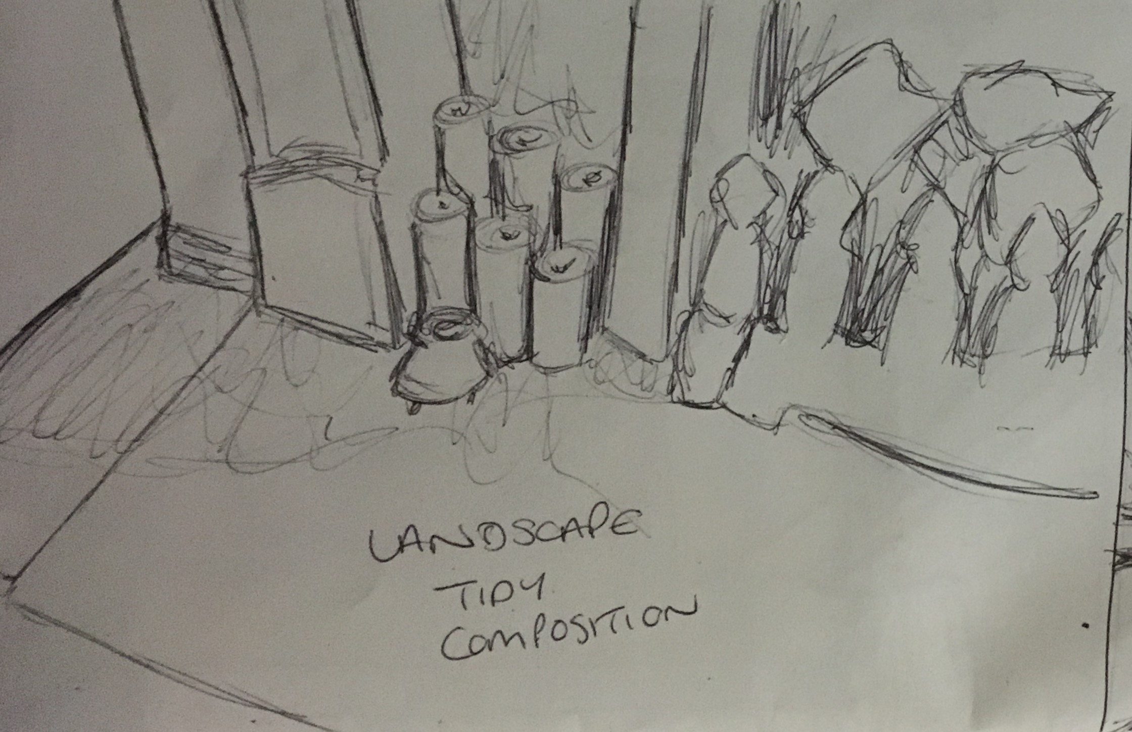
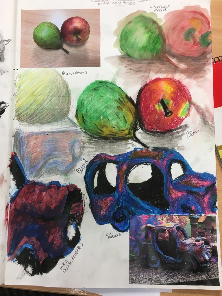
From here, I decided to carry out several experiments within my sketchbook. I began by reflecting on my research of composition within pieces and created several quick sketches in Chinese brush pen, simplifying the objects as much as possible to their general shapes and divided two pages into four.
Landscape Composition Experiments
I used the first page to create some sketches in landscape of some mixed combinations of objects and their placements. I then draw some quick rough lines over each box to split the images into nine boxes to assess them for the ‘Rule of Thirds’. My favourite of these four sketches was actually the first of the images due to the amount of information within in. I was surprised to find this as I do quite like images with less visual information. My second favourite was number four as I think the central square definitely speaks of an absence of something important between the two vases, however, overall I think the image a bit sparse and bland.
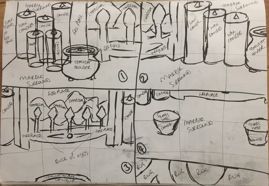
Portrait Composition Experiments
On the next page, I created four images in portrait, again mixing the objects up and focussing on different sections. Again, I split each image roughly into nine squares. My favourite of these four sketches was number seven as it appears the candles are gathering around the tealight holder and feels rather cosy.
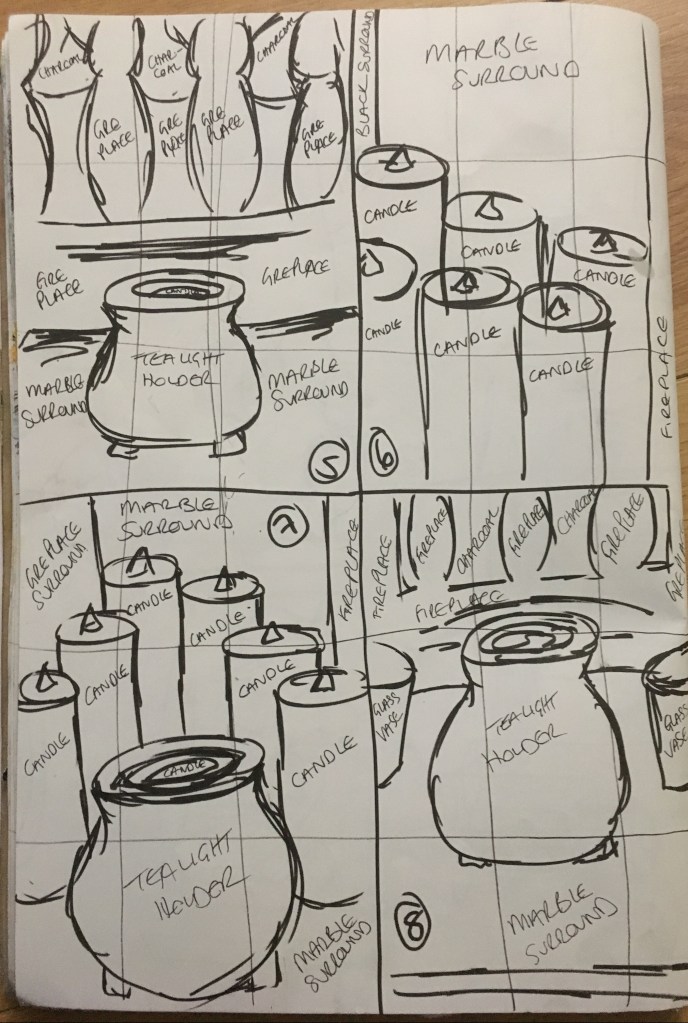
Quick sketches of different compositions in portrait format
Positive and Negative Space Experiment
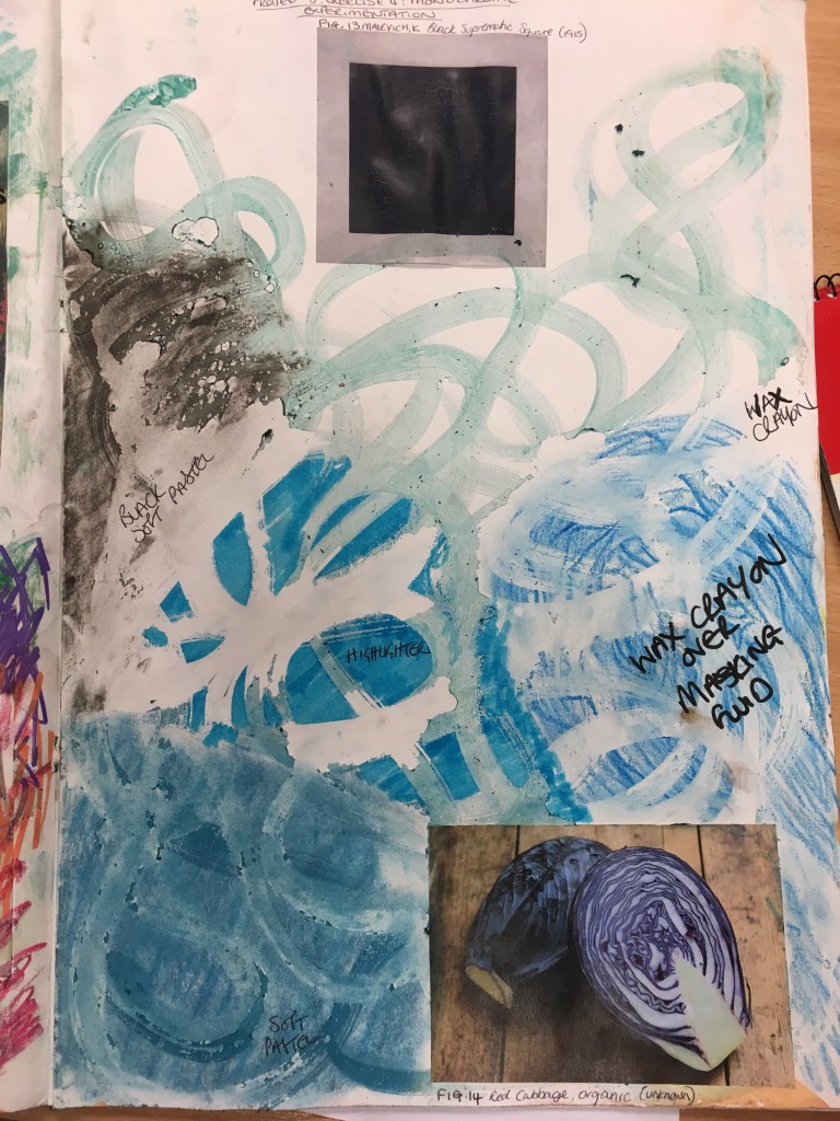
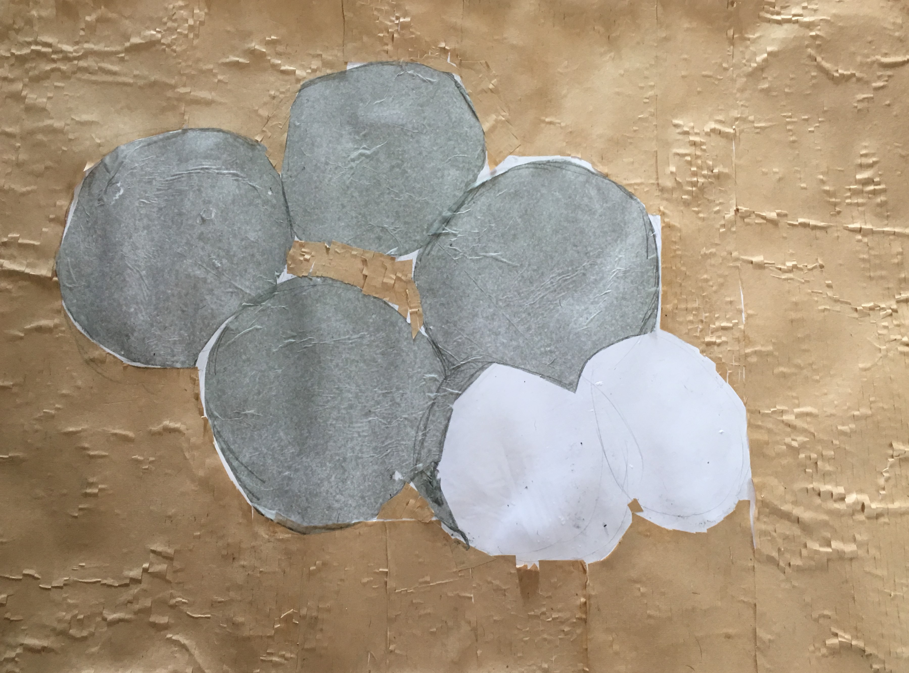
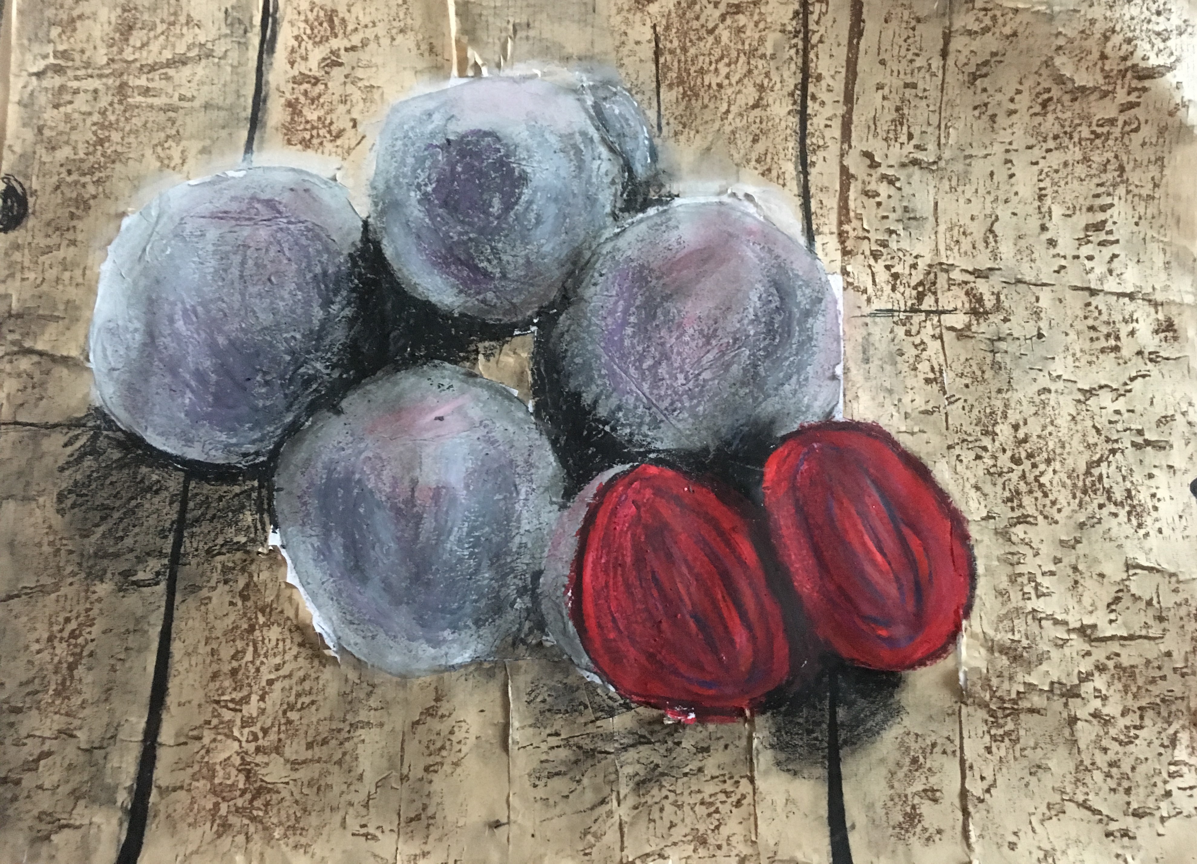
From here, I picked a couple of the objects to investigate further and to analyse the positive and negative space surrounding them, as researched in an earlier section of this Part of the course. I used masking fluid to ‘draw’ the candles in a group and then the tealight holder, filling the objects with the fluid. Then, I drew the outline of the candles and the dripping wax on them and then the outline of the tealight holder. I used an ink wash over the top of the silhouette of the candles and the outline of the tealight holder and then used a wax crayon over the silhouette of the tealight holder and the outline of the candles. I rather liked the outline of the candles after the masking fluid had been removed as the dripping wax looks rather realistic and the ability to mix the greens and blues before removing the masking fluid allows for a fair amount of expressive freedom without ruining the crisp contrasting lines when removed.
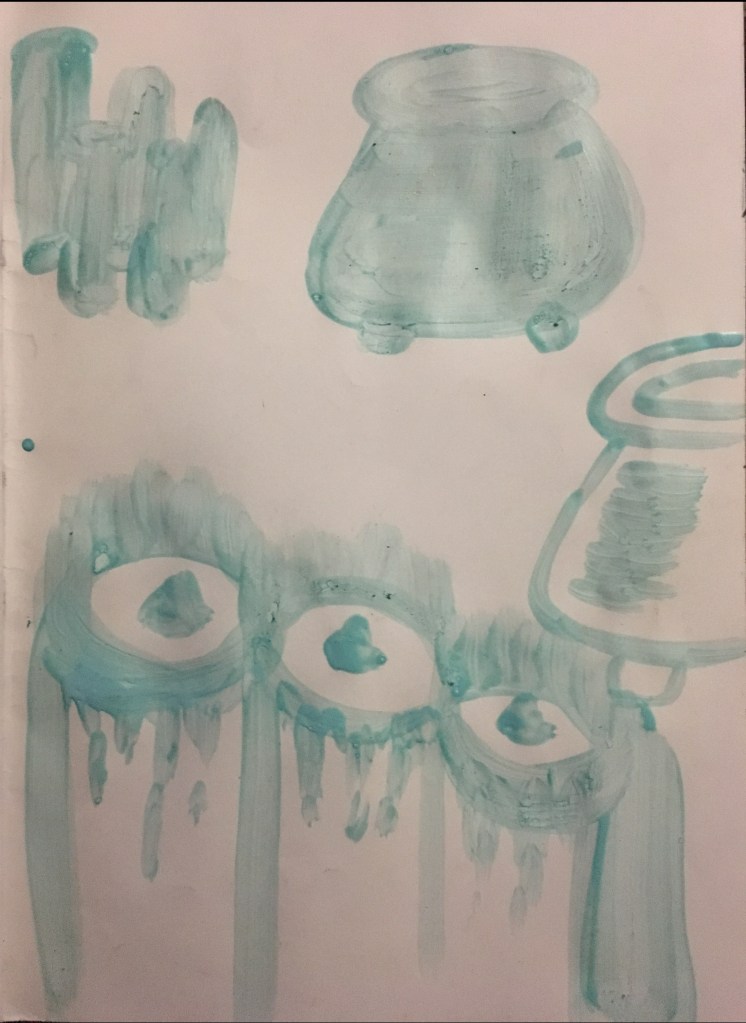
Masking fluid silhouettes and outlines 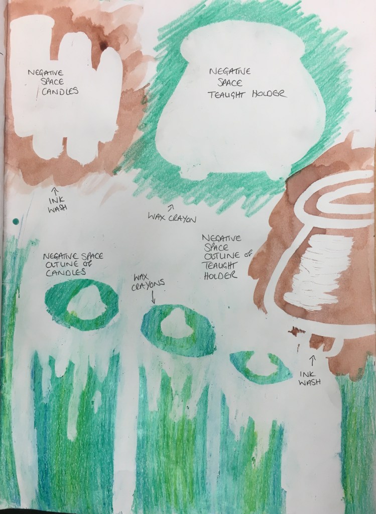
Objects after masking fluid removed
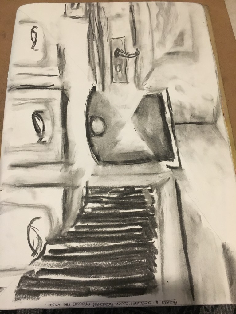
Experiment with Tone in Black and White
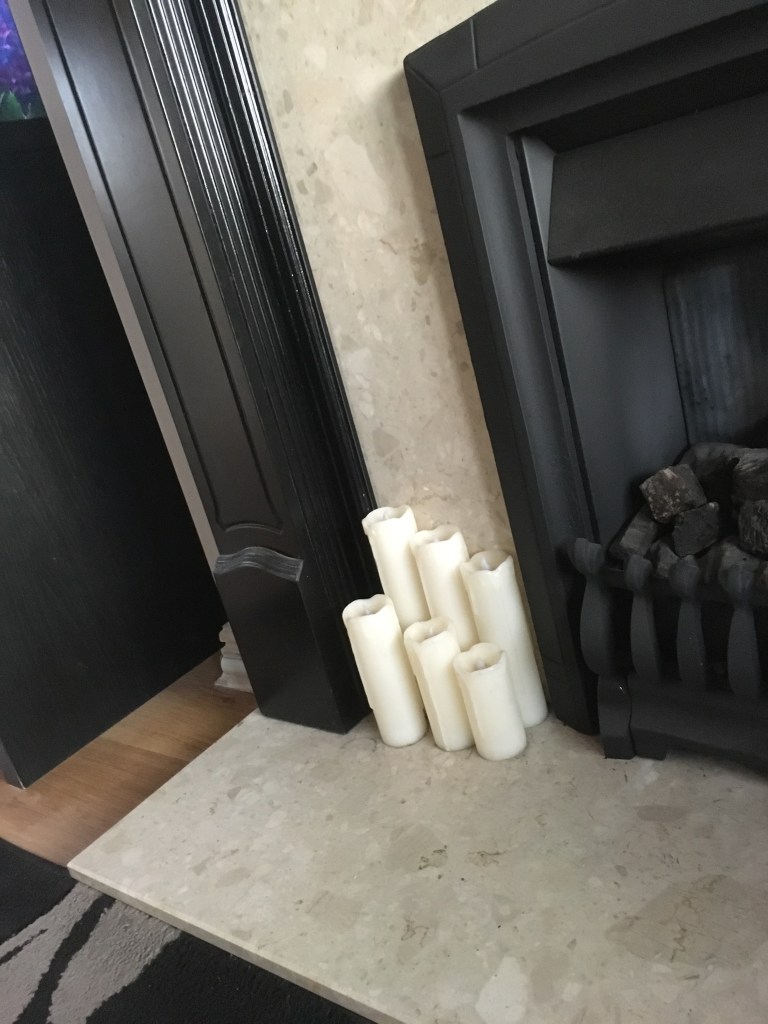
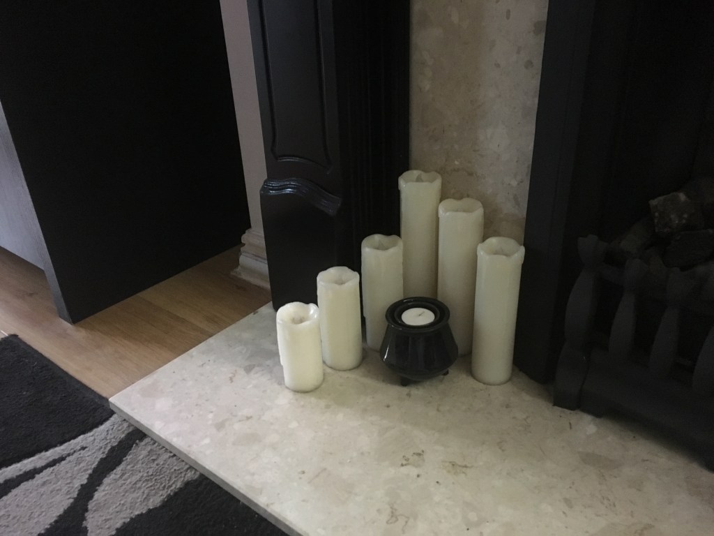
I had already settled on the composition I had created in my last exercise of the landscape tidy composition as this was the one I felt most comfortable with, but also which allowed me to explore most of the textures and surfaces. I had already created a larger scaled version of this for my final piece for the previous exercise, however, I decided to recreate it again quickly to refresh my memory of what was included and to also add some finer details which I had excluded from the previous piece due to being able to see more through the assistance of a black and white photograph of my chosen composition.
Black and white image of chosen composition for sketchbook experiment 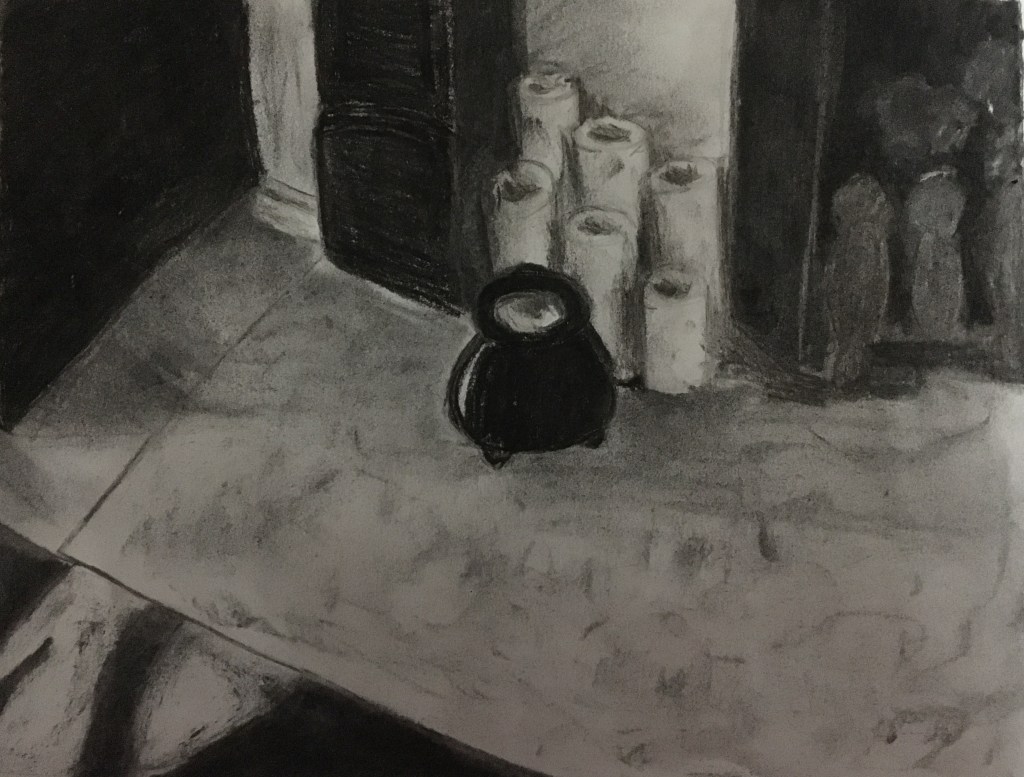
Black and white experiment of chosen composition in sketchbook
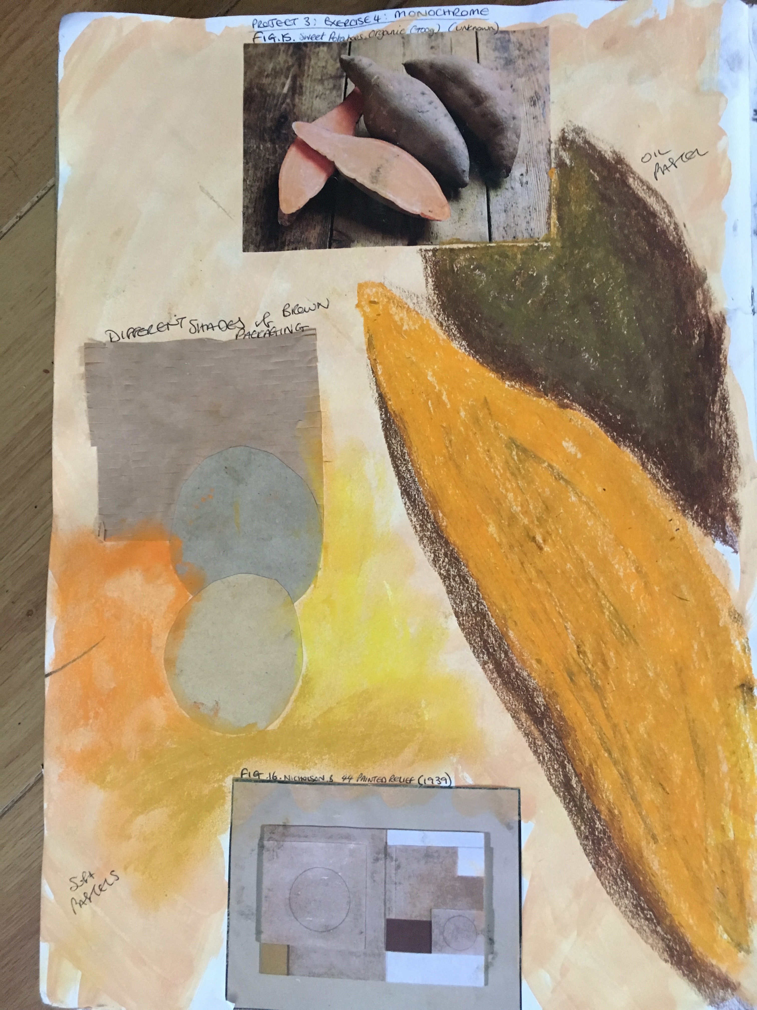
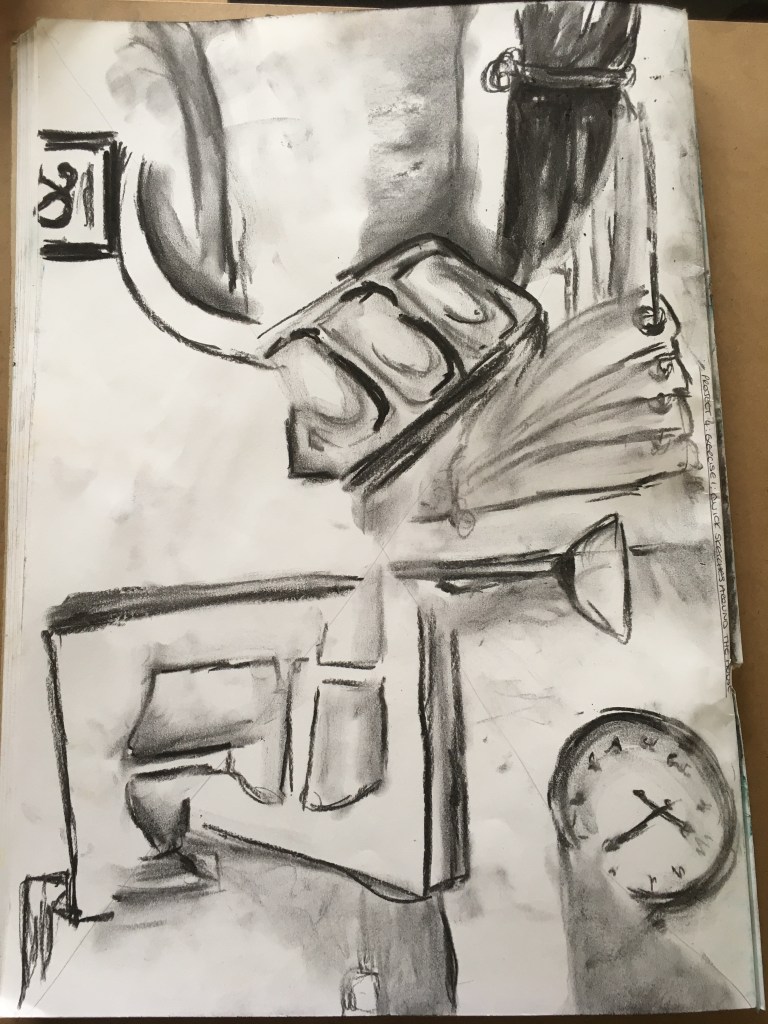
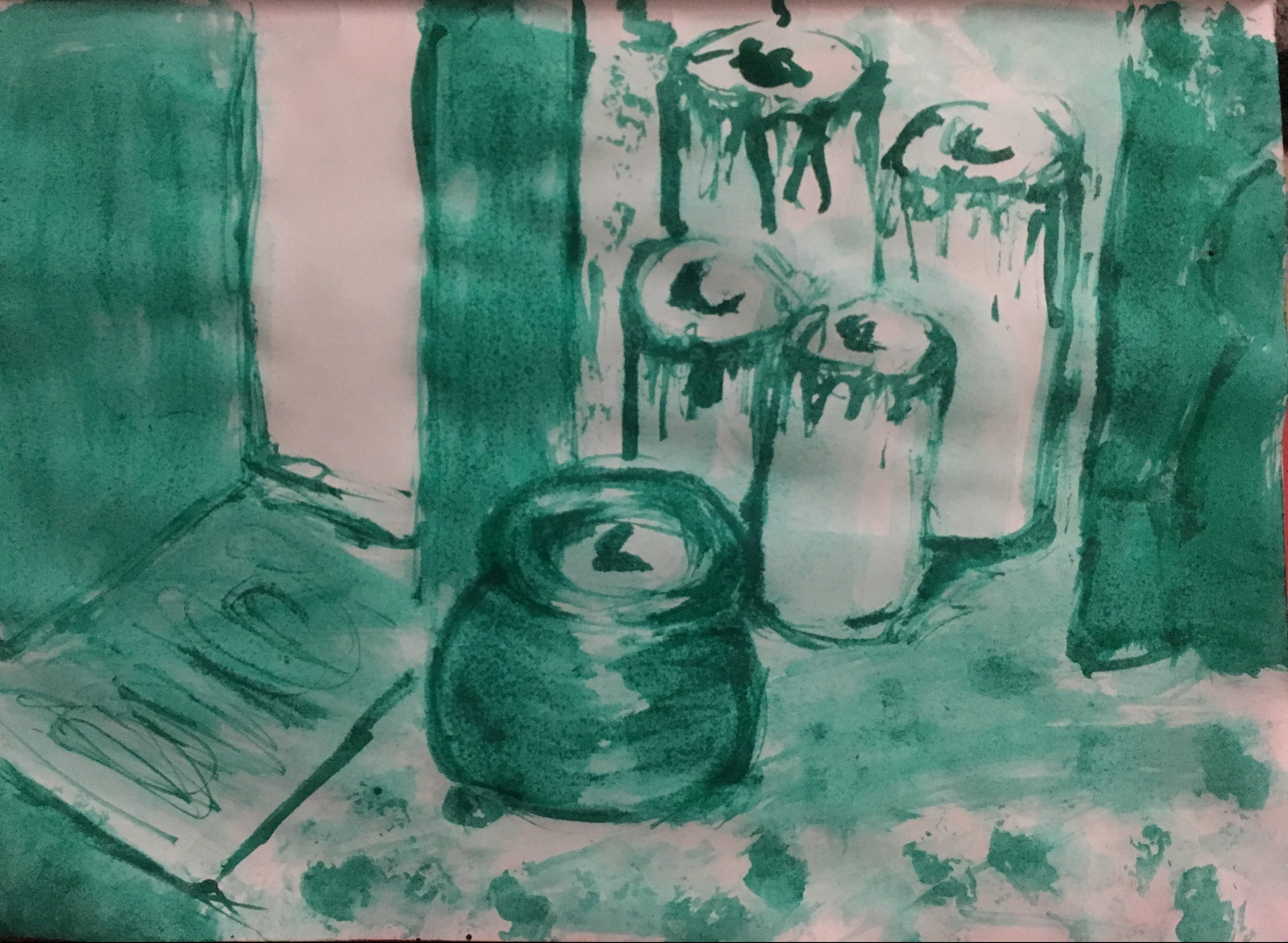
Experiment with Detail and Tone in Colour
I then carried out an experiment similar to another previous exercise to add colour to the piece in a quick thumbnail sketch to experiment with the different shades of the image and to also attempt to create a piece in a similar way to Morandi’s work, except with bolder, more intense colours. I worked in soft pastels and tried to choose a different colour to represent the different tones in the composition. I chose red for the blackest tones, yellow for the lighter tones, with a touch of green for the white areas to show some shadow. To be completely honest, I did not really have a plan for this section as such, I just went with the flow and created a sample piece in whatever came to mind first. Considering there was no specific rhyme or reason to the experiment, I actually rather like the outcome as I think it just naturally seems to come together and work quite well. I chose the red and yellows to create a sense of warmth in the experiment as this is how I feel when I look at my fireplace. Again, I chose to keep detail to a minimum as I rather enjoy this method and the boldness of the colours created as a result but I think my composition doesn’t actually contain much in the way of finer details anyway.
Chosen composition in colour for experiment in sketchbook 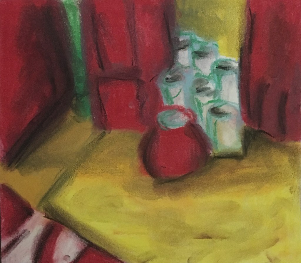
Chosen composition in colour for experiment in sketchbook
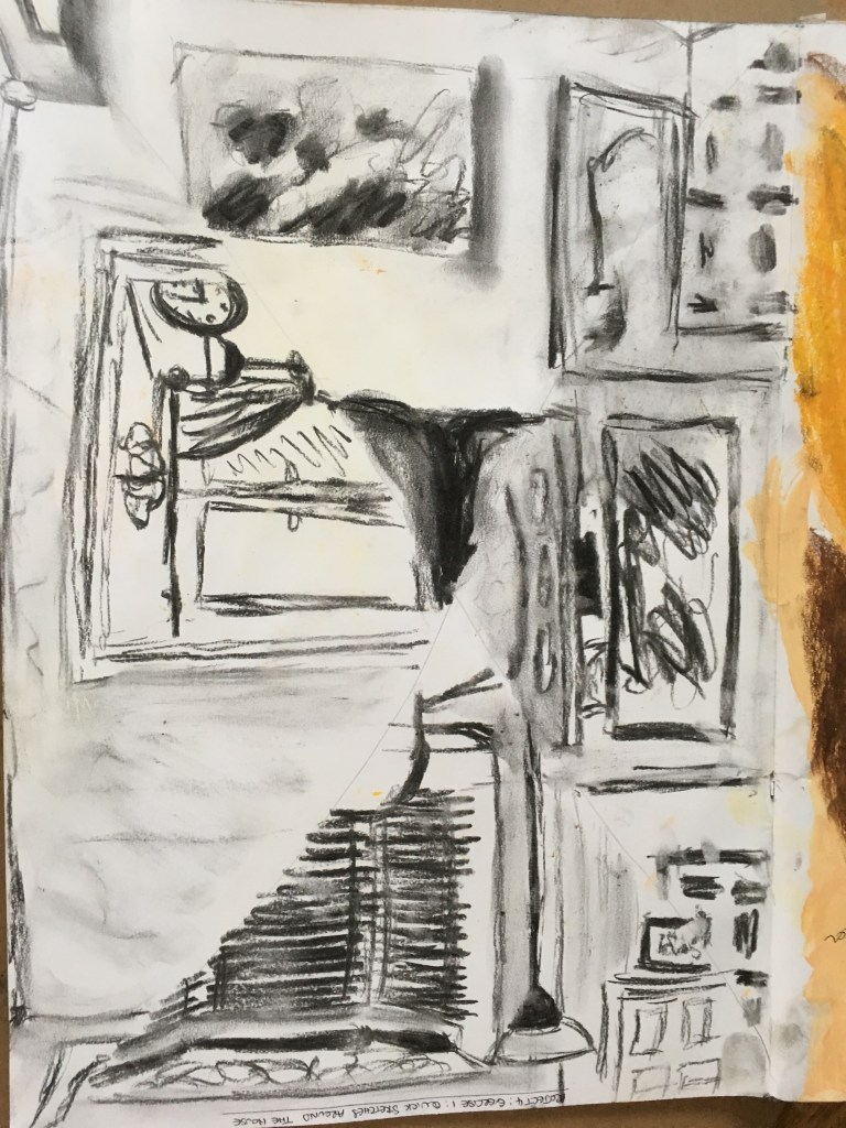
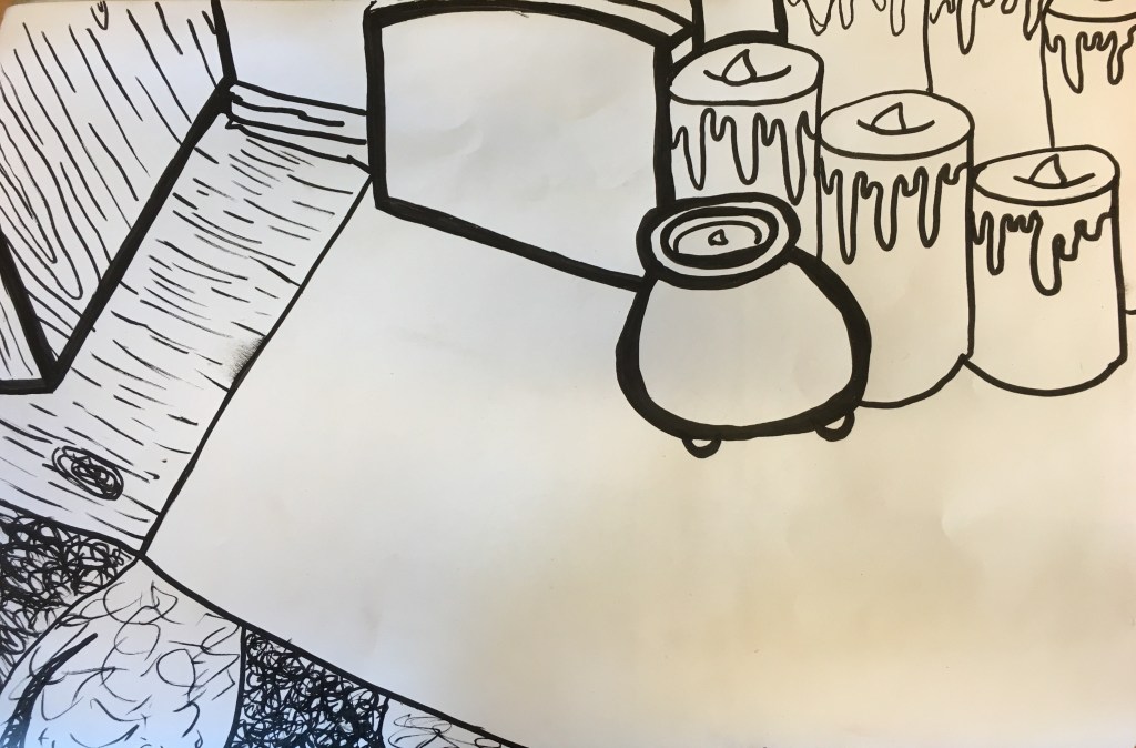
Line Drawing Experiment
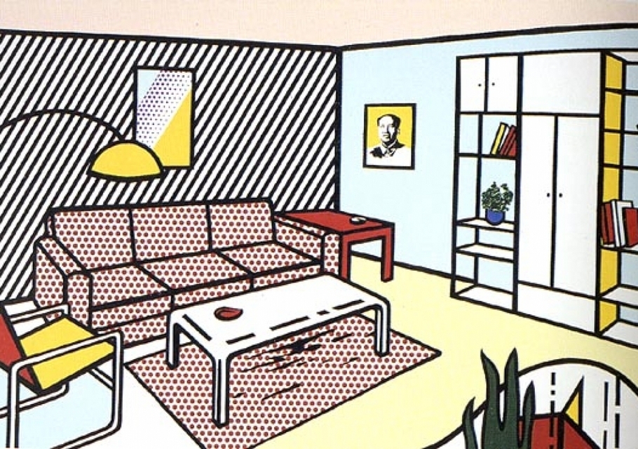
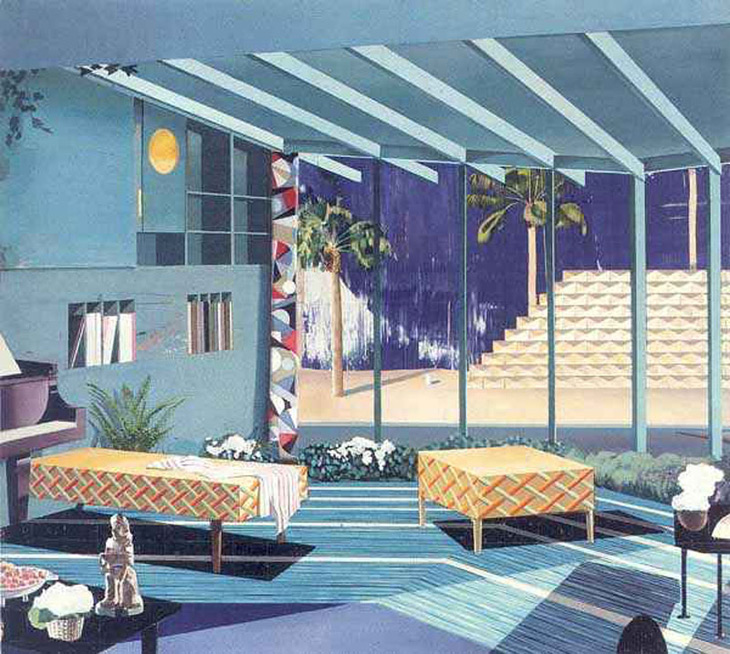
I then decided to carry out an experiment in line drawing, as done in an earlier exercise in this Part of the course. For this, I tried to envision the piece I came across during my research of domestic interior artists by Lichtenstein with its cartoon-like values and different use of line within the piece. I tried to show different directions of line for the wooden flooring to show the difference in the objects and their movement within the piece, as well as using thicker lines for the darkest areas within the piece. I figured that, this way, if I were only able to work from this piece for assisting to create my final piece, I would be able to distinguish the black areas, the direction in which they are moving, the texture of the rug, the delicateness of the candles (though I think I could have used finer lines for these). The only thing I felt unable to get across was the markings within the marble surround. However, I think the lack of any detail adds to the allowance of interpretation of the negative space to view this part as smooth and shiny of its own accord.
Monochrome Experiment
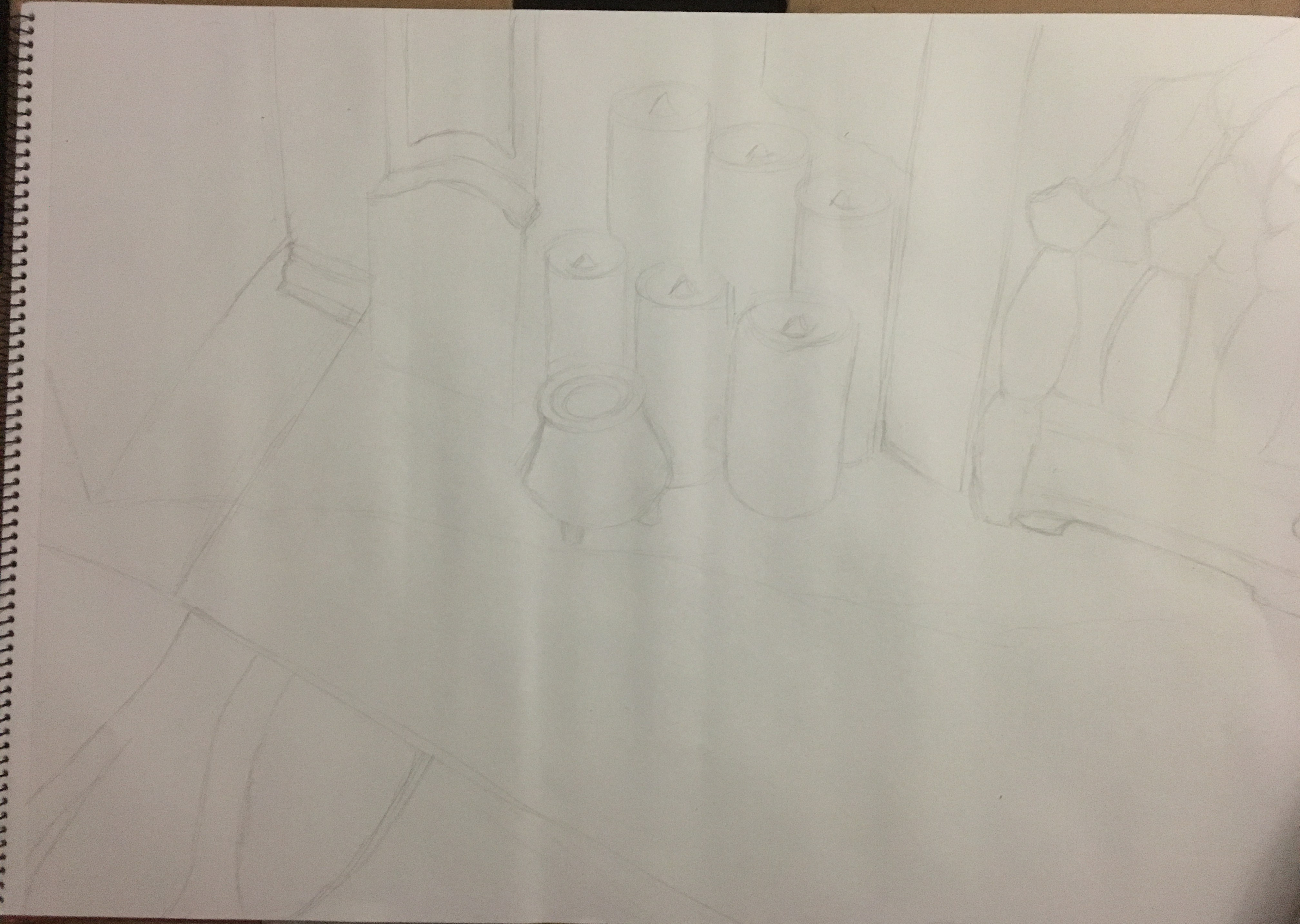
Final Piece
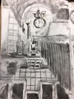
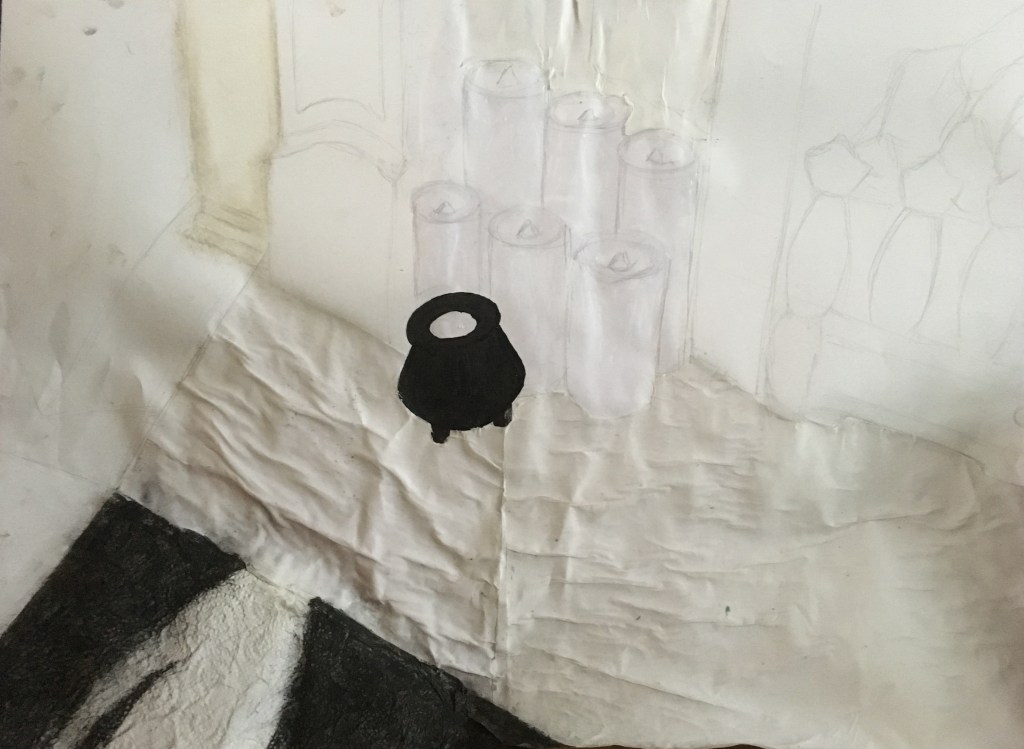
For my final piece, I tried to look at my preliminary work both for the assignment and the Part of the course as a whole and develop my piece from there. I took an A2 piece of paper and lightly sketched my image in. I was rather pleased with my result as it was on quite a large scale, however, I did not use a grid to create it, so I think my skills are improving somewhat!
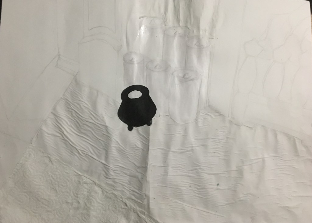
After this, I used an acrylic marker to colour in the tealight holder, then used PVA glue to fill the candles with a waxy coating since they are generally white anyway, as well as a layer over the tealight holder to help create the sense of the shiny coated ceramic. Next, I added the tracing paper ready to apply the tea staining over the top. I was actually rather disappointed with this due to it gathering and spoiling the appearance of a smooth, marbled surface. I am going to try and think of a way to correct this, but won’t spend too long worrying about it and will put it down to a learning curve if all else fails!
I then applied some white chalk to the area which is the wall surrounding the fireplace. I added a bit of beige chalk and also some grey to create depth and tone. Once finished, I will add in any shading needed, but I am trying to keep it all as base layers where possible until the end. After this, I added the black soft pastel to the rug and was made up with the result! I think it really adds depth and texture to the piece and actually rather resembles the rug in question! I did notice, however, that I had lost the initial shape of the actual rug in my creation due to having stuck the kitchen roll down and not being able to see the preliminary sketch and taking the line for the white part of the rug to be the end of the rug. I put this down to artistic licence though and chose not to fret too much about it as now I would be able to show more of the wooden flooring texture as opposed to the small section I would have been showing if created picture-perfectly!
Next, I added the final ‘layer’ of main colours; I used brown and black conte sticks for the wooden flooring, using a wash over them to smooth the surface. I then used ink for the black cupboard to the far left of the piece, black acrylic marker for the fireplace surround, charcoal for the actual pieces of charcoal in the fire and a tea-staining wash over the tracing paper replicating the marble surround. I was happy with all aspects of the base layers besides the creasing of the tracing paper, which I was deeply disappointed in. I tried to think of a way to smooth this out and considered using PVA, but thought I had used this rather a lot already and should try something else. I just could not decide what that something else should be.
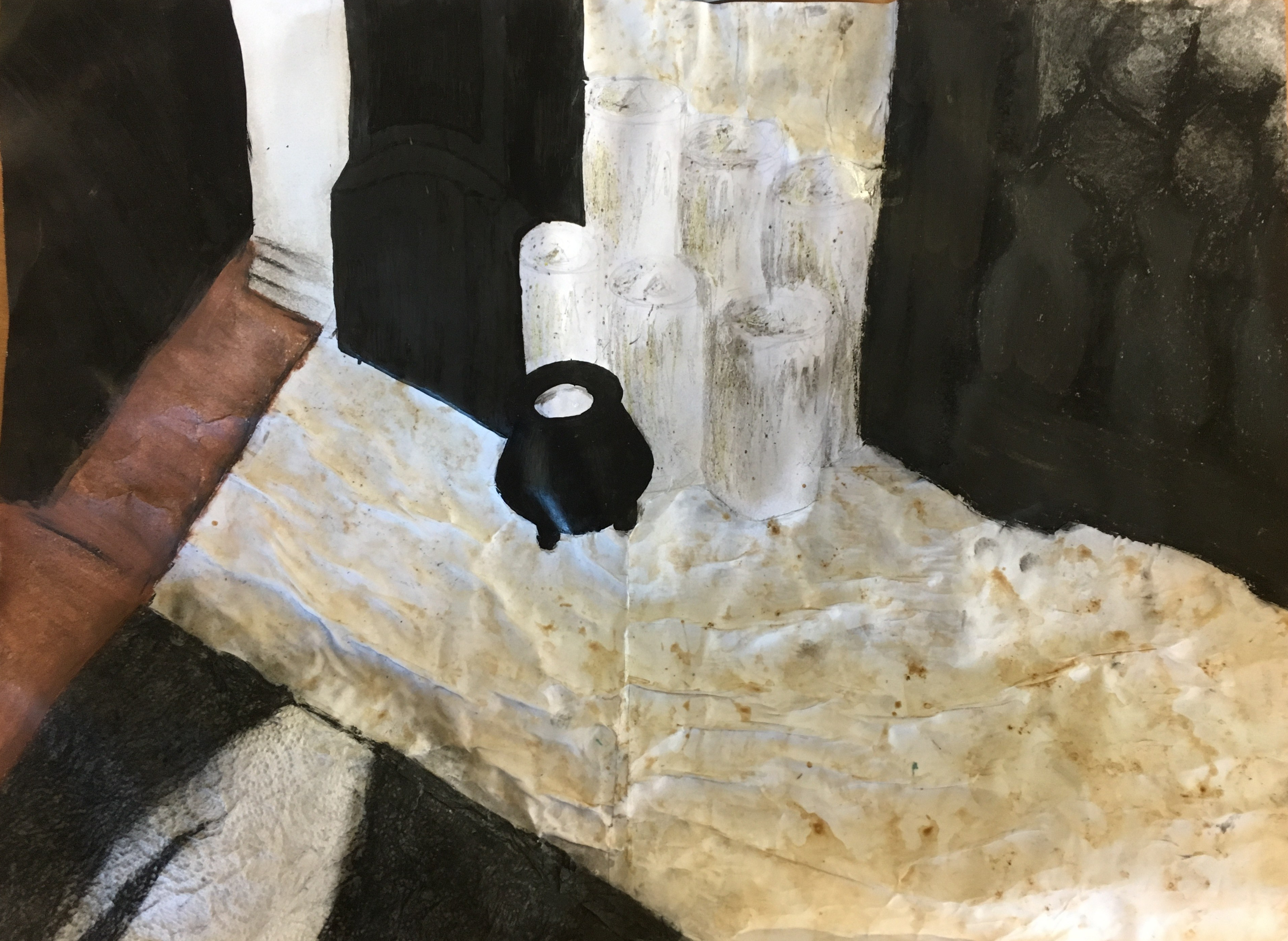
My next and final task for this piece was to add in the shadows where seen in my original photograph (since some time had passed since then) and to try and create some depth in places by adding highlights where needed.
Reflection
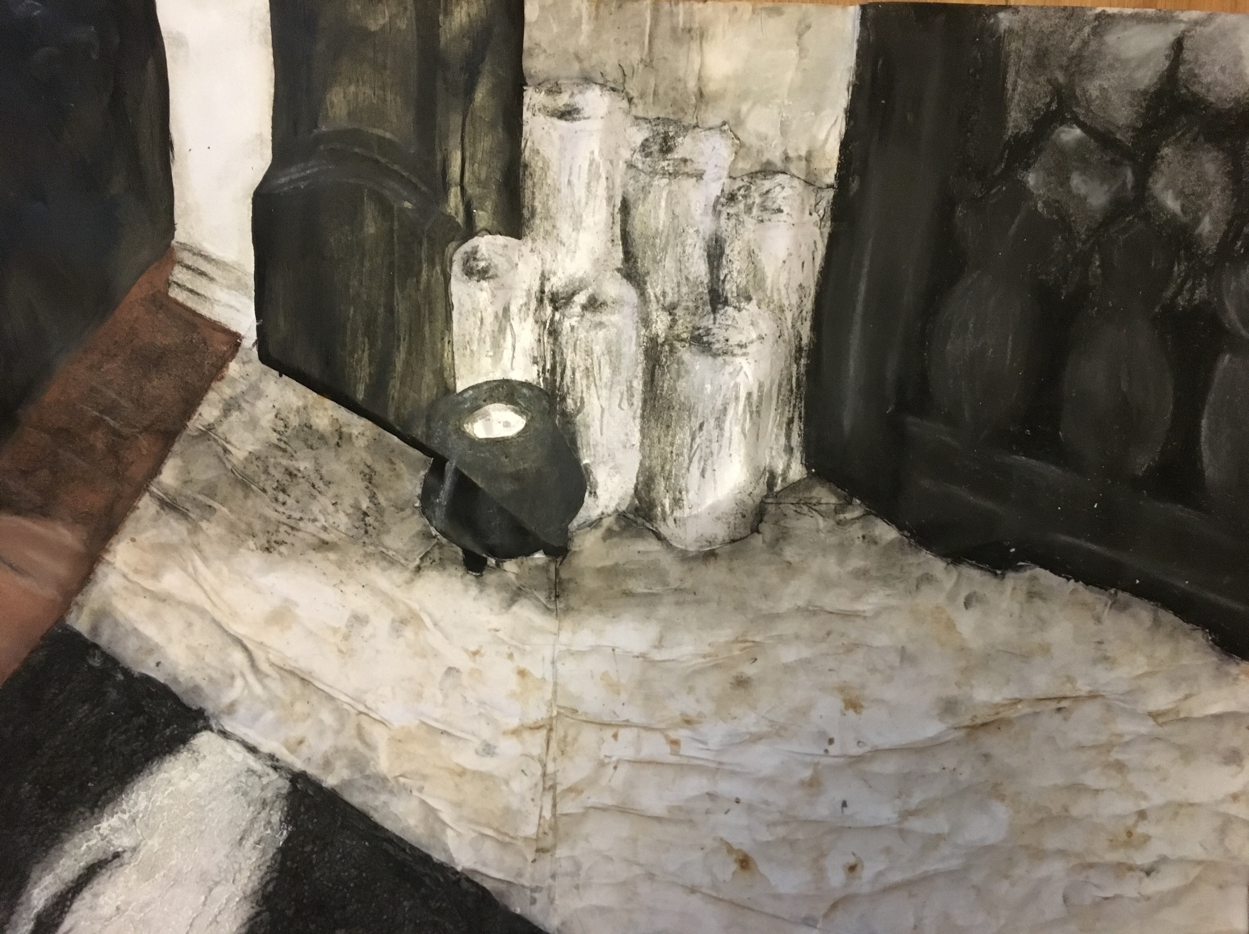
Overall, I am really happy with this piece. I chose to create a warmer atmosphere in my piece and pulled out the brown hues of the marble to warm the cold, solid blacks in the composition. I sat in front of my fireplace slightly to the right-hand side to create the view I did. I took a photograph of this area in the day time as a reference for the darkest tonal areas of shadows and areas of lightest tone, but generally worked from real-life sitting to gain the overall shapes and loosest details of the composition, as well as for the textures.
Having learned some things in this part of the course regarding tone, I tried to stay away from trying to actually draw depth within the piece, but to create it naturally through shadows, highlights and the textures of each object, which I feel worked rather well, especially with regard to the rug and the wooden flooring to the left of it as I get a real feeling that the flooring is beneath the rug, as it should be.
Having already decided my chosen media for each object through the material differences exercise, I was able to apply them rather efficiently, however, I think I would think again before using the tracing paper for the marble effect if I were to redo this piece. Whilst it has irked me since I completed this section, I decided to leave it be as I actually really like how the light hits it and fragments off from it. The marble surface itself has small particles within it which seem to reflect the light in very fragmented ways so, whilst it initially bugged me, I finally understood the sentence in this part of the course “…remember that your subject matter might be quite different to your source material” as my source material is definitely different to my subject matter in this sense!
I think the objects I used and the background setting have a very obvious natural connection and the story / setting is rather clear. I have tried to show the differences between the objects through their texture and, thinking back to my tutor’s comments regarding my first assignment, I tried to treat each object very separately and uniquely, concentrating just on that object at a time, whilst building the piece up layer by layer.
Going forward, I would really like to improve my method with regard to the marble surround to be able to create that smooth, but textured surface. I also really enjoyed creating the wooden flooring and the rug, so I think I would like to perhaps do some more work with wood and its grains as it is so beautiful to behold. I think the rug the most effective part of my piece as the texture of the kitchen roll just works so well to replicate the fluffiness and bobbles of the actual rug.
Overall, I have really enjoyed this part of the course and have learned some valuable lessons along the way. Whilst I am sad to leave still life behind, I will definitely carry forward elements of what I have learned as I think a lot of it can be used through all aspects of art as a subject.
I feel I have developed my skills and understanding of the use of colour and line and when each works better in their own way, but also how to manipulate both to suit my purpose; using expressive or finer lines where needed and strengthening my pieces with contrasting colours and combinations. I’ve definitely learned a lot in relation to the aspects and ‘rules’ of composition and how to set up a group of objects in an interesting and appealing way. I think my ability to accurately depict scale has improved quite a fair bit. I think this is due to the rough sketches I am carrying out alongside my course. I still think I have a fair way to go and have enjoyed using grids, though I do find them time-consuming and also restrictive as I can only really use them if working from a photograph, so they are not very practical for real life situations. I will, however, create a viewfinder to use as I progress through the course as the markings on this will allow me to create a rough grid for the basic idea of placement of some of the objects, such as trees etc.