This page is to highlight some of the pages within my sketchbook for the third Part of this course which do not correlate with any specific exercise.
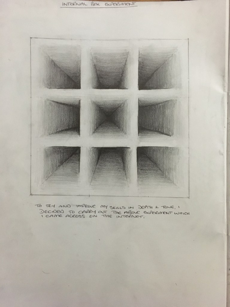
Internal Box Experiment
Working on my tutor’s comments regarding bringing forth the many layers of tonal ranges, I came across this exercise on the internet and decided to have a go myself in my sketchbook. I was quite pleased with the result and enjoyed the piece and tranquility completing it brought with it. This experiment will definitely assist me going forward.
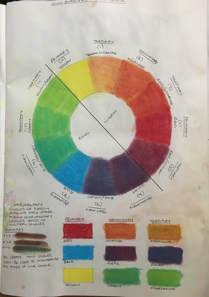
Colour Wheel Experiment
Following on from my tutor’s comments regarding understanding colour and its different attributes, I decided to carry out a creation of a colour wheel which, again, I had found on the internet. Whilst I could have just used their version to work from, I decided to create the piece myself and was happy that I did so as actually redoing it myself helped me to understand the mechanics and use of this wheel.
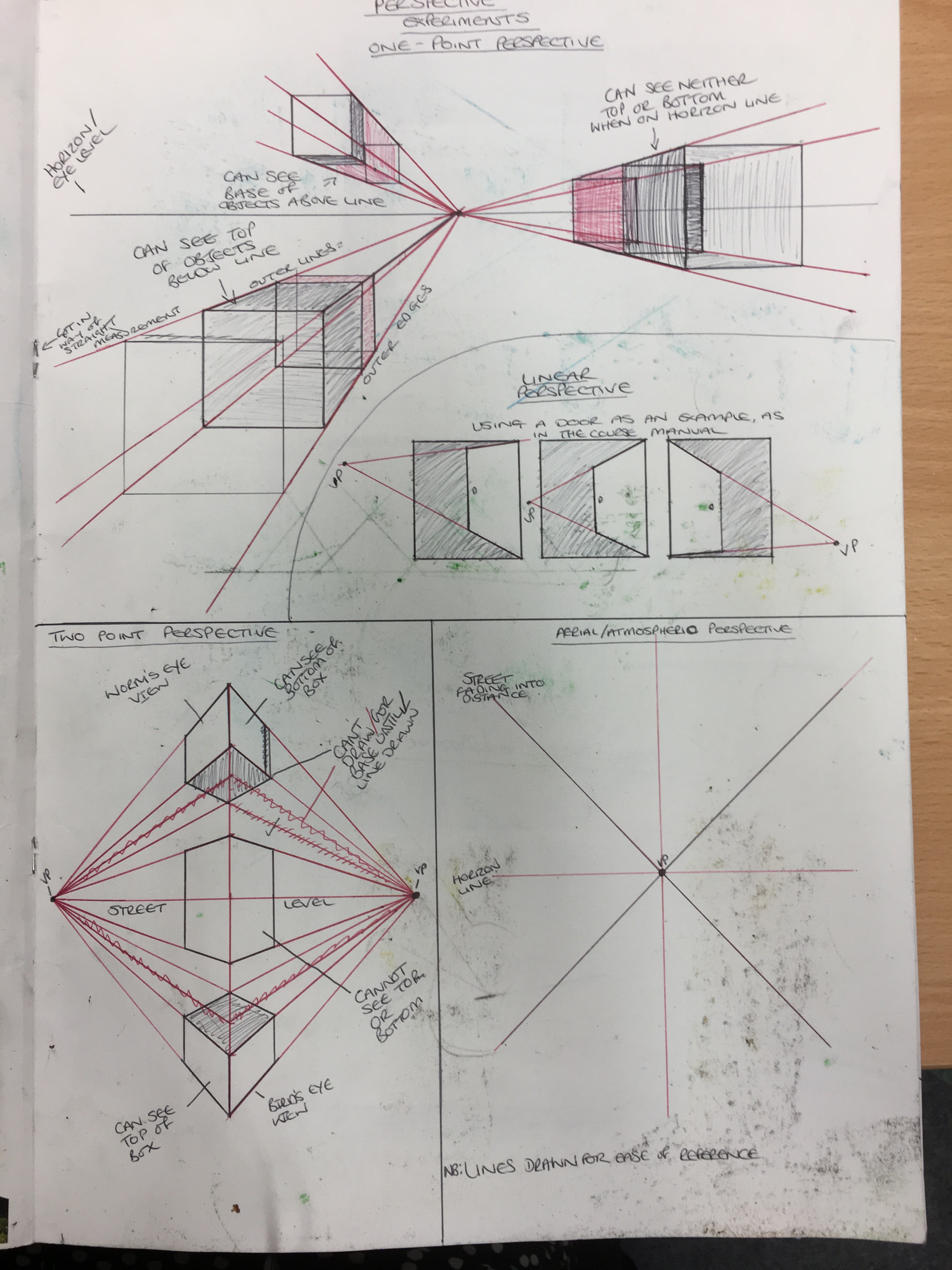
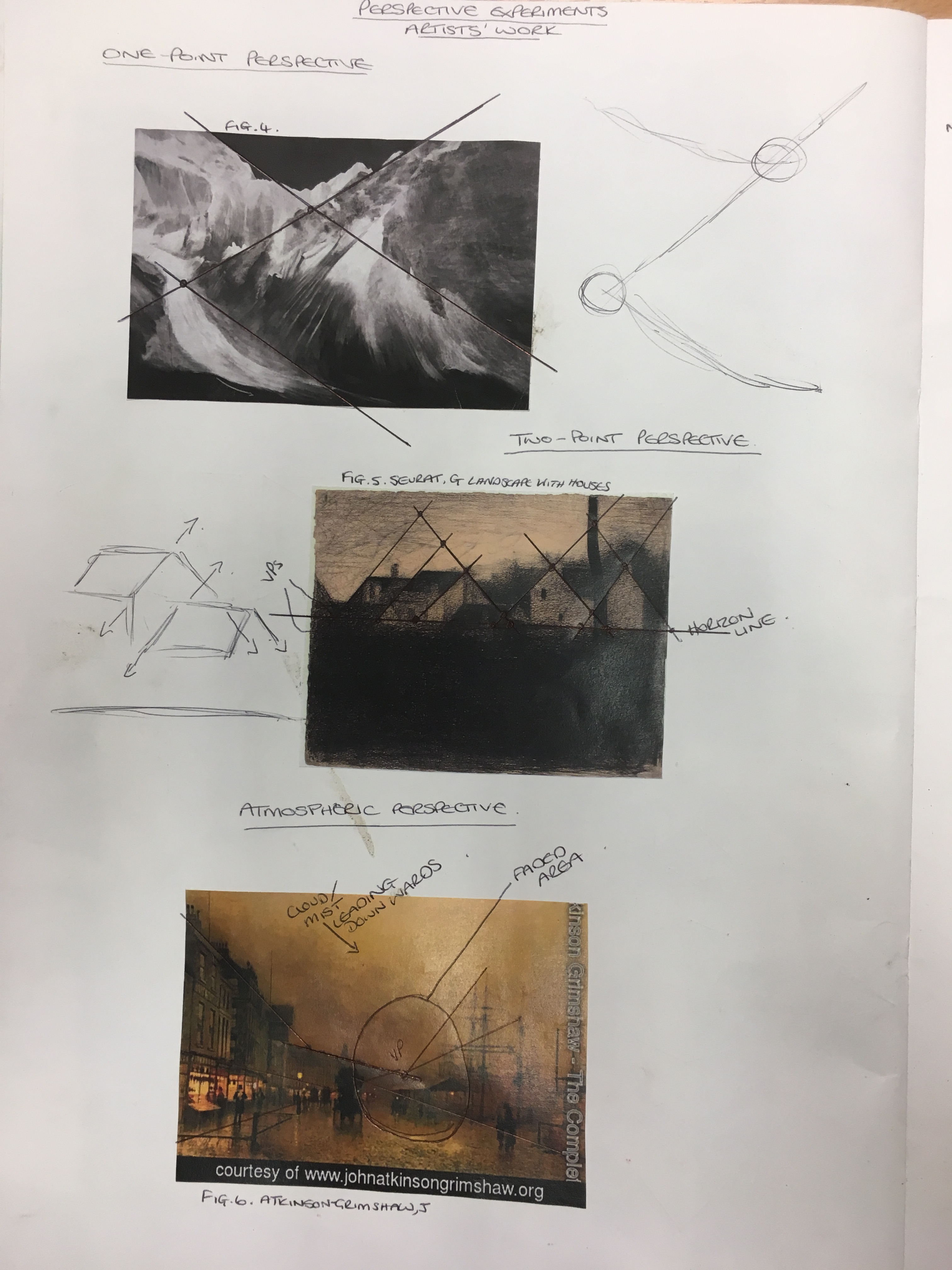
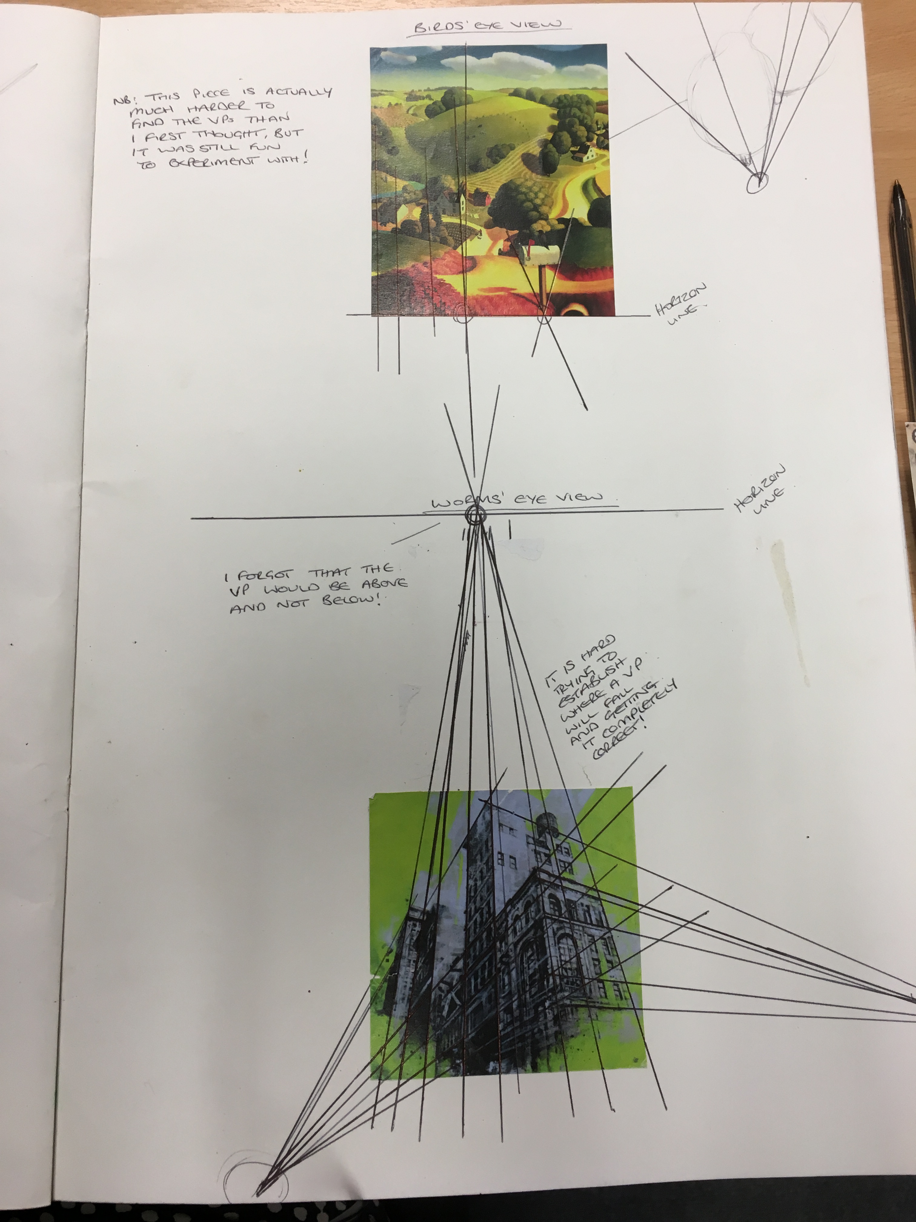
Perspective Experiment
I decided that, since I didn’t feel I fully understood the concept of perspective having read the course manual, I would do my own research into it and carry out my own experiments to help me comprehend it fully in my own way. Below are the three pages of my sketchbook showing these experiments and the results of the same.
Sketchbook List of Illustrations and Bibliography
Please see the below document for citation relating to my sketchbook for this Part of the course:
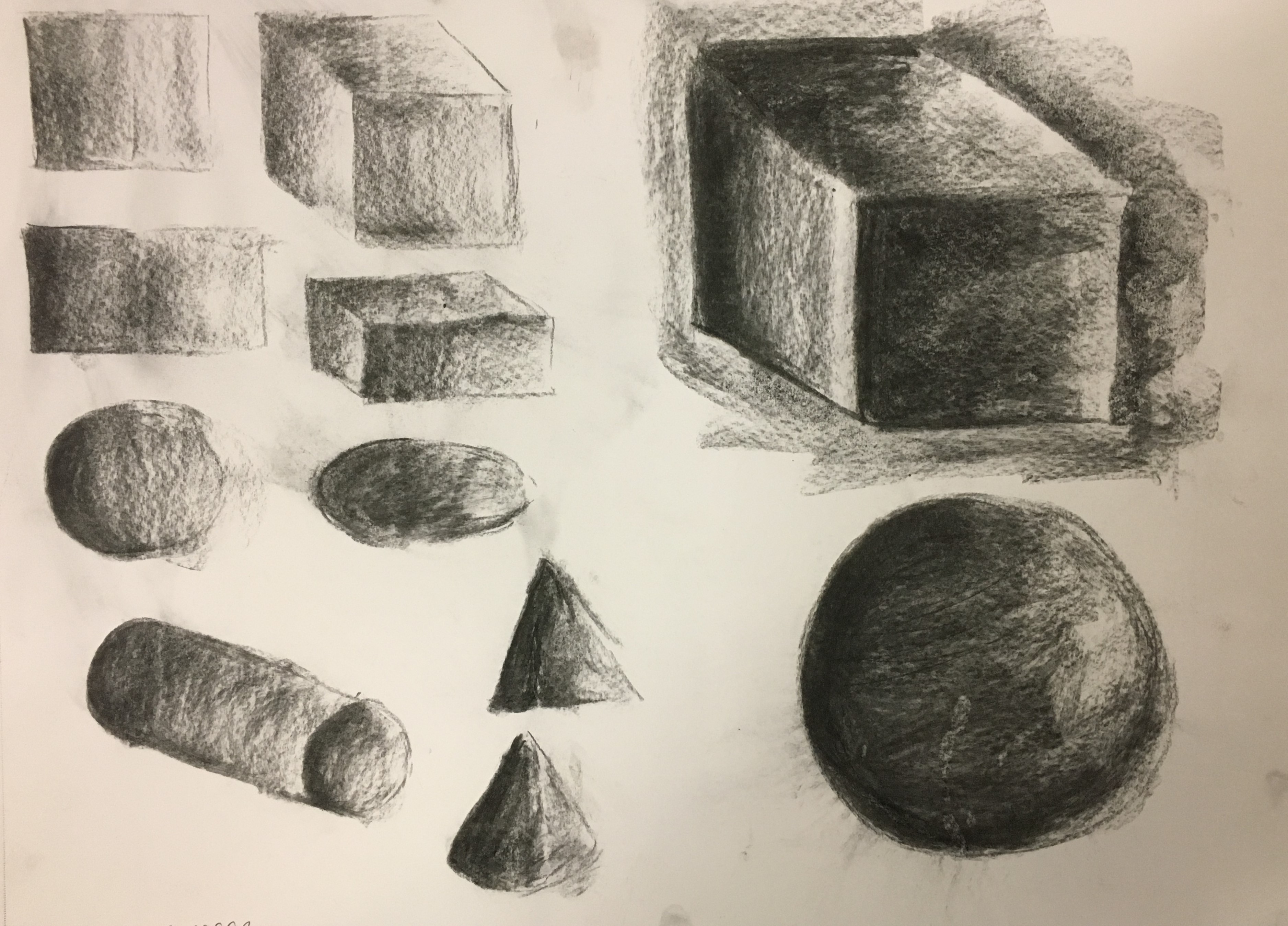
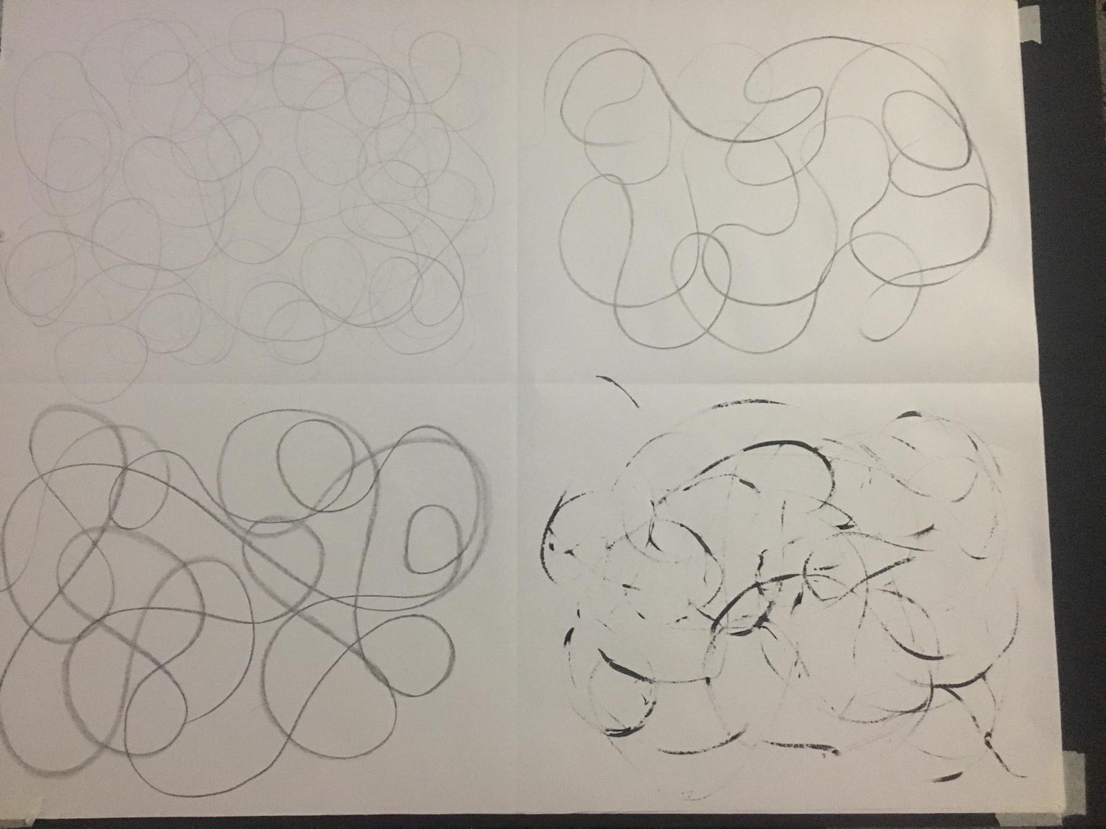
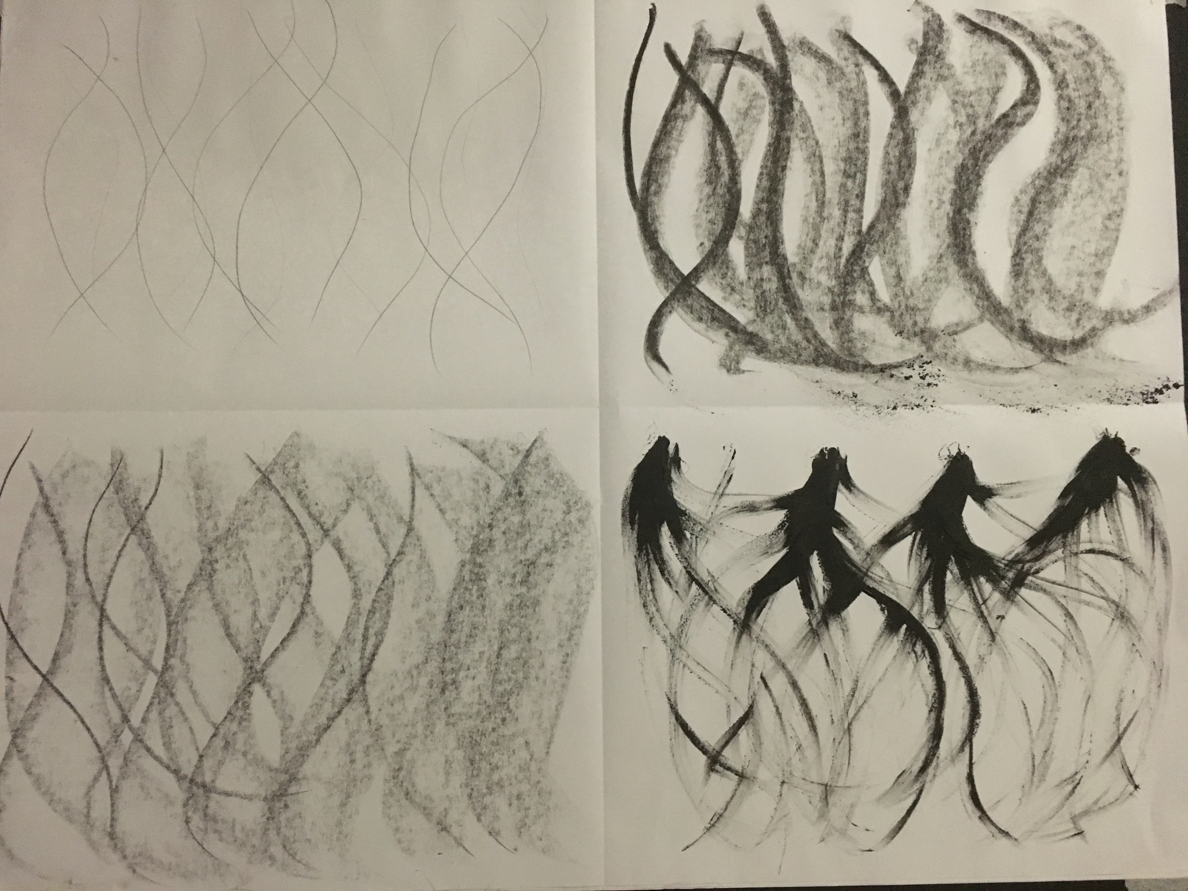
Before starting this exercise, I wanted to experiment using
lines and marks to create shading on the basic shapes (circle, square,
rectangle, ellipse and triangle) and forms (sphere, cube, cylinder and cone),
as shown below.
I rather enjoyed doing this activity, but found it rather hard to keep some of the shapes looking flat (such as the circle / stippling) and to create enough depth in some of the forms (such as the sphere / stippling). I tried to imagine the light’s direction coming from the right, casting shade to the left. One thing I noticed here is my reluctance to let go of an outline in my work – for example, the circle / line and cube / line combinations did not feel obvious enough without the outline to the right-hand side. Thinking back, I think I should have perhaps just added a little bit of delicate shadow from the right-hand side of the shape / form heading inwards to show the outline, or created a bit of delicate shade to the right of the outline, heading outwards. The latter of the two would be the most realistic in real life I believe, as it would be shown in the detail of the background. I really like how the cylinder / line and cylinder / cross-hatch combinations work – the end of the shape does look very flat and blunt, which I think is quite a success. I was not too keen on the stippling as this took quite a toll on my hand, but I was able to let my tremor help quite a bit with creating the dots, which I found rather humorous! I came to decide to only use stippling in small areas in future to avoid over-straining myself.
Single Object
I decided to work quickly for both parts of this exercise;
not focussing on the finished piece fully resembling the real object or even
realistic in appearance at all. For the
first part of the exercise, I chose a frosted glass vase and to work in pencil,
willow charcoal, drawing pens and oil pastel.
I divided a page in my sketchbook into four and chose to draw the vase
purely based on tone, using lines (both straight and curved), cross-hatching
and stippling.
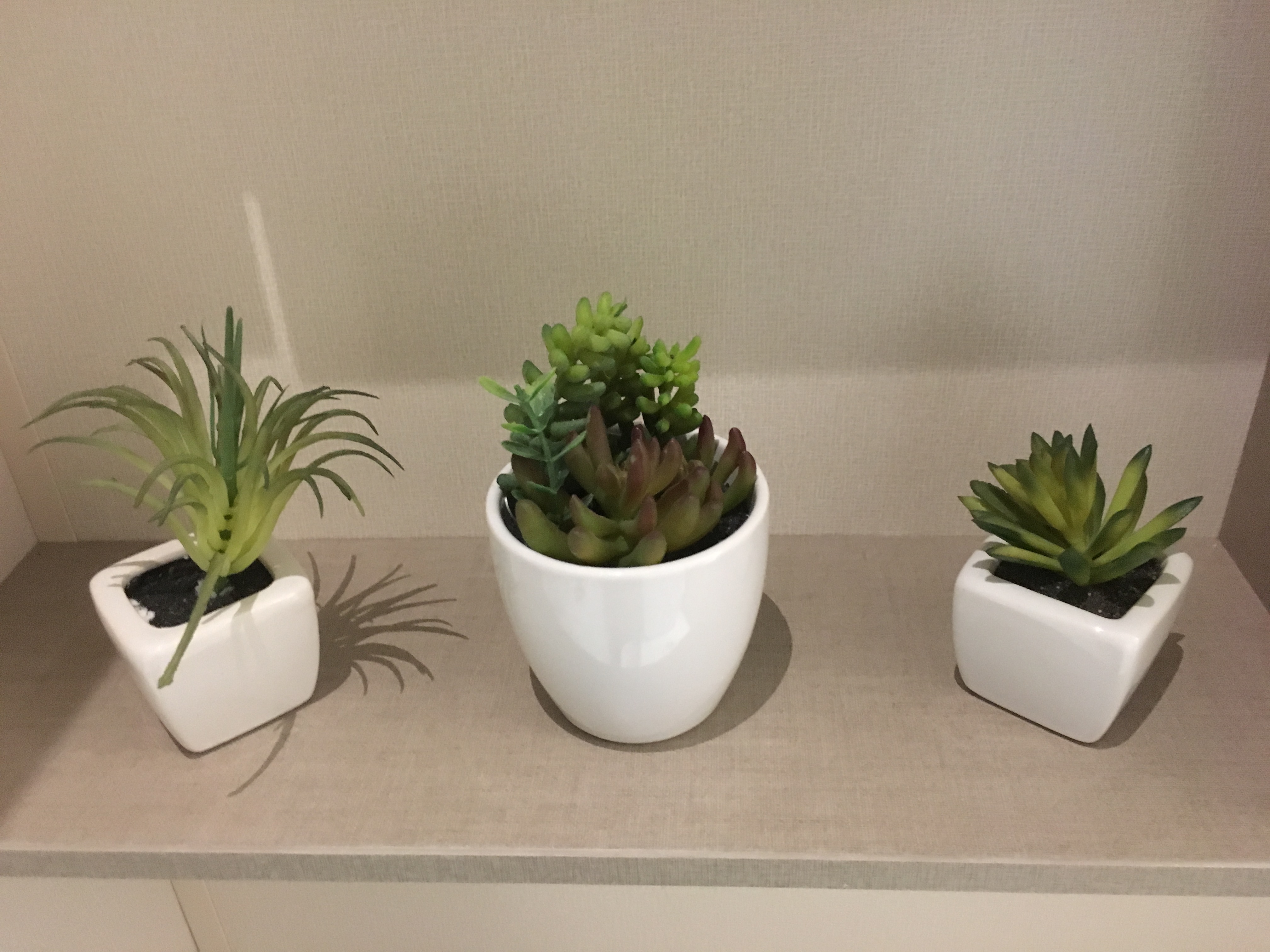
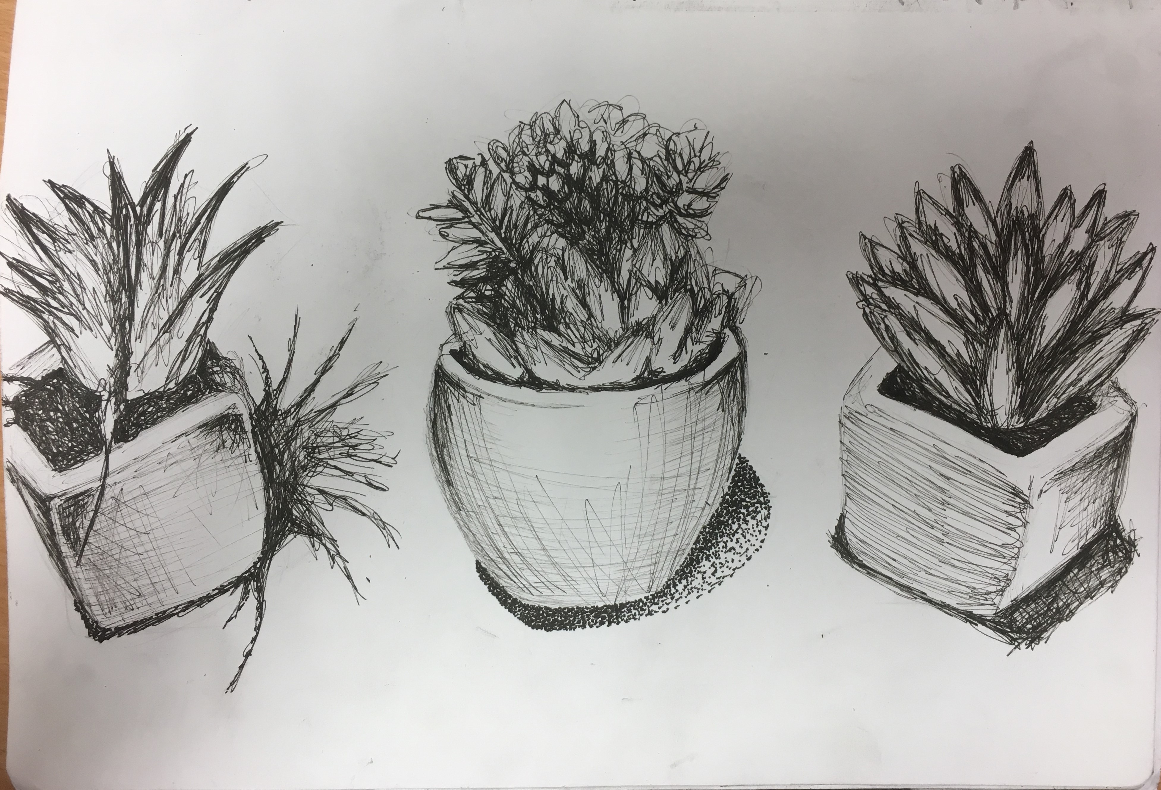
I then went on to do a similar activity with three different mini plant pots. I chose a different media (drawing ink, soft pastel and ball-point pen) for each plant to help me choose which media I preferred for the second part of my exercise. I was quite frustrated with this part of the exercise. My skill with the ink and pastel are somewhat limited and I found it hard to manipulate them well enough. I was pleased with the outcome of the ink in the end as I think I managed to salvage the piece – I love the contrast between the darkest tone of the side of the pot and the lightness of the front of the pot and how it has come together to look like the actual shape of the pot instead of just flat on the page. This is something I would like to work on and improve on. I think I need to try a few more experiments with ink and pastels in the future to improve this skill.
With regard to the soft pastel, I was rather disappointed with this. Again, my skill in this media is somewhat limited and requires practice. Regardless, I allowed myself to use line freely and the end result does resemble the actual object somewhat. Again, I will work to improve my skill in this media.
The ball-point pen, however, I really enjoyed and allowed
myself to get lost in. I fully allowed
my eye and my hand to go wild here. I
used line to show the wall reaching upwards in the background (perhaps I should
have been lighter to avoid drawing the eye from the main focus of the
plant). I used cross-hatching on the
vase to create a smooth appearance, but also to add depth and tone, whilst
using a mixture of stippling and free movement of line to create the plant and
shadow. I think I should have done stippling
for the shadow on the ground as there appears to be too much outline around the
shadow which I believe makes it slightly unbelievable. I decided to attempt that for my final piece
for this exercise.
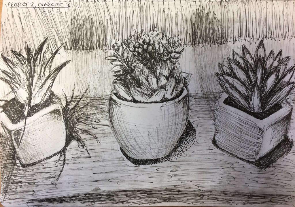
Group of Objects
I decided to create the final part of this exercise in
drawing pen as this was a mix of ink and pen, together with a slight wash to
help practice my ink skills some more. I
chose to work in expressive marks for the flowers and did not focus on the
actual shapes in the flowers, but allowed my hand to just flow as it felt
necessary. I tried to recreate the
cross-hatching for the vases and uses stippling for the shadow on the middle
vase and a mix of stippling and expressive line for the soil in the first vase. I thought the water would mix quite well with
the ink, but was disappointed to find that it only lifted the ink very
slightly. Again, I put this down to a
learning curve! I was also rather disappointed
with the mild shadow coming from the plants / vases and up the wall. I think I had, again, included too much
outline instead of blending them better.
I drew the objects first for this piece as they were my main focus, however,
I think I should have mapped out on my page what should go where first as when I
included the lines for the joining of the ledge to the wall behind it, I noticed
it did not tally up with the real objects in some places. I think by doing this I will also increase my
skill of scaling and placement.
Group of plant pots
Group of plant pots in drawing pen before the background and water wash were added
This exercise strengthened my belief that my skills with
charcoal and ink are still at a very novice stage and require more practice,
which I will carry forward with me, whereas my strength in drawing pen and
ballpoint pen is rather more advanced. I
don’t believe I have fully mastered the concept of light and reflected light,
but have just been recording what I have seen.
My least favourite part of the exercise was definitely the stippling due
to its demands on my arm and hand, so I do not think I will use this often in
my work going forward, however, I do find it much easier with looser and broader
media, so perhaps if I were to do more work in charcoal or ink (with a brush),
it would be less demanding. I have also
learned that I need to stop drawing what I think should be in the piece (shadow’s
outlines) and simply draw what is actually in front of me.
I decided to begin this exercise with a quick rough sketch using charcoal to depict light and shadow on the basic shapes and forms, magnifying my favourites to enable broader strokes. I really like the sphere (bottom right) with only a touch of the lightest tone and think I have created depth rather well in this object considering it was only a very quick, barely controlled sketch! I was rather disappointed with my cubes as
Quick sketches of basic shapes and forms in charcoal
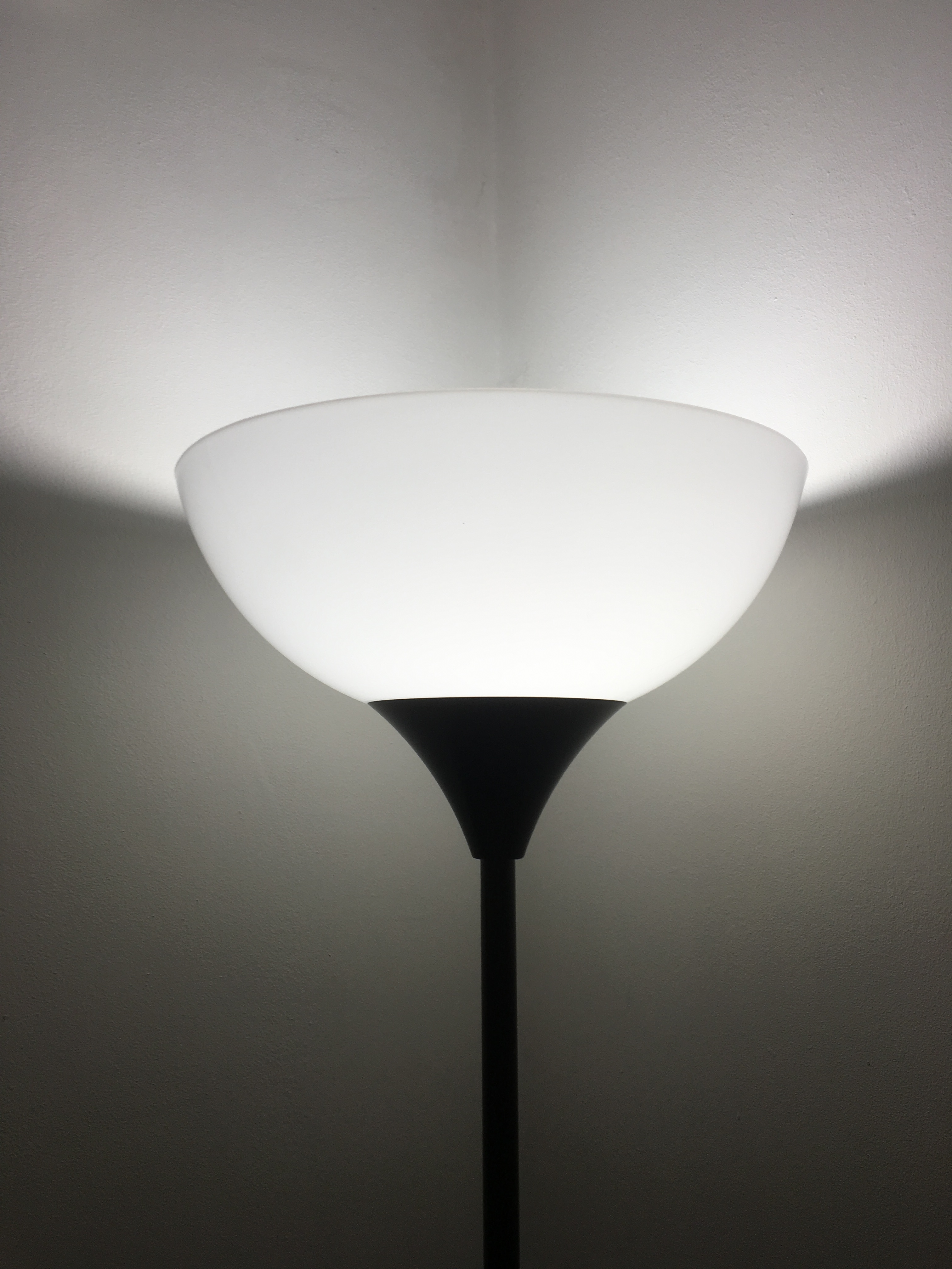
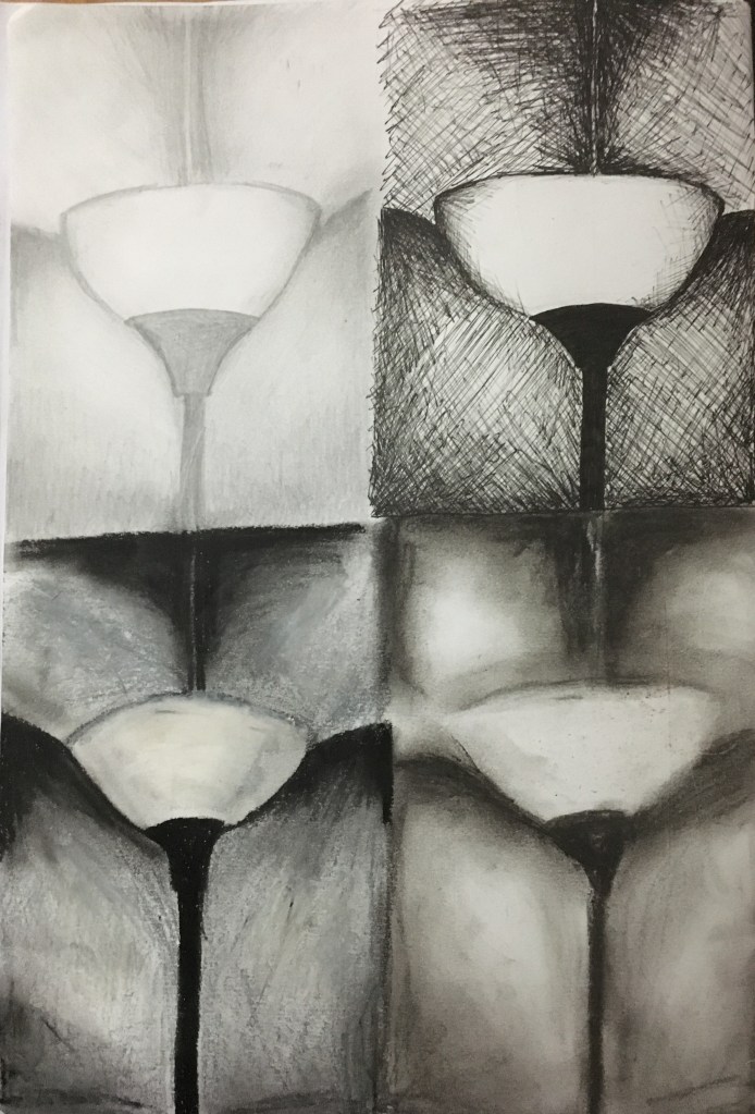
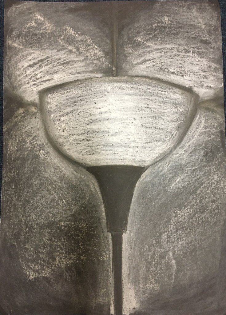
Since starting this course, I have been obsessed with the simplicity and tonal range of the lamp in my dining room so, seeing this as the perfect exercise to experiment with this object, I wanted to begin by playing with four different media; HB pencil, drawing pens, oil pastels and soft pastels. I decided to do this experiment in my A4 sketchbook. I had some A1 black paper so decided I would choose my favourite of the four experiments and invert the colours for my larger piece to use the page’s natural darkness for the areas of the piece which held the deepest shade and to add in the rest with the lighter colours. I thought my favourite pieces would be the oil pastels or soft pastels due to their easy blending capabilities.
Dining Room Lamp
When creating my pieces, I soon realised my previous belief that the lamp and its surroundings were simple due to there being only three or four parts to the composition was very much misled! It soon became apparent to me just how difficult the most basic of shapes, tone and composition can actually be to recreate! I was actually really surprised by this revelation but decided to persevere regardless. I found the pencil and the drawing pen the easiest to manipulate into going where I wanted them to go when drawing a rough guideline of the shapes and shadow placements, and also when finalising the solid outline of the stem of the lamp. However, the pencil did not allow for any very deep and dark shading which was rather frustrating – it felt that no matter how hard or vigorously I pressed, the page just would not darken beyond a certain point. The drawing pens, I found, were fantastic for the deep darkness I was yearning to achieve; however, I did not think the shading worked to best represent the smoothness of the walls and the lampshade. I suppose I could have used just lines, but I still do not think this would have been good enough.
Looking at the two media I had originally thought would be my most successful, I was frustrated with the inability to create solid, sharp edges. The shading of both was brilliant as I could blend them really well (the soft pastels much better than the oil pastels), but I loved the warmth the soft pastels gave off. The whole picture just looked cosy and inviting (if slightly distorted in the piece) – precisely how I feel when I think of my home. I decided this was the winner by far.
I carried out my inverted piece and was rather pleased with the end result. I don’t think it was immediately obvious that it was a lamp – in fact, I even posted the picture in a group on social media and received a comment from someone believing the piece to be a glass! I found this rather comical – I could have been upset or offended etc, but I actually thought it quite amusing and intriguing that someone had seen something in my piece that I had not intended to be there or even seen myself. It gave me a brief insight into just how differently people interpret artwork. I was, however, slightly disappointed in the final outcome due to having, ironically, an inverted issue with not being able to get the intensity I desired, this time in white. I loved the blending of the colours and did this using my fingers to really get into the piece. I think perhaps I could have used fixative and then built the deepest white areas up layer by layer to intensify their vibrancy.
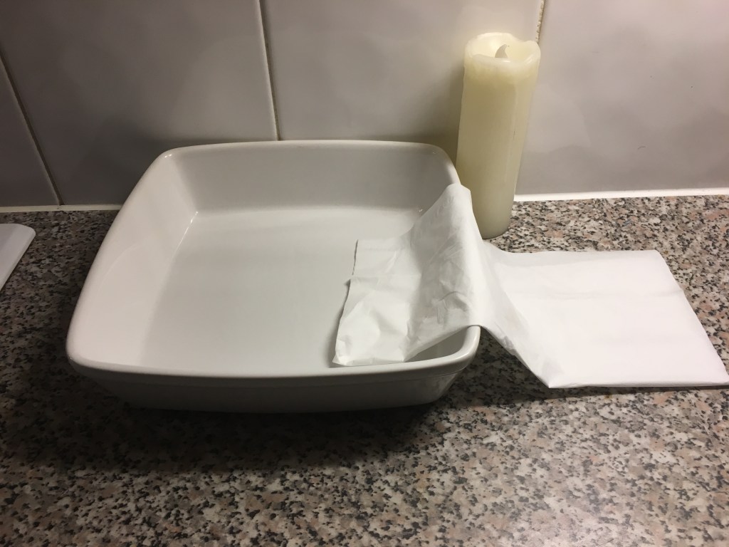
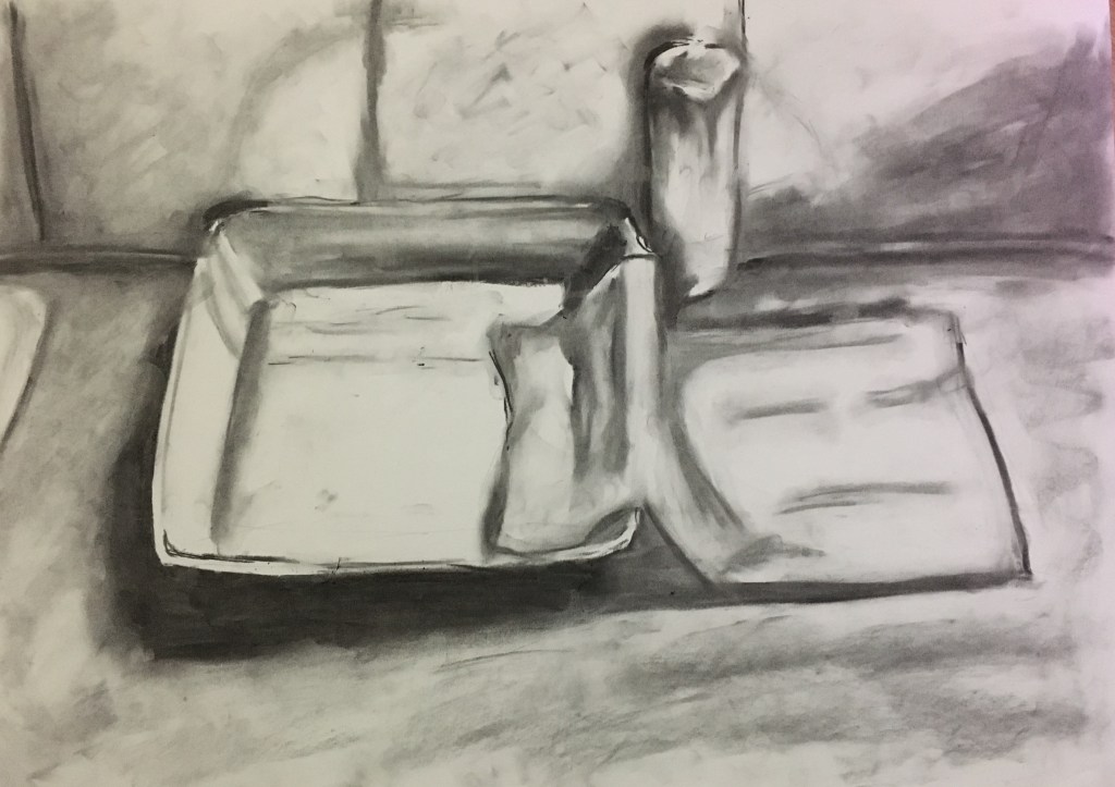
I looked at the exercise again and saw there was a requirement to use two or more objects, so decided to create another piece. I wanted to work quickly on this piece and without too much restriction on myself – I have seen this whole process so far as just quick, rough experiments as opposed to official, structured drawings. I have been more concerned with the process than the end result. I chose three light coloured items: a food dish, a tissue and a candle and placed them on my kitchen worktop. The lighting was poor in the surrounding vicinity due to it being night-time and the only lighting was high above. My kitchen worktop, however, had spotlights just underneath the overhead cupboards, so I thought this would work much better in casting shadows, if only from an angle I was not so accustomed to.
I had a play on an A2 sheet with willow charcoal and, due to the warmth
and ambience of the night-time around me, decided to smudge the edging of the
piece. I chose to do this after seeing
the result of my earlier piece of the lamp’s glow and the warmth that
held.
Besides a few issues with the structure of the objects, I was actually rather pleased with the final result as I think I caught the shading rather well. I had a comment as to the kitchen tiles and that they were rather obvious in their description. I noticed when looking back at the end that the shape of the square bowl could have been much better laid out and made to look much more realistic with some more lighter and darker areas due to the reflective surface which, again, I think is a result of not measuring or taking time and care in the planning of the piece. I also think there is a large element of ‘practice makes perfect’!
Overall, I really enjoyed the process of not so much drawing the piece, but drawing it through the block colours and shading and just adding the finer details of the outline in the end. I will definitely use this again further on in my journey as I have always generally drawn first, added detail and then added shade and light, but actually found it rather refreshing to reverse my methods. Even though my initial piece was misconstrued by a member of the public, I won’t see this as too much of a mistake but more a learning curve of perhaps asking myself how I can try and portray the piece more realistically and tell the viewer what its actual purpose is clearer, or to even work on enhancing the lack of instant recognisability dependent upon the piece I am creating and the purpose it is to fulfil.
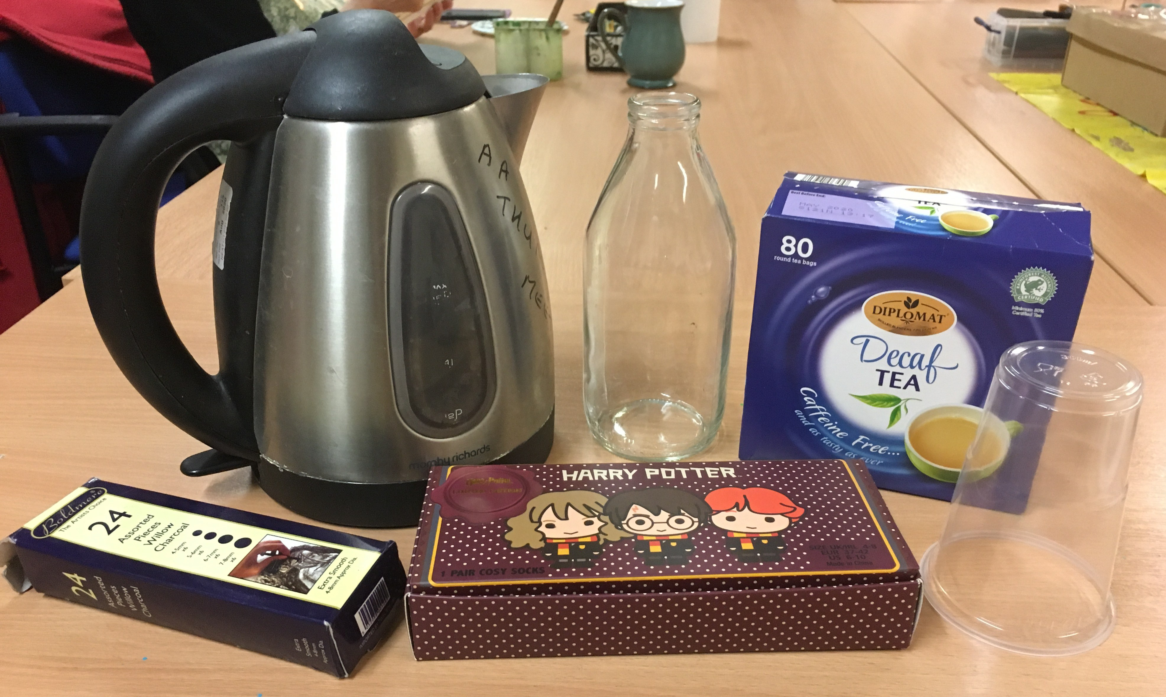
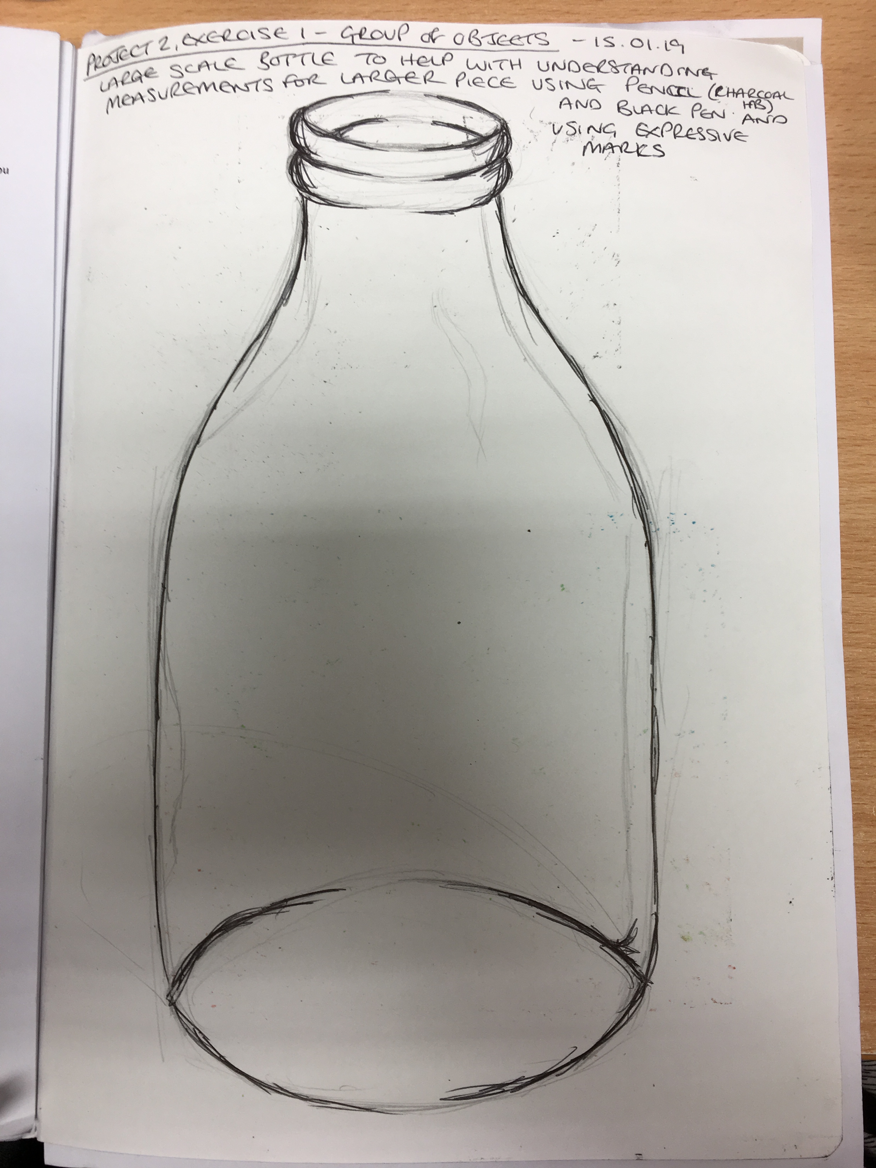
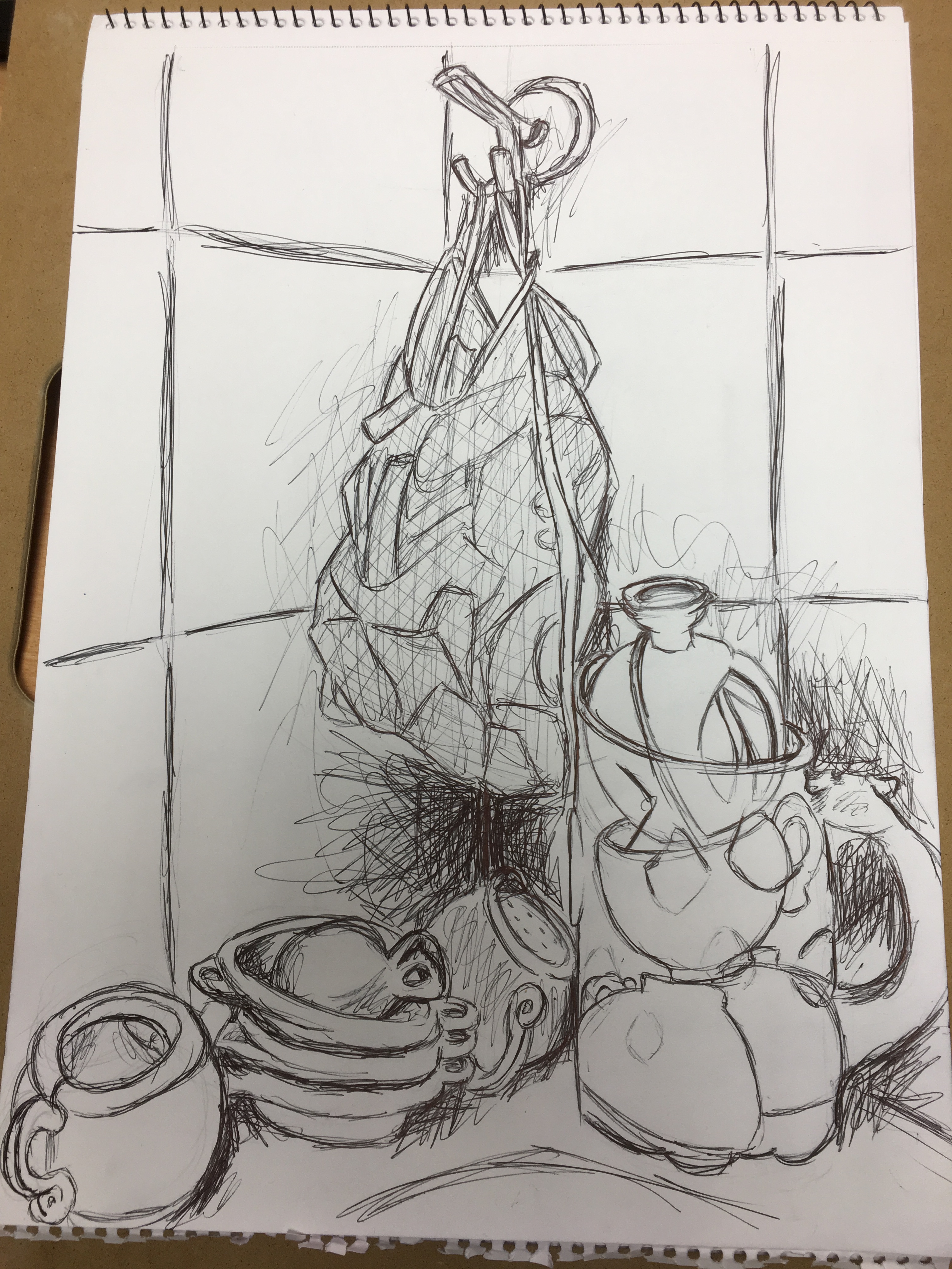
For this piece, I thought I would gather a few different objects from around the local art class I attend and sketch them whilst there. I arranged some objects and, thinking the glass milk bottle would be the hardest piece to replicate due to its symmetry and difference in shade, tone and reflection, I made a sketch of it in my sketchbook to familiarise myself with the shape before continuing to the main piece. I decided that, due to working on such a large scale, I would forgo the pencil and attempt the piece in willow charcoal instead. I thought this would have a much bolder result on such a large-scale piece of paper than a pencil would and, since I was only concentrating on the outline, the pencil would be very fine and almost invisible if viewed from any amount of distance. I was rather disappointed with the end result as I thought it had an almost cartoon-like appearance. I was also disappointed that I had not managed to scale the objects properly in the beginning due to not measuring the objects out on the sheet first, but I thought it was quite good considering it was only a quick attempt and did not have much effort put into it really.
First group of objects
Brief sketch of the glass milk bottle in sketchbook
Sketch of the first group of objects
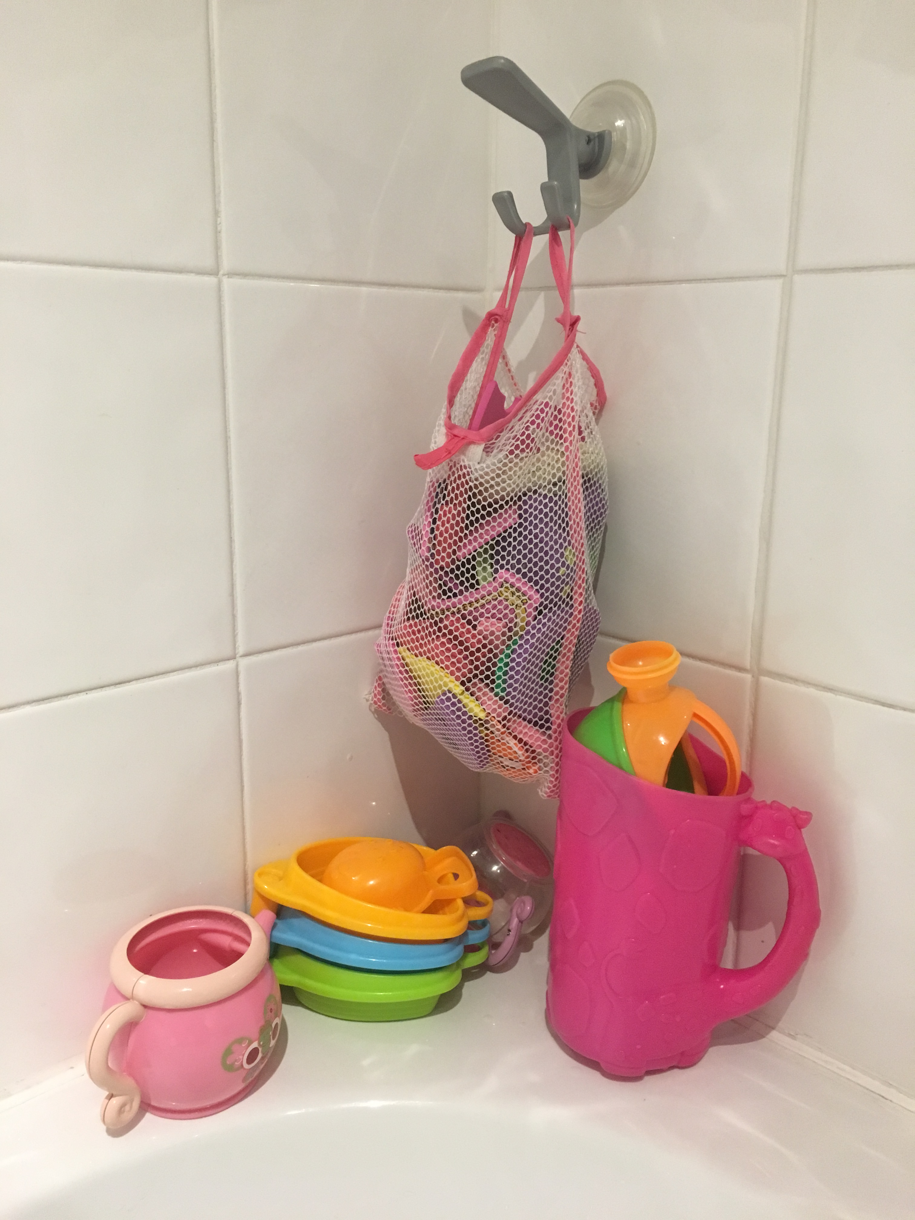
I then thought I would try a different group of objects due
to the first not including anything loose and also wanting to try and draw the
objects inside, as requested, which I had only then realised I had not done in
the first piece. I settled on my
daughter’s bath toys and net bag. I was
rather dubious about the bag as I thought it much too delicate and intricate
for my liking – I am not a fan of creating very fine, detailed work personally (and
more so with my tremor sometimes deciding on the line’s direction and structure
for me!) – and so expected to become frustrated by its delicateness. I thought the pink jug would by far be the
easiest object to recreate. I began the
piece by drawing two sketches in my sketchbook of the net bag and its
enclosures to familiarise myself with the bag and the weight of the items inside
it before continuing onto a larger scale.
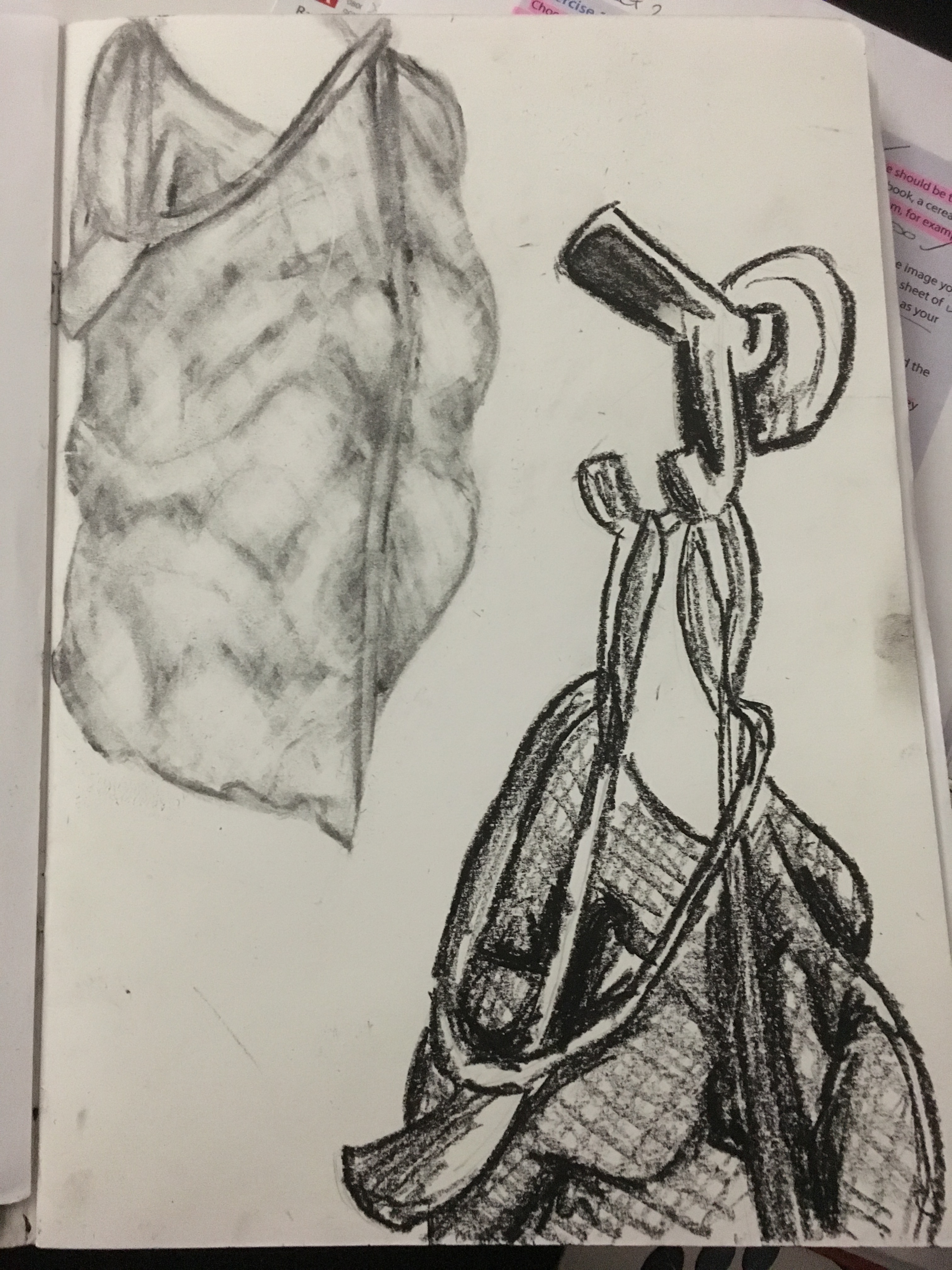
Second group of objects
Initial sketches of second group of objects in willow charcoal (top left) and oil pastel (bottom right)
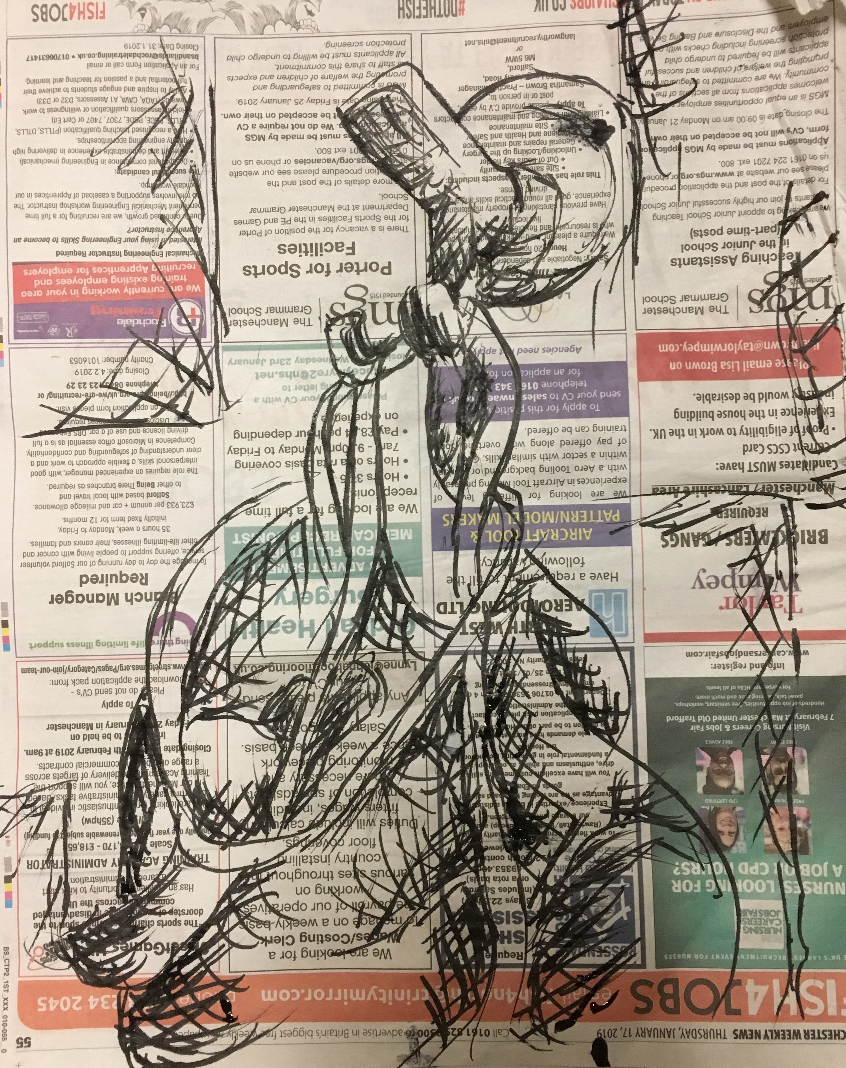
Initial sketch of bag using a drawing pen and ink on newspaper
I created my larger piece in black biro on a sheet of A3 sketchpad
paper. I was actually pleasantly
surprised by the end result of this piece; I had somehow managed to integrate
delicate lines for such things as the net bag and the outline of the objects which
could not be seen by the naked eye, but also deep, dramatic lines for the shaded
areas. I did not want to concentrate too
heavily on the shaded areas due to the piece being mostly focussed on just an outline,
but couldn’t help myself in adding just a little (and rather loosely) in
certain parts of the picture to help clarify the depth and weight of the objects
and their locations within the piece.
Final sketch of second group of objects
Reflection
I really enjoyed this exercise and have learned a lot from it. Mostly I have learned that just because something looks as though it will be difficult to replicate, it is worth giving it a go as there may be different ways to recreate it without going very deeply into fine detail and precision. I think it is also important to try to visualise the items which are inside other items and understand their composure to appreciate how and why the final resting place comes to be. I think this will come in useful when drawing the figure; trying to imagine the placement of muscles and other tissue underneath the skin, why they are there, what purpose they serve and what impact they have on the image you see before you and also in architecture when considering the framework and foundation, and also who might inhabit each building, considering their individual stories. Finally, I think the structure of the objects and the spacing between items in the final piece is quite good compared to my earlier pieces. Perhaps this is because I am now beginning to see the importance of ‘reading between the lines’ so to speak. I will definitely be referring back to this piece in the future.
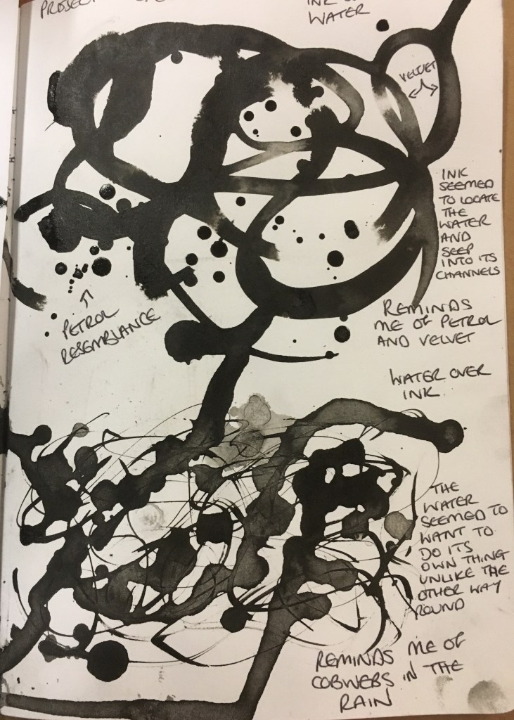
For this exercise, I began by looking around my home, workplace and pretty much every place I visited. I began the exercise by wiping some water across a page in my sketchbook in a swirling motion and dropped ink on top of it. I was surprised to see that the ink seemed to find the water and almost infect it – taking control of the water and merging together with it. Parts of this reminded me of the dense, heavy weight of petrol, whilst others (where the ink and water were quite light in their tone) reminded me of a soft and delicate velvet.
Below this experiment, I inverted the exercise, dropping ink onto the page and then using the drawing pen to create swirls with the ink. I then dropped some water onto the ink and was surprised to see the water was not so eager to merge with the ink. It appeared to have a will of its own. The ink slowly took hold of the water again, but there remained a large portion of the ink areas which stayed solely ink. These areas reminded me of a spider’s cobweb, whilst the mixed areas again reminded me of velvet.
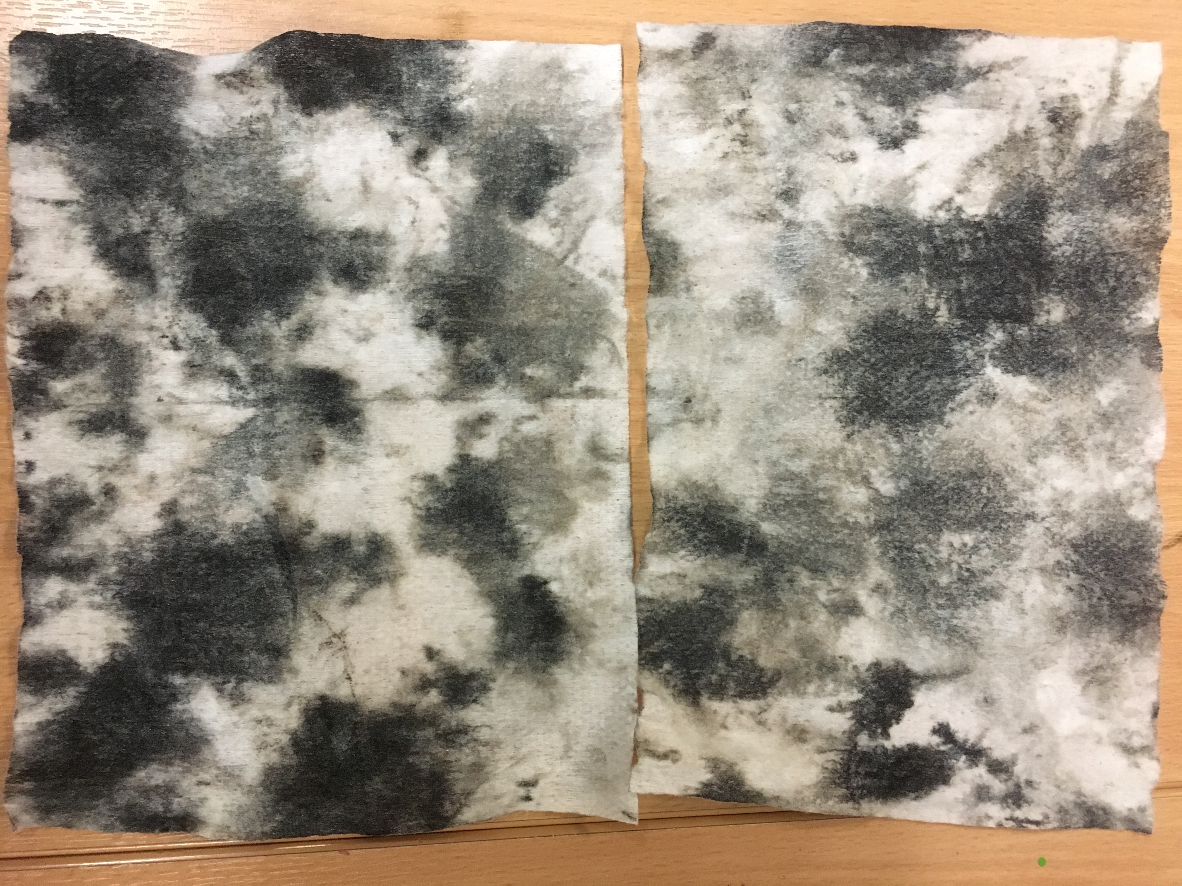
When I had finished, I found the ink had run onto the table in several places, so I got a couple of wet-wipes and wiped the ink up. Bizarrely, I was much more impressed with the results on the wet-wipes than I was the ink in my sketchbook! This got me thinking as to just how differently media can result when on different surfaces. The end result reminded me of my chenille curtains or a marbled pillar somewhat and I just love how the ink has dispersed.
Ink and water / water and ink experiments
Ink-stained wet-wipes
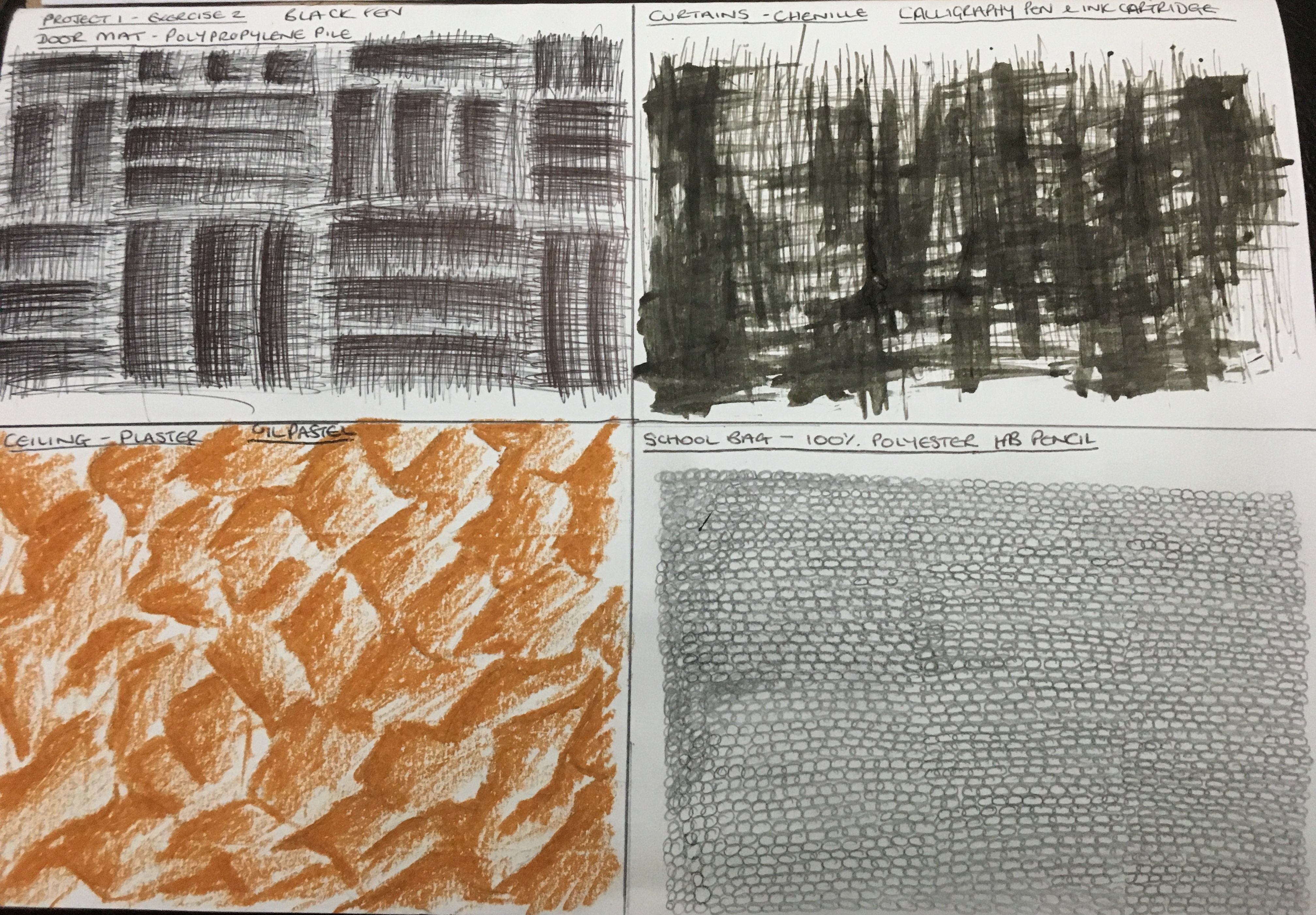
I then decided to focus on four different items which I felt represented very different textures and the potential to use very different media to represent them. I finally decided on the following textures and media:
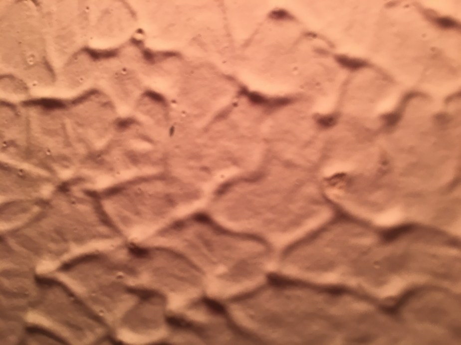
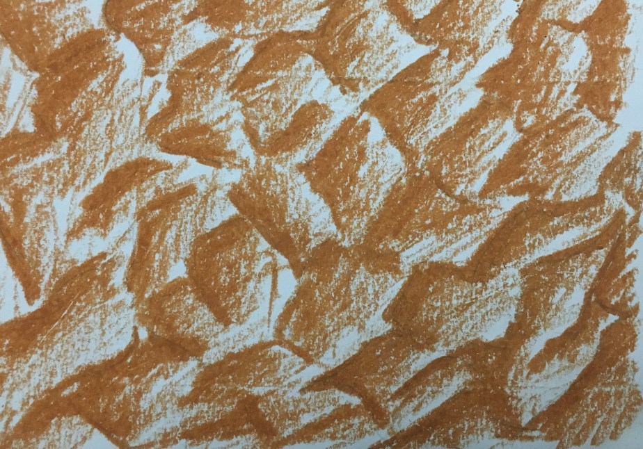
Photograph of the artexed ceiling Dra
Artexed Ceiling
Plastered
artexed ceiling using oil pastel: I chose this item due to its apparently
random design. I chose to use oil pastels because I thought that due to the
ceiling’s texture appearing quite soft, somewhat powdery but also slightly
oily. There was no very fine detail, which I also thought corresponded well
with the oil pastels.
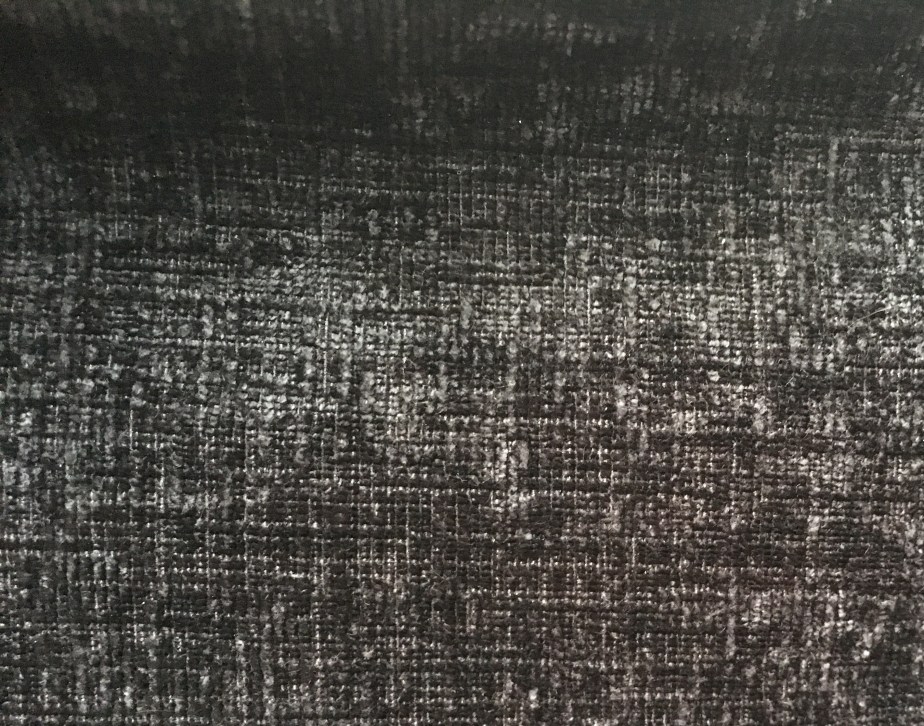
Chenille Curtains
Chenille Curtains
Chenille
curtains: The texture of this, whilst appearing quite fluffy and glossy at
first glance, was actually rather fine and sharp in the lines it held in its
stitching. I really liked the shininess of the fabric and the way it reflected
the light. I decided to use a calligraphy pen and ink to represent this texture
as I thought I would be able to recreate the sharp, fine lines of the
stitching, but also the glossiness of the fabric due to the glossiness of the
ink.
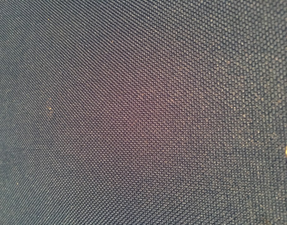
100% Polyester School Bag
Polyester School Bag
Polyester
school bag: I found this texture quite intriguing. It was very fine in its detail and appeared
almost bubble-like in its formation. I
decided I would use a HB pencil for this piece due to it being so delicate and
feeling it would best represent the fine stitching.
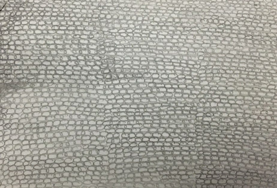
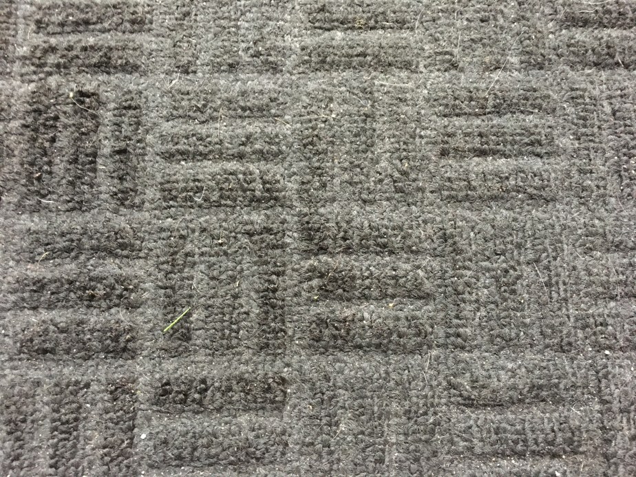
Polypropylene Door Mat
Polypropylene Door Mat
Polypropylene
door mat: I was drawn to this texture purely for its pattern of three lines
horizontal, three lines vertical and so on.
I decided that this was very similar to the chenille curtains, but that
I would use a black biro pen due to not requiring the glossy effect of the
curtains. This material was also rather
rough and I enjoy working rather quickly and roughly with pen, so thought this
a great media to work in.
When I actually began carrying out creating the pieces, I realised rather quickly that I had made the correct choices in some areas, but not in others. I was really pleased with the outcome of the chenille; however, I was rather angry with the calligraphy pen. When I started creating the lines, I found the ink didn’t really flow very well and that it appeared almost brown instead of the desired black. In my frustration, I took the pen apart, squeezed the ink onto the page directly from the cartridge and moved in a crosshatch motion across the space. I actually really liked the outcome and continued until I thought it was done. I really enjoyed the horizontal and vertical line drawing in rapid succession for the mat too. This is definitely something I would like to explore further down the line. I expected to find the fine detail of the polyester bag rather infuriating to draw, but it was actually rather relaxing so, going back to my previous exercise and the likeness to the ‘calm’ mood, the pencil suited the piece perfectly.
Finished Texture Pieces
Reflection
My immediate thoughts when reflecting on this exercise is that I think I could have chosen better media to work with. The chenille, I think, would have looked much better in printing ink or even black oil pastel due to their density and shine, however, I do really like the outcome of this piece. I think it is because of the contrast between the light and the dark, the positive and the negative. I think the artexed ceiling should have been replicated in chalk or soft pastels as I think they would have suited the texture better and could have created a more realistic feel. Looking back, I almost feel as though I have repeated the expressive lines and marks task again as each piece seemed to invoke a different emotion in me; the chenille invoked frustration, anger, disappointment and then surprise when it actually seemed to work out somehow; the polyester bag filled me with a sense of calm, but also relief when I had finally finished the piece; the polypropylene door mat filled me with a sense of giddiness of working in such short, sharp bursts in a media I seemed to just connect with instantly; the artexed ceiling caused disappointment and sadness due to it just not turning out how I had imagined and hoped, but then also acceptance when I admitted to myself that it was an experiment and I would learn from it.
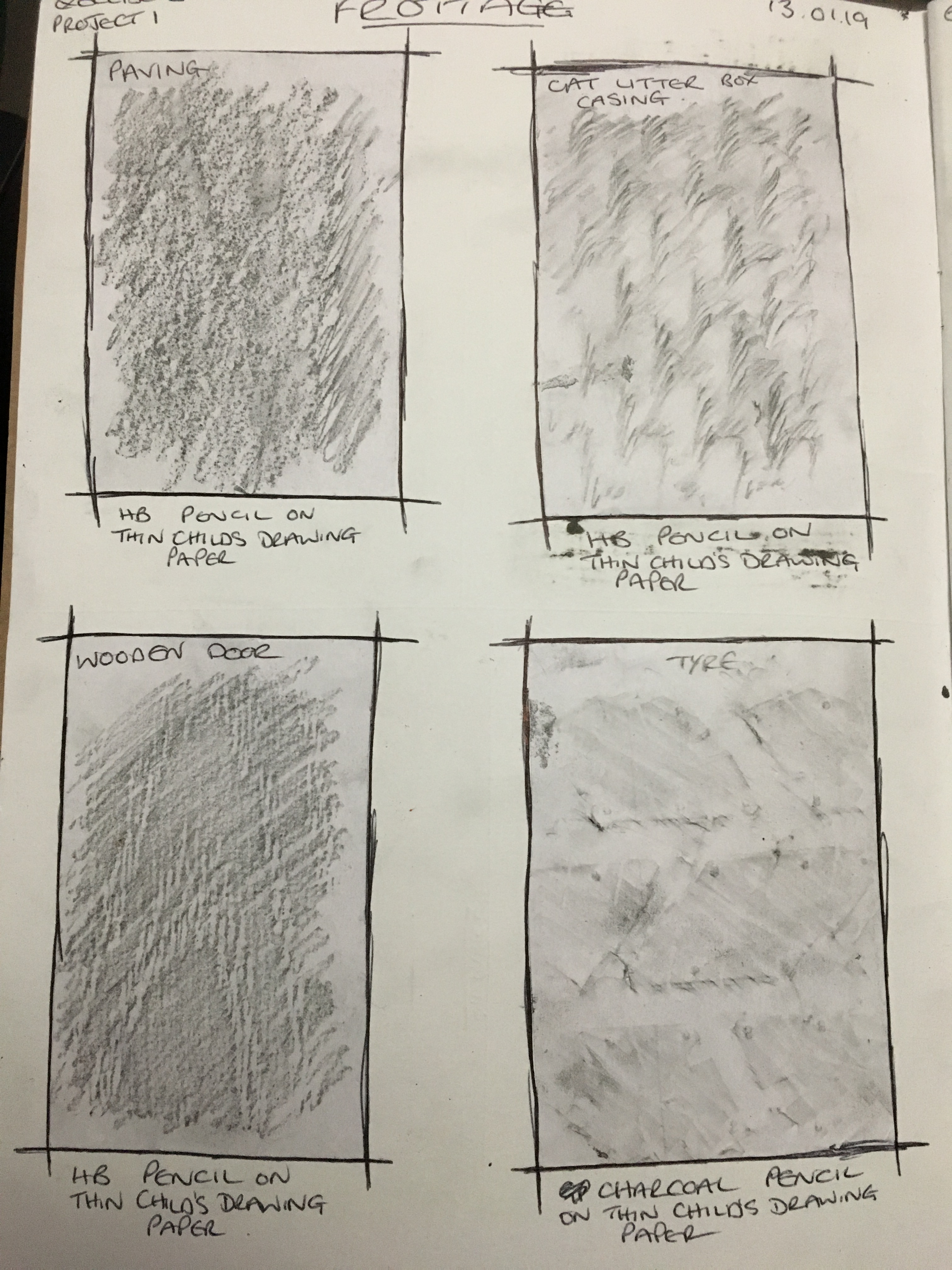
Frottage
I soon realised frottage is something I did quite a lot as a child and have done with my own children without realising there was even a name for it! I quickly learned it was an artist called Max Ernst who actually developed the technique in 1925 (though, personally, I think the concept itself must have been around for a very long time without actually being classed as a method of art or documented etc) and, having done some brief research into who Max Ernst was and what he did, I instantly wanted to have a play at creating a piece of my own quickly in Ernst’s style (I waited, however, until I had an idea as to which surfaces would provide the best results). I was surprised how someone could create work so fantastic and so detailed from a concept so simple and how relatively recently in the history of the world it was that someone discovered and claimed it!
To begin
the actual exercise, I wanted to try some experiments with several different
textured surfaces in charcoal pencil. I
wanted to work in the same media to see just how differently one media could
transfer and create different markings, depth and tone.
Frottage experiments page 1
I decided
to work with a paving stone, the outer casing of my cat’s litter box, a wooden
door, a tyre, a piece of scrap wood my husband uses for cutting and drilling
on, the concrete flooring of our garage, a metal sheet base of our trailer and
a leaf I found whilst walking along. I
expected some items to have more of an impact than others (notably the concrete
floor, the paving stone, the wooden door, the scrap wood, the litter box casing
and the metal sheet).
Frottage experiments page 2
Whilst
working on the individual pieces, it became rather apparent that my initial predictions
were rather hit and miss. Some were
accurate (the scrap wood, litter tray and metal sheet were what I would call a
success), whilst others were rather disappointing (the paving, concrete
flooring and wooden door opened my eyes – or rather fingers – to the fact that
sometimes, just because a surface looks as though it has a lot of texture, does
not mean it will transfer well in this method).
I was also pleasantly surprised by the leaf, as I did not expect the
result of this one to be anywhere near as good or as detailed as it was. It is my favourite by far and definitely
something I would like to redo again.
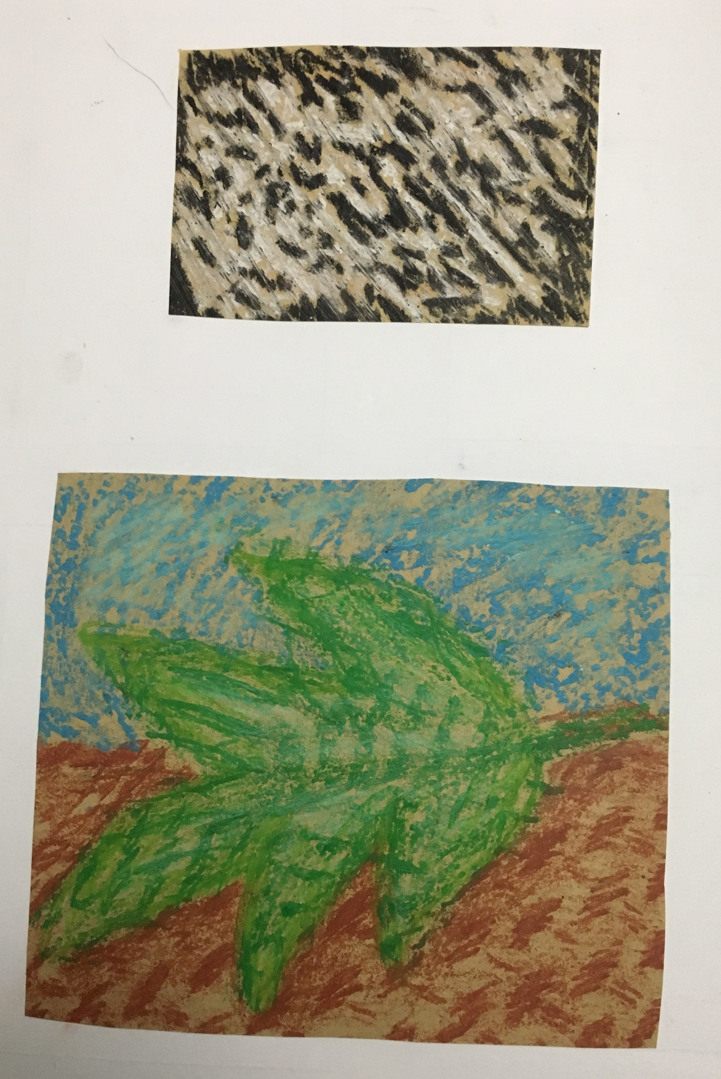
Since I no longer had the leaf and the weather outside meant I wouldn’t be able to find any I could use soon enough, I chose to draw a leaf as though lying on the floor and then added a sky in the background. I decided to use the metal sheet for the leaf, the litter box for the ground and the concrete floor for the sky due to it having an appearance of clouds when used in pencil. I chose to use oil pastels as I thought it quite a contrast to the pencil and would provide a very different result. I decided to use a different colour for each section just to make clear the different parts and separate types of surfaces. The end result was quite juvenile in appearance and something I would actually be ashamed to say I did, so I was rather disappointed, but the process itself was rather fun and definitely a good experiment to try.
Oil pastel frottage in style of Max Ernst
Finally, I decided to make a rubbing of my ceiling again, but this time in white oil pastel. I actually draw into the negative space (the parts which had remained brown) with a black oil pastel. I quite like this result too and think it looks a bit more ‘mature’. It reminds me of a maze with no exits and plenty of dead-ends, so this piece intrigues me more than the actual picture. Also, I think if I am struggling to work out how best to draw a surface’s textures, I will use this method and either incorporate it into my work or use the result as a guide when actually drawing the texture myself.
I would
definitely like to revisit this method further down the line, especially with
leaves and other natural surfaces, however, I would like to attempt it with
something like charcoal or conté sticks, as I think these are still close
enough to a pencil’s firmness, but have a much darker and bolder end result.
I struggled somewhat with this exercise, purely because I
could not find many objects which were reflective and located in the same area
(none of which I was able to carry around with me either)!
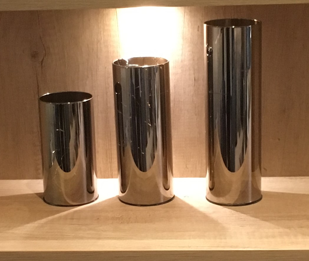
I finally settled on three stainless steel cylindrical vases
which were resting on a shelf and placed one next to the other, from smallest
to largest. Again, I worked rather
freely to create this piece with the charcoal, using large, bold strokes of the
charcoal to show the darker tones / shadows of the piece and used a putty
rubber to lift out the lightest tones / reflected light / light from the
overhead spotlight and, once again, not focussing on the overall shapes of the
objects.
Three stainless steel vases
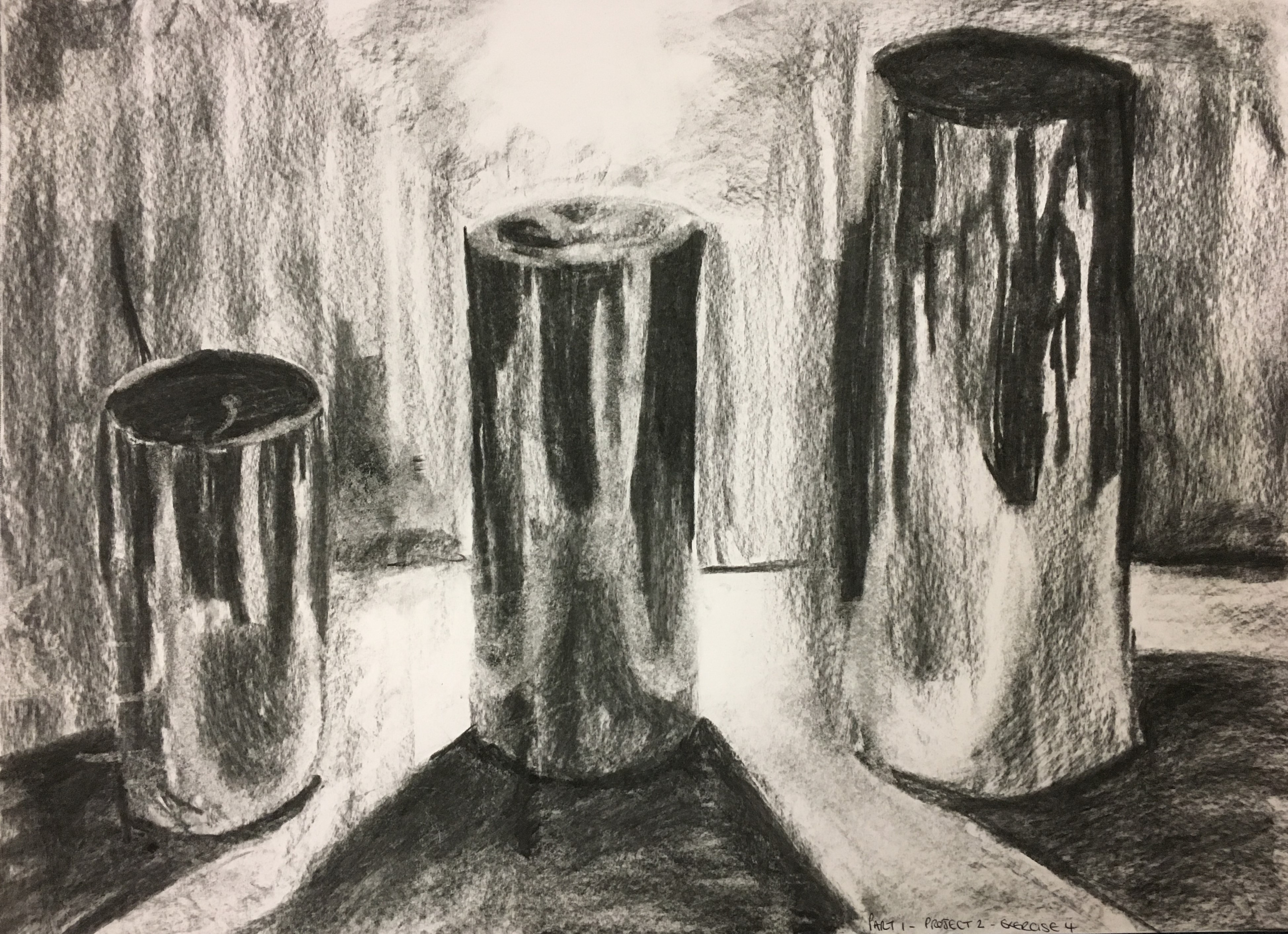
I found this exercise very similar to my previous exercise
and at times became confused with trying to separate the two! I enjoyed being expressive and unrestricted
and maintaining a lack of self-control of my movements, as opposed to working
intricately to create a ‘masterpiece’. I
really enjoy the freedom of expressive mark-making and will definitely use it
in my future works. I found myself
allowing some emotions to flow whilst creating this piece too; I worked
vigorously, relieving stress in the darkest areas, but moved delicately and
gently for the lightest.
Completed three stainless steel vases
Upon closer inspection, I do not think the lines really connect with each other well, but I was shocked to find that if I looked from further away, I could clearly see the objects they were meant to be and how the tones – whilst contrasting – seem to come together and work in harmony to show the finished objects. This really fascinated me!
Whilst I was happy with the outcome of this piece, there
were parts I thought could do with improvement; the shape of the tallest vase
is quite wide compared to the actual object, the shadows on the ground are not
wide enough, the reflected light on the vases is not well placed, as aren’t the
darker tones on the vases, though I wonder how much of this is due to the
difference in my positioning and viewpoint.
I was, however, slightly disappointed in my lack of control with the
charcoal and can only marvel as to how artists such as Odilon Redon are able to
imbue such skill and control over the medium.
I think I need to work more on the formation of the objects and my control
over the charcoal – perhaps using fixative and building the piece up in layers?
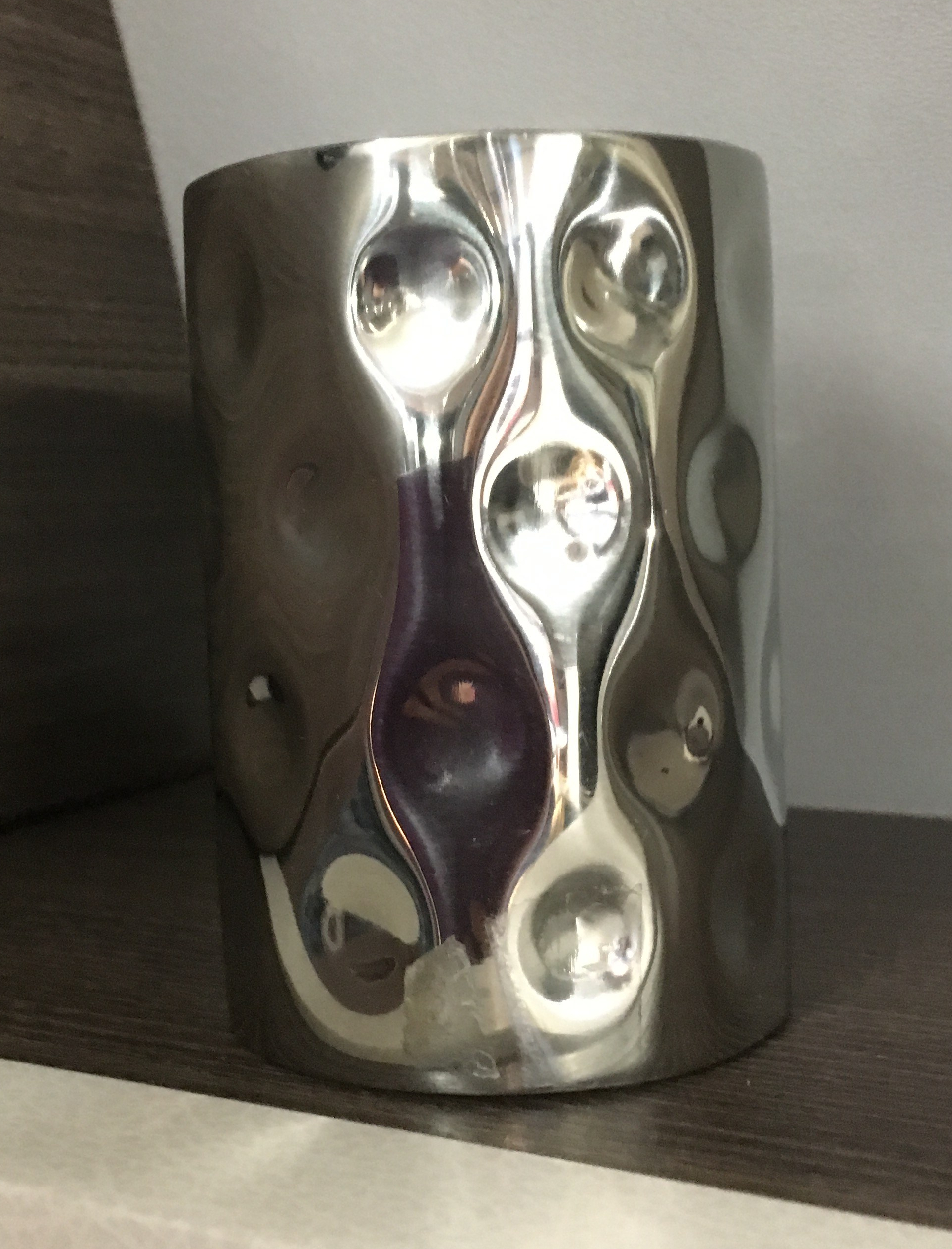
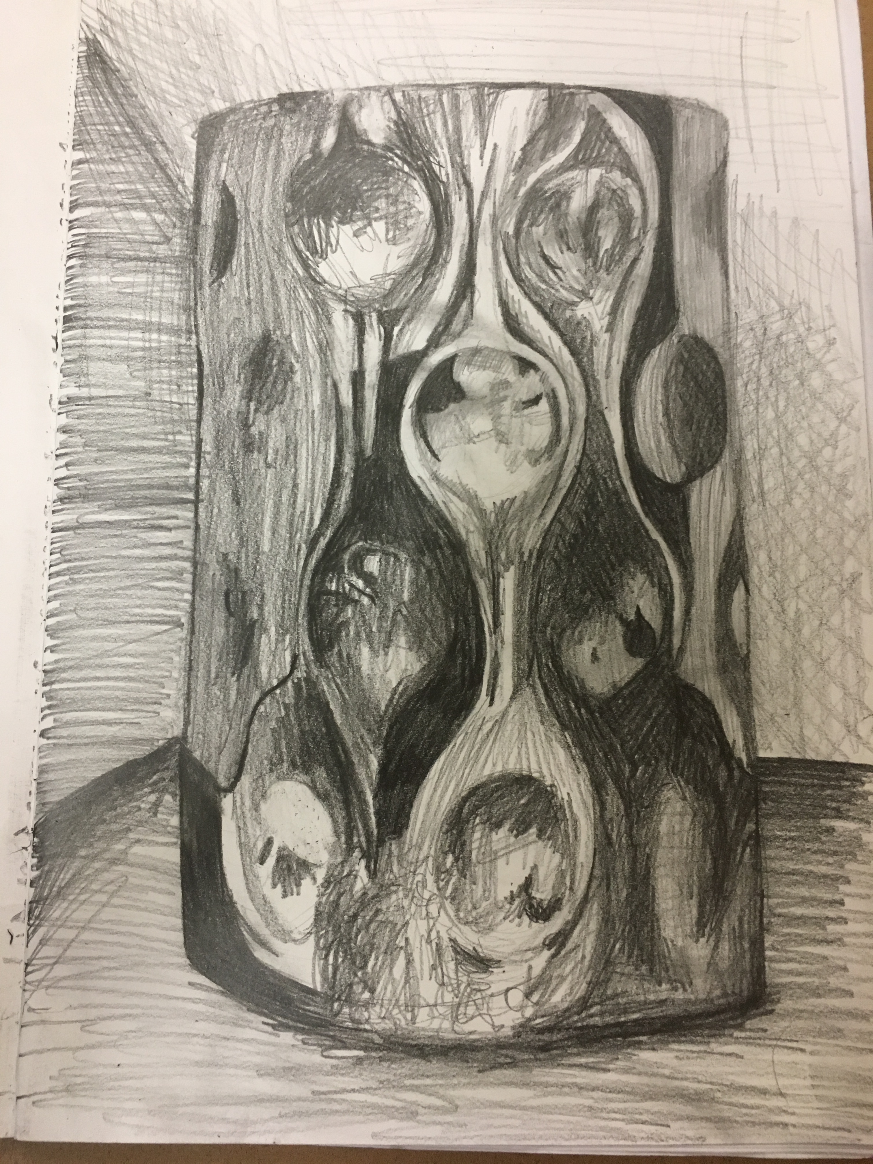
I then moved on and created a piece using just one vase
which had circular indentations. I found
the light reflected beautifully on this object, but I wanted to experiment by using
pencil. For this, I decided to focus
mostly on the shaded areas, laying out only the basics for placement of the
shapes and indentations etc. When I had
finished this piece, I was absolutely thrilled with the result. Whilst I think I lost some of the shaping to
the vase on the bottom right hand corner, I really like how, again, up close the
markings just look very harsh and quickly done, yet from afar the vase appears
very fluid. I think I could have also
added to the depth of the object more by using more curved cross-hatching with
emphasis on the horizontal lines as opposed to the vertical to help show the
curvature of the vase.
Reflective vase with circular indentations
Going forward, I really want to learn how to manipulate
charcoal in such a way as to resemble the clarity and sharpness of the pencil
as artists such as Redon are capable of achieving in their work.
For this exercise, I decided to
stick to pencil (a mix of HB, 4B and 6B), black chalk, black conté stick and
black acrylic printing ink to try to show what I believe to represent the four
topics; pencils for calm (due to their light, fine detail), chalk for sadness
(due to its lightness, but slight lack of control), black conté stick for joy
(to represent the control similar to a pencil, but the boldness of the colour
to represent the intensity of the stronger emotion), and printing ink to
represent anger (as this media is quite a thick, dense liquid, I felt it would
be best suited to the mood as it helps show a lack of control in the flow and
intensity of the darkness in anger).
Calm
Calm: (Top Left – Pencil, Top Right – Black Chalk, Bottom Left – Black Conté, Bottom Right – Black Printing Ink)
I decided to begin my exercise
with the word ‘calm’ as this was, I thought, the most neutral of all of the
emotions chosen and was a good base to start with. I decided to forgo thoughts whilst creating
each section and to just allow my arm to do as it pleased. I quickly realised what represents ‘calm’ to
me are swirls and light, delicate touches with the chosen media. I found the pencils moved smoothly and freely
over the page, as did the conté sticks as they held more control, whereas the
chalk did not flow quite so smoothly and the ink barely at all. I thought, however, the shade of the pencils
and chalk were light and delicate, which I felt suited the mood better than the
boldness of the conté stick and ink.
Sadness
Sadness: (Top Left – Pencil, Top Right – Black Chalk, Bottom Left – Black Conté, Bottom Right – Black Printing Ink)
For this emotion, I decided to
once again allow my arm to flow freely.
I found that I was sluggish in my movements and was pulled naturally in
a downward pattern. I felt the pencil and
conté stick did not create enough of an impact for the mood, whereas I thought
the chalk’s boldness yet slight lack of control fitted perfectly. I liked how the printing ink seems to lessen
in intensity as it flows down the page, almost as though tears were rolling
down a face.
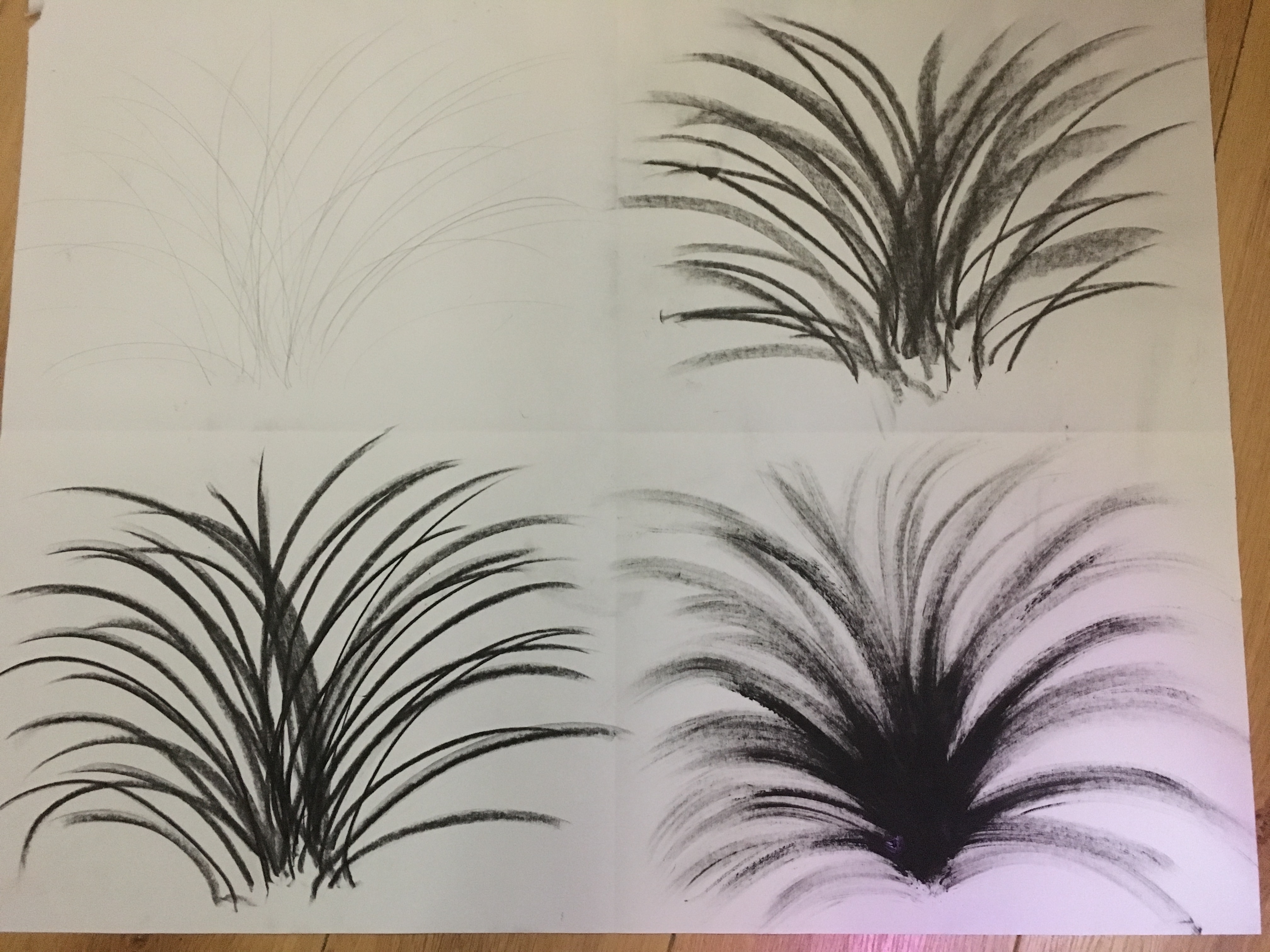
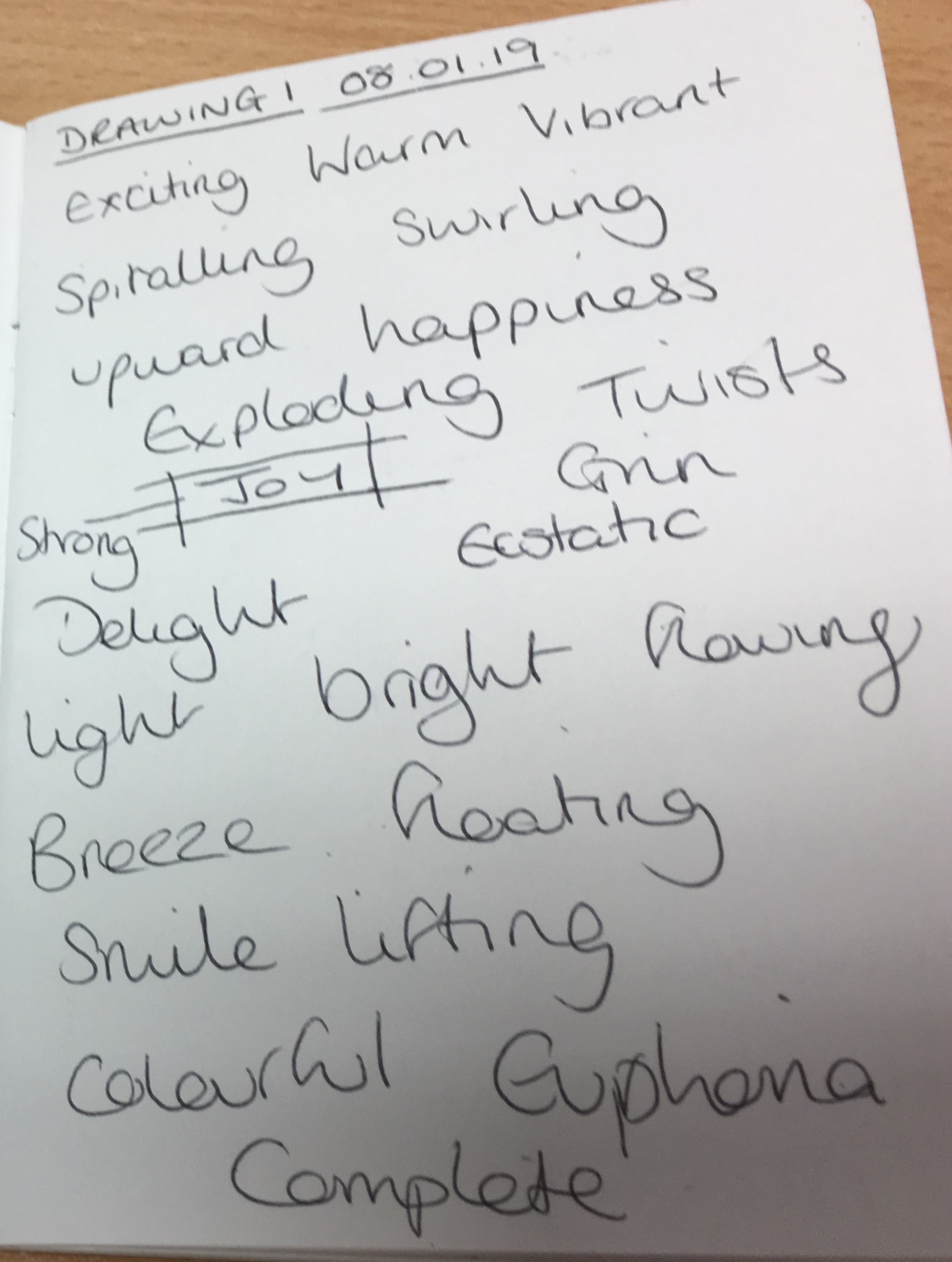
Joy
Joy: (Top Left – Pencil, Top Right – Black Chalk, Bottom Left – Black Conté, Bottom Right – Black Printing Ink)
I felt ‘joy’ represented a
similar amount of control to that of ‘calm’, but with short bursts of energy in
lines raising upwards almost like a firework, as opposed to free-flowing swirls
or sluggish downward-pulling movements.
Again, I do not think the pencil does the mood justice here as its
intensity is very lacking, however, I feel the charcoal and ink do not show
enough control or vibrancy which I experienced with this emotion. I really like the conté stick piece as I feel
that portrays the emotion the best for what it means to me – almost like the
crispness of vision in an adrenaline rush.
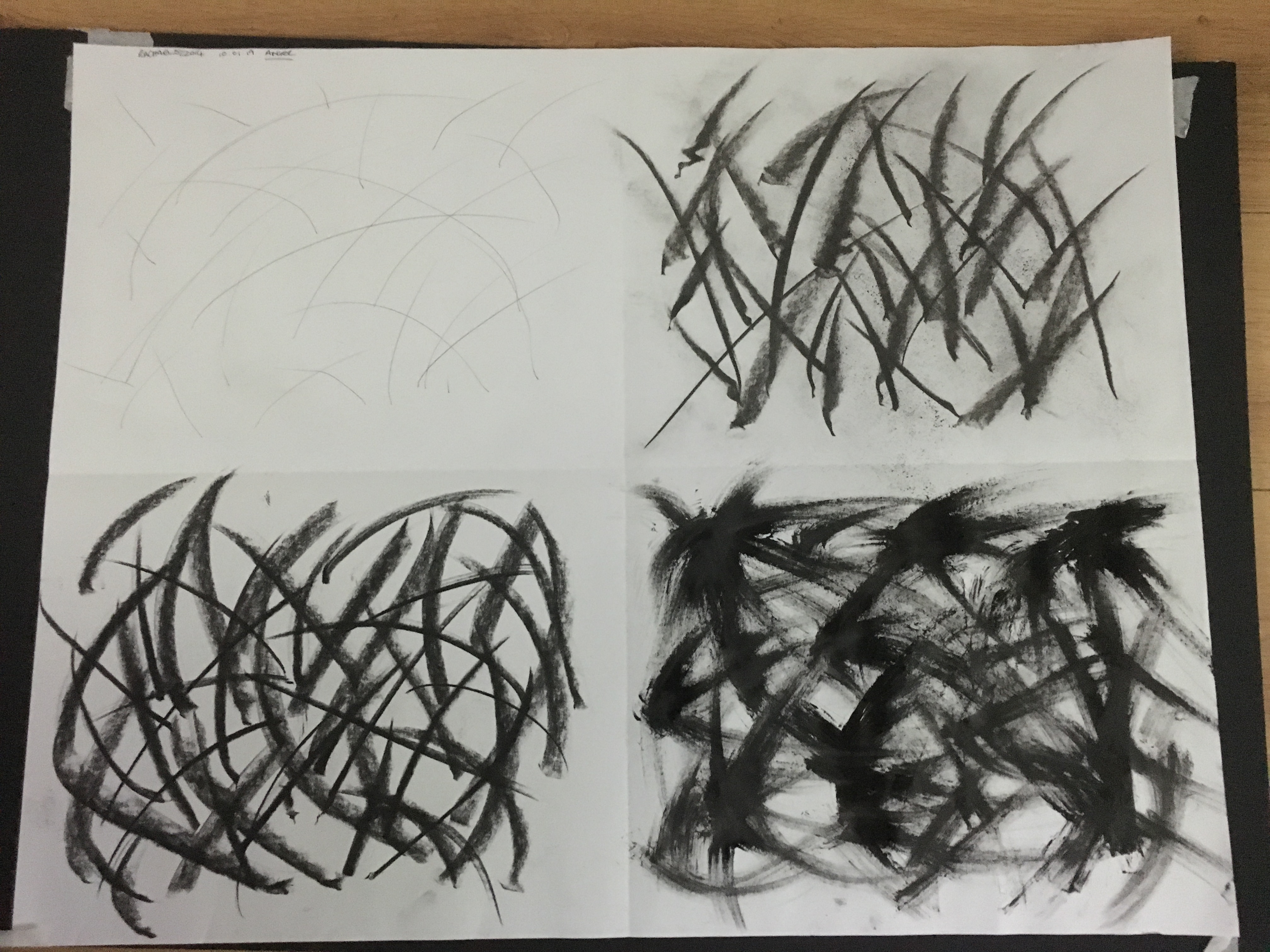
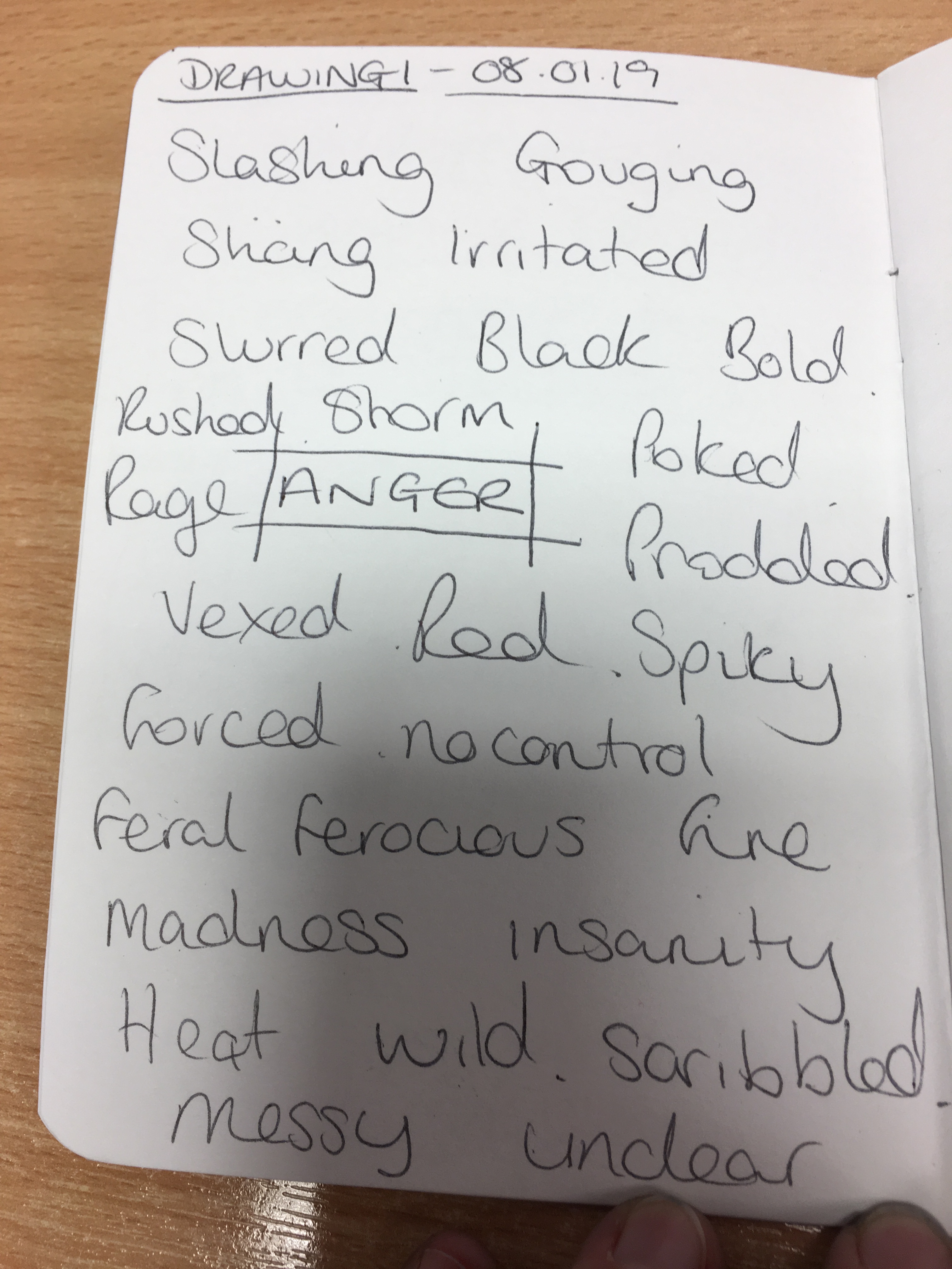
Anger
Anger (Top Left – Pencil, Top Right – Black Chalk, Bottom Left – Black Conté, Bottom Right – Black Printing Ink)
For this emotion, I found I had
no self-control whatsoever. I found my
arm slashing and jabbing in short bursts with no thought to their aim or
impact. Again, the pencil does not do
this mood justice as its marks are too faint and feeble to express the strength
you seem to find from nowhere when angry.
Whilst I think the chalk and conté stick create a good representation of
the mood, I am more drawn to the boldness and intensity of the printing ink due
to the thickness of its texture and the lack of control I experienced when
trying to manipulate it.
Reflection
Upon reflection, I think I have learned that pencil is not always the best tool to express emotions and works better for the ‘happier’ moods, whereas the boldness and intensity of the printing ink, conté stick and somewhat the chalk, all work better for the ‘darker’ moods. I found I enjoyed working on the ‘anger’ pieces the most due to the fact I enjoyed the messiness of it and the lack of restriction and self-control the ‘happier’ moods seem to require. I think if I were to redo these pieces, I would choose media such as watercolour pens and markers for the happier moods as, whilst pencil works well for calm, I do not think it portrays mood well at all, regardless of what emotion that is.
Before
beginning this exercise, I had a think about what temporary art meant to me and
the thoughts and feelings it invoked. I found the idea of it frustrated me as I
couldn’t quite understand why anyone would want to put so much effort, time and
energy into something which would be washed away in a matter of seconds,
minutes, hours etc. It felt quite sad knowing that it would not be around for
the masses to view, such as a masterpiece hanging in a gallery for decades at a
time. Whilst reluctant to begin this task, and also unsure as to what method to
use, I decided to wait until the timing felt natural and I could give the
biggest dedication level I could to it.
Whilst
doing my weekly cleaning, I reached the stage where I would polish the fronts
of my kitchen cupboards. My children and husband were not around and I had a
bit of time to relax and focus. I decided to see what would happen if I were to
attempt to use my polish as a spray paint substitute.
I
didn’t really think about what I wanted to do with the spray, or how I wanted
the design to go, I just decided to let my arm choose where it wanted to go and
what it wanted to do.
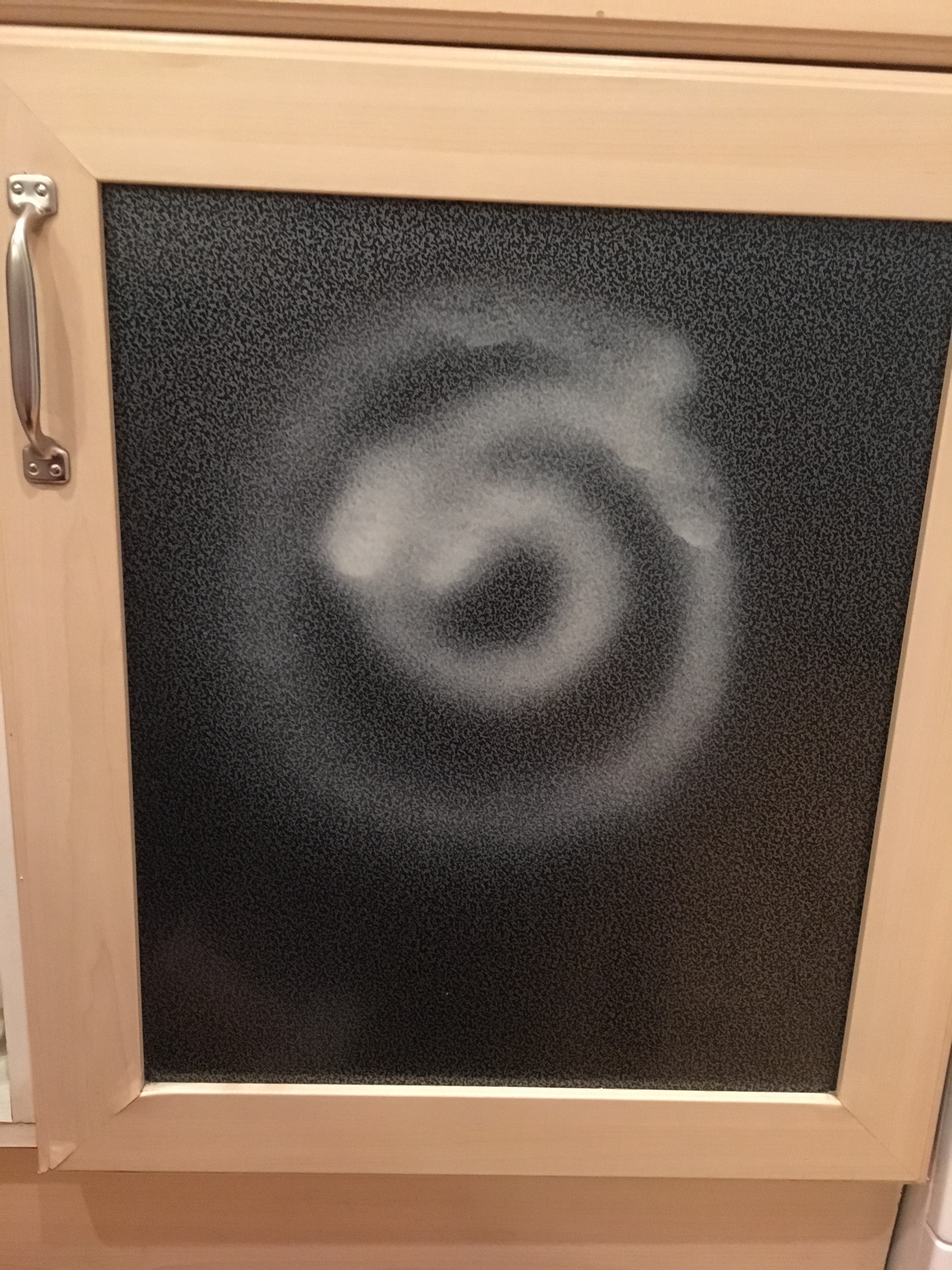
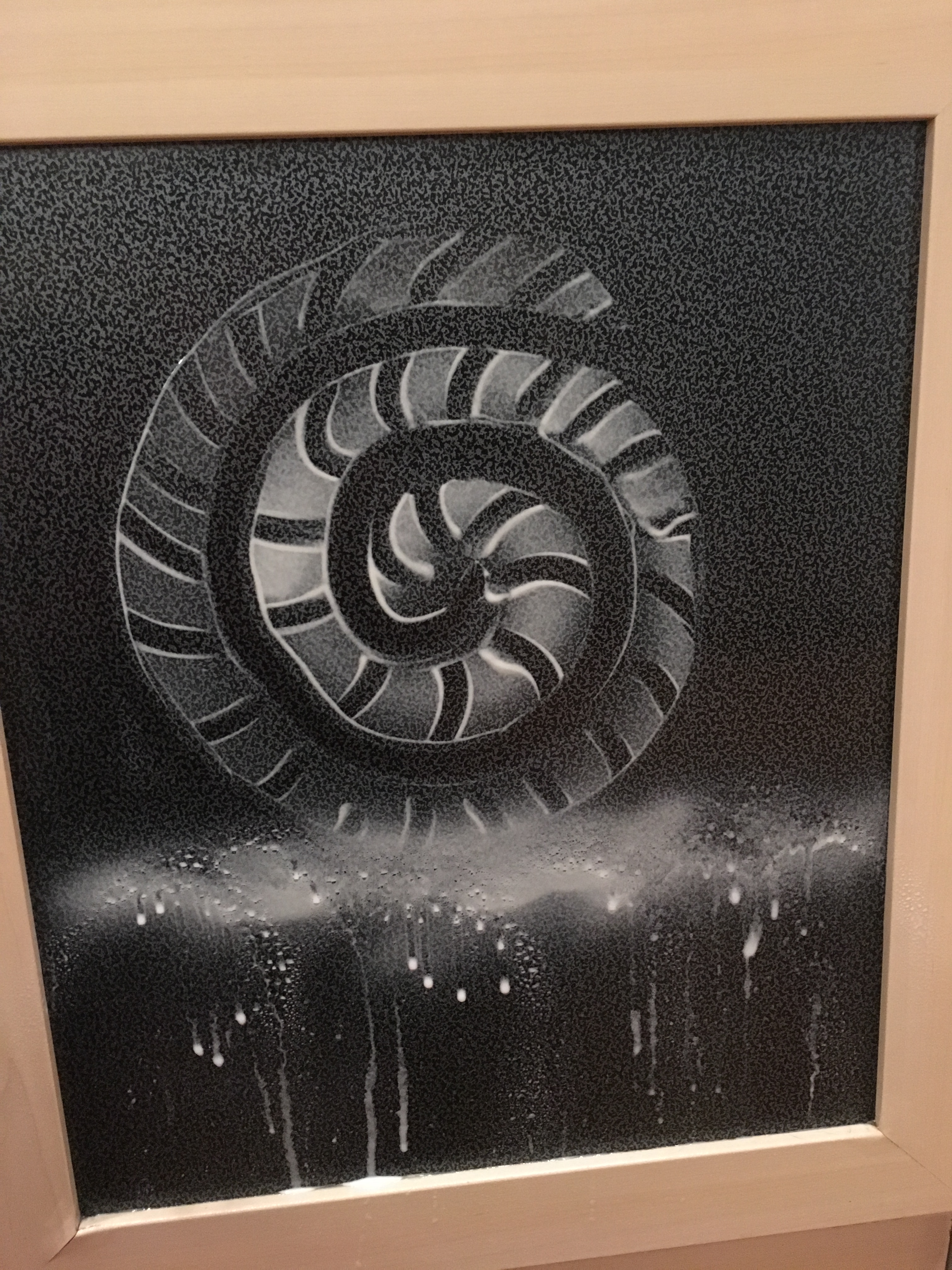
Since being diagnosed with Essential Tremor, I have found I am rather drawn to the spiral as this shape helps to assess the intensity of my tremor and also the angles at which it is worst (usually at the ‘2 o’clock’ angle), so I suppose my subconscious took control!
First Stage: Creating a spiral
I
started by just spraying the spiral shape and to fade it out slightly as I went
on. I then decided to draw curved lines throughout the spiral to give it a
sense of being 3D. After this, I thought I could leave it there, but decided it
was not sharp enough or quite as ‘finished’ as I would like, so I proceeded to
rub a line throughout the shape’s outline to enhance the resemblance to a
shell, which it was apparent it was beginning to take the form of without any
conscious prior willing for it to do so by my mind.
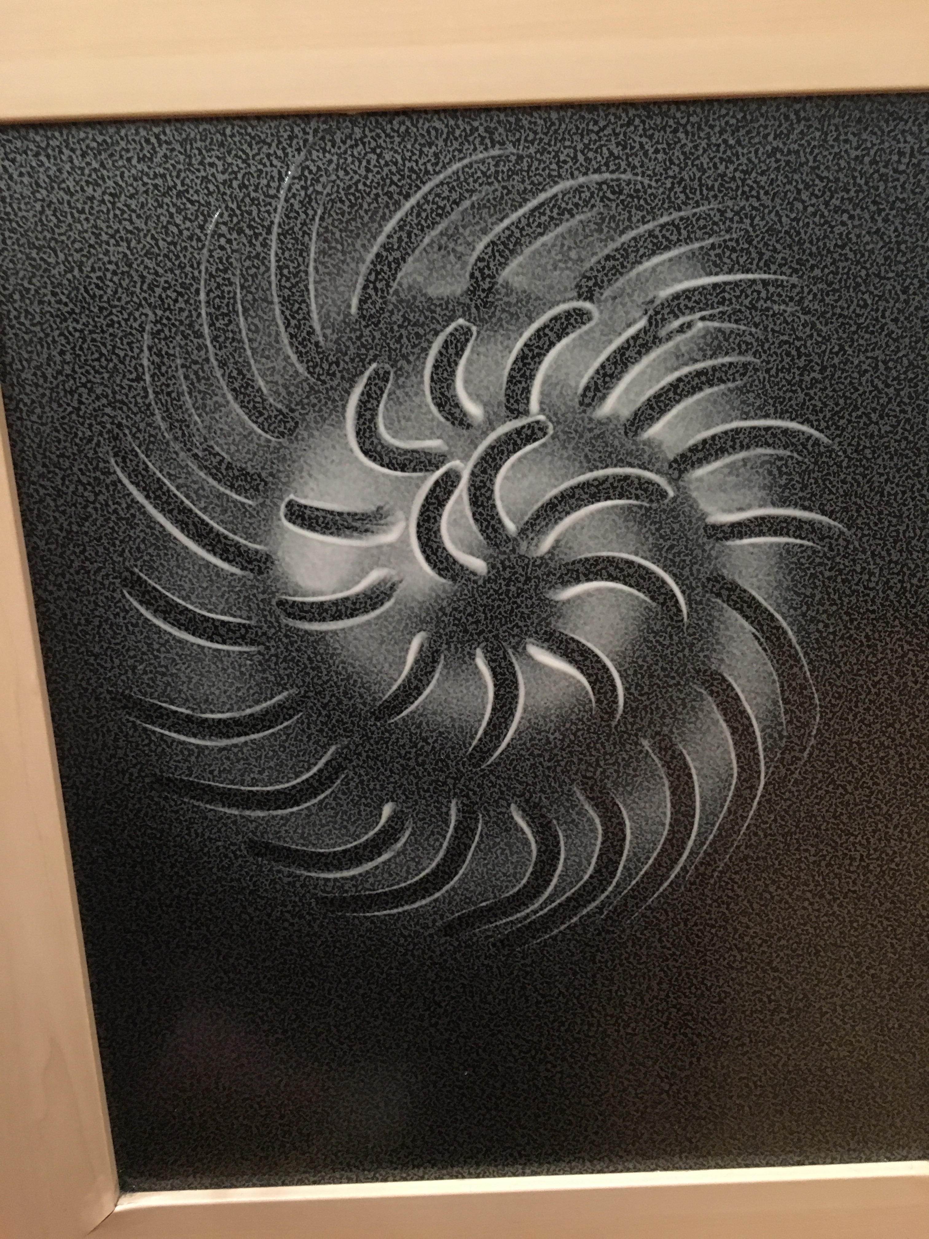
Once
the outline was complete, I decided to try and create a beach effect with the
spray, so at first I held it facing parallel to the cupboard door, but then
changed it so I was pointing it downwards to create a dripping effect to
represent the tide’s ebb and flow.
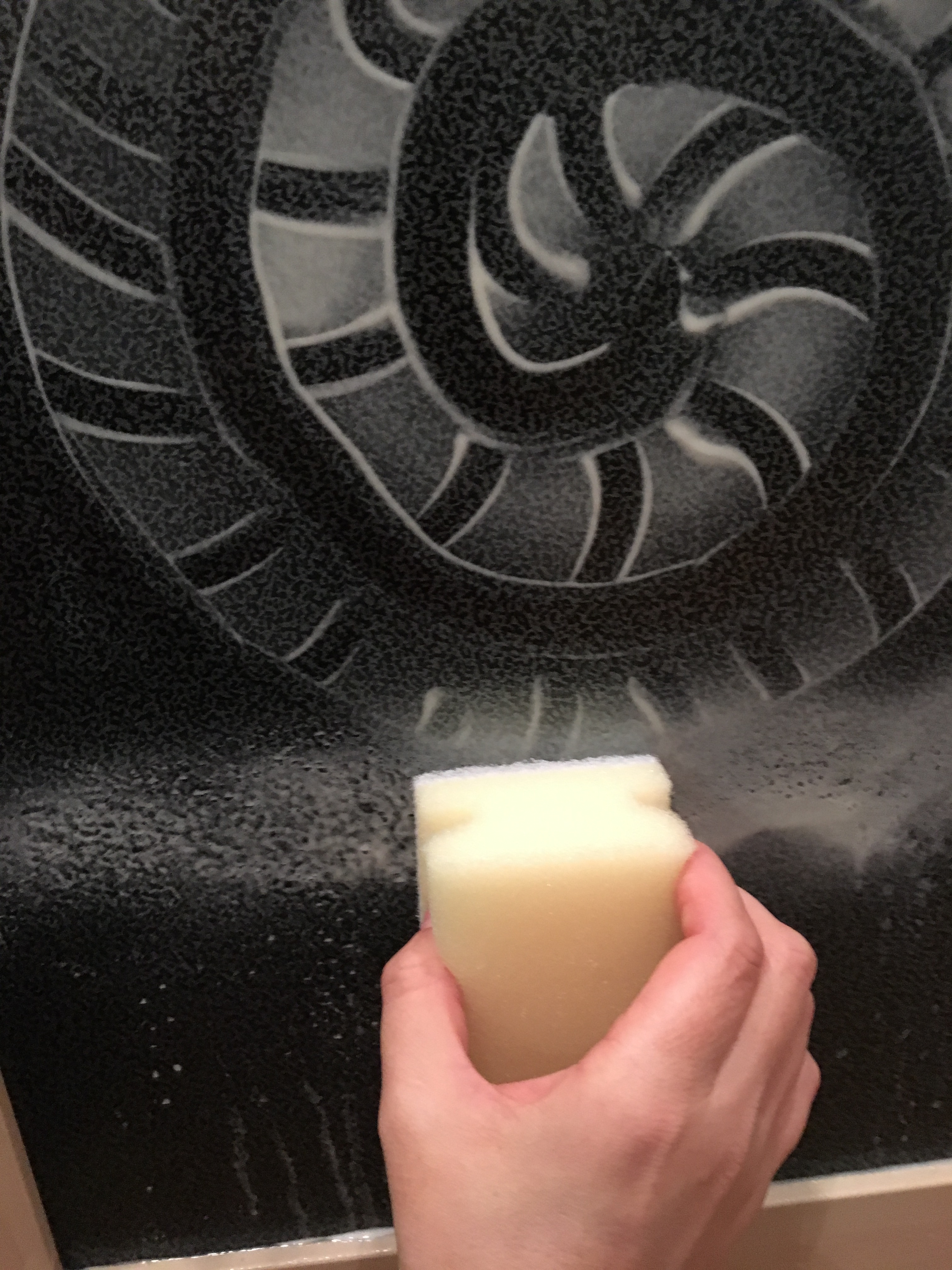
I
then used a sponge to dab the spray to create a grain effect to emphasise the
sand detail.
I
then added a brief spray at the top of the door to resemble clouds but mostly
to fill the empty space. The spray splattered a little, but I left this as I
thought it resembled stars and created the appearance that the whole picture
was actually a twilight image. Whilst creating the piece though, the time of
day of the piece had not even entered my mind.
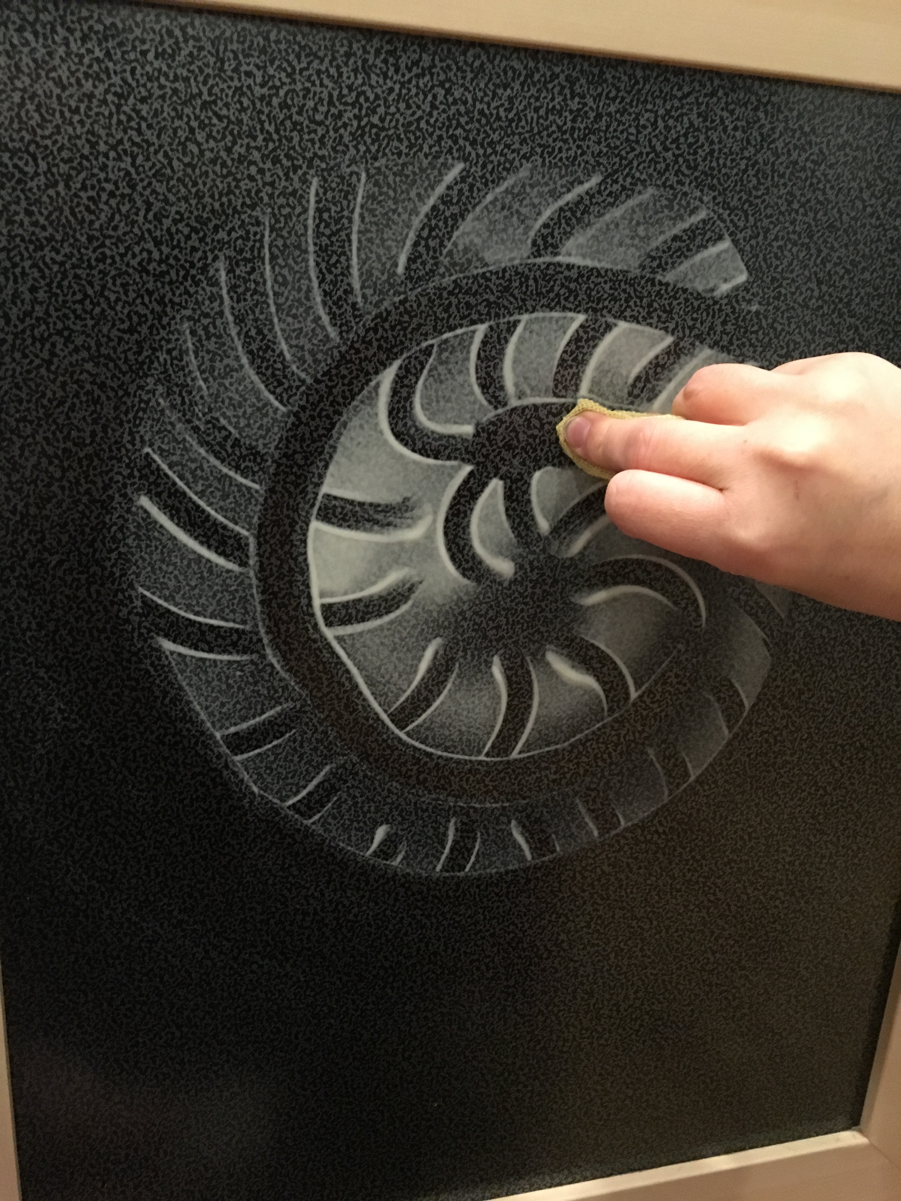
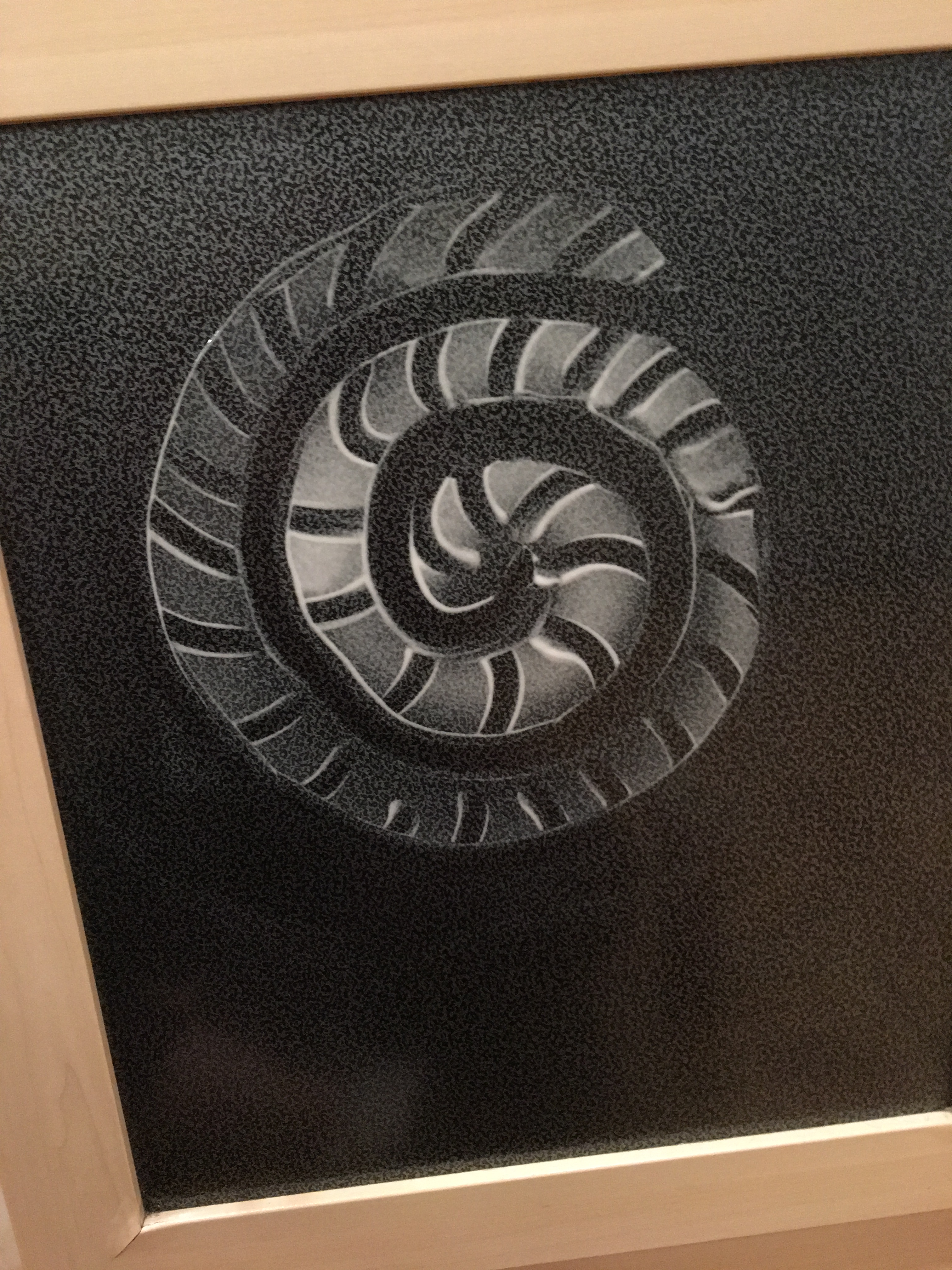
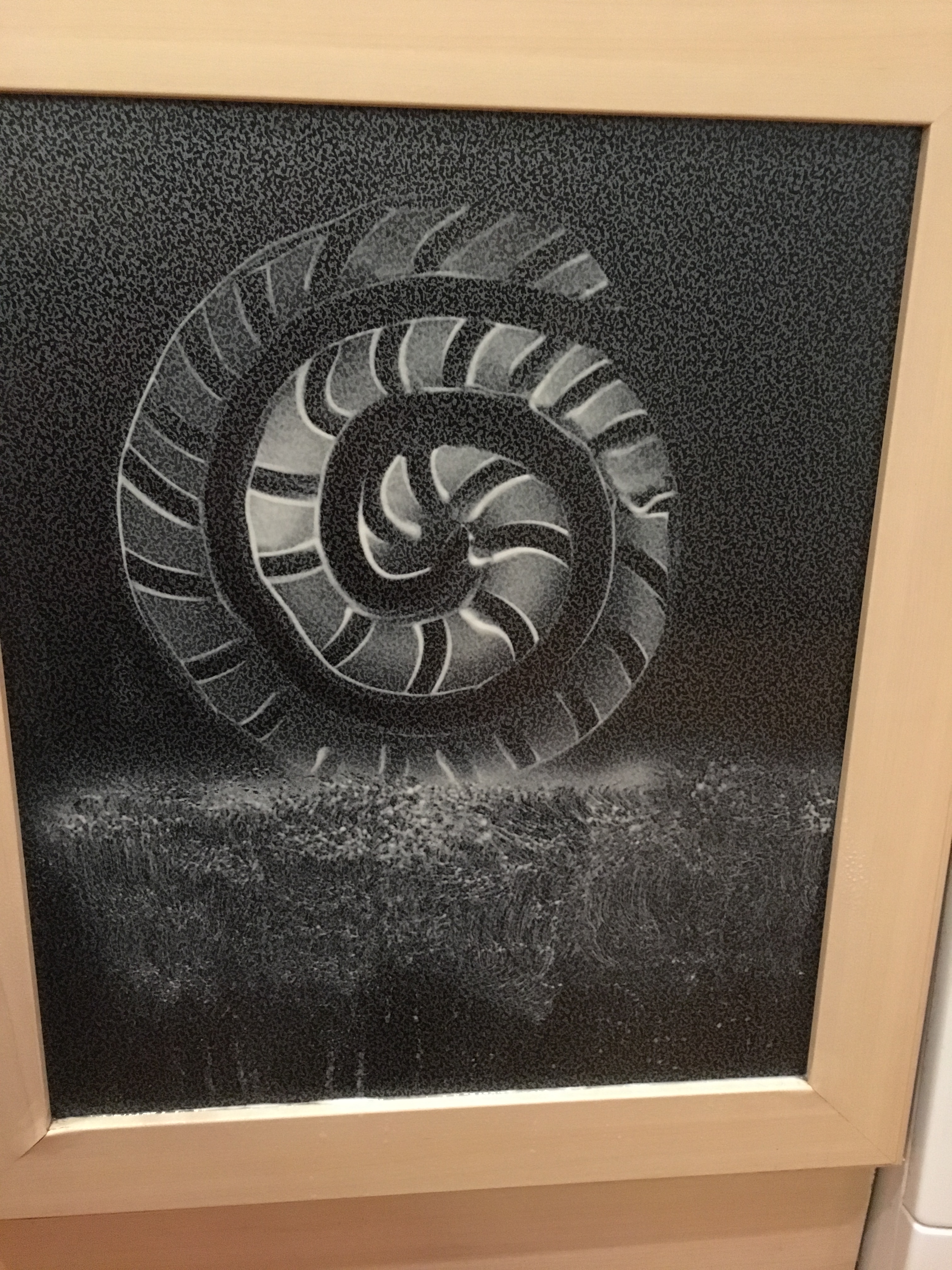
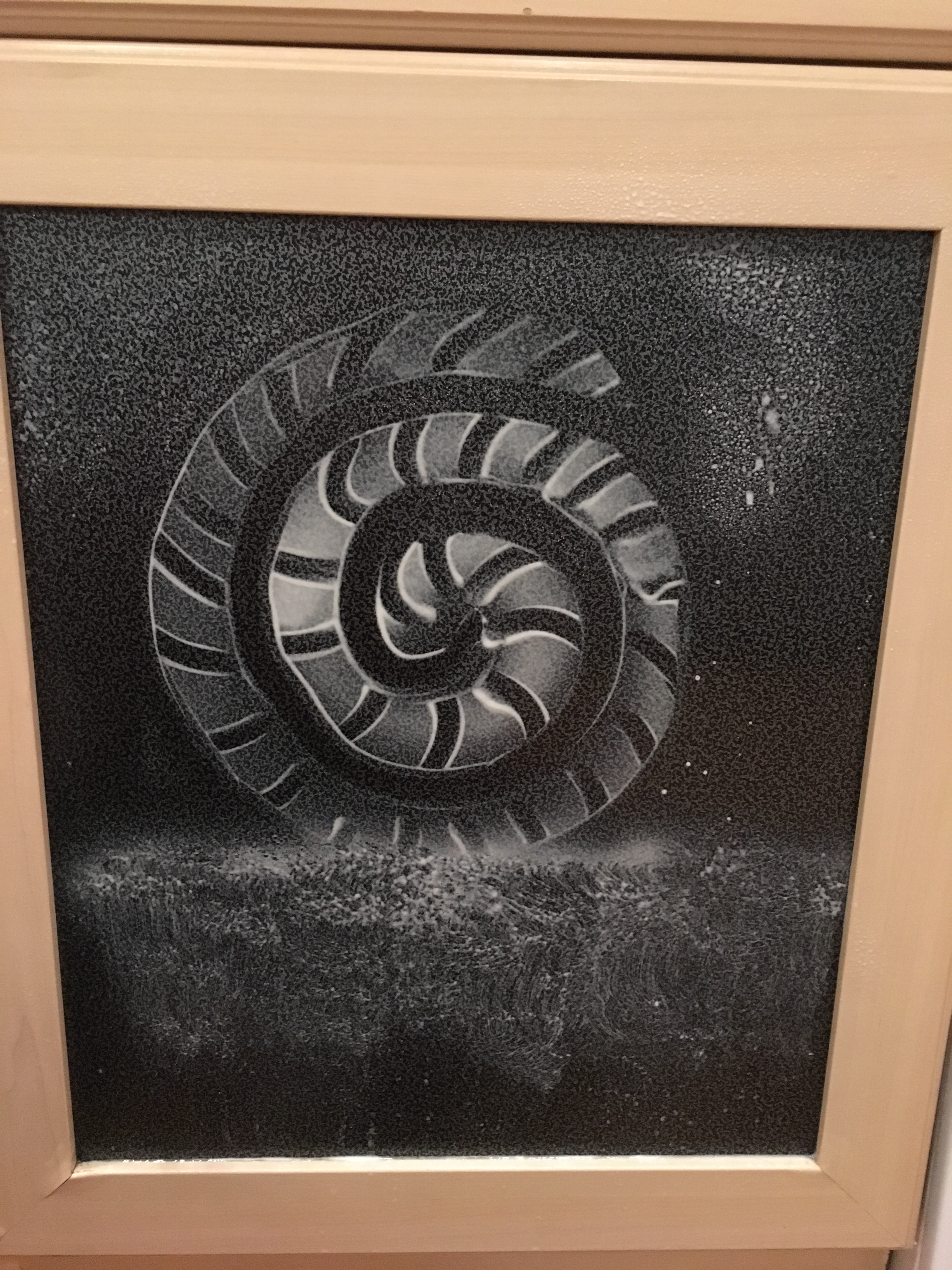
Finished piece
Reflection
On looking back on my work, I think I was a little reserved in my approach to the task, as I did not feel it was quite my style of working. However, I did create a piece and think it turned out quite well considering there was no muse or prior planning. I really like the contrast between the dark and light and how effectively the shading comes across. I do think, however, that my lines could have been a little straighter and less jagged in places. I also think I could have experimented with more tools (such as kitchen roll, crumpled tin foil or adding colour with spices etc). I also think that I could have improved the weight of the shell by having the sand start higher up, as though the shell were lay down on the sand, as I do not think a shell of this size or shape would be able to stand in this way, so it slightly ruins how believable the piece is. Overall, this piece opened my eyes to experimenting more than I usually would and being willing to see ‘what if?’. It has definitely awoken my artist side and increased my excitement to begin my learning and experimentation journey.