This page is to highlight some of the pages within my sketchbook for the third Part of this course which do not correlate with any specific exercise.
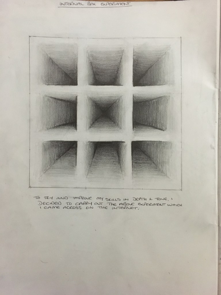
Internal Box Experiment
Working on my tutor’s comments regarding bringing forth the many layers of tonal ranges, I came across this exercise on the internet and decided to have a go myself in my sketchbook. I was quite pleased with the result and enjoyed the piece and tranquility completing it brought with it. This experiment will definitely assist me going forward.
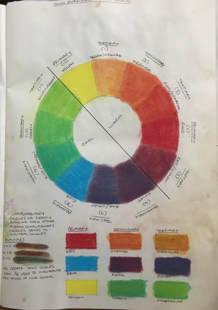
Colour Wheel Experiment
Following on from my tutor’s comments regarding understanding colour and its different attributes, I decided to carry out a creation of a colour wheel which, again, I had found on the internet. Whilst I could have just used their version to work from, I decided to create the piece myself and was happy that I did so as actually redoing it myself helped me to understand the mechanics and use of this wheel.
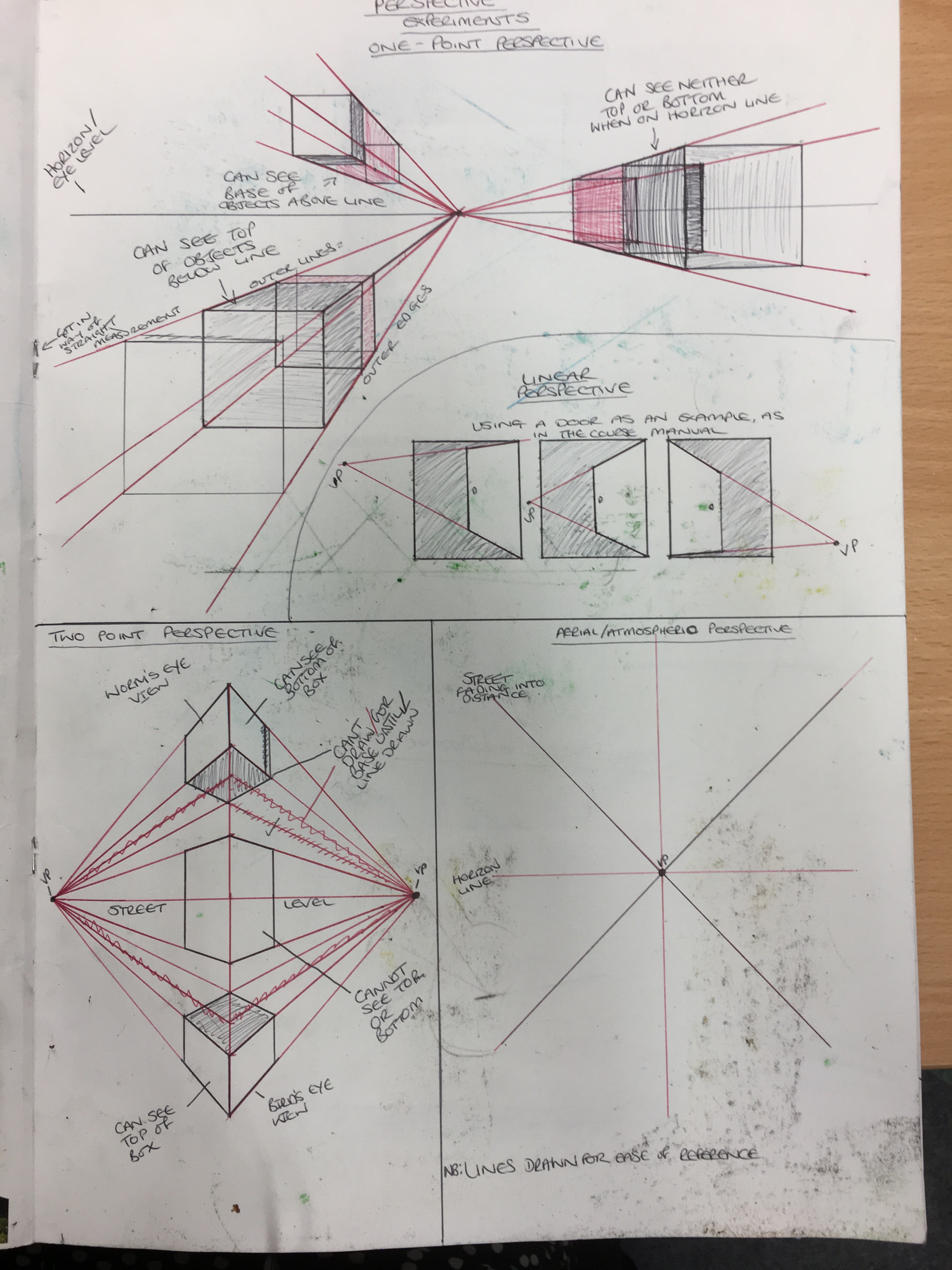
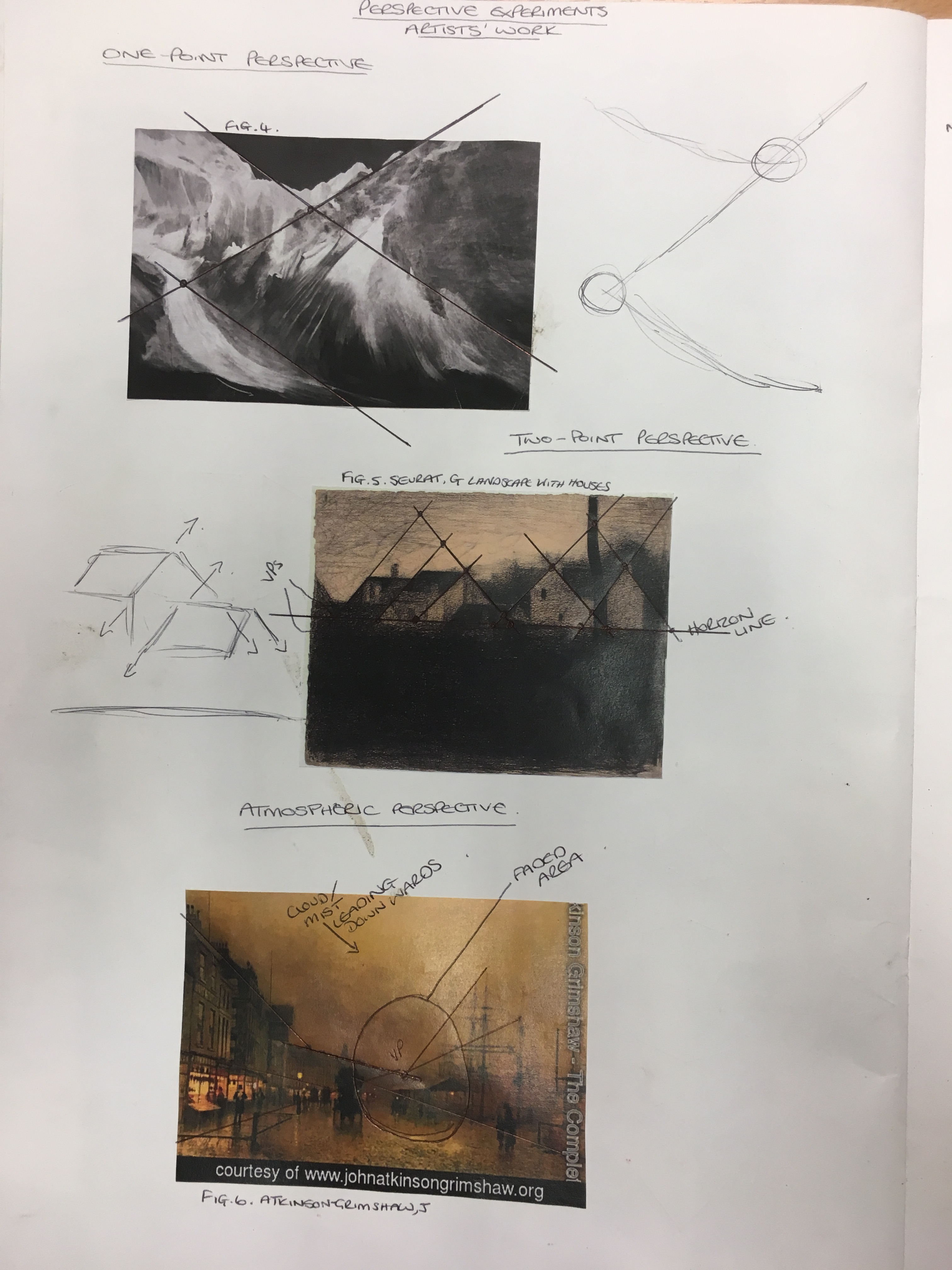
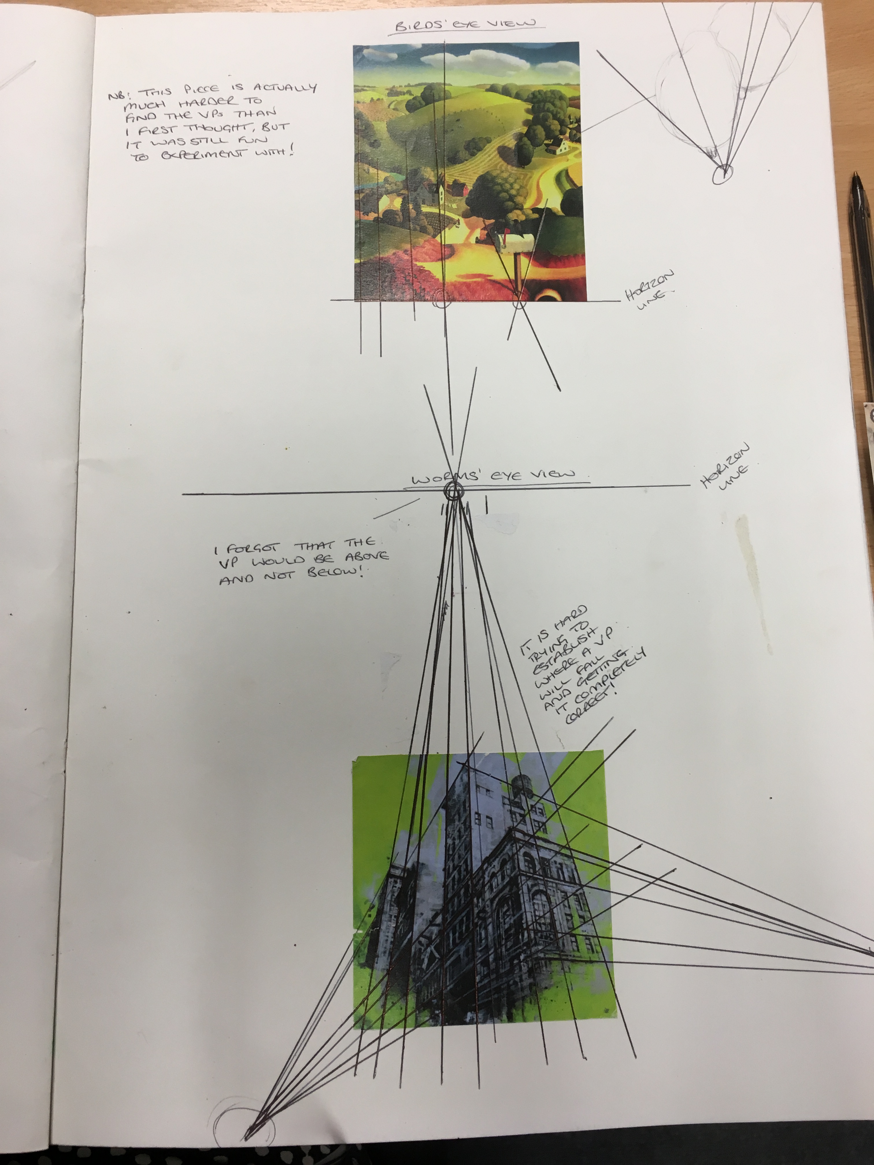
Perspective Experiment
I decided that, since I didn’t feel I fully understood the concept of perspective having read the course manual, I would do my own research into it and carry out my own experiments to help me comprehend it fully in my own way. Below are the three pages of my sketchbook showing these experiments and the results of the same.
Sketchbook List of Illustrations and Bibliography
Please see the below document for citation relating to my sketchbook for this Part of the course:
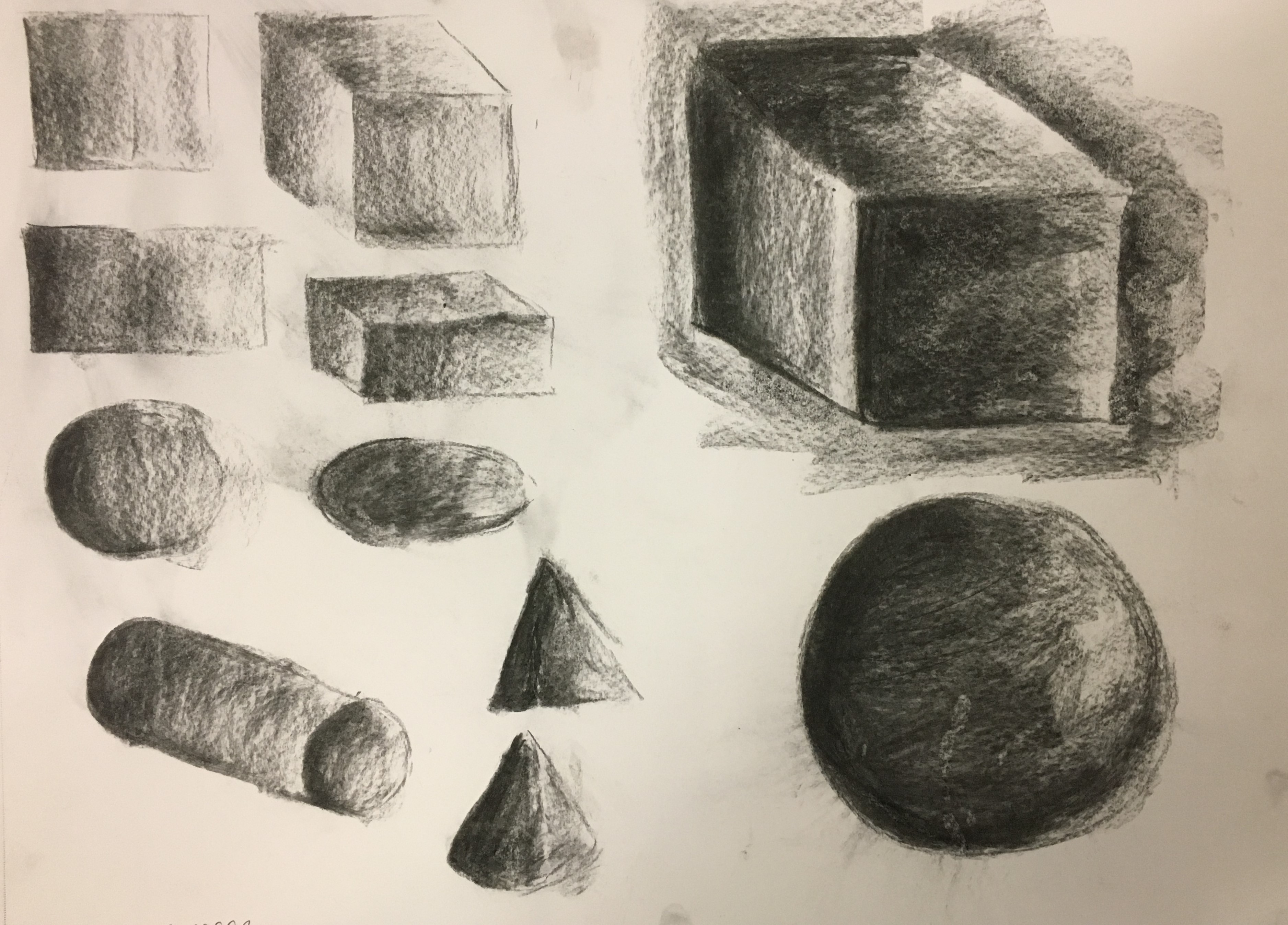
I decided to begin this exercise with a quick rough sketch using charcoal to depict light and shadow on the basic shapes and forms, magnifying my favourites to enable broader strokes. I really like the sphere (bottom right) with only a touch of the lightest tone and think I have created depth rather well in this object considering it was only a very quick, barely controlled sketch! I was rather disappointed with my cubes as
Quick sketches of basic shapes and forms in charcoal
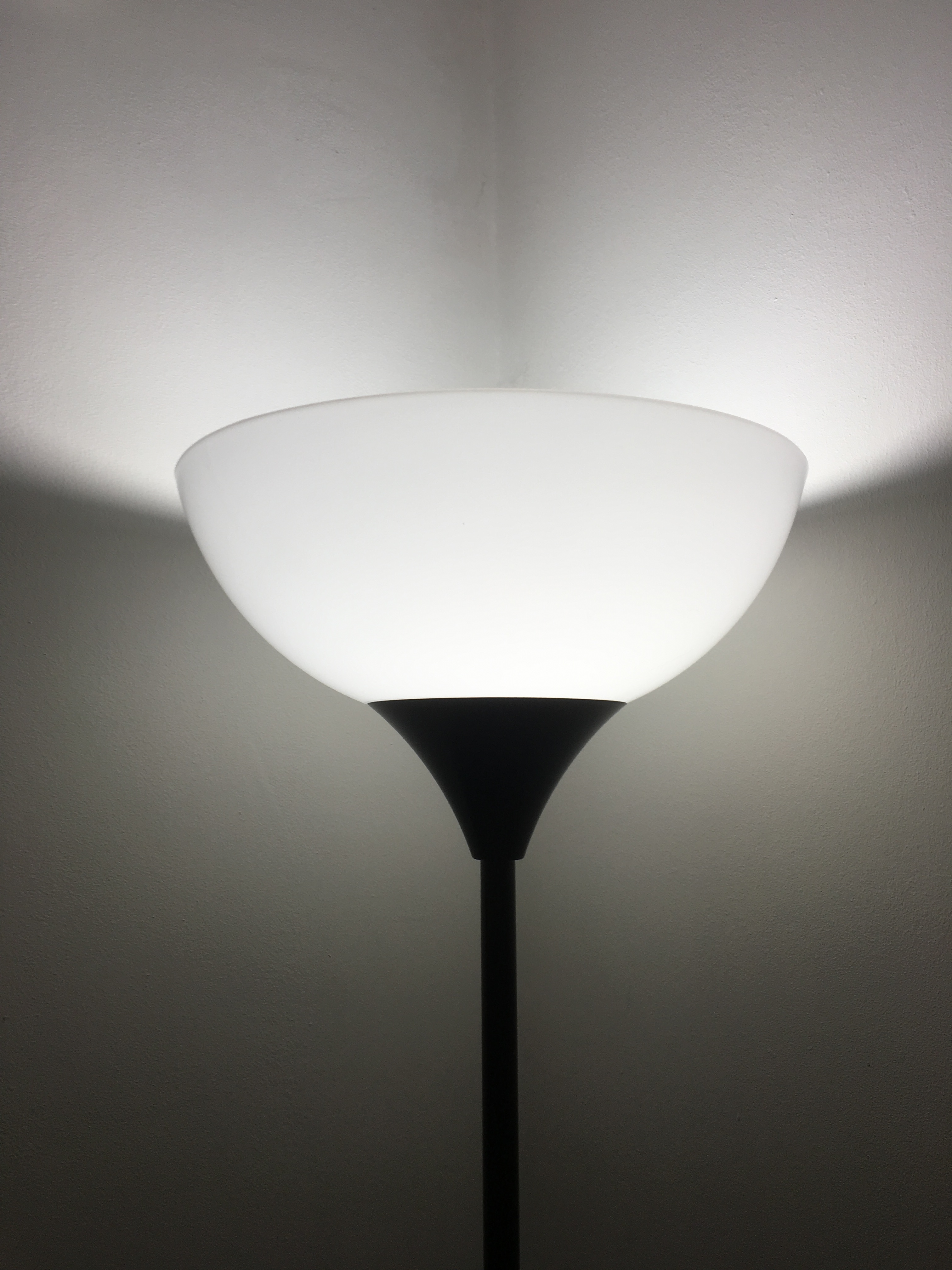
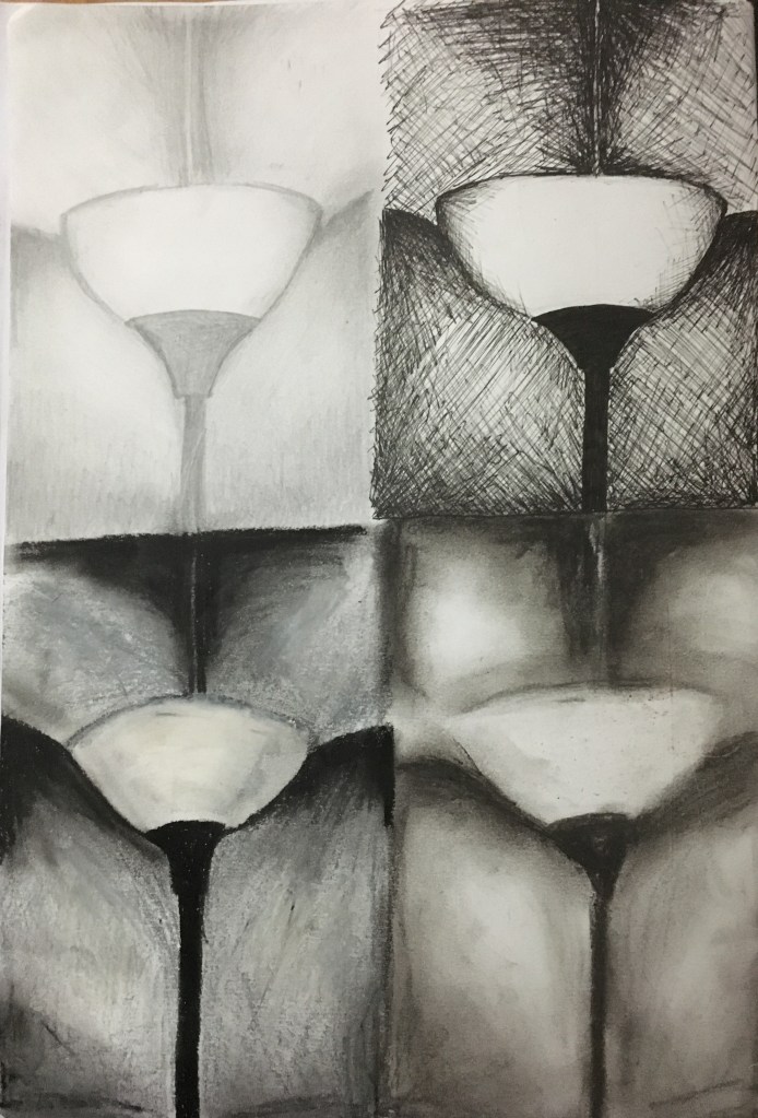
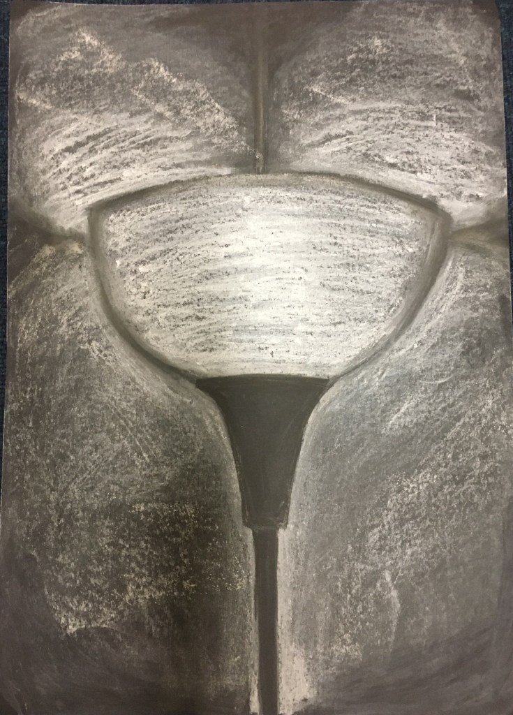
Since starting this course, I have been obsessed with the simplicity and tonal range of the lamp in my dining room so, seeing this as the perfect exercise to experiment with this object, I wanted to begin by playing with four different media; HB pencil, drawing pens, oil pastels and soft pastels. I decided to do this experiment in my A4 sketchbook. I had some A1 black paper so decided I would choose my favourite of the four experiments and invert the colours for my larger piece to use the page’s natural darkness for the areas of the piece which held the deepest shade and to add in the rest with the lighter colours. I thought my favourite pieces would be the oil pastels or soft pastels due to their easy blending capabilities.
Dining Room Lamp
When creating my pieces, I soon realised my previous belief that the lamp and its surroundings were simple due to there being only three or four parts to the composition was very much misled! It soon became apparent to me just how difficult the most basic of shapes, tone and composition can actually be to recreate! I was actually really surprised by this revelation but decided to persevere regardless. I found the pencil and the drawing pen the easiest to manipulate into going where I wanted them to go when drawing a rough guideline of the shapes and shadow placements, and also when finalising the solid outline of the stem of the lamp. However, the pencil did not allow for any very deep and dark shading which was rather frustrating – it felt that no matter how hard or vigorously I pressed, the page just would not darken beyond a certain point. The drawing pens, I found, were fantastic for the deep darkness I was yearning to achieve; however, I did not think the shading worked to best represent the smoothness of the walls and the lampshade. I suppose I could have used just lines, but I still do not think this would have been good enough.
Looking at the two media I had originally thought would be my most successful, I was frustrated with the inability to create solid, sharp edges. The shading of both was brilliant as I could blend them really well (the soft pastels much better than the oil pastels), but I loved the warmth the soft pastels gave off. The whole picture just looked cosy and inviting (if slightly distorted in the piece) – precisely how I feel when I think of my home. I decided this was the winner by far.
I carried out my inverted piece and was rather pleased with the end result. I don’t think it was immediately obvious that it was a lamp – in fact, I even posted the picture in a group on social media and received a comment from someone believing the piece to be a glass! I found this rather comical – I could have been upset or offended etc, but I actually thought it quite amusing and intriguing that someone had seen something in my piece that I had not intended to be there or even seen myself. It gave me a brief insight into just how differently people interpret artwork. I was, however, slightly disappointed in the final outcome due to having, ironically, an inverted issue with not being able to get the intensity I desired, this time in white. I loved the blending of the colours and did this using my fingers to really get into the piece. I think perhaps I could have used fixative and then built the deepest white areas up layer by layer to intensify their vibrancy.
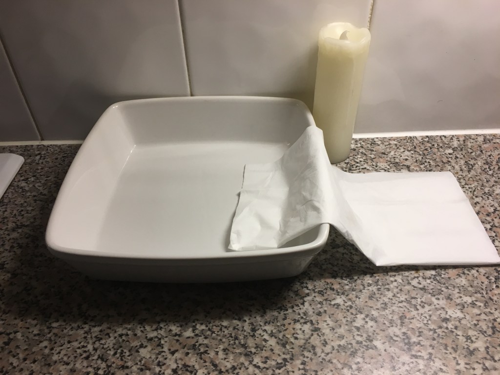
I looked at the exercise again and saw there was a requirement to use two or more objects, so decided to create another piece. I wanted to work quickly on this piece and without too much restriction on myself – I have seen this whole process so far as just quick, rough experiments as opposed to official, structured drawings. I have been more concerned with the process than the end result. I chose three light coloured items: a food dish, a tissue and a candle and placed them on my kitchen worktop. The lighting was poor in the surrounding vicinity due to it being night-time and the only lighting was high above. My kitchen worktop, however, had spotlights just underneath the overhead cupboards, so I thought this would work much better in casting shadows, if only from an angle I was not so accustomed to.
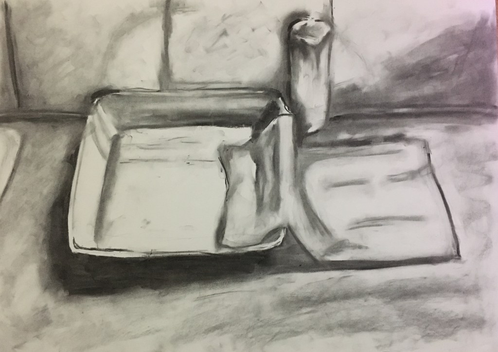
I had a play on an A2 sheet with willow charcoal and, due to the warmth
and ambience of the night-time around me, decided to smudge the edging of the
piece. I chose to do this after seeing
the result of my earlier piece of the lamp’s glow and the warmth that
held.
Besides a few issues with the structure of the objects, I was actually rather pleased with the final result as I think I caught the shading rather well. I had a comment as to the kitchen tiles and that they were rather obvious in their description. I noticed when looking back at the end that the shape of the square bowl could have been much better laid out and made to look much more realistic with some more lighter and darker areas due to the reflective surface which, again, I think is a result of not measuring or taking time and care in the planning of the piece. I also think there is a large element of ‘practice makes perfect’!
Overall, I really enjoyed the process of not so much drawing the piece, but drawing it through the block colours and shading and just adding the finer details of the outline in the end. I will definitely use this again further on in my journey as I have always generally drawn first, added detail and then added shade and light, but actually found it rather refreshing to reverse my methods. Even though my initial piece was misconstrued by a member of the public, I won’t see this as too much of a mistake but more a learning curve of perhaps asking myself how I can try and portray the piece more realistically and tell the viewer what its actual purpose is clearer, or to even work on enhancing the lack of instant recognisability dependent upon the piece I am creating and the purpose it is to fulfil.
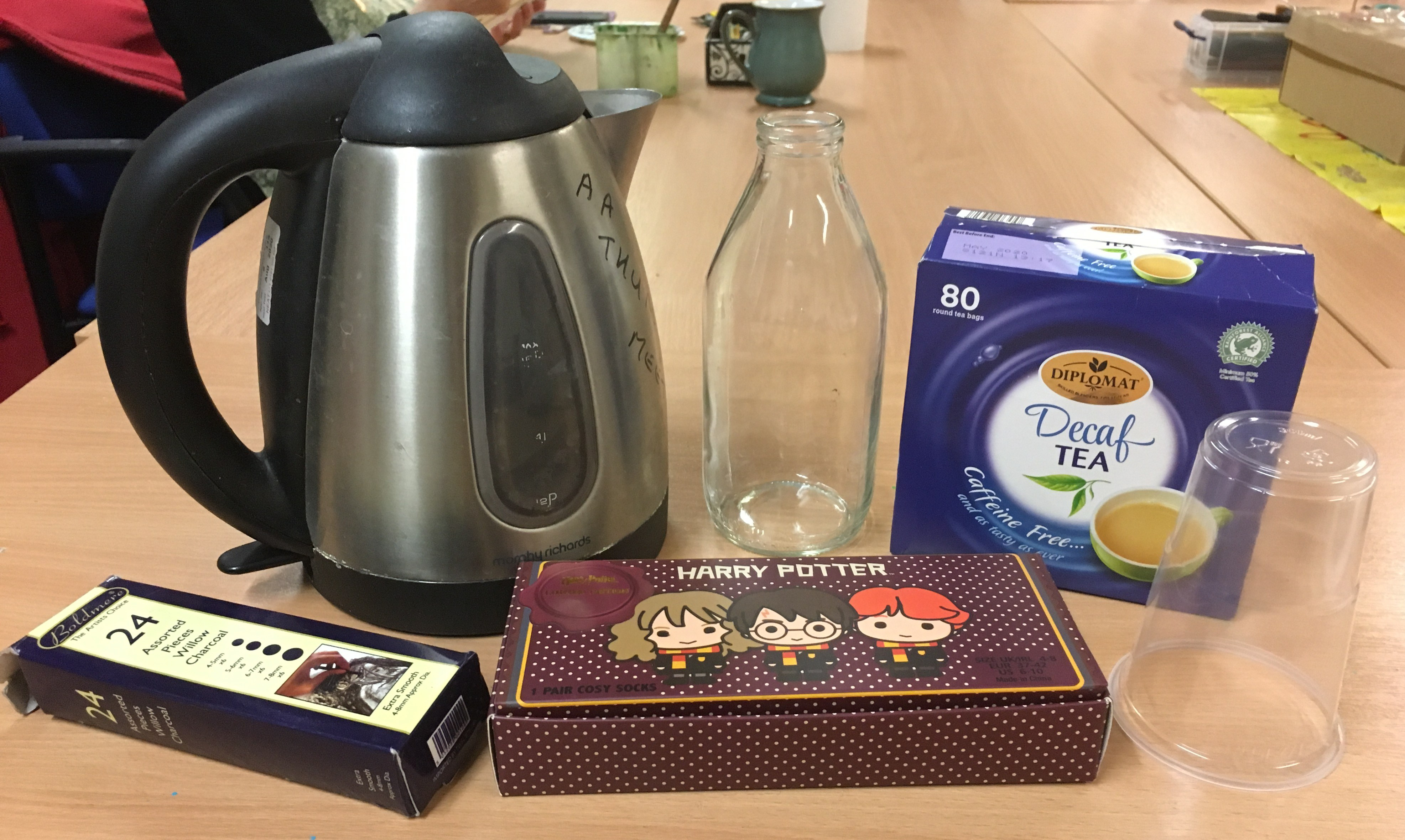
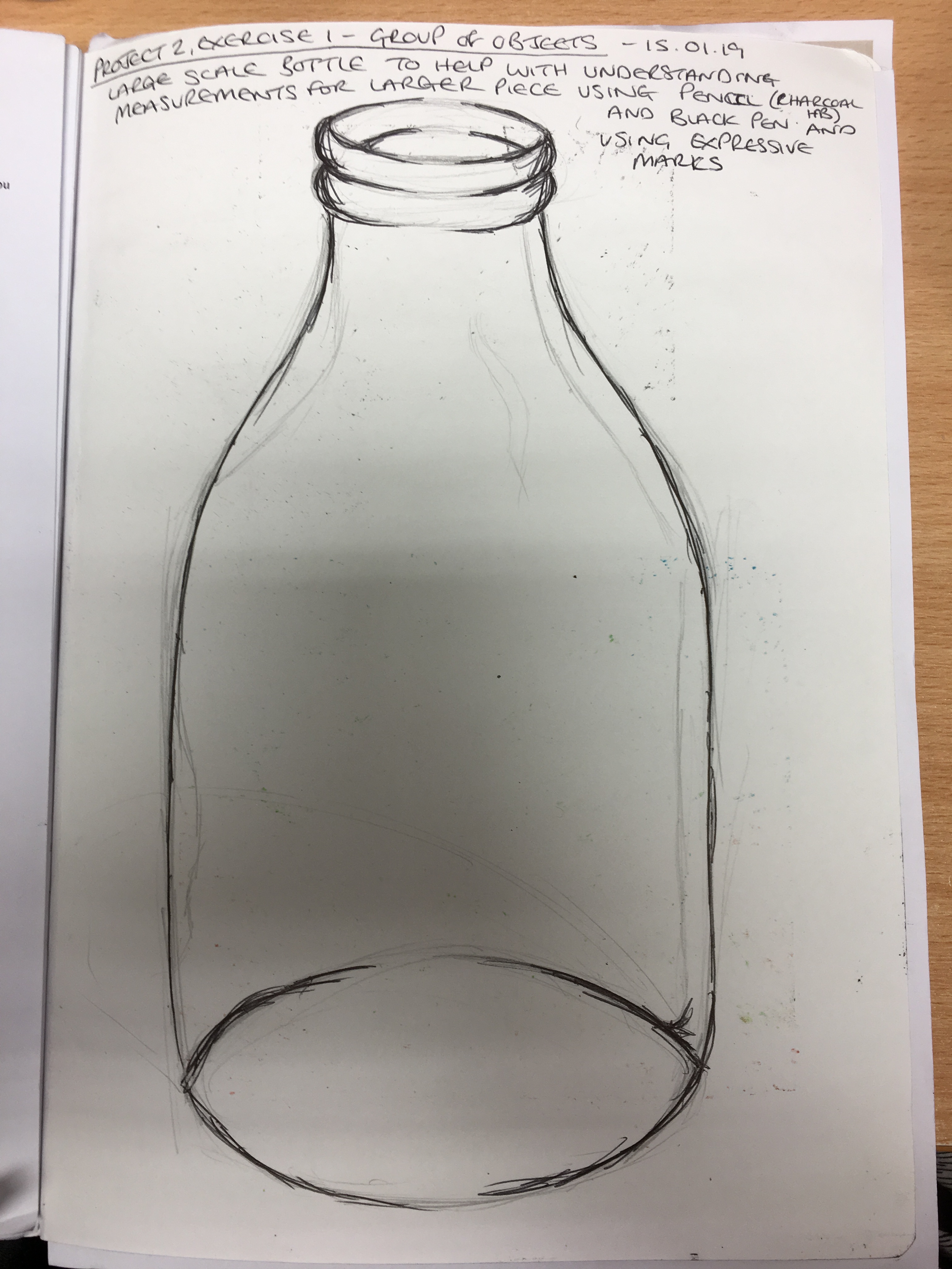
For this piece, I thought I would gather a few different objects from around the local art class I attend and sketch them whilst there. I arranged some objects and, thinking the glass milk bottle would be the hardest piece to replicate due to its symmetry and difference in shade, tone and reflection, I made a sketch of it in my sketchbook to familiarise myself with the shape before continuing to the main piece. I decided that, due to working on such a large scale, I would forgo the pencil and attempt the piece in willow charcoal instead. I thought this would have a much bolder result on such a large-scale piece of paper than a pencil would and, since I was only concentrating on the outline, the pencil would be very fine and almost invisible if viewed from any amount of distance. I was rather disappointed with the end result as I thought it had an almost cartoon-like appearance. I was also disappointed that I had not managed to scale the objects properly in the beginning due to not measuring the objects out on the sheet first, but I thought it was quite good considering it was only a quick attempt and did not have much effort put into it really.
First group of objects
Brief sketch of the glass milk bottle in sketchbook
Sketch of the first group of objects
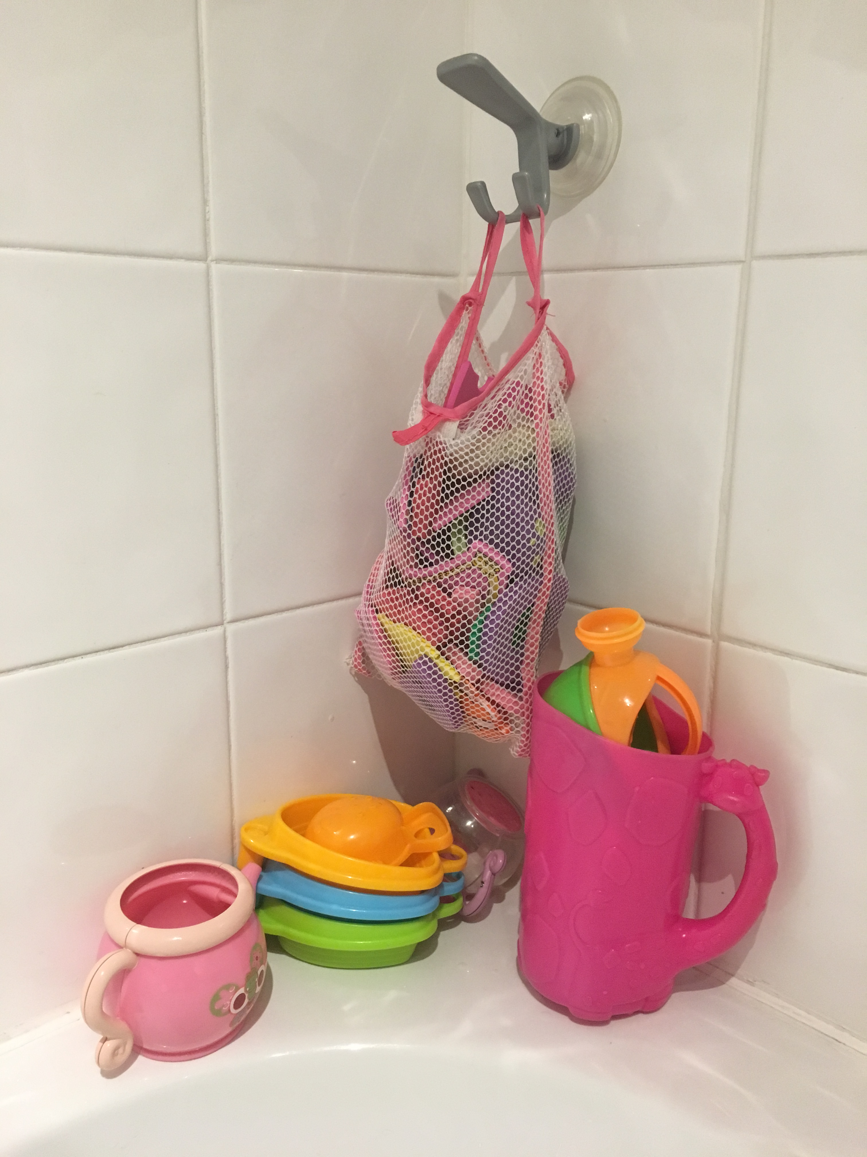
I then thought I would try a different group of objects due
to the first not including anything loose and also wanting to try and draw the
objects inside, as requested, which I had only then realised I had not done in
the first piece. I settled on my
daughter’s bath toys and net bag. I was
rather dubious about the bag as I thought it much too delicate and intricate
for my liking – I am not a fan of creating very fine, detailed work personally (and
more so with my tremor sometimes deciding on the line’s direction and structure
for me!) – and so expected to become frustrated by its delicateness. I thought the pink jug would by far be the
easiest object to recreate. I began the
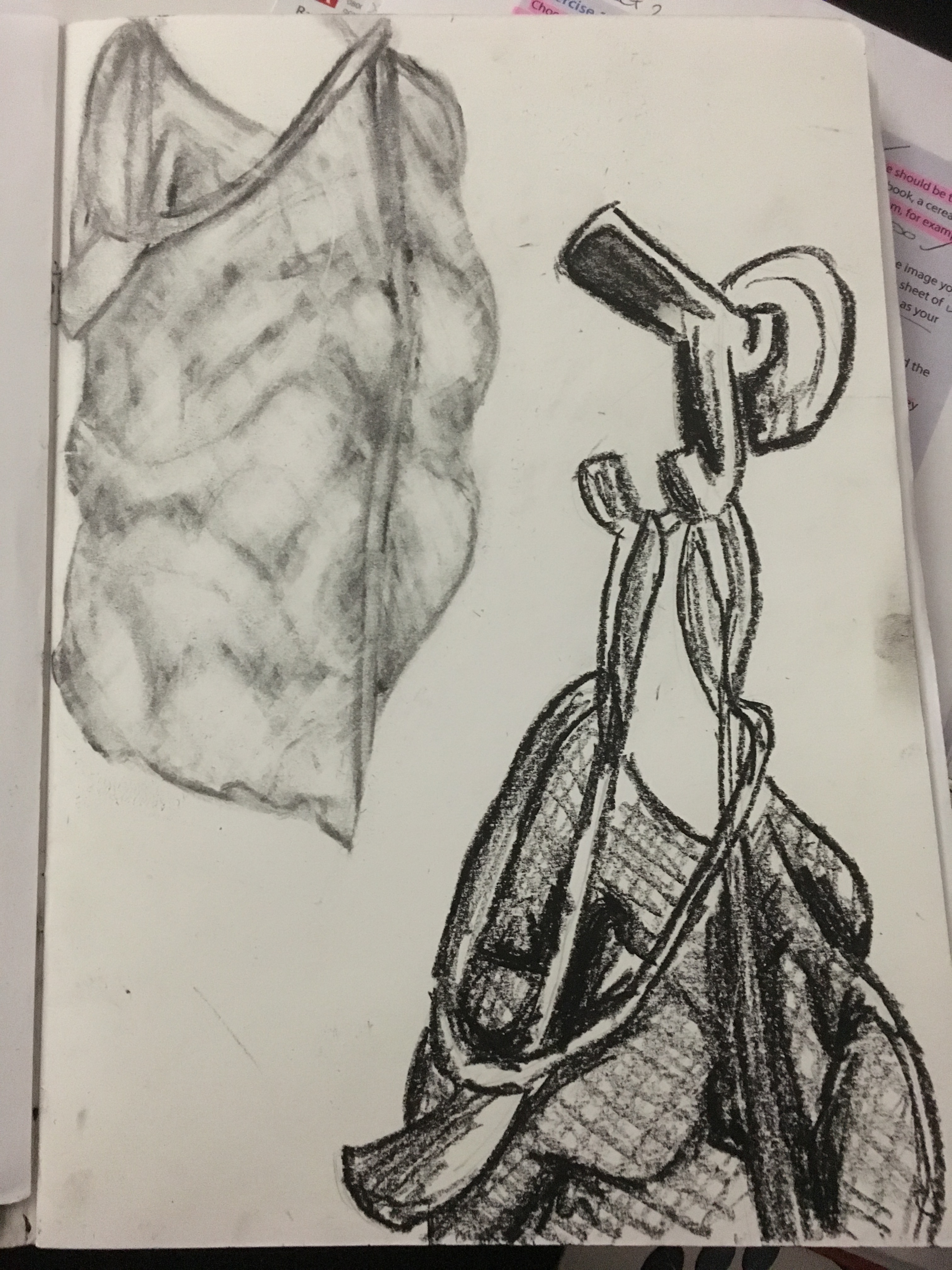
piece by drawing two sketches in my sketchbook of the net bag and its
enclosures to familiarise myself with the bag and the weight of the items inside
it before continuing onto a larger scale.
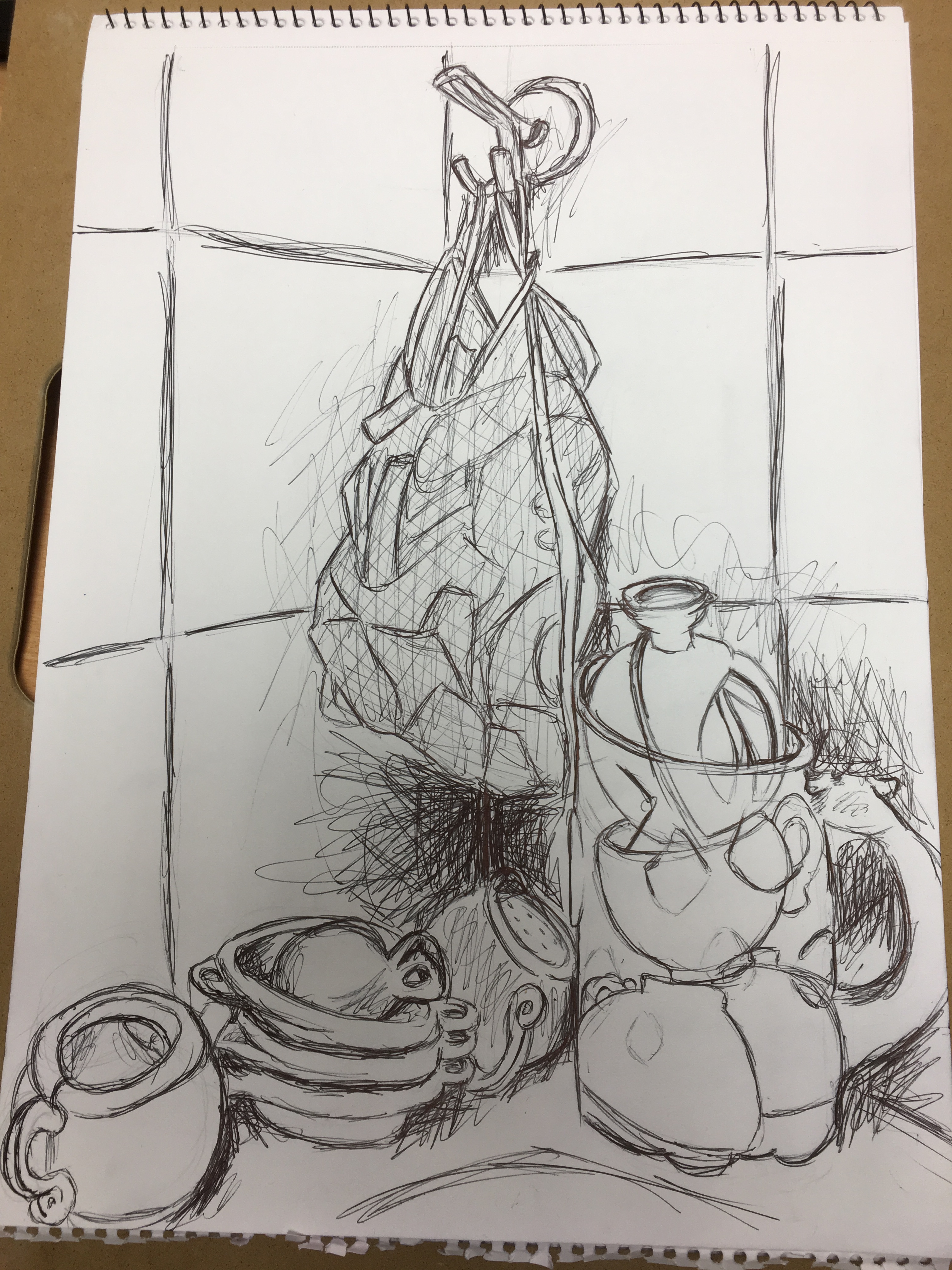
Second group of objects
Initial sketches of second group of objects in willow charcoal (top left) and oil pastel (bottom right)
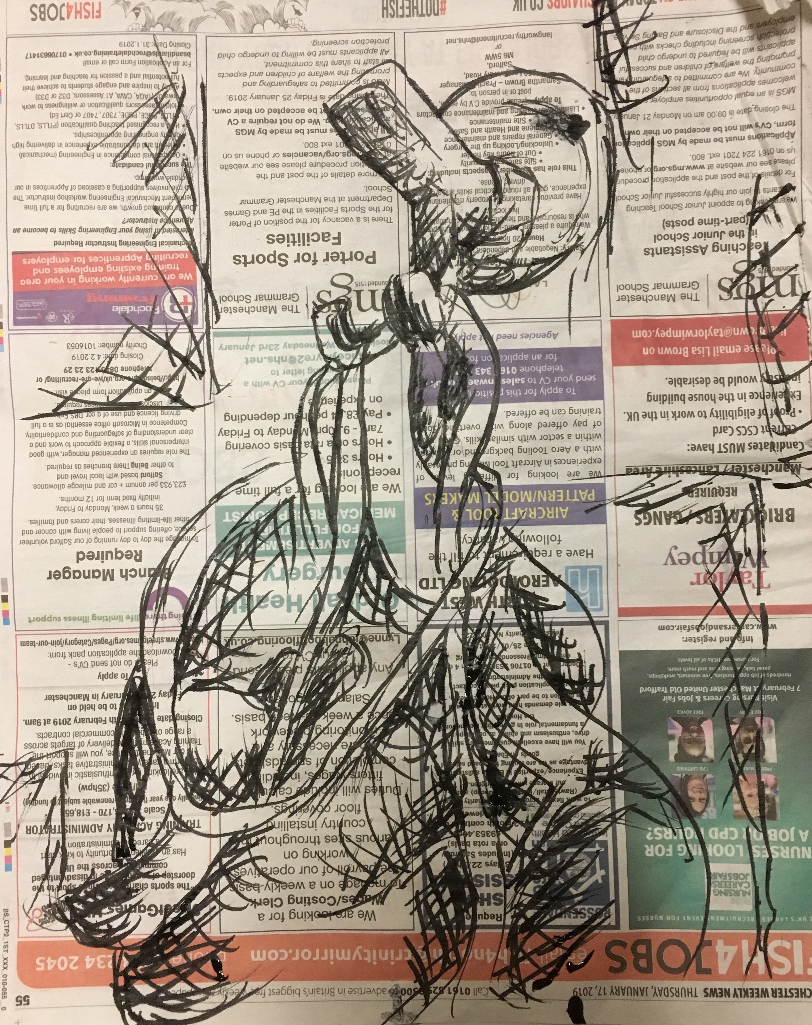
Initial sketch of bag using a drawing pen and ink on newspaper
I created my larger piece in black biro on a sheet of A3 sketchpad
paper. I was actually pleasantly
surprised by the end result of this piece; I had somehow managed to integrate
delicate lines for such things as the net bag and the outline of the objects which
could not be seen by the naked eye, but also deep, dramatic lines for the shaded
areas. I did not want to concentrate too
heavily on the shaded areas due to the piece being mostly focussed on just an outline,
but couldn’t help myself in adding just a little (and rather loosely) in
certain parts of the picture to help clarify the depth and weight of the objects
and their locations within the piece.
Final sketch of second group of objects
Reflection
I really enjoyed this exercise and have learned a lot from it. Mostly I have learned that just because something looks as though it will be difficult to replicate, it is worth giving it a go as there may be different ways to recreate it without going very deeply into fine detail and precision. I think it is also important to try to visualise the items which are inside other items and understand their composure to appreciate how and why the final resting place comes to be. I think this will come in useful when drawing the figure; trying to imagine the placement of muscles and other tissue underneath the skin, why they are there, what purpose they serve and what impact they have on the image you see before you and also in architecture when considering the framework and foundation, and also who might inhabit each building, considering their individual stories. Finally, I think the structure of the objects and the spacing between items in the final piece is quite good compared to my earlier pieces. Perhaps this is because I am now beginning to see the importance of ‘reading between the lines’ so to speak. I will definitely be referring back to this piece in the future.